PRELIM | Psychological Statistics (PSM102)
1/151
There's no tags or description
Looks like no tags are added yet.
Name | Mastery | Learn | Test | Matching | Spaced | Call with Kai |
|---|
No analytics yet
Send a link to your students to track their progress
152 Terms
Statistics
a range of techniques and procedures for analyzing, interpreting, displaying, and making decisions based on data
Statistics is the language of ____ and _____
science and data
Statistics
serves as the link between a research idea and and usable conclusions
Statistics
provides tools that you need in order to react intelligently to information you hear or read
Statistics
can be used to add credibility to an argument or advice
Data
represent the measured value of variables
Variable
a characteristic or feature of the thing we are interested in understanding
Independent Variable
manipulated by an experimenter
Dependent Variable
shows the results after the independent variable is manipulated
Experimental Group
group that received the variable being tested in an experiment
Control Group
the group in an experiment that does not receive the variable you are testing
Qualitative
express a qualitative attribute such as hair color, eye color, religion, favorite movie, gender, and so on. The values do not imply a numerical ordering.
Quantitative
measured in terms of numbers. Some examples are height, weight, and shoe size.
Discrete
variable you can count in a finite amount of time
Discrete
countable, instead of measurable
Discrete
easy to visualize and distribute, and can be categorical
Continuous
can assume an infinite number of real values within a given interval
Continuous
variable that changes over time, may or may not have decimals, and visualized with line graphs or skews
Nominal
naming or categorizing responses
Ordinal
uses labels to classify cases (measurements) into ordered classes
Interval
there is order, the difference between the two variables is meaningful and and equal, and the presence of zero is arbitrary
Ratio
the most informative scale and an interval scale with the additional property that its zero position indicates the absence of the quantity being measured
Sample
a small subset of a larger set of data
Population
the larger set from which the sample is drawn
n
sample
N
population
Simple Random Sampling
most straightforward among the sampling strategies
Simple Random Sampling
requires every member of the population to have an equal chance of being selected into the sample
Simple Random Sampling
the selection of one member must be independent of the selection of every other member. picking one member from the population must not increase or decrease the probability of picking any other member (relative to the others)
Stratified Random Sampling
sometimes used to make the sample more representative of the population since simple random sampling often does not ensure a representative sample
Stratified Random Sampling
this method can be used if the population has a number of distinct “strata” or groups
Convenience Sampling
a non-probability sampling method where units are selected for inclusion in the sample because they are the easiest for the researcher to access
Convenience Sampling
can be due to geographical proximity, availability at a given time, or willingness to participate in the research
Sampling Bias
occurs when some members of a population are systematically more likely to be selected in a sample than others
Sampling Error
a deviation in the sampled value versus the true population value. occurs because the sample is not a representative of the population or is biased in some way
Experimental Research Design
defined by the use of random assignment to treatment
conditions and manipulation of the independent variable
Quasi-Experimental Research Design
involves manipulating the independent variable but not randomly assigning people to groups
Non-Experimental Research Design
sometimes called Correlational Research
Non-Experimental Research Design
involves observing things as they occur naturally and recording our observations as data
Types of Statistical Analyses
Descriptive Statistics & Inferential Statistics
Descriptive Statistics
numbers that are used to summarize and describe data. data refers to the the information that has been collected from an experiment, survey, historical record, etc.
Inferential Statistics
the formal analyses and tests we run to make conclusions about our data
Inferential Statistics
use measurements from the sample of subjects in the experiment to compare the treatment groups and make generalizations about the larger population of subjects
X and Y
variables being observed in an experiment or research
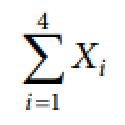
Σ
indicates summation
i = 1
indicates that the summation is to start with x₁

4
indicates that the summation will end at x₄
Frequency Distribution
an organized tabulation showing exactly how many individuals are located in each category on the scale of measurement
Frequency Tables
shows the frequencies of the various response categories and the relative frequencies, which are proportion of responses in each category
Regular Frequency Distribution
When a frequency distribution table lists all of the individual categories (x values), it is called _________
Class Intervals
groups of scores
Grouped Frequency Distribution
In a grouped table, the x column lists groups of scores, rather than individual values
the same width
In grouped frequency distribution, the intervals all have _________, usually a simple number such as 2, 5, 10, and so on
Multiple
Each interval begins with a value that is a ________ of the interval width
Interval Width
selected so that the table will have approximately ten intervals
Cumulative Frequency
Calculated by adding each frequency from a frequency distribution table to the sum of its predecessors. The last value will always be equal to the total for all observations, since all frequencies will already have been added to the previous total.
Relative Frequency
A proportion or percentage which is calculated with the help of given frequency
f/N
formula of relative frequency
1
total of relative frequency
Interpolation
mathematical process based on the assumption that the scores and the percentages change in a regular, linear fashion as you move through an interval from one end to the other
Percentile
commonly expressed as the percentage of values in a set of data scores that fall below a given value
n/N * 100%
formula for percentileQya
Quartile
three values that split sorted data into four parts, each with an equal number of observations
Decile
each of ten equal groups into which a population can be divided according to the distribution of values of a particular variable
Pie Chart
each category is represented by a slide of the pie and the area of the slice is proportional to the percentage of responses in the category
Pie Chart
This is simply the relative frequency multiplied by 100
Pie Chart
effective for displaying the relative frequencies of a small number of categories but not recommended when you have a large number of categories
y-axis
In bar charts/graphs, this is where frequencies are shown
x-axis
In bar charts/graphs, this is where the variable is shown
Bar Charts/Graphs
Typically, the y-axis shows the number of observations in each category rather than the percentage of observations in each category as is typical in pie charts
Lie Factor
refer to the ration of the size of the effect shown in a graph to the size of the effect shown in the data
Baseline in bar charts/graphs
the bottom of the y-axis, representing the least number of cases that could have occurred in a category. Normally, but not always, this number should be zero
Pie Charts and Bar Charts/Graphs
can be used for graphing qualitative variables
Line Graph
essentially a bar graph with the tops of the bars represented by points joined by lines (the rest of the bar is suppressed)
Line Graph
generally better at comparing changes over time
Stem-and-Leaf Display
graphical method of displaying data. It is particularly useful when your data are not too numerous
Stem-and-Leaf Display
Its one purpose is to clarify the shape of the distribution
Histogram
graph that shows the frequency of numerical data using rectangles
distribution frequency of a variable
In Histogram, this is what the height of a rectangle (the vertical axis) represents
Frequency Polygon
A curve that is drawn on the x-axis and the y-axis
Frequency Polygon
can serve as an alternative to a histogram
x-axis
In frequency polygon, it represents the values in the dataset
y-axis
In frequency polygon, it shows the number of occurrences of each distinct category
x-axis
where the frequency polygon needs to start and end
Frequency Polygon
the points in this graph represent frequency of values within a particular interval rather than actual data value.
Box and Whisker Plot
Otherwise known as a boxplot, is a graph summarizing a set of data
Box and Whisker Plot
shows how the data is distributed and it also shows any outliers and a useful way to compare different sets of data
Bar Graph
This graph should be used when the score categories (x values) are measurements from a nominal or an ordinal scale
Bar Graph
This graph is just like a histogram except that gaps or spaces are left between adjacent bars
Line Graph, Stem-and-Leaf Display, Histogram, Frequency Polygon, Box and Whisker Plot, Bar Graph
can be used for graphing quantitative variables
Bell Curve
a common type of distribution for a variable, also known as the normal distribution
Bell Curve
originates from the fact that the graph used to depict a normal distribution consists of a symmetrical bell-shaped curve
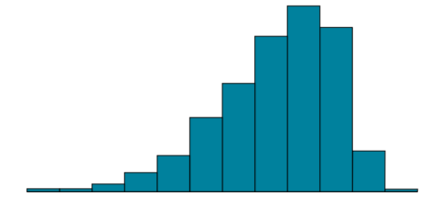
Skew
most common asymmetry; one of the two tails of the distribution is disproportionately longer than the other
Skew
This property can affect the value of the averages we use in our analyses and make them an inaccurate representation of our data, which causes many problems
Skew
can either be positive or negative (also known as right or left, respectively), based on which tail is longer
Positive Skew
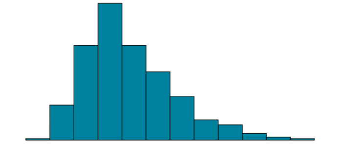
Negative Skew
Arithmetic Mean
the sum of the numbers divided by the number of numbers
μ
mean of a population
M or x̅
mean of a sample