Displaying & Summarizing Quantitative Data
1/29
There's no tags or description
Looks like no tags are added yet.
Name | Mastery | Learn | Test | Matching | Spaced | Call with Kai |
|---|
No analytics yet
Send a link to your students to track their progress
30 Terms
Quantitative Data
numerical data that represents a specific quantity, amount, or range of numbers
Ways to represent quantitative data
Histograms
Steam & Leaf Displays
Dotplots
Boxplots
How to make a histogram
Decide on an appropriate bin width
Create a frequency table to organize the data into appropriate bins
Label axes appropriately, if there needs to be a break in the graph…put it. The x-axis will contain the bin values and the y-axis is the frequency
Construct the histogram by creating vertical bars whose height represent the quantity of values in the specified bin
Make sure there are NO gaps between the bars (unless the bin is empty) and there’s appropriate titles and equal bin widths
Stem and Leaf Displays
Organized into bins (stems) and allows one to see the individual data point and modes. Needs a key and could usually only be used for 2-3 digits whole numbers
Truncating the values
usually happens when the numbers are too large and need to round them to put them in the display
Dotplots
most simple display and used to visualize simulations. Works best with a small range of numbers
“Quantitative Data” condition
A condition that verifies that the data is numerical and the units are known
Questions about SHAPE to ask oneself
Does this histogram/stem&leaf plot/dotplot have a single central hump of data, or several separated humps?
Is the histogram symmetric?
Do any unusual features stick out?
4 Main types of Shape (Distribution)
Symmetric
Uniform
Skewed left
Skewed Right
Symmetric
Same on both sides if folded at the highest bar
Uniform
When the data is almost the same
Skewed left
Little bit of data on the left and the central part of the data on the right (mean <median)
Skewed Right
Tail on the right and the rest of the data on the left (mean>median)
Roughly symmetrical
Occurs because real-life data is never perfect
Bimodal
Kinda symmetrical but has 2 modes (can be asymmetrical)
Make sure to mention ___ while describing shape
OUTLIERS (either be the most informative part of data or an error)
Median
Middle of the data points
Ways to describe the spread
Range, IQR, Standard Deviation
Range
max. - min.
Interquartile Range (IQR)
Difference between the upper and lower quartiles
Five Number Summary
reports the min., 1st quartile, median, 3rd quartile, and max. of a set of data. This breaks the data up into 4 sections that gives 25% of the data in each section
Outliers
When the data is not within the bounds of the fences/ if it’s more than 1.5 times the distance of the middle 50% (usually the min. and max.)
Lower Fence
Q1 - 1.5(IQR)
Upper Fence
Q3 + 1.5(IQR)
Describing data for when its symmetric
Use the mean and standard deviation
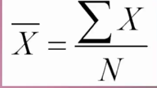
Mean formula
Add up all the data points then divide the sum by the number of data points
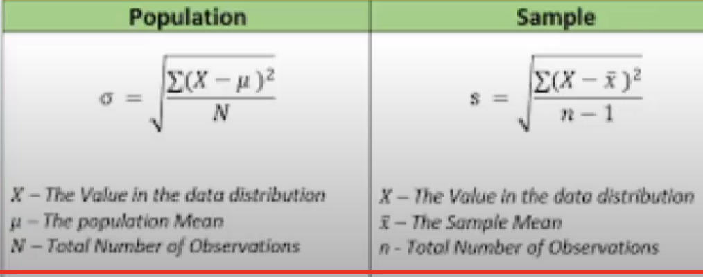
Standard Deviation Formula
Take the mean and subtract every single data point from the mean, then square it (for every single data point in the set) add them all together, then divide by either N (Population) or n-1 (sample)
When the shape is skewed (Data Description)
Use the median and IQR because they are not affected by outliers (since they are positional values)
What to Tell About a Quantitative Variable
Start by making one of the pictures and discuss the shape of the distribution
Next, discuss the center and spread. Always pair the median with the IQR and the mean with SD. NEVER REPORT A CENTER WITHOUT A SPREAD
If the shape is symmetric use the mean and SD. If it’s skewed, use the median and IQR (Might want to report mean and SD too but note WHY it’s different)
Discuss any unusual features. If there are multiple nodes, discuss that and try to explain why if possible. If there are clear outliers, try and report the data with and without them to show their influence.
What can go wrong?
Dont make a histogram of categorical data
Dont look for shape, center, and spread of a bar chart
Dont use bars for every display.. save them for histograms and bar charts
Choose an appropriate bar width
Dont round in the middle of a calculation
Watch out for multiple modes
Beware of Outliers
Dont forget to sort out the data before finding medians and percentiles
Dont report too many decimal places