Introduction to Data Visualization in Psychology Research
1/15
There's no tags or description
Looks like no tags are added yet.
Name | Mastery | Learn | Test | Matching | Spaced |
|---|
No study sessions yet.
16 Terms
What is the primary purpose of visualizing data?
To understand and communicate the data accurately and effectively.
What type of chart is effective for displaying the relative proportion of categories?
A pie chart.
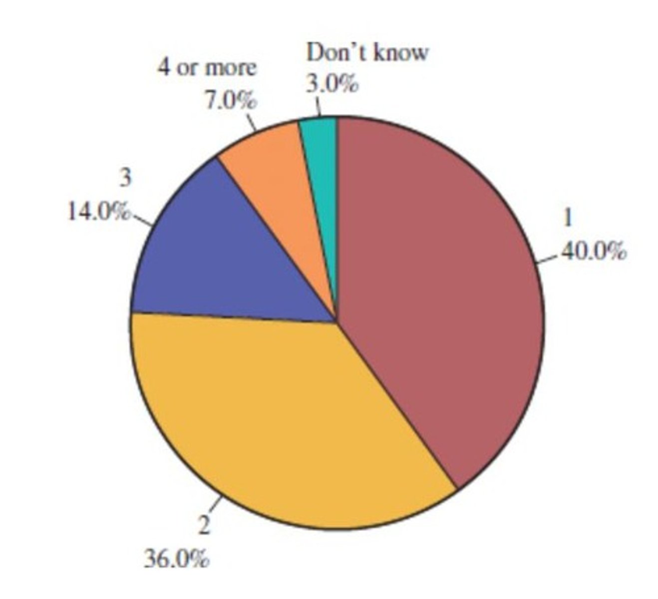
What is the formula for calculating the slice size of a category in a pie chart?
Slice size of category A = 360° x relative frequency of category A.
When is a pie chart most effective?
When the number of categories is relatively small.
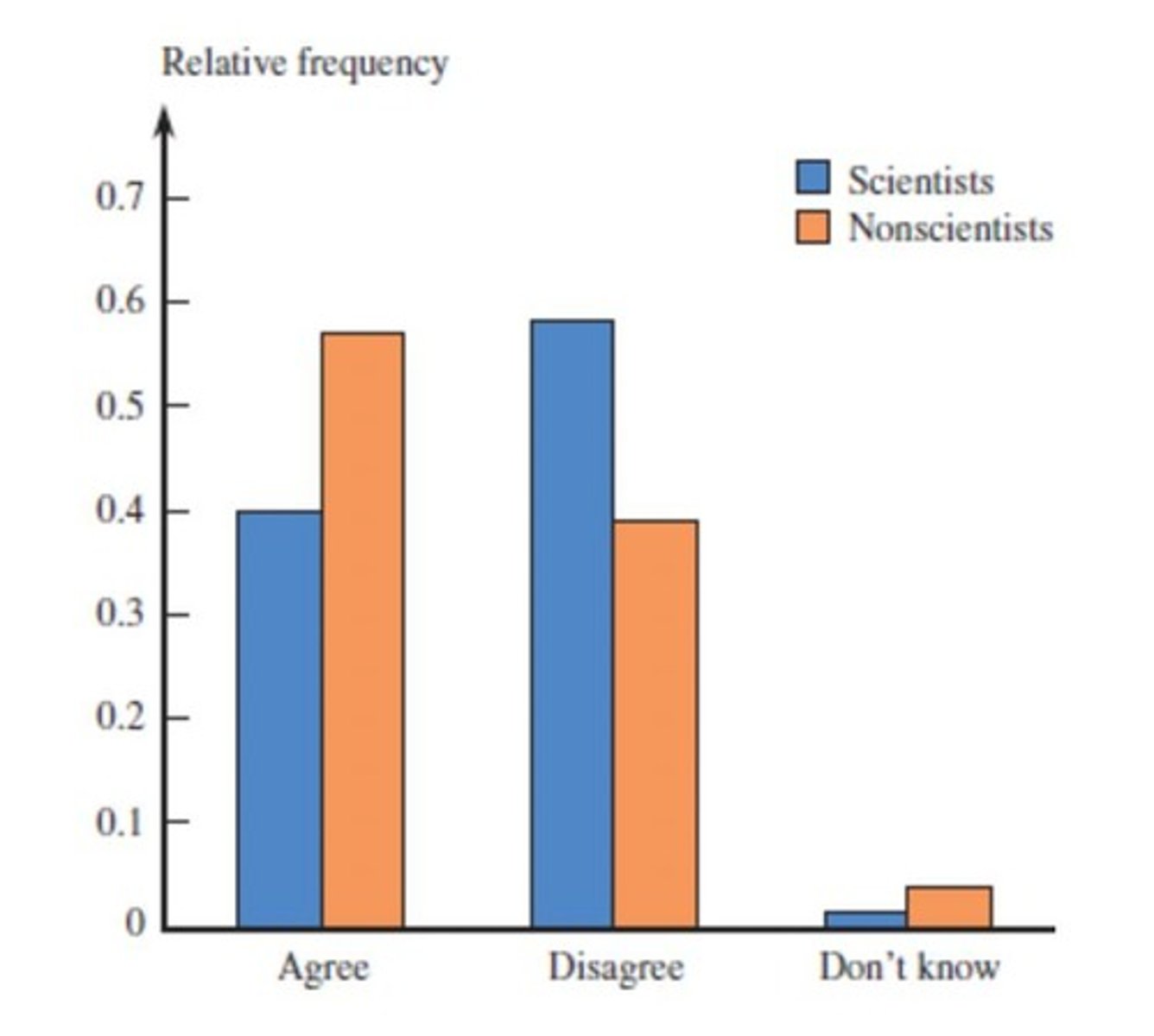
What type of chart can communicate the relative proportion of categories besides pie charts?
Bar charts.
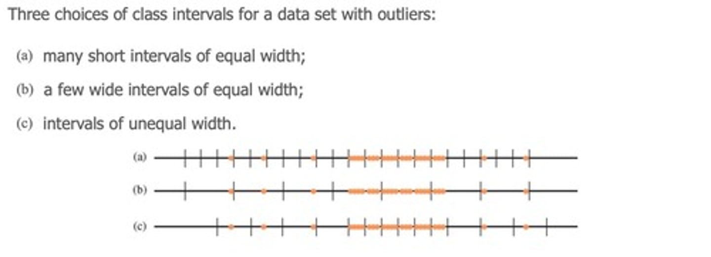
What is an outlier in data analysis?
A datapoint that is markedly different from other datapoints.
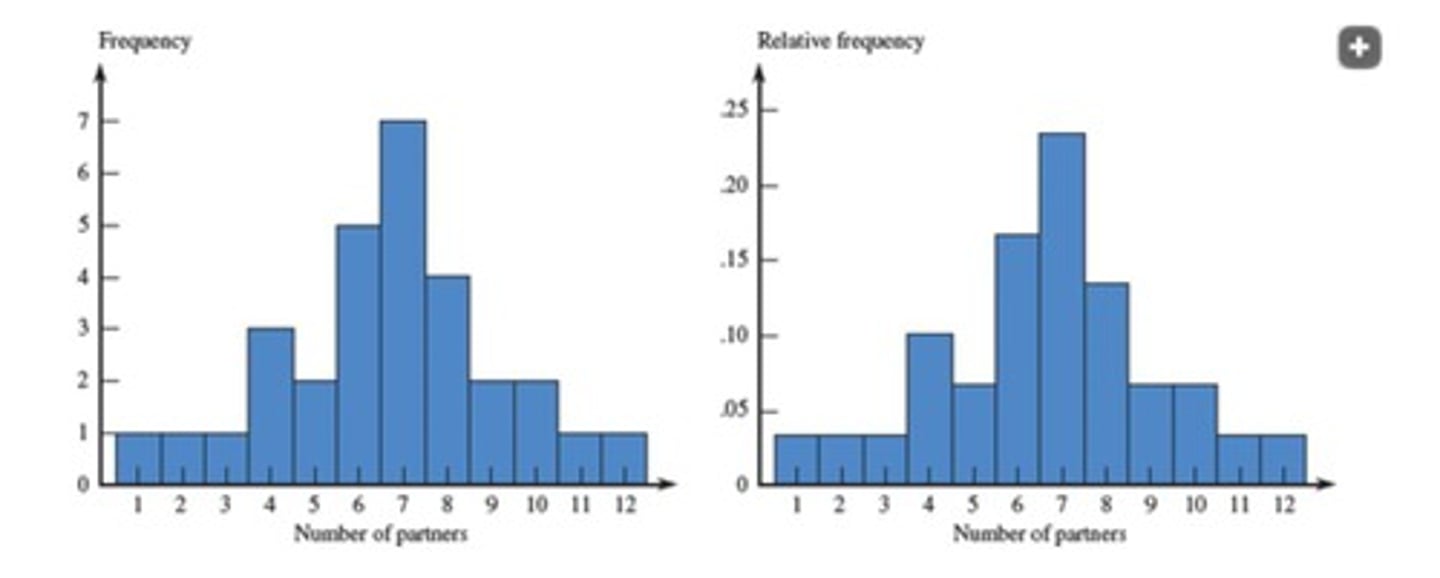
What does a histogram communicate?
The distribution of frequencies of observations.
What is the significance of comparing data across different groups?
It helps in understanding differences and similarities in responses or behaviors.
What does the term 'bin size' refer to in data visualization?
The width of the intervals used to group data points in histograms.
What does cumulative relative frequency compute?
It computes the sum of all the relative frequencies for a given value and less.
How is cumulative relative frequency calculated for a specific value?
By summing the relative frequencies for that value and all values less than it.
What type of relationship is examined between height and artistic scores of figure skaters?
A bivariate relationship.
What should be included in a data display to ensure clarity?
Scales and labels of all axes.
What does the term 'skewed' refer to in data visualization?
It refers to a distribution where one tail is longer or fatter than the other.
What can a line graph depict when comparing multiple sets of data?
It allows for convenient comparisons as long as the display is not too complicated.
What is the importance of including labels and legends in data displays?
They help clarify what the data represents and enhance understanding.