Post Production Studying
1/43
There's no tags or description
Looks like no tags are added yet.
Name | Mastery | Learn | Test | Matching | Spaced | Call with Kai |
|---|
No study sessions yet.
44 Terms
CB
-Contrast (luma) then Balance (chroma)!
-Contrast is adjusted first because it has a profound impact on balance rather than the other way around
-Ask: how does this relate or connect to CB? when we talk about and read and learn stuff in class
-Mess with luma and then chroma!
-Luminance affects chrominance but chrominance don’t really affect luminance
-Start with luma then go into chroma — you can go back and forth a little eventually but you need to start the process like this
Contrast
-Disparity between the darkest and lightest points
-Contrast increases/decreases the saturation of colors when it is adjusted
Luma/Luminance
-Contrast! luma is contrast. Remember CB — mess with luma then chroma
-It is the tonal range of bright and dark values
-Black is defined as 0% and white is 100%
-Called the “Y” or “L” channel — interchangeable
-Bigger difference or disparity between the light and dark of the frame means higher contrast and vice versa
-Easy to see when you put the image in black and white
-There are different ways to build luminance
-It is a fundamental building block
-Think YRGB parade in resolve, it adjusts luminance or contrast with the Y section because Y stands for the luma channel
Tone/Value
-Refers exclusively to contrast/luminance ranges so don’t say “earth tones” because it isn’t describing the color it’s describing contrast ranges
Chroma/Chrominance
-Color! The balance part of CB! luma then chroma!
-3 channels for chroma: RGB—red green and blue channels
-Color is defined as RGB combined which makes what we’re looking at
-Opposing colors are red and cyan, green and magenta, and blue and yellow
-All of the colors together make white
-Chroma is color but more specifically it is the RGB channels
-Think YRGB parade in resolve, it adjusts the RGB channels
-Hue and saturation are how we articulate chrominance
Opposing Colors
-Red and cyan
-Green and magenta
-Blue and yellow
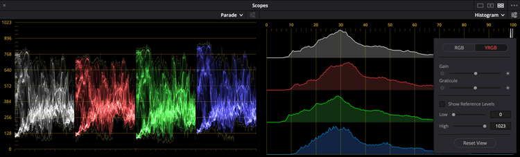
Waveform/Scopes
-The overarching terms for the ways in which we measure color correcting properties and aspects
-An exact measurement, not just guessing by eye
-How we measure luminance, Y, chrominance, and RGB channels — these four things
-EX: YRGB parade, vectorscope, histogram, etc. — these are like units of measurements so like using both a ruler and a tape measure because they both measure/are useful for different things
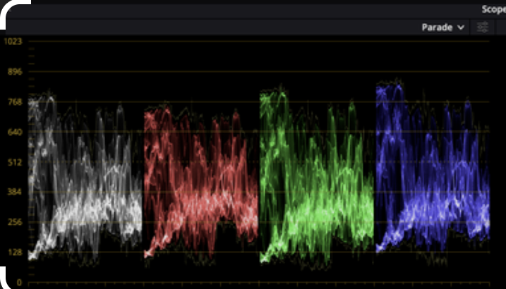
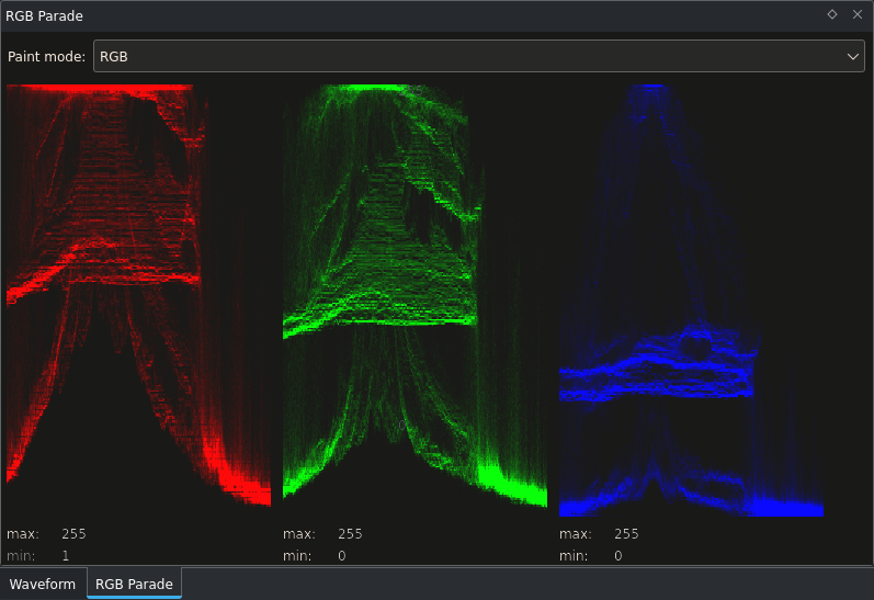
YRGB Parade
-Type of waveform/scope, the main one we’ll be using this semester like 80% of the time
-Measures luminance, Y, chrominance, and RGB channels
-Think of Looney Tunes Wile E. Coyote who gets smushed flat like a pancake, parades show us a flattened version of the image
-If colors are out of alignment, it means there’s a color cast going towards that direction (EX: if blue level is higher, the image has a blue color cast)
-If RGB are lined up in evenly in any luminance (contrast) range then it is colorless and neutral! This is how you balance an image
-The dots on it are called the trace, “where trace sits on the parade”
-Each pixel in the frame is represented by one tiny dot on the parade — the y or up and down shows the intensity from top to bottom and the x or left and right shows the horizontal placement of picture elements with no regard to vertical placement
-Shows value from 0-100 of every single pixel
-In the EX of bridge frame from class: spikes at the top that are hard to see are like lights on a bridge or the brightest parts,t he weird stuff at the bottom are the darker parts, the big curve is the sky — it’s up and down!! So remember that!
-YRGB is your friend so use it like 80% of the time but then go into vectorscope and see if there are any issues with drift like skewing magenta (pixels going in one direction) – two different things that these tools do
-Parade monitors luma and how chroma interacts with specific luminance ranges, vectorscope is exclusively a chroma tool
-Measures luminance in red green and blue channels (chromanents) but it’s hard to measure specific shades of colors — you can’t do this based on the parade so we need vectorscope for this
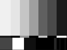
SMPTE Bars
-Academic way to read scopes
-0% means black and 100% means white
Curve
-A concept — there are different types of curves like a log e curve
-Composed of shoulder at top, toe at bottom, and linear center that the angle of that is called the gamma
F-Stops
-A unit of measurement that measures how much light is coming in — it is a way to concretely quantify amounts of light that are being let in
-Each stop is double the brightness
-Each chip in a parade is like one f-stop of light
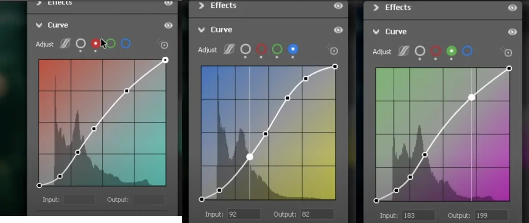
Log E Curve/S Curve
-Type of curve that stands for Logarithmic Exposure Curve
-This curve is in the shape of an S, also called an S Curve
-The human brain applies a contrast curve to the image we’re seeing with our eyes in real life — this curve mimics what the human eye sees
-This curve is what makes images look good, without the curve the image looks funky and flat
-3 parts of an S Curve: the shoulder, toe, and linear center
-If the curve isn’t a curve but is a flat line, it’s in log so if there’s no S Curve
-Straight line is more of a harsh or snappy or crunchy toe and one that goes out further is softer
-Crunchier toe makes it look sharper and in focus and more contrast

Shoulder
-One of the 3 parts of an S Curve
-The shoulder is the bending part at the top of the curve — it represents what happens as you go toward 100%
-Shows how luminance compresses and goes up toward the peak value
-Maximum tonality allowed is 100% white
-Shoulder is how the linear center ramps up and compresses to go to white
-Called knee in other fields
-This is the inverse of the toe
-Shoulder is as we go from the end of the linear center and we start approaching 100% it starts to bend and compress – same with toe but other way

Toe
-One of the 3 parts of an S Curve
-The toe is the bending part at the bottom of the curve — it represents what happens as you go toward 0%
-Shows what happens as you approach 0% which is black or lowest value allowable
-Toe is how the linear center goes down and compresses to black
-Called pedestal in other fields
-This is the inverse of the shoulder
-Straight line is more of a harsh or snappy or crunchy toe and one that goes out further is softer
-Crunchier toe makes it look sharper and in focus and more contrast
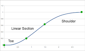
Linear Center
-One of the 3 parts of an S Curve
-Also called Gamma!
-This is the area that you are able to perceive most clearly

Gamma
-The linear center on an S Curve
-This is the area that you are able to perceive most clearly
-Angle of the linear center
-A relative concept, some photographers don’t like it because of this like Ansel Adam
More is Less Philosophy
-Don’t do a little bit of everything — it is a big giveaway that you’re not paying attention if you adjust every part/aspect in Revolve when you’re showing your work to the class
-Sugar cookie EX: like you don’t need to add cinnamon, nutmeg, cumin, mustard seed, unnecessary spices to a sugar cookie because it will taste bad and be doing too much
-Need a plan of attack — need to know what you’re going to adjust rather than just moving stuff around
-You can do so much with just primary corrections, you don’t always have to be doing too much and keying and whatevering targeted adjustments
-Do stuff in passes, do primary and balancing and getting things in the ballpark first
Unity/Disunity
-When RGB are aligned and with the white, it means there is no color
-When RGB aren’t aligned with the white, it means there is color
-If we don’t want color pollution, we’d put all of the colors in unity in that specific luminance (contrast) range
-If we do want color pollution like in the image of the man in class we’d bring the blue channel up and take them out of unity
LOG (color space)
-Log is a color space
-It is how we get big amounts of information into a small file — it compresses the information
-It is a flat file
-We will be working with a lot of Log encoded images
-If it was filmed on filmed it can’t be log
-We’re working in a color space when we say we’re working in log – we’re compressing it into one space
-Use LUT to put it back out
-Log isn’t raw and raw footage isn’t log
-We work with log in exercises – “looks flat”
RAW (format)
-Log is a format
-All of the in-camera decisions are meta-data
-Can change the decisions that the DP made when filming which can be disappointing for them but also helpful sometimes
-Huge file sizes, it can go wrong — it is not compressed like how Log is compressed
LUT
-A lut is like a template that you can put on an image so it adjusts the aspects of color correcting for you, like a filter
-LUT stands for look up table
-It is a series of Log E Curves that affect luminance (contrast) and chrominance (color)
-The LUTs we are using are ones that were designed by the camera manufacturer – this is how they were monitoring the image on set, start from the set mindset and build outwards
Vector
-Vector measures just chrominance or color
Zones
-Zones are stops of exposure — each zone is at 10% intervals in terms of YRGB parades
-Textural range allows us to define the relation from one area to another, this is clearly visible in the image
-People color on thermonuclear levels (when a mac is all the way bright), everything will be dark when you look at it on a monitor because the computer was at a crazy brightness level when they were editing
-Living human flesh is within a very small range of zones
Gamut
-The gamut is the range of displayable colors within the color space we’re working in
-We’re working in gamma 2.4 (defines luma) and rec 709 (defines chroma)
-It is the range of allowable values — the values relate to luma/chroma/tonality
-The allowable lum and chrom values – we’re working within this
-Working in a smaller gamut is okay bc the colors will reproduce when you look at a monitor in the same gamut
The Color Space We’re Working In
-We’re working in Gamma 2.4 (defines luma or contrast)
-We’re working in REC 709 (defines chroma or color)
Clipping
-Luminance (contrast) clips when a straight line forms at the top of a parade
-The luminance is going beyond the gamut or what’s allowable in the color space so it turns either white or black depending on which extreme it’s exceeding
-Clipping destroys the detail of that area too
-When something exceeds the maximum allowable in that one area
-Legal means it’s not at that point yet
-Can clip the blacks, whites, and chromanents
-Rule of thumb = clipping is bad don’t do it in this class but can be an option if intentional
-Blue channel clipping for EX is when u bring that channel all the way up and you lose detail like how you would for black and white — this is chroma channel clipping (be careful in underwater section of project)
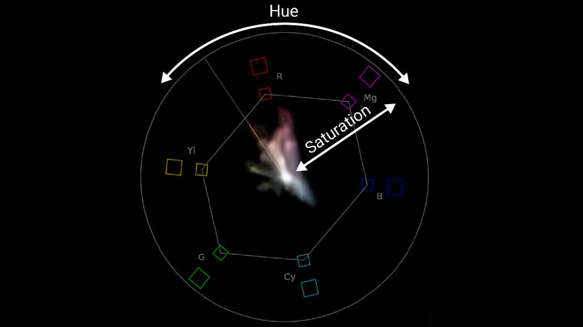
Vectorscope
-YRGB is your friend so use it like 80% of the time but then go into vectorscope and see if there are any issues with drift like skewing magenta (pixels going in one direction) – two different things that these tools do
-Parade monitors luma and how chroma interacts with specific luminance ranges, vectorscope is exclusively a chroma tool
-Parade measures luminance in red green and blue channels (chromanents) but can’t measure specific shades of colors – so we need we need the vectorscope to measure this
-Similar to squishing into flat pancake like YRGB
-If the image is at black and white/unity, it’s just a dot in the center of the vectorscope
-Once a color gets on the frame, its distance from the center outward shows how saturated that specific color is
-R - red, m - magenta, b - blue, c - cyan, g - green, y - yellow
-Across from each other (opposing colors/complementary), red with cyan, magenta with green, blue with yellow
-Adding saturation makes the trace extend out – displaying the chrominance of all of the pictures that is defined as the vector of it – the hue
-The distance from the center defines the saturation
-Hue and saturation are how we articulate chrominance
-Saturation is the distance from the center and hue is defined by the compass thing — for EX it’s going toward the red part in that image from class
-Trees actually skew quite yellow in real life and the light makes it look green, sky isn’t blue as it skews closer to cyan
-Luminance-wise they can’t be very bright bc they’ll lose saturation – like Dorothy’s shows in Wizard of Oz
-Don’t want to see the straight tall lines in our first projects — means clipping like the line goes the other direction it means don’t do more because you’re outside the gamut
-Colors might look fine but they could be looking wonky in the graphs so always check
-These are global corrections like primary it applies to the frame equally so we’ll get into secondary corrections later
Textural Range
-It’s okay to go out of textural range if it’s intentional
-Anything that is critical or clearly needs to seen needs to be in the textural range
-Clipping makes that area not have texture