proportional symbol maps
1/7
There's no tags or description
Looks like no tags are added yet.
Name | Mastery | Learn | Test | Matching | Spaced |
|---|
No study sessions yet.
8 Terms
proportional symbol maps
= represents the magnitude of a data with a proportionally sized symbol
Good at representing count data or absolute data or raw totals
a solution to the issue of choropleth maps being unrepresentative due to population size
types of data it represents data used
True point data = represents data measured at a given point - ex: number of people per city
Conceptual point data = data collected all over areas but symbolized as point location, centered in the area
what symbols can be used
literally any
circles used the most → visually stable, preferred by users, easy to tell where the center is, easy to compare/construct
squares
pictographic symbols → hard to compare size and hard to see when overlapping
three types of scaling methods
mathematical/absolute
perceptual scaling
range grading
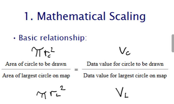
mathematical/absolute scaling
= size the area of point symbol increases in direct proportion of the data value → as value increases, area increases
starts by setting the value of the largest data value
perceptual scaling (flannery scaling)
a study showing people tend to under estimate the size of circles on maps, to correct this underestimation they use 0.57 as the exponent to create the effect of having the area of circles increasing faster
range grading (graduated symbol maps)
= class based symbols
Similar to choropleth maps because you have to choose: number of classes, classification method, symbol size for each class
Useful for pictographic symbols where it is hard to create precise sizes and compare sizes
Useful for when data varies too much or too little -> when it is hard to see pattern
Have to be careful to not create a pattern that isn't really there
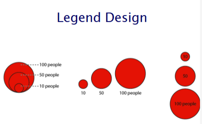
labelling symbols
nested legend (left picture) = conserves space
linear legend (middle and right) = easiest to visualize
use round numbers to represent thee range of data