Ch.3 Stats Vocab
1/37
Earn XP
Name | Mastery | Learn | Test | Matching | Spaced | Call with Kai | Chat |
|---|
No analytics yet
Send a link to your students to track their progress
38 Terms
univariate data
one set of data
ex: boxplot, ogive, histogram, timeplot, dotplot, ribbon chart, pie chart
describe w/ SOCS
bivariate data
two quantitative data sets
always graph data on scatterplots!
ex: tables, scatterplots, correlation, LSRL
describe w/ FODS (form, outliers, direction, strength)
scatterplot
shows relationship between two QUANTITATIVE variables that were measured on the same individual
has a horizontal & vertical axis
each individual = one point
describe distribution (BIVARIATE)
form, strength, direction, outliers/deviations
IN CONTEXT!!!!
form
general shape of the scatterplot
linear or nonlinear
nonlinear = curved, exponential, cluster, multiple clusters, etc
strength
describes the association between the two variables; how closely related are the two variables
ex: strong, moderate, weak
ALWAYS use the r-value
direction
the type of association; the region the scatterplot appears to be going to
can be:
positive - increases in explanatory variable = increases in response variable
negative - increases in explanatory variable = decreases in response variable
none/no - increases in explanatory variable = no predicted region the scatterplot is going toward
outliers/deviations
any points that don’t really fit the pattern, have large residuals
this is measured approximately
may decrease or increase a correlation coefficent
formula for describing distribution
There is a strong/moderate/weak (r = a) positive/negative linear/nonlinear association between variable x and variable y. In general, as the explanatory variable increases, the response variable increases/decreases.
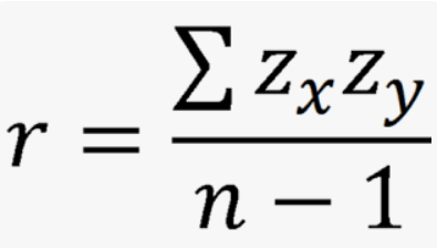
correlation coefficient (r)
measure of the direction and strength of the association
only used for LINEAR relationships
does not depend on units of measurement (can interchange variables)
between -1 and 1
sensitive to outliers
does NOT mean causation or form
requires both explanatory and response variables
calculate r-value
product of the z-scores (x and y) over n-1
regression line
summarizes the relationship between two variables, but only in a specific setting: when one variable helps explain the other
ŷ = a + bx
ŷ = y-hat, the predicted value of the response variable
x = the explanatory variable
a
y-intercept
b
slope, can be calculated w/
r × (Sy/Sx)
least-squares regression line/LSRL
the line of best fit; the regression line that makes the sum of the squared residuals a small as possible
NOT the same as a regression line; it is a very specific type of regression line
always passes through (x̄, ȳ)
how to find LSRL
ŷ = a + bx
(x̄, ȳ) is always on the line
slope = r × (Sy/Sx)
plug and chug
plug in mean coordinates into ur general equation
solve for a
write out equation and define variables
residuals
the leftovers or prediction errors in the vertical axis; y - ŷ = actual - predicted
positive —> y > ŷ
actual is higher than predicted
negative —> y < ŷ
actual is lower than predicted
none —> y = ŷ
actual is the same as predicted
slope in context formula
On average, or every increase in 1 (unit of explanatory/x variable), the predicted (response variable) increases/decreases by slope (unit of response/y variable)
y-intercept in context formula
When the (explanatory/x variable) is at 0 (unit of explanatory variable), the predicted (response/y variable) is at “a” (unit of response variable)
extrapolation
the use of the regression line for a prediction far outside of the interval of the x-values used to create the line
often not accurate
residual plot
a scatterplot that displays the residuals on the vertical axis and explanatory variable on the horizontal axis
linear model = appropriate if
no obvious patterns
relatively small in size
even scatter above and below x-axis
standard error (Se)
the average size of a residual; measures how far, on average, each value differs from the predicted
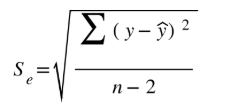
Se in context formula
On average, the predicted (response variable) differs from the actual (response variable) by about Se (units of response variable)
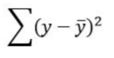
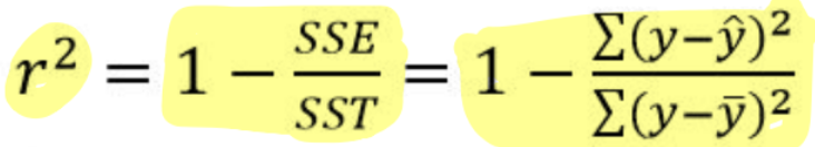
Total Sum of Squares of Errors (SST) or Sum of Squares Total
the overall measure of variation in the y-values
uses y-bar, not y-hat
sum of the difference between the actual and average squared
on a scatterplot —> draw average as a horizontal line and fine difference
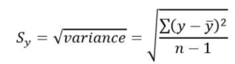
standard deviation from average (Sy)
measures how far, on average, each value differs from the mean
Sy = square root of variance
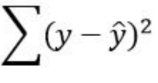
Sum of the Squares of Errors (SSE) or Residuals
amount of variation in the residuals
uses y-hat, not y-bar
R-squared/Coefficient of Determination
measures the percent reduction in the sum of squared residuals when using the LSRL to make predictions, rather than the mean value of y
the percent of the variablity in the response variable that is accounted by the LSRL
can also use the correlation coefficient squared
can only be applied to LINES, not just any curve
influential points that lie near LSRL —> increase the value
r-squared in context formula
the amount of variation that has been explained/accounted for by the linear relationship between (response and explanatory variables) is __%
or
___% of the variation in the (response variable) can be explained by/accounted for by the linear relationship with (explanatory variable)
learn how to read computer regression output
be able to find
the slope b
the y intercept a
the values of s
the value of r2
is the linear model appropriate
residual plot —> scattered randomly and evenly
r2 —> high percentage
sum of residuals squared —> small total residuals
comparing models criteria
when comparing two different LSRL models, make sure to list the numbers and observations for both models when explaining.
must use these three: residual plot, r2, and SSE (sum of residuals squared)
optional: comparing point predictions (within range?), nicer scatterplot (curved or not curved?)
general formula for comparing LSRL models
general statement - Model #A does a better job at predicting the response variable with explanatory variable.
three evidence in context with justification
SSE - There is less amount of errors with Model #A (SSE Model #A versus SSE Model #B)
R2 - There is more variation explained with Model #A (R2 %) than Model #B (R2 %).
Residual plot - The residual plot for Model #A indicates a better model because ___ (more scattered? even distribution? less cluster? less pattern?), while Model #B has __ (less scatter? more clusters? more pattern?).
high leverage
points that are extreme in the x direction
influential
points that, if removed, substantially change the regression line
change in slope, y-intercept, correlation, coefficient of determination, or increases in standard deviation
exponential growth
when a variable increases by multiplication by a fixed amount as time increases by a fixed amount
transforming the data
applying another function (ex: logarithm or square root) to a quantitative variable
must be applied to ALL inputs of that variable
typically done with the intention of “linearizing” data
finding residuals of transformed data (explanatory data)
plug values in like normal, making sure to correctly enter the x-value into the function
ex:
ŷ = a + b × log(x) —> y - ŷ
ŷ = a + b × ex —> y - ŷ
ŷ = a + b × x2 —> y - ŷ
finding residuals of transformed data (response variable)
plug in x-values into function (if applicable), but makes sure to “undo” the function for the y-variable
compare apples to apples; dont want to compare the exponent to the real value
ex:
log(ŷ) = a + b × log(x) —> y - 10ŷ
eŷ = a + b × x —> y - ln(ŷ)
(ŷ)2 = a + b × x2 —> y - sqrt(ŷ)