VOGUE
1/86
There's no tags or description
Looks like no tags are added yet.
Name | Mastery | Learn | Test | Matching | Spaced | Call with Kai |
|---|
No analytics yet
Send a link to your students to track their progress
87 Terms
What is Vogue? (Context)
A mainstream lifestyle and high fashion magazine targeted at women.
It was first published in Britain in 1916.
It’s been published by Condé Nast since 1909.
It’s printed on glossy paper - emphasising its aspirational, luxurious look.
Who are Condé Nast?
A global media company that produces vogue. They’re recognised for producing high quality content with a global reach.
They shaped British Vogue by establishing a high-standard and aspirational brand and ensuring consistent quality.
What were the ‘Swinging Sixties’ and how did they influence fashion?
The Swinging Sixties - a period in the mid 60s, categorised by an explosion in youth culture, sexual liberation etc.
How it influenced fashion:
Fashion was now led by the youth
Miniskirt revolution
Unique styles
Fashion became more affordable and accessible
What were attitudes to ethnic minorities like in the 60s?
People thought white people were superior.
(Hence the lack of ethnic minority models and darker toned makeup in the magazine)
What was the dichotomy in women’s newspapers in the mid-sixties?
Dichotomy - a division/contrast between two things that are opposed.
The dichotomy involved some magazines reinforcing traditional expectations - the ‘happy housewife’ - and some reflecting the growth in female independence.
Vogue 1965 set text front cover
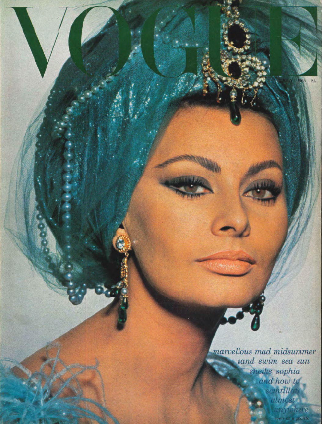
What typical magazine features of women’s lifestyle magazines are shown on the cover?
The main model (Sophia Loren) is a female
Diamond jewellery
Luxury clothes
The main model takes up almost the whole page
She makes direct address with the audience.
Who is Sophia Loren?
One of the world’s most iconic movie stars.
She was chosen to be on the cover of Vogue as she was an international icon of beauty at the time
She was a major star in the golden age of Hollywood cinema in the 50s and 60s.
She was in the film “Lady L” - relevant to the 1965 Vogue issue as the image is from the set of Lady L, where she is dressed in a glamorous costume.
Who were the other people involved with the 1965 issue of Vogue?
Diana Vreeland - editor of Vogue at the time
David Bailey - photographer of the cover shoot. He was a very popular 60s fashion photographer.
What is significant about the cover lines on the front cover?
They’re on the bottom right corner - showing that they’re aren’t as important as the dominant image of Loren.
This breaks magazine conventions.
They use alliteration to draw the reader in.
‘Mad midsummer’ - breaking free of old constraints from the early 60s.
Representations: What is significant about the masthead?
The serif font represents luxury and high-end fashion.
The masthead is an example of iconography.
What is significant about the lighting?
The bright light shining over Loren’s face represents her status and importance.
What does Loren’s make-up and jewellery represent?
Stereotypical femininity - which was extremely popular (and expected)at the time.
How is there an aspirational aspect on the front finger?
Loren is dressed as a rich Turkish dancer. This connotes aspiration as travelling to exotic countries was rare and expensive in the 60s.
In the cover lines it says about “shieks” - associated with foreign countries.
Loren’s jewellery is also very lavish and aspirational - pearls.
What’s significant about the layout of the front cover?
It uses the ‘Z line method’ - follows the natural human eye so encourages audience attention.
What’s significant about the palette of the front cover?
Green masthead mixed with Loren’s bright blue clothing adds another sense of exoticism.
Image of contents page
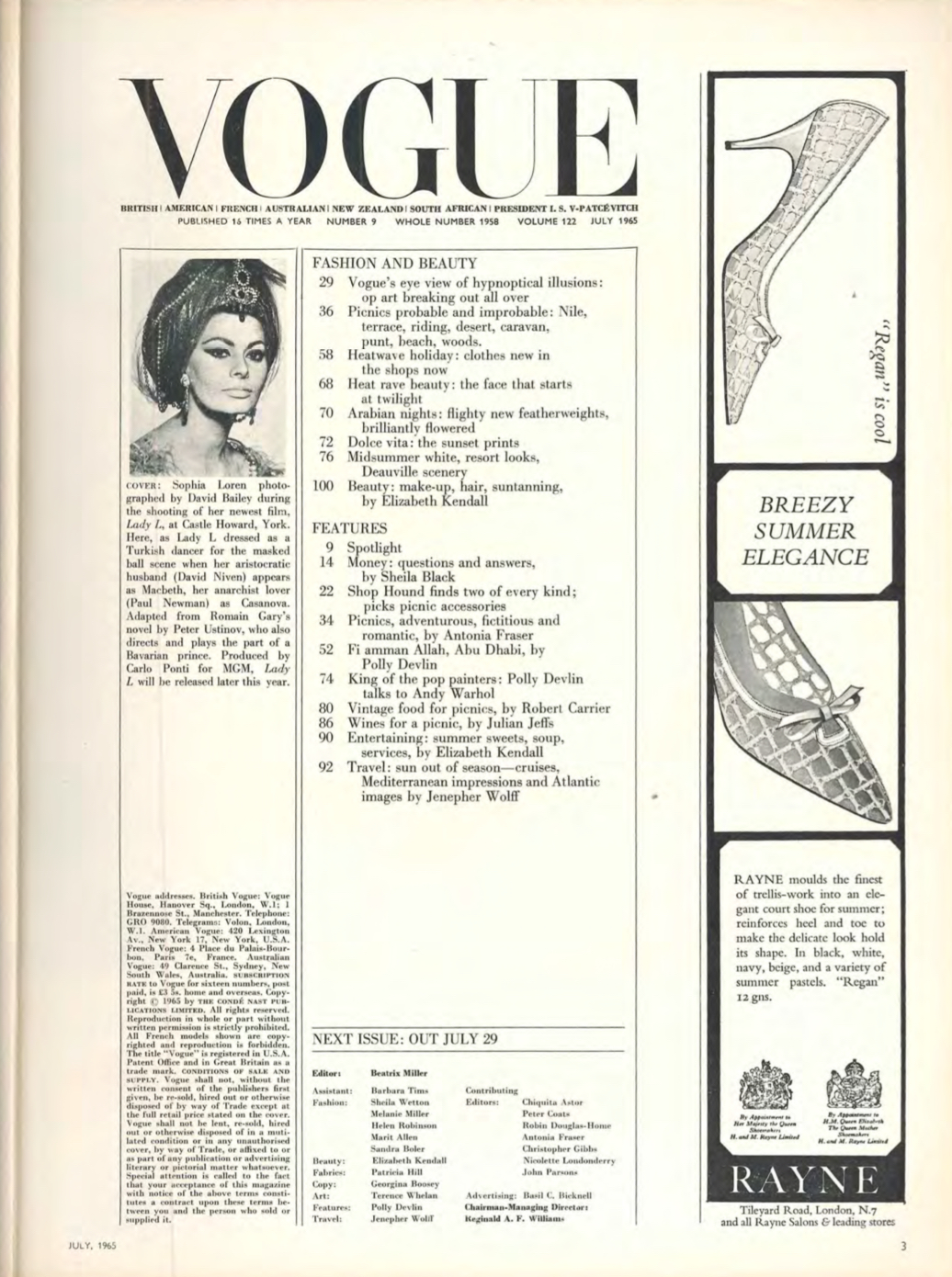
Analysis of contents page: how does the contents page conform to societal expectations?
Conforms to typical conventions of mainstream magazines - page numbers, address of head office, credits, advert
The advert is of a high heel - stereotypical femininity, represents women as symbols of beauty. The ad emphasises the quality and value of the product with adjectives - “finest”, “elegant”, “delicate”.
How does the contents page reinforce the brand?
The inclusion of the masthead once again reinforces the importance of the brand.
The serif font connotes sophistication and high-class
How does the contents page target audiences?
‘Op art’ (optical illusion) targets a younger audience - swinging 60s
It includes luxury goods - targets wealthy people
Focuses on exclusive places - Spain, Abu Dhabi. This targets wealthy people interested in international travel - was aspirational at the time.
Summary of “money” article
It’s a financial article featuring a working female expert in finance (Sheila Black) - unusual in the 60s.
Sheila Black answers her female readers’ queries about finances. She explains things in simple terms - reflects how women were seen as inferior to men at the time.
The focus on investment and finances reflects the wealth of vogue readers.
How are women presented as financially passive in the article?
Says that women have admitted to “have done nothing more with it than buy what they want and leave the rest in the bank”.
This implies that women heavily subscribe to consumer culture, rather than doing smart things with money.
How are women presented as uncertain and dependant on others for practical advice?
“Dear Miss Black, what can I buy with £500?”
How is the emergence of women’s financial freedom shown in the article?
Topics like “borrowing” and “home improvements” show that women were increasingly engaging with financial responsibilities in 1965.
However these being framed within domestic contexts show that women hadn’t reached full freedom at the time.
How does the article contrast the front cover?
Sheila Black’s financial article presents women as practical people who worry about things such as insurance.
The front cover presented traditional female stereotypes - beauty and jewellery, mindless consumers
How are women presented on page two of the article?
Financially dependant on their husbands - “married women are never independent, even if they are the chief breadwinners”.
This reinforces the subordinate position of women in financial life.
How are women shown on page two of the article to have a desire for privacy and independence?
Many women write in wanting to invest/borrow money without their husbands knowing.
This reveals the suppressed identity of women at the time.
How are women shown as curious but naïve?
Basic questions such as “How should I invest £10,000?”
What does the fact that Sheila Black makes it very clear that the readers’ queries are “completely confidential” show?
That women were anxious and fearful of overstepping social norms around money.
Overall, the front cover of the magazine is a dichotomy with the “money” article.
How can Gerbner’s cultivation theory be applied to Vogue?
Vogue was read regularly by many women in the 60s.
The stereotypical, housewife ideas are repeated in representations in Vogue, cultivating views.
What’s Butler’s gender performativity theory?
Butler says that going outside of traditional gender norms (eg tom boys, sissy boys) leads to getting mocked.
She says that gender is part of a performance that is deemed culturally acceptable in society, and that we learn from a young age how to express our gender.
Butler describes these performances as ‘rituals’.
She states that gender is a product of environmental factors - not biological/innate.
Vogue picnic article (1st page)
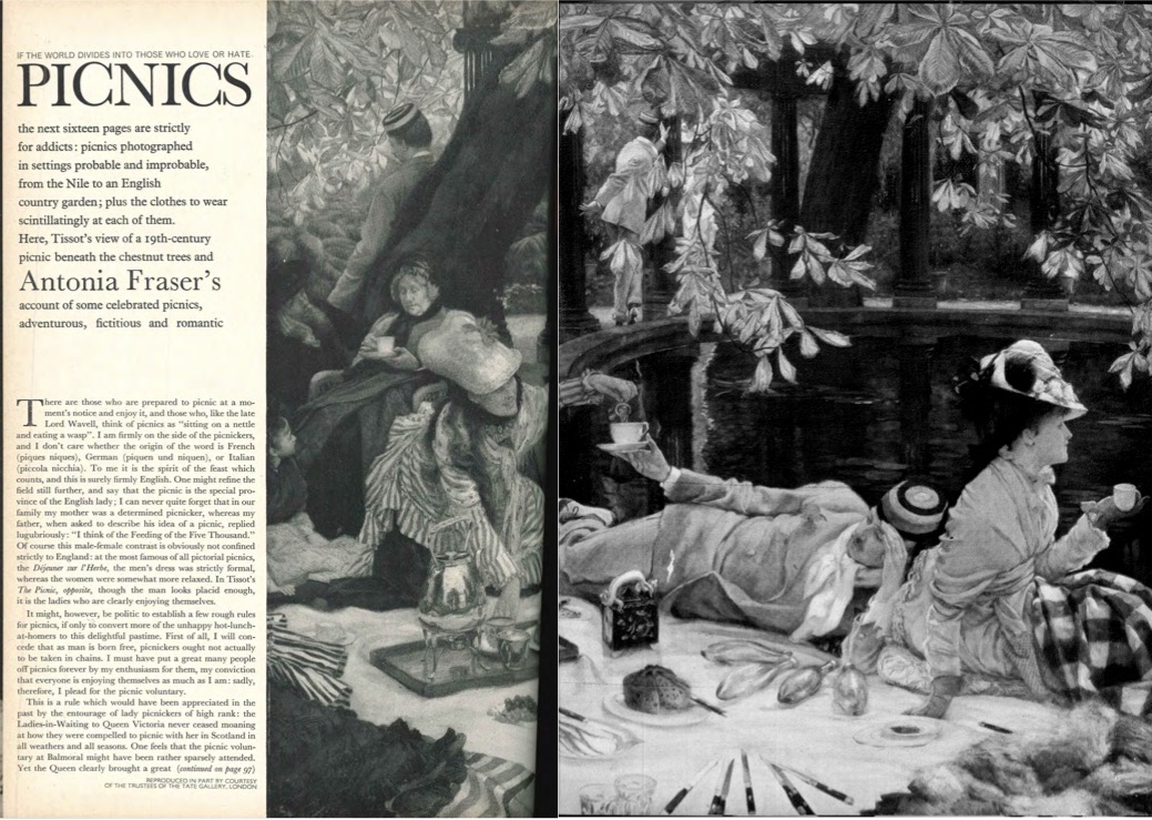
What does the image on the first page of the picnic article show?
There’s a picture of six wealthy people having a lavish picnic feast next to the pond.
The picture is a painting - vogue is high-class, still stuck in the past.
This painting is intertextuality - it’s an old famous painting
Mostly women are shown.
What does writer Antonia Fraser write about?
About the “male-female contrast” regarding opinions on picnics.
She explains how women are more keen on picnics than men.
Fraser represents picnics positively herself, explaining them to be a “delightful pastime”. This shows that the class system wasn’t as important then, as picnics were seen as a lower-class activity.
How is the man in the painting presented?
The writer comments that “the man looks placid enough”, “it’s the ladies who are clearly enjoying themselves”.
This represents the stereotype (Hall representation theory) of hegemonic masculinity that was expected of all men at the time.
How does the page of the article appeal to the target audience?
The target audience of Vogue is wealthy, upper-class women.
The image contains mostly women.
The font is serif.
The luxurious clothes being worn by the women in the image.
Second page of picnic article.
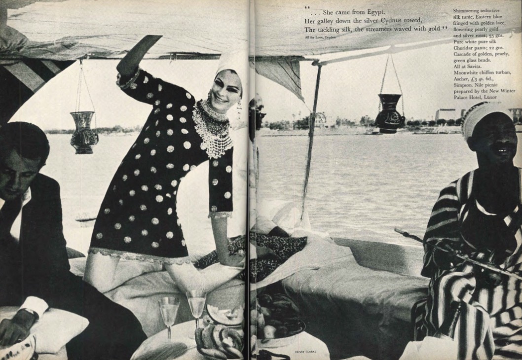
What does the second page of the article show?
A double page image of Sophia Loren having a picnic (with champagne) on a boat.
How is Loren presented?
She is smiling and making direct address at the camera - stereotypical femininity.
She wears a lavish silk dress and luxurious jewellery - Van Zoonen theory.
She has a relaxed body language - kneeling down and hand up in the air.
How is the black man in the image presented?
He is positioned on the far right of the image and cut off by the camera frame. This signals his low importance.
He is looking away from the camera.
This supports Gilroy’s postcolonialism theory - the man is seen as ‘the other’ and as less important than the European woman, as colonial attitudes are still present in society.
Page 3 of picnic article
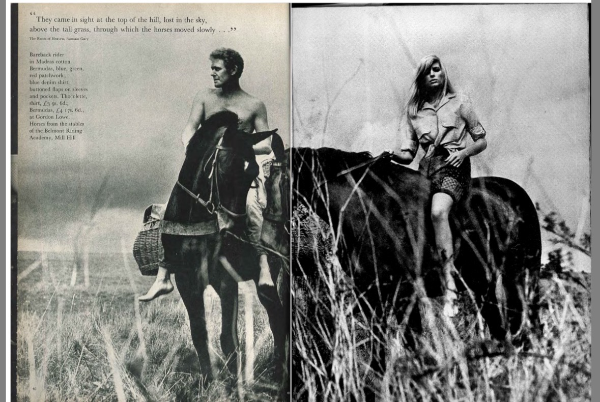
What’s going on in the page of the article?
A man and a woman are riding horses.
The man is topless and looking off to the side.
The woman is wearing a shirt and makes direct address whilst having a neutral facial expression - shows dominance and masculinity, white was uncommon for women at the time.
Page 4 of picnic article
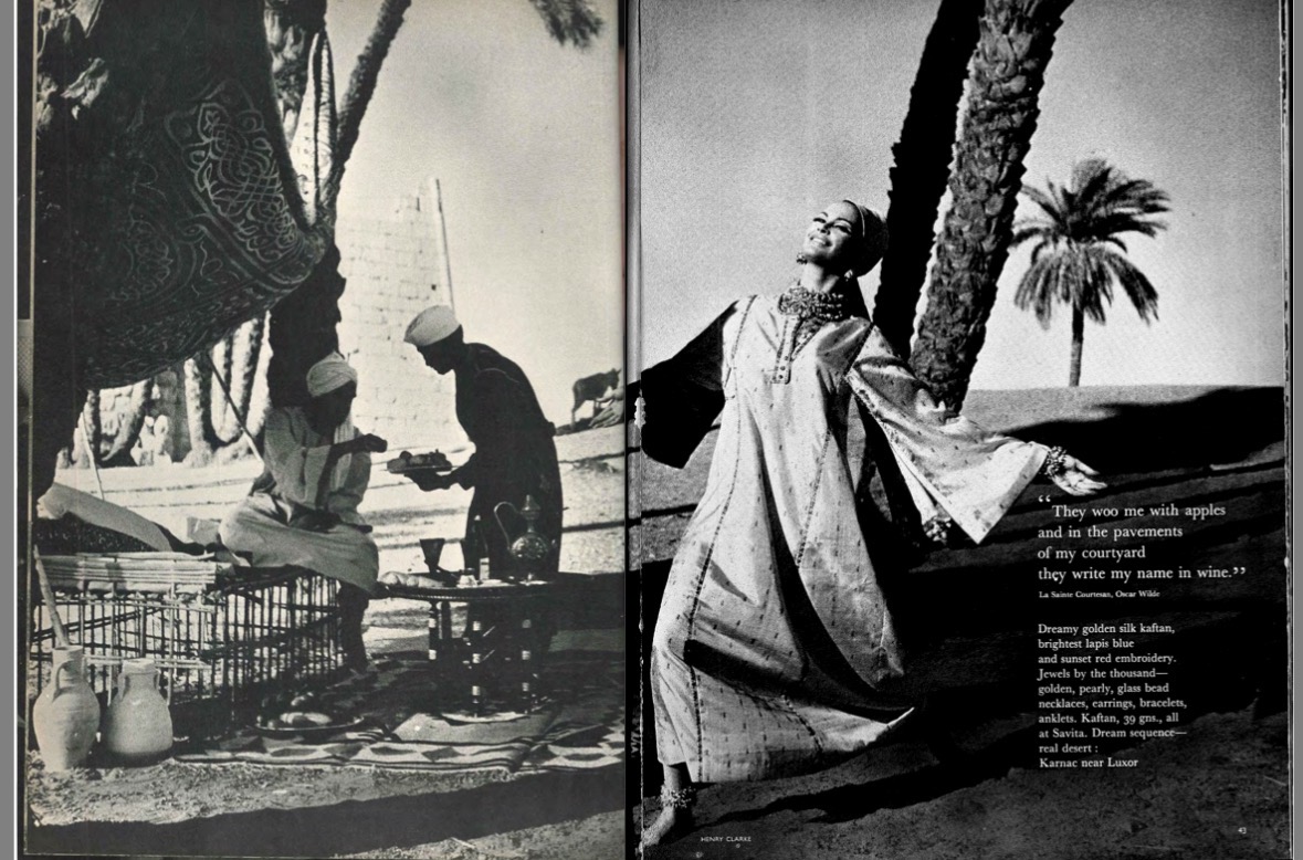
What’s being shown?
Sophia Loren dancing in a “dreamy golden silk kaftan”. She is smiling and has an open posture.
The setting is exotic - a beach with palm trees.
Two black people are in the background - their faces aren’t visible. They are shown to be working while the European woman is dancing around. This is another example of postcolonialism.
Final page of picnic article
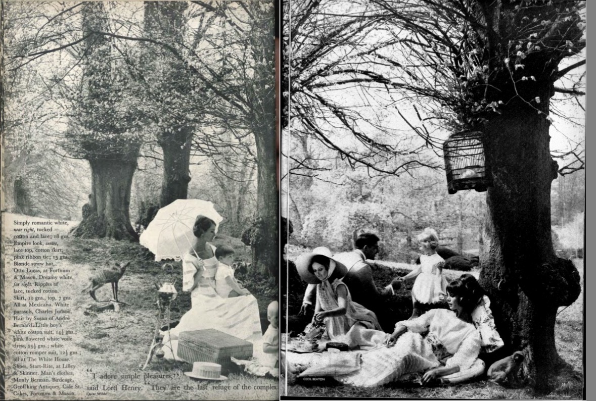
What’s going on in the page?
It is another double page image, of three women, a man and young children having a picnic.
They’re in a woods setting, surrounded by a few animals.
How are women presented in the image?
As symbols of beauty - they wear extravagant dresses, wear makeup and are in feminine poses.
They’re shown as mother figures - they are looking after the young children. This is a stereotype.
How is the man presented?
Masculine - he wears a suit.
(Ethnicity representation - his smart, professional dress codes represent white people as successful and wealthy)
He is talking to the little girl - not hegemonic masculinity.
Cutex advert
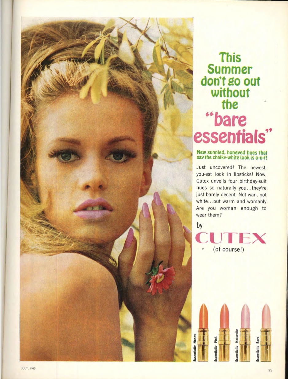
Advert analysis
Very feminine woman in the picture - making direct address and wearing makeup - stereotypical femininity
“Are you woman enough to wear them?” - encourages women to buy the product as it’s presented as very womanly.
The language is very playful - women were seen as less intelligent than men.
Bright colour palette creates positive associations.
How is the woman in the advert sexualised?
She appears to be naked.
This draws in a male audience - Mulvey male gaze theory.
Revlon advert
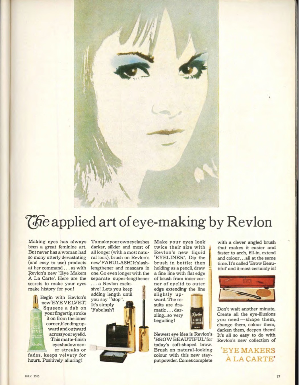
Advert analysis
Image of woman with bright blue eye makeup above the article.
Her eye makeup is highlighted in the image, contrasting the dull colours - draws attention to it.
The article describes Revlon’s products as luxury through adjectives and positive language.
The serif font of the headline connotes sophistication.
Imperial leather advert
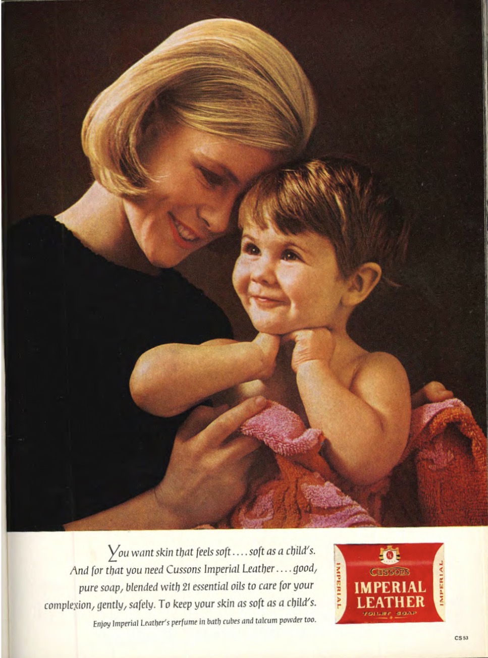
Advert analysis
The mother happily holds her child who is smiling.
The woman here is shown to have a maternal and domestic identity - reinforces the stereotype of the happy housewife.
The advert is promoting soap that feels “soft as a child’s”
In which adverts are beauty and glamour a key focus?
In the adverts for Cutex and Revlon - women are presented as youthful and desirable.
Cutex uses the phrase “bare essentials” - implying that makeup is necessary for women to be seen in public.
Female identity on these ads is objectified and consumer-driven.
How do the adverts contrast the money article?
The money article presents women as curious about independence and finances.
The adverts anchor women back into being glamorous beauty objects and maternal homemakers.
What do both the article and adverts reveal about women in 1965?
Their limited financial and social agency.
Their identities here are constructed through appearance, domestic duty and cautious financial engagement rather than independence or power.
How does the contrast in the adverts and money article present the 60s dichotomy about female representation?
The ads and money article clearly present the dichotomy of empowerment vs restraint.
The beauty ads (and the front cover) sell glamour, but the financial article reminds women of legal, financial and social dependence.
Vogue heatwave holiday article (page 1)
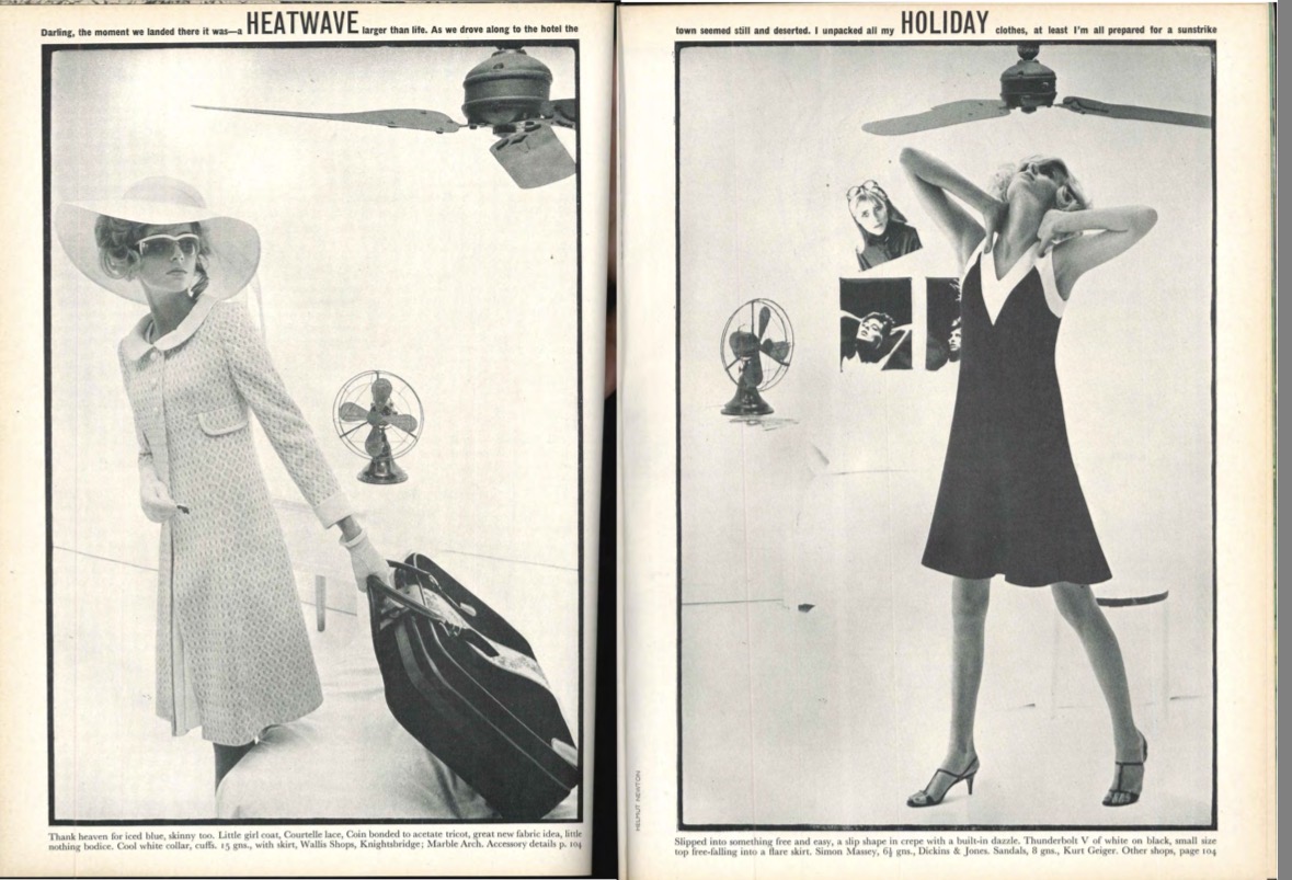
Vogue heatwave holiday article (page 2)
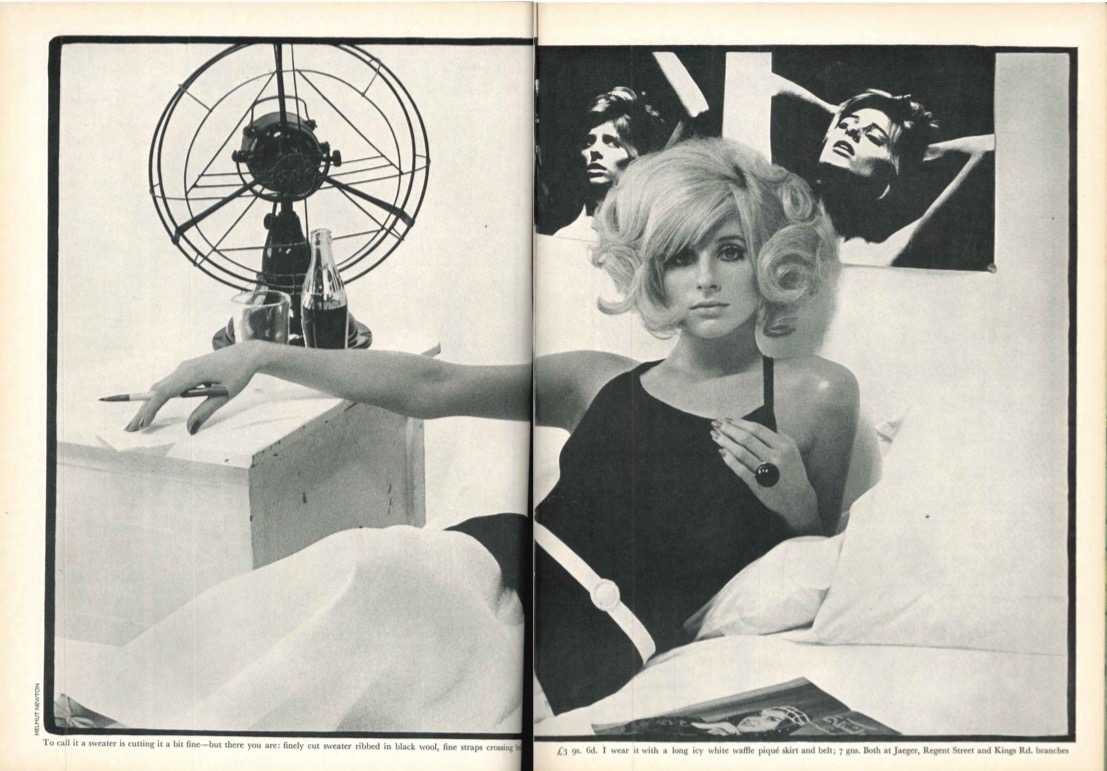
Vogue heatwave holiday article (page 3)
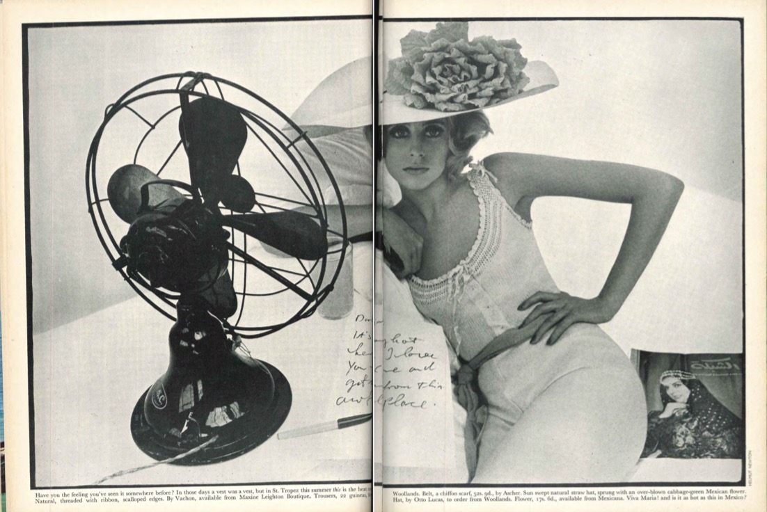
How are women presented in the heatwave holiday article?
Fashionable - model poses and lavish clothes
Beauty objects - seductive poses and tight, minimal clothing in pages 2 and 3. (Laura mulvey male gaze theory)
Housewifes - all images are of women inside.
How is an atmosphere of aspiration and escapism created in the article?
“holiday”, “heatwave”, suitcase
Explain the ideology in the article
Femininity is aligned with buying clothes and luxury travel.
This implies that a woman’s worth and pleasure solely involves consumerism and appearance.
The fashion feature reinforces ideologies present in the front cover and adverts - stereotypical femininity.
What audiences is the article targeted at?
The target audience is aspirational young women who are interested in luxury lifestyles.
Male readers are the secondary audience - the sensual images of women appeal to men and position the women to be merely desirable trophies.
INDUSTRY: Vogue is published by Condé Nast. What other titles have they made, and what does this show about them?
They make a huge range of titles, including:
Vanity Fair, WIRED, GLAMOUR, Pitchfork.
The fact that they make a huge number of magazines shows that they’re a successful business.
When did Vogue start?
1892
When and why did Condé Nast buy Vogue?
They bought it (The original American version) in 1909.
They bought it as they saw potential in the magazine, and they wanted to bring the already successful magazine into their brand.
When did Condé Nast launch the UK version of Vogue?
In 1916.
(The UK version of Vogue is a spin-off of the original American version)
How did Vogue perform in the early 1900s?
It thrived - was very successful.
This was even through the wars - when people didn’t have much money.
The reason for its success was its sense of aspiration
(there was an economic boom for Vogue after WW2 with people’s new disposable income)
How does Vogue perform today?
Still very well, contrary to other print magazines that have suffered in the last 20 years.
It still sells 100,000s of copies per month.
Describe Vogue’s international expansion from the 60s onwards.
They launched:
German Vogue, Italian Vogue, Spanish Vogue and many more.
They also released issues in Asia and Eastern Europe.
Why did Vogue expand internationally?
To target various global audiences and increase profits.
(This reinforces Hesmondhalgh’s theory - they replicated a successful format to generate maximum profit)
How has Vogue contrasted Hehsmodhalgh’s theory over the years?
Condé Nast have taken risks over the years.
Eg they were one of the first magazines to use colour photography - in the 30s. This made them unique.
Condé Nast were also bought by Advance Publications in the 60s - they encouraged more risk taking and modernity.
What risks did Advance Publications make in Vogue?
They used a black female model on the front cover of Vogue in the 70s.
This paved the way for the increased inclusions of races in magazines.
What’s a way that Vogue try to minimise risk and maximise profit (Hesmondhalgh)?
They do lots of collaborations with celebrities - appearing on front covers or guest editing the magazine.
Eg Andy Warhol (artist) designing a front cover, Princess Diana
This gives the magazine an element of quality and exclusivity.
It also draws in a large global audience.
How has Vogue got a reputation of discovering and nurturing amazing new talent?
Vogue has featured lots of people before they became famous - eg Virginia Wolf (writer).
This adds modernity and excitement to the magazine.
How have Condé Nast made more money?
By diversifying.
Eg there is now a Condé Nast fashion and design college
Also Condé Nast luxury conferences - where people can go to workshops, hear luxury designers speak
Restaurants and Bars (Vogue cafe)
What individuals have been important for Vogue?
Editors for Vogue - eg Anna Wintour.
She’s an iconic personality and editor of Vogue. She made huge changes to the magazine - eg she used celebrity models on the front covers, she started teen Vogue.
Having her at your fashion show was a massive statement.
What did Anna Wintour do to attract a larger audience?
She introduced Teen Vogue and Men’s Vogue
What is the Vogue Fashion Fund?
A fund to help new fashion designers and promoting new talent in the market.
This turned into a reality TV show - more revenue.
Explain Vogue’s exhibition in the National Portrait Gallery.
The exhibition celebrated 100 years of Vogue.
This shows how important and powerful Vogue are.
What factor is hugely important to magazines? Why?
Advertising.
This is where magazines make most of their money.
(This is particularly important in the modern day, as magazine sales are declining)
How much does Vogue charge for one full page advert?
£36,000
Why do audiences embrace adverts in Vogue?
As they see Vogue as an opinion leader - giving them ideas of what they should buy to have a certain lifestyle.
How does Vogue operate in digital media?
You can buy the digital version of Vogue - can be viewed on phones and tablets.
Vogue also have a strong social media presence - millions of followers on Twitter, Instagram, WeChat (china)
This targets more modern audiences.