Chapter 2 Tabular and Graphical Methods
1/35
There's no tags or description
Looks like no tags are added yet.
Name | Mastery | Learn | Test | Matching | Spaced | Call with Kai |
|---|
No analytics yet
Send a link to your students to track their progress
36 Terms
Useful way of interpreting data is through
data visualization
Help organize and present data
For a categorical variable:
frequency distribution, bar chart, pie chart
For two (or more) categorical variables:
contingency table, stacked bar chart
For a numerical variable:
frequency distribution, histogram, polygon, ogive, line chart
For two numerical variables:
scatterplot
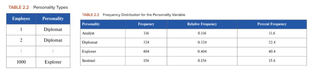
A frequency distribution for a categorical variable
groups the data into categories and records the number of observations that fall into each category
ex) Myers-Briggs Assessment Results (1,000 employees)
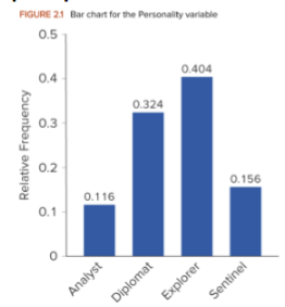
A bar chart (column chart)
depicts the frequency or the relative frequency for each category of the categorical variable as a series of horizontal or vertical bars, the lengths of which are proportional to the values
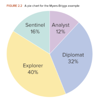
A pie chart is a
segmented circle whose segments portray the relative frequency of each category for a categorical variable
When constructing or interpreting charts or graphs:
The simplest graph should be used
Each axis should be clearly marked and labeled
Each bar/rectangle should be of the same width for creating bar charts or histograms
The vertical axis should not be given a very high value
The vertical axis should not be stretched
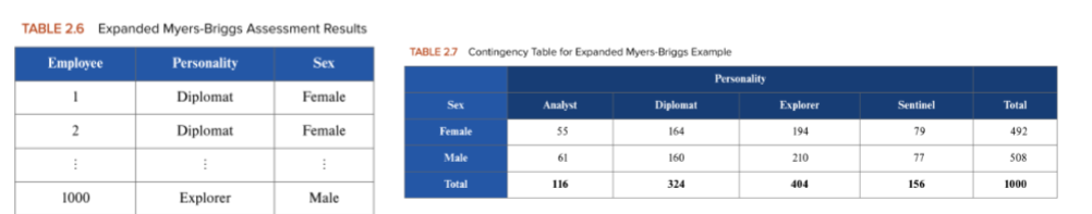
A contingency table shows
the frequencies for two categorical variables x and y, where each cell represents a mutually exclusive combination of the pair of x and y values
ex) Expanded Myers-Briggs Assessment Results
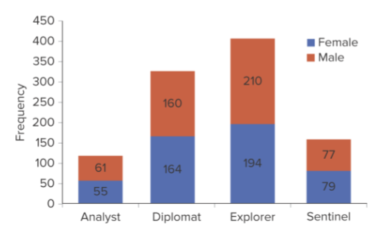
A stacked column chart
graphically depicts a contingency table designed to visualize more than one categorical variable
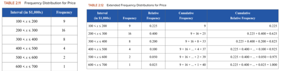
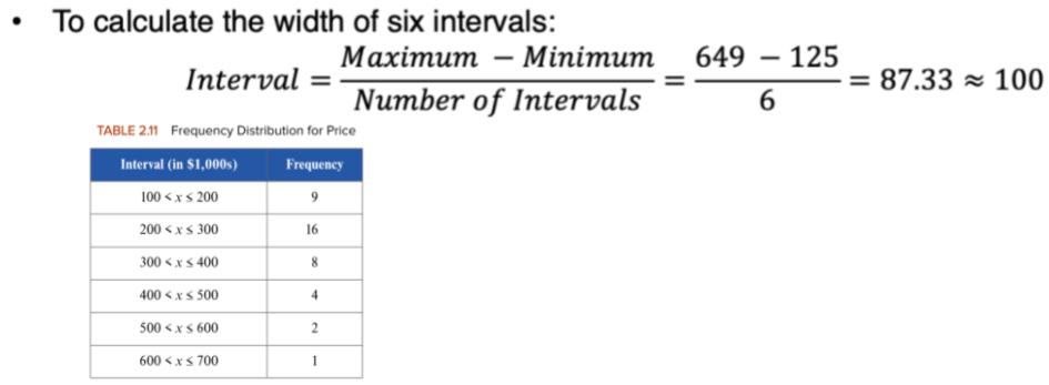
A frequency distribution for a numerical variable
groups the data into nonoverlapping intervals and records the number of observations that fall into each interval
ex) The price of a house for a sample of 40 houses in FL
Guidelines when constructing frequency distribution
Intervals are mutually exclusive
Intervals are exhaustive
Interval limits are easy to recognize and interpret
The total number of intervals in a frequency distribution usually ranges from 5 to 20.
To calculate the width if 6 intervals
(Max - Min) / # of intervals
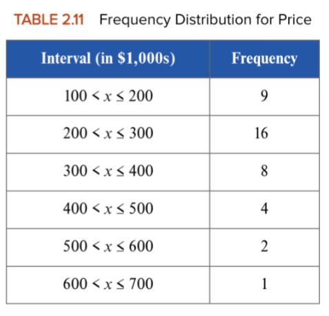
How many of the houses sold in the range of $300,000 up to $500,000?
8 + 4 = 12 houses

How many of the houses sold in the range of $200,000 up to $700,000?
16 + 8 + 4 + 2+ 1 = 31 houses
A relative frequency distribution records
the proportion of observations that falls into each interval
A cumulative frequency distribution identifies
the number of observations that fall below the upper limit of a particular interval
A cumulative relative frequency distribution shows
the proportion of observations that falls below the upper limit of a particular interval
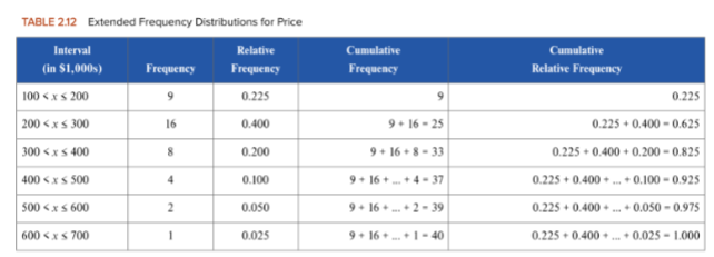
What proportion of the houses sold in the $200,000 to $400,000 range?
0.4+0.2 = 0.6

What percentage of the houses sold for more than $400,000?
0.1+0.05+0.025 = 0.175, 17.5%

How many of the houses sold for $300,000 or less?
9+16 = 25 houses
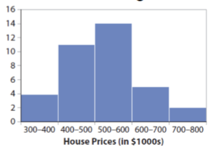
A histogram is
a series of rectangles where the width and height of each rectangle represent the interval width and frequency (or relative frequency) of the respective interval
The counterpart to the vertical bar chart for a categorical variable
ex) A histogram of housing prices
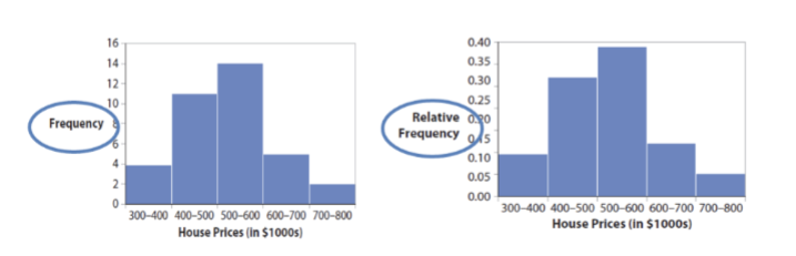
Here are the frequency and relative frequency histograms for the house-price data
Note that the only difference is the y-axis scale
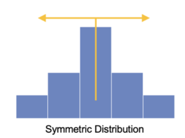
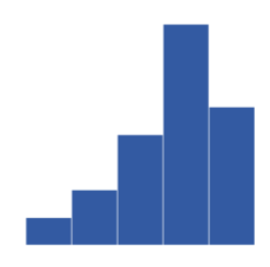
Histogram Shapes of Distribution
typically, symmetric or skewed
Symmetric—
mirror image on both sides of its center
Positively skewed:
skewed to the right, long tail extends to the right
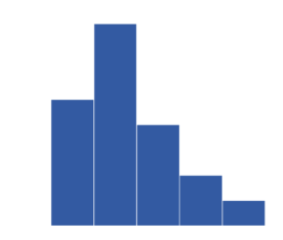
Negatively skewed:
skewed to the left, long tail extends to the left
A scatterplot is
a graphical tool that helps in determining whether or not two numerical variables are related in some systematic way
Each point in the diagram represents a pair of observations of the two variables: (x1,y1), (x2,y2), etc.
Three relationships: Linear, Nonlinear, and No relationships
ex) Incomes vs. Education
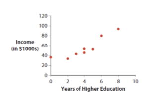
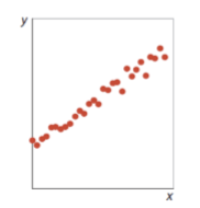
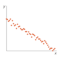
A linear relationship:
upward or downward sloping trend of data
Positive linear relationship
Negative linear relationship
Positive linear relationship:
as x increases, y increases (positive slope)
Negative linear relationship:
as x increases, y decreases (negative slope)
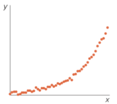
Nonlinear Relationship
As x increases, y increases at an increasing or decreasing rate
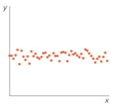
No Relationship
There is no apparent pattern between x and y
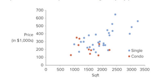
A scatter plot with a categorical variable modifies a basic scatterplot by
incorporating a categorical variable
It is common to encode the categorical variable through point color
ex) House prices and square footage by type in FL
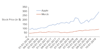
A line chart connects
the consecutive observations of a numerical variable with a line
Useful for tracking changes or trends over time
Easy to identify any major changes happened in the past
Multiple lines can be plotted
Ex) Monthly stock prices for Apple and Merck