User-Interface Elements
 Studied by 0 people
 Call Kai
 Learn
Learn Practice Test
 Spaced Repetition
 Match
Match Flashcards
1/4
Earn XP
Description and Tags
various UI components and controls
Name | Mastery | Learn | Test | Matching | Spaced | Call with Kai |
|---|
No analytics yet
Send a link to your students to track their progress
5 Terms
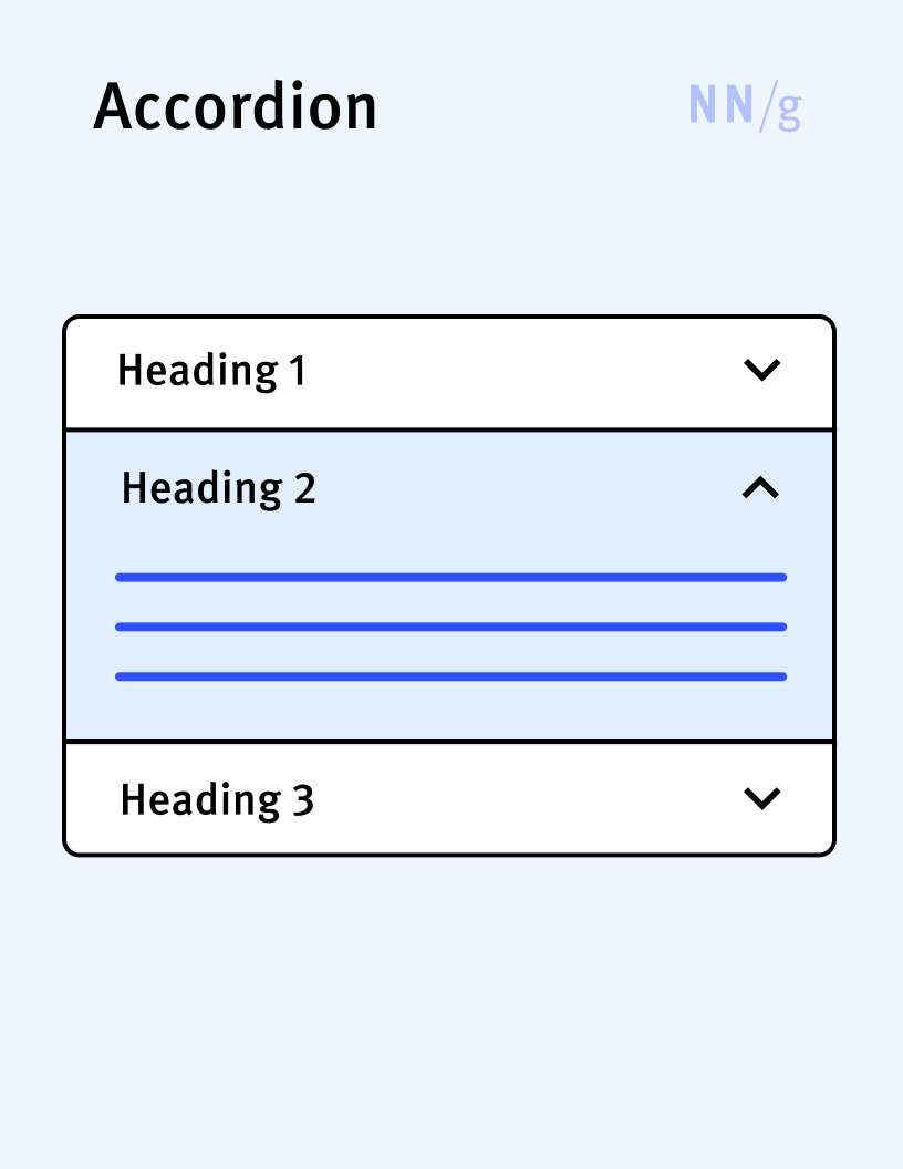
Accordion
A UI element that expands in place to expose some hidden information. Accordions are often used to compress content on a long page and are especially helpful on mobile. Accordions are usually represented by a label and an arrow or a plus sign.
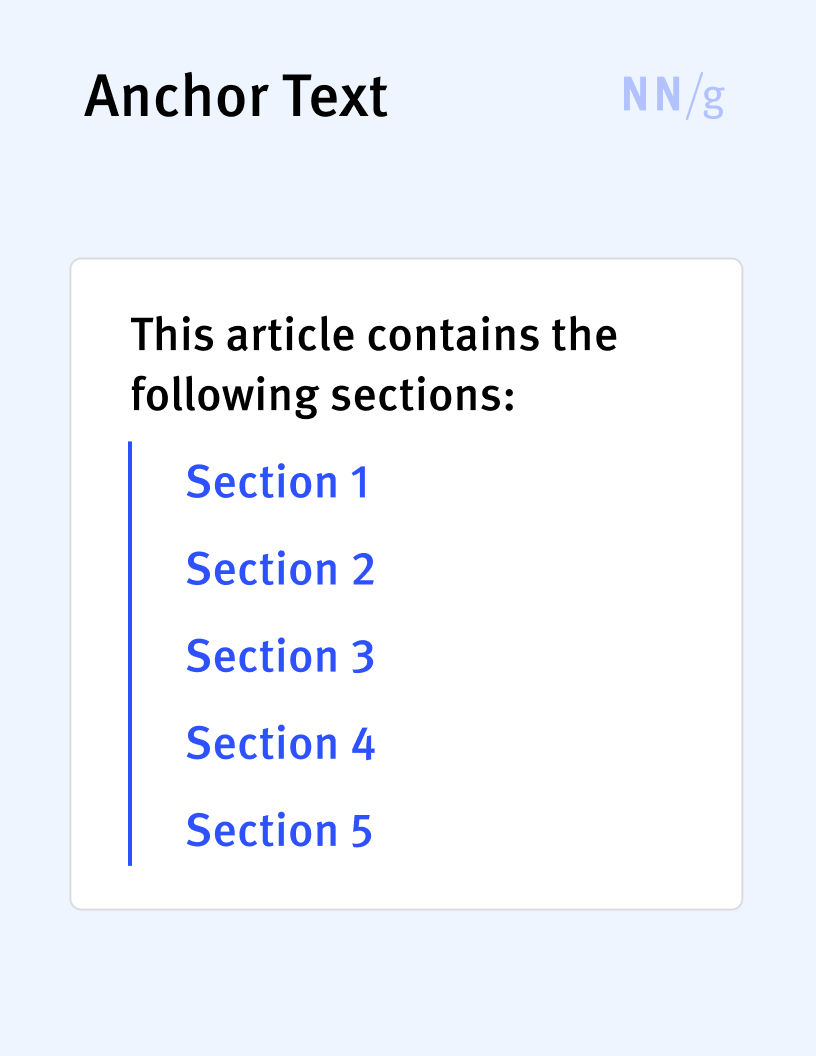
Anchor Link (In-Page Link, Jump Link)
A link that allows users to navigate from one location to another within the same page. Anchor links are often used to implement in-page tables of contents.
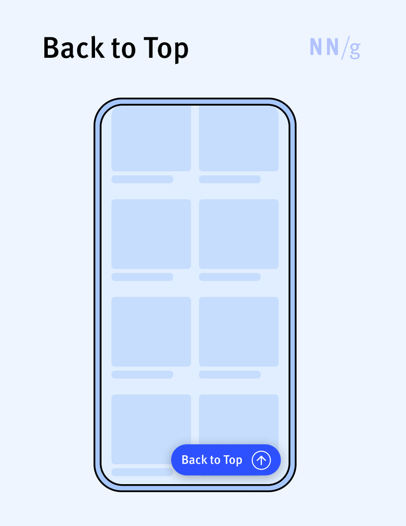
Back-to-Top Button
A button that takes users back to the top of the page, where usually the navigation UI or other important controls are placed. It is usually implemented as a floating button placed in the bottom right corner of the page and is particularly useful on long mobile pages.
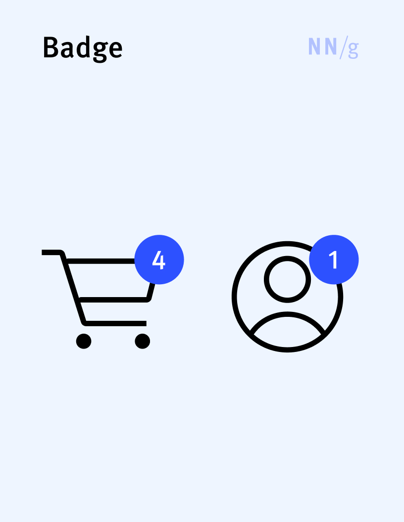
Badge
Indicates a notification (usually as a dot) or an item count (usually as a number). A badge usually appears on top of an icon (such as a shopping cart or messages icon) to direct attention to that element.
 Note
Note  Flashcards (27)