Stats
1/129
There's no tags or description
Looks like no tags are added yet.
Name | Mastery | Learn | Test | Matching | Spaced |
|---|
No study sessions yet.
130 Terms
Sampling Unit
The unit being selected at random.
E.g. If you randomly selected 100 email addresses to gather data on grocery store preference, then the sampling unit is the email address of a person.
The sampling unit may be the same as the observation unit, or it may contain multiple observation units
Sample
The collection of sampling units that you randomly selected.
E.g. If 72 people replied to your email about their favourite grocery store, then your sample includes the 72 email responses.
Observation Unit
The scale for data collection. You can think of this as the subject of the study.
E.g. If we were to ask people which grocery store was their favourite, the observation unit would simply be the individual person.
Statistical population
The collection of all sampling units that could have been in your sample, and represents the true scale in which your statistical conclusions are valid.
E.g. Let's say that you decided to collect your data by sending an email out to a 100 random people from a list of all emails in the City of Toronto. The statistical population would then be all people in Toronto with an active email account.
Population of interest
The collection of sampling units that you hope to draw a conclusion about. In contrast to the statistical population, which is defined by the technical details of your sampling design, the population of interest is defined by the scope of your research question.
E.g. If your research question is about the proportion of people who shop at large grocery stores as opposed to locally owned corner stores in Toronto, then the population of interest is all the people in Toronto. Ideally the population of interest is the same as your statistical population, but often the population of interest is larger.
Measurement variable
What we want to measure about the observation unit, such as height, age or voting intent.
Measurement unit
The scale of the measurement variable, such as centimetres for height or years for age. If the data are categorical, such as voting intent, then there is no measurement unit.
Descriptive statistics
The set of tools used to describe and characterize the data in your sample. Includes things like averages, tables, and graphs.
Inferential statistics
The set of tools used to say something about the statistical population based on your sample. This includes things like confidence intervals and statistical tests.
Four steps of overall framework of statistics
Sampling is the step of creating your study design and collecting your samples.
Measuring is the step of taking measurements from your observation units, which gives you the data with which to work.
It may be just a single measurement variable from the observation unit (e.g., weight of a cow) or multiple measurement variables (e.g., weight, age, and health of a cow).
Calculating descriptive statistics is the step where you describe the data in your sample.
This may include calculating the average value of a measurement variable in your data set, calculating the variation among measurements, or creating graphs.
Calculating inferential statistics is the final step where you use the information contained in your data to draw a conclusion about the statistical population.
How are descriptive and inferential stats used when there are multiple groups within a statistical population?
When there are multiple groups in the statistical population, the descriptive statistics are repeated for each group. Inferential statistics are done only once for the statistical population and can be used to make statements about the difference among groups.
Sampling design
A description of all the steps involved in collecting data from a statistical population
This description includes details on how to select sampling units at random and how to make sure they are representative of the larger statistical population
A sampling design is tailored to a particular study based on logistical constraints and alignment with the research question
A sampling design must achieve 4 goals:
All sampling units are selectable
Every sampling unit in the statistical population must have some non-zero probability of being included in your sample.
Selection is unbiased
The probability of selecting a particular sampling unit cannot depend on any attribute of that sampling unit and—on average—the sampling units must have the same attributes as the statistical population.
Selection is independent
Selection of a particular sampling unit must not increase or decrease the probability that any other sampling unit is selected.
All samples are possible
All samples that could be created from the statistical population are possible.
All groups must be able to be selected.
Ex. you must include ppl from the west and the east in a study, not just ppl from the east
Bias
An over- or under-estimate of some value from an average sample compared to the statistical population
Bias cannot be detected from a single sample, but rather it is a statement about whether the average value from multiple samples is different from the statistical population.
A sampling design must ensure that the selection of sampling units is unbiased so that your sample is representative of the larger statistical population.
There are several ways that bias can inadvertently slip into a study.
Selecting sampling units using our own senses, which have their own inherent biases.
Selecting samples based on geographic location, but not allowing all locations to be selected at random
Observational Studies
Observational studies are based on observations of a statistical population.
They are used to get what is sometimes called "real-world" information because they are a snapshot of how variables might be related.
Observational studies distinguish themselves from experimental studies in that the researcher does not have any control over the variables, which impacts the strength of our conclusions.
Goals and limitations of observational studies
The primary goal of an observational study is to characterize something about an existing statistical population
Overarching goal is to collect data from an existing statistical population that allows us to investigate relationships among variables
Observational studies provide a tool for discovering associations, but they cannot make statements about whether a factor causes the response you are interested in
Response variable
The response in which you are interested
Explanatory variable
A variable that an investigator believes may explain the response variable
Confounding variables
Unobserved variables that affect a response variable. We will never be able to identify them all and cannot exclude them from observational studies
Spurious relationships
When the relationship between an explanatory variable and response variable is thought to be driven mostly by a confounding variable
Observational Study Designs
Simple random survey
Stratified survey
Cluster surveys
Case-control survey
Cohort survey
Simple random survey
A survey design where the sampling units are selected at random from the statistical population
Stratified survey
A survey design in which the researcher first defines strata that represent natural grouping within the statistical population and then proceeds to do a simple random survey within each strata.
Strata is the name given to a subgroup within the statistical population in a stratified survey
Each strata has equal weighting in the sample and is defined ahead of time
Cluster surveys
Cluster surveys are survey designs done to average over unwanted heterogeneity by separating the sampling unit (cluster) from the observation unit
The idea is to create groups where the non-relevant heterogeneity is contained within each group.
The group is called a cluster, which is selected at random from all possible clusters. As such, the cluster is the sampling unit and the observation unit is nesting inside the cluster. The observation unit and sampling unit are DIFFERENT
One-stage cluster surveys
In one-stage cluster surveys, data are collected from all observation units in a cluster.
In one-stage and two-stage surveys, the cluster is the sampling unit and the only scale with true statistical replication.
Two-stage cluster surveys
In two-stage cluster surveys, a subset of observation units are randomly selected within each cluster.
In one-stage and two-stage surveys, the cluster is the sampling unit and the only scale with true statistical replication.
Case-control survey
A survey design where the statistical population is divided into a case and a control group based on a response variable to study how other factors might be associated with the observed response
The first group is called the case and contains sampling units with a particular response variable
The second group is the control and contains sampling units without the response variable of the case group.
This type of sampling is purposefully biased in that it aims to select sampling units for the case group based on a measured response variable and compare that to the control group.
Given that sampling units are intentionally selected with bias, there is a strong risk of spurious relationships
Cohort survey
Cohort survey a survey design where sampling units are selected at random from the statistical population and then followed over time, looking for change in the response variable
The key factor that distinguishes cohort surveys from case-control surveys in that the outcome is unknown when the sampling units are selected
Greatly reduces the chance of a spurious relationship
Observational → Retrospective studies
Retrospective studies are ones where the outcome is already known, which comes with an increased risk of spurious relationships if you are selecting groups based on the outcome. Case-control studies are a good example of a retrospective study.
Observational → Prospective studies
Prospective studies are ones where the outcome is not yet known. Typically more effort because you need to follow the sampling units for a period of time, but these studies suffer less from spurious relationships. Cohort studies are a good example of a prospective study.
Cross-sectional studies
Cross-sectional studies are ones that study a response variable at only a single snapshot in time.
Ex. Measuring flu levels in blood once after vaccination
Longitudinal surveys
Longitudinal surveys are ones that study a response variable at multiple points in time.
Ex. Measuring flu levels in blood multiples times after vaccination, spaced apart
Experimental studies
Experimental studies are based on creating treatments where the researcher controls one or more variables.
Goals and Limitations of Experimental Studies
The goal of an experimental study is to study the effect of one (or more) manipulated variables on one (or more) response variables.
Each manipulated variable is called a factor
Each factor then has at least two levels, which are different values of the factor
Factors and levels fully describe all manipulations of an experimental study
What distinguishes experimental studies from observational studies?
The first is that the explanatory variable is manipulated by the researcher.
The second is that sampling units are randomly assigned to each level in each factor.
Two steps where sampling units are selected at random in experimental studies
The initial step is selecting sampling units to ensure that they are an independent and unbiased subset of the statistical population.
The next step is to randomly assign the selected sampling units for different treatments within the study.
Treatment
An explanatory variable that the researcher has created with a direct manipulation
Factor
any manipulated variable in an experimental study
Level
The manipulated value within each factor
Replication/Replicate
The number of times a treatment is repeated on independent, representative and randomly selected units.
In statistics, this is the sampling unit.
Thus, the number of replicates is the number of sampling units in an experimental study
The number of sampling units in each level of each factor
Pseudoreplication
An error in the design of an experimental study where the observation units are analyzed rather than the sampling units and thus are not independent, representative, or unbiased
Experimental study designs
Control treatment
Blocking
Blinded
Placebo
Sham treatment
Control treatment
Common in experimental studies and is intended as a reference treatment to compare against the treatment levels that alter the explanatory variable. It contains everything that the treatment levels do, except the treatment itself.
Blocking
Blocking is analogous to stratified sampling, but for experimental studies. It is used to control for variation among the sampling units that is not of interest to the researcher.
Defining groups that account for variation among sampling units that the researcher is not interested in. The groups are defined ahead of time and the treatments repeated within each group
Blinded
Blinded is commonly used in experimental studies involving people and refers to a design where the sampling unit (usually a person, but could be a group of people) does not know what treatment they are being exposed to.
In a single blind design, the sampling unit does not know the treatment they are assigned to.
In a double blind design, both the researcher and sampling unit do not know what treatment they are assigned to.
The primary benefit of a blinded design is to remove accidental bias caused from the sampling unit or the researcher knowing what treatment is being applied.
Placebo
Placebo is a method often used in medical trials for the control treatment that helps accomplish a blinded design. It is substance, or treatment, that has no effect on the response variable.
Sham treatment
Sham treatment is similar to placebo in that it is a method used in control treatments. However, the purpose of a sham treatment is slightly different in that it aims to account for the effect of delivery of a treatment that is not of interest to the researcher.
Multiple factors in experimental study designs
We are often interested in studying the effect of multiple explanatory variables on some response.
A powerful experimental design would evaluate both variables at the same time, allowing us to study both explanatory variables as well as their interaction.
An interaction is when the two explanatory variables have effects that are different from the simple sum of each variable in isolation, which is a topic we cover in more detail later on.
Variable
A variable is any measurable characteristic of an observation unit
The value of the variable can vary among sampling units
A variable contains three pieces of information.
The first is what the variable represents, the second is the measurement unit, and the third is a description of the observation unit
The value of a variable that you measure from an observation unit is called the datum
Numerical variables
Numerical variables are those where the data is numeric
Numerical variables, however, have measurement units that indicates the scale
Categorical variables
Categorical variables are those where the data is a qualitative description.
Categorical variables have no measurement units because they are qualitative descriptions.
Continuous numerical variable
Continuous numerical variable is a variable that can take on continuous numbers. Continuous numbers are those that can take on any value including fractional numbers. For example, your weight is a continuous numerical value because it can be portions of a kilogram (e.g., 104.23 kg).
Discrete numerical variable
Discrete numerical variable is a variable that can only take on whole numbers (integers). For example, if you are counting the number of patients that arrive at the emergency room each day, you can only have integer values (e.g., 28 people).
Ordinal categorical variable
Ordinal categorical variable is a variable that can take on qualitative values but where values are from a ranked scale. A great example of this is using emojis to describe how you are feeling today.
Nominal categorical variable
Nominal categorical variable is a variable that can take on qualitative values but where values do not have any particular order. Food is a good example. There isn't an inherent order to apples, oranges, bananas and kiwi; they are all just types of frui
Counts
Counts are used for categorical variables and are the number of observations in your sample that fall into each category
Counts and proportions indicate the central tendency of categorical data. On the other hand, range is used to indicate dispersion, which describes the variation in the response variable
Proportions
Proportions are used for categorical variables and are the share of observations in your sample that fall into each category
Counts and proportions indicate the central tendency of categorical data. On the other hand, range is used to indicate dispersion, which describes the variation in the response variable
Calculating Variance
The variance is a measure of the amount of variation in your sample. It is calculated as the average squared distance of each data point from the sample mean
A related quantity is the standard deviation, which is the square root of variance
The variance is calculated as:
Calculate the mean for a sample
Calculate the difference between each data point and the mean, then square that value
Sum the squares of the differences and divide by the number of observations/data point
Calculating quartiles
Quartiles are specific values of the variable that divide your data into ranked groups.
Sort the data in your sample from lowest to highest value
Find the 2nd quartile by splitting the data in half according to whether
The sample has an odd number of observations, in which case the middle value of the dataset is the second quartile
The sample has an even number of observations, in which case the average of the two values closest to the middle is the second quartile
Find the 1st quartile by creating a subset of the data that is the lower-valued half of the observations, then use the rules in step 2 to find the middle value. The lower-valued subset is created according to whether
The sample has an odd number of observations, in which case the lower-valued subset is all values less than or equal to the second quartile. The subset includes the second quartile
The sample has an even number of observations, in which case the lower-valued subset is all values less than the second quartile. The subset does not include the second quartile
Find the 3rd quartile by repeating step 3 but for the upper-valued half of the observations.
Central tendency
The central tendency, or middle value of the sample, is given by the second quartile
Since it is the central quartile it is called the median
We know that 50% of the data lies below the median and 50% of the data lies above.
Dispersion
Dispersion describes how much variation there is in a sample.
When working with quartiles, we can describe variation as the range of values that contain the centre-most 50% of the data.
This range is between the 1st and 3rd quartiles and is called the interquartile range (IQR).
To calculate the interquartile range, subtract the 1st quartile from the 3rd quartile
Pros and cons of quartiles
Pros
The median and interquartile range are relatively robust to extreme values.
Cons
The median and interquartile range become quite variable for samples with a small number of observations.
Imagine that you had just three observations in your sample. The median and interquartile range will be sensitive to the value of the middle observation.
Be sure that you are consistent between central tendency and dispersion.
Pros and cons of mean
Pros
The mean and standard deviation are more robust when there is a small number of observations in the sample.
Cons
The downside to the mean and standard deviation is that they are sensitive to extreme values.
Be sure that you are consistent between central tendency and dispersion.
Effect size
Effect size is the change in mean value of the response variable among groups.
Effect size allows us to evaluate whether the change in the response variables is meaningful for a particular study.
We can calculate effect size as a part of descriptive statistics. As such, it is a description of the change in mean among the samples you collected from different groups.
In observational studies, effect size is calculated as the change among groups. E.g., in a case-control study, effect size would be the change in mean value of the response variable between case and control groups.
In experimental studies, effect size is calculated among treatment levels. E.g., in a single factor experiment, effect size would be the change in mean value of the response variable among the levels of the factor.
Calculating effect size
We are calculating the absolute effect size (the simple change in mean value between groups) for descriptive statistics
Effect size can be calculated either as a difference or a ratio.
Difference calculations are the differences in mean values among groups.
Using the difference to calculate effect size has the advantage of retaining the original scale.
Ratio calculations are the ratio of mean values among groups.
Using the ratio to calculate effect size has the advantage of indicating a relative change, but it loses the original scale
Difference versus ratio for effect size
The choice of calculating effect size using differences versus ratios depends on the study.
Differences give an effect size on the original scale of the response variable, which is particularly useful for studies where it is easy to assign meaning to the scale. Money, weight and speed are good examples of scales that have an inherent meaning.
Ratios show a relative change and are useful in studies where the scale does not easily lend itself to meaning. Medical studies are good examples where ratios are useful because the overall risk of getting a disease is typically low and difficult to assign meaning. By using ratios, researchers can instead evaluate the proportional increase in the risk of getting a disease.
Contingency table
A contingency table shows the frequency (or proportion) of sampling units in each level of a categorical variable. The frequency is simply the number of sampling units that falls in each level
One-way and two-way categorical data
One-way contingency tables and two-way contingency tables just refer to the number of categorical variables you observe for each sampling unit.
If you observe one categorical variable, then you have a one-way contingency table
If you observe two categorical variables, then you have a two-way contingency table
Deciding what categorical variable should be the first variable
The short answer is that this depends more on your research question than on the study variables themselves.
In essence, there is no technical reason to select one categorical variable to be the first variable over the other.
One thing to consider is that since the first variable is shown as column titles, it is often more prominent to readers.
Marginal distributions
When there are two (or more) categorical variables, it is common to present the total frequencies for each row and column. These are the simple sums across each row and column, and are called marginal distributions.
The row marginal distribution shows the total counts for each row across all columns, and the column marginal distribution shows the total counts for each column across all rows.
Calculating marginal distributions
To calculate marginal distributions as frequencies
Row: sum frequencies across all columns for each row
Column: sum frequencies across all rows for each column
To calculate marginal distributions as proportions
Table total: sum all frequencies in the table
Row: sum frequencies across all columns for each row and divide by table total
Column: sum frequencies across all rows for each column and divide by table total
Conditional distributions
The interaction between categorical variables is visualized using conditional distributions, two-way tables that show the proportion of sampling units for one variable within each level of the second variable
As such, conditional distributions allow us to see how the secondary variable changes across the primary variable
To create a conditional distribution table, you first select one of the categorical variables to be the primary variable and the other to be the secondary (conditional) variable.
The choice of what variable should be primary versus secondary depends on the question being asked
Calculating conditional distributions
Once the primary variable has been identified, the calculations are straightforward. Conditional distributions are calculated as the frequency from the contingency table divided by the marginal distribution of the primary variable. The steps are:
Identify the primary versus secondary variable. This determines whether you use the row or column marginal distribution
For each cell in the new table, divide the value from the contingency table by the marginal distribution of the primary variable.
Bar Graphs
Bar graph is a type of figure used to visualize categorical data. The base of the graph separates the levels of a categorical variable, and the height (or length depending on orientation) is the number of sampling units in each level.
Can either be in vertical or horizontal orientation
The most relevant information should be on the horizontal axis
Can bar graphs be used for numerical data?
The short answer is that it depends. There are two common cases where people try to use a bar graph for numerical data—one is ok, but the other is not.
Case 1 If you have data from a statistical population where one variable is numerical and the other is categorical, then you might be tempted to use a bar graph to visualize the trends. However, since the bar graph only has a single height for each level of the categorical variable, the best you can do is show the average numerical value among your sampling units. Showing just the average loses a lot of information. A better choice for this case is to use a box plot, which we cover in an upcoming lesson
Case 2 Statistical datasets have categorical information on many sampling units. But people often collect data that characterize a system that are not statistical in nature. For example, if you wanted to characterize the amount of renewable energy generated for each province in Canada, then you would have data where each province (categorical) has a single numerical value (amount of renewable energy). This type of data is often depicted by a bar graph, which is fine. However, it's important to keep in mind that the data are not statistical in nature because they don't represent a subsample from a larger statistical population.
Two variable bar graphs
As with contingency tables, bar graphs can be used to display data with two categorical measurement variables.
The first step is to designate one variable as the grouping variable.
The grouping variable forms the base of the figure, and levels of the other variable are shown within each level of the grouping variable
It is typical to designate ordinal categorical variables, such as months or happiness, as the grouping variable.
The next step is to decide whether to create the figure as a grouped bar chart or a stacked bar chart.
Grouping variable
Grouping variable For datasets with two variables, the levels of the grouping variable are shown along the base of the figure. The levels of the second variable are then displayed within each level of the grouping variable.
Grouped bar graphs
Grouped bar graphs are for visualizing datasets with two categorical variables. The grouping variable is shown along the base of the figure, and levels of the second variable are shown as side-by-side bars within each level of the grouping variable
The figure works by using two gap sizes. Levels of the grouping variable are separated by a large gap, whereas levels of the other variable are separated by a small gap
Stacked bar charts
Stacked bar graphs are for visualizing datasets with two categorical variables. The grouping variable is shown along the base of the figure. The second variable is displayed as a single stacked bar within each level of the grouping variable with each level of the second variable distinguished by colour.
There is just one bar for each level of the grouping variable, and colour is used to separate levels of the other variable
Histograms
A histogram is a type of figure used to visualize numerical data. The approach is to divide the numerical variable into bins of equal size, and plot then the number of sampling units that fall in each bin
To understand how histograms are created, it is useful to break it into three conceptual steps.
Divide the numerical variable into a number of bins of equal size
Count how many sampling units fit within each bin (frequency)
Create a plot where each bin has a bar with a height equal to the frequency of that bin. Make sure there are no gaps between the bars!
Bins
A small range of the numerical variable. The numerical variable is divided into a number of bins of equal size forming the base of the figure
Advantages and disadvantages of histograms
Histograms provide a great way to visualize the pattern of relative abundance in your sampling units along the numerical variable
The disadvantage is that it is cumbersome to display histograms when your dataset also has multiple levels of a categorical variable
Number of bins
The main decision you have to make when creating a histogram is to decide on the number of bins.
Too few bins and the pattern in the data is lost because of excessive aggregation.
Too many bins and the pattern is lost because there is little variation in frequency.
Box plot
Box and whisker plots, or box plots for short, are another good way to visualize numerical data.
Box plots are based on quartiles and are popular because they show five descriptive statistics in relatively compact design: minimum, 1st quartile, median, 3rd quartile and maximum.
Since it shows the 1st and 3rd quartiles, it also shows the interquartile range, which is quite nice because at a glance you can see where half the data lie.
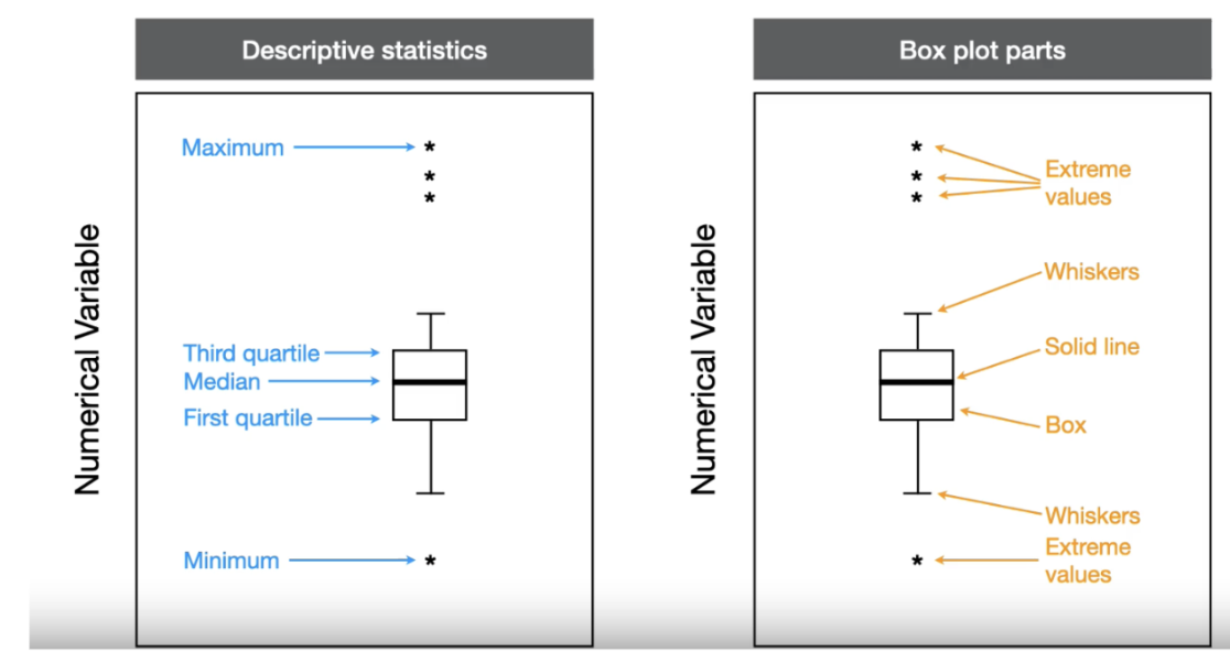
Box
Box is the part of a box plot that outlines the inner most 50% of the data. It starts at the 1st quartile and goes to the 3rd quartile.
Extreme threshold
Extreme threshold is a temporary reference line used to draw the whiskers and extreme values. The thresholds are drawn at 1.5 X the interquartile range above the top of the box and below the bottom of the box. They are removed in the final graph.
Extreme value
Extreme value is any data point outside of the extreme threshold as you move away from the median. Each data point is given a separate symbol. No symbols are shown if there are no data points outside the extreme threshold.
Whiskers
Whiskers are lines drawn from the edge of the box to the last data point within the extreme threshold. Whiskers are shown in both directions moving away from the median. No whiskers are shown if there are no data points between the edge of the box and the extreme threshold.
Building a box plot
A box plot is created from four parts: a box, solid line, whiskers and extreme values. The first two, the box and solid line, are based directly on the quartiles:
A box that is drawn from the 1st quartile and to the 3rd quartile. The overall height of the box is the interquartile range.
A solid line that is drawn at the median value
Once the extreme thresholds are calculated and sketched, the last two parts can be added:
Whiskers are drawn from the edge of the box to the last data point within the extreme threshold. No lines are drawn if there are no data between the box edge and threshold.
Extreme values are symbols drawn overtop any data points outside the extreme threshold. No symbols are drawn if there are no data outside the threshold
To finish the box plot, remove the thresholds leaving just the box, solid line, whiskers and extreme values
Box plots across categories
In observational studies, the categorical group would be a measured categorical variable.
In experimental studies, the categorical group would be the treatment factors.
A box plot really shines in these situations because it is easy to visualize how the numerical variable changes across multiple categorical groups.
The plot is created by spacing the categorical groups equally across the x-axis and drawing a box plot of the numerical data for each group.
Grouped box plots for two categorical groups
Grouping variable is the primary categorical grouping shown on the x-axis of grouped box plots. Secondary variable is the non-primary categorical grouping in grouped box plots. All levels of the secondary variable are shown within each level of the grouping variable.
The first step is to designate one categorical variable as the grouping variable and the other the secondary variable. The grouping variable forms the base of the figure, and levels of the secondary variable are shown within each level of the grouping variable.
The figure is created by drawing a box plot using the numerical data within each combined level of the two categorical variables. The two categorical variables are distinguished in the figure by the gap between levels. The grouping variable has a large gap between levels, and the secondary variable has a small gap between levels.
Often, levels of the grouping variable are shown on the x-axis, and levels of the secondary variable are shown in a legend.
Solid line
Solid line is the part of a box plot that shows the median
Pros and cons of histograms
The main advantage of histograms is that can be used to illustrate the shape of the distribution.
The main disadvantage is that it is difficult to look at a numerical variable across categorical groups.
Pros and cons of box plots
The advantage of box plots are that it is easy to compare across multiple categorical groups.
If you have numerical data for a small number of categorical groups and want to showcase the shape of the data distribution, then histograms are the way to go.
If you have many categorical groups, or are not interested in showcasing the shape of the data distribution, then box plots are the way to go.
Scatter plot
A scatter plot is used to visualize the relationship between two numerical variables. A type of figure used to visualize data with two numerical variables when there are no repeated measurements on sampling units.
Each point on the scatter plot is a sampling unit, and both numerical variables are measured from the same sampling unit
Scatter Plot names for the axes - Experimental studies
When one of the numerical variables is the treatment and the other a measured response, then the x-axis can be called the independent variable.
The corresponding name for the y-axis is the dependent variable.
When both numerical variables are measured quantities from the sampling unit, the axes are typically called covariates.
The reason is that neither variable is under control of the researcher, which means we are evaluating a pattern rather than a causal relationship.
Covariate
Covariate is the name given to the x-axis and y-axis when i) the data are showcasing descriptive statistics and are from an experimental study, or ii) the data are showcasing inferential statistics and the statistical test is about association..
Scatter Plot names for the axes - Observational studies
Both numerical variables are measured quantities from the sampling unit and are typically called covariates.
Scatter plots - Incorporating additional variables
Scatter plots are also great for illustrating changes in the relationship between two numerical variables across other variables.
A third (or fourth) variable can be added by changing the shape, size or colour of the symbols.
If the variable is categorical, then different symbols are used to denote each level of the categorical variable.
If the variable is numerical, then either size or colour are modified along a continuous scale.
Line plots
Line plots are used when you have data on two numerical variables, and where the researcher has taken repeated measures from the same sampling unit.
The repeated measurements for each sampling unit are connected together by a line so that the viewer knows the data points are not independent of each other.
The number of lines in the figure should equal the number of sampling units