Statistics Chapter 2: Displaying Categorical Data
1/44
There's no tags or description
Looks like no tags are added yet.
Name | Mastery | Learn | Test | Matching | Spaced | Call with Kai |
|---|
No study sessions yet.
45 Terms
Distribution of a Variable
Tells us what values the variable takes and how often it takes each value
Frequency table
Shows the number of individuals having each data value
Relative Frequency table
Shows the proportion or percentage of individuals having each data value
What helps to summarize a variable’s distribution?
Both frequency tables and relative frequency tables
How to start frequency and relative frequency tables?
Tally the number of times the variable takes each value
Bar Chart
Shows each category as a bar
What part of a bar chart shows the category frequencies/relative frequencies?
The heights of the bar
Are bar charts or pie charts more flexible?
Bar charts
Pie Chart
Shows each category as a sector of a circle
Use a ___ ___ when you want to emphasize each category’s relation to the whole.
Pie chart
When are pie charts appropriate?
When data are categorical and all individuals have exactly one value
Two-Way Table
A table of frequencies (or relative frequencies) that summarizes the relationship between two categorical variables for some group of individuals
Be sure to use _____ instead of _____ when analyzing data of two categorical variables.
Relative frequencies; Frequencies
Why are relative frequencies better for comparing two categorical variables than frequencies?
It makes it easier to compare groups of different sizes
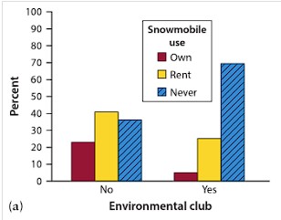
Side-by-Side Bar Chart
Displays the distribution of a categorical variable for each value of another categorical variable
Segmented Bar Chart
Displays the distribution of a categorical variable as portions (segments) of a rectangle, with the area of each segment proportional to the percentage of individuals in the corresponding category
When is there an association between two categorical variables?
If knowing the value of one variable helps to predict the value of another
_____ does not imply causation.
Association
Dotplot
shows each data value as a dot above its location on a number line
Roughly Symmetric
A distribution in which the right side of the graph is approximately a mirror image of the left side
Skewed to the Right
A distribution in which the right side of the graph is much longer than the left side
If distributions are about the same for all points, we can describe the shape as _____
Approximately Uniform
How do you characterize graphs with a single peak? A double peak? More than two peaks?
Unimodal, bimodal, multimodal
What are 2 steps to describe the distribution of a quantitative variable?
Look at its shape, center, and variability
Look for departures such as outliers
What to use to describe the center of a data set?
The median
What to use to describe the variability of a data set?
The minimum and maximum values of the data
When describing the distribution of a quantitative variable, look for the ____ ____ and for ____ ____ from that pattern.
overall pattern; clear departures
Stemplot
Shows each data value separated into two parts: a Stem, which consists of the left most digit(s), and a Leaf, the final digit
How are stems ordered in a stemplot?
From least to greatest and arranged in a vertical column
How are leaves ordered in a stemplot?
Arranged in increasing order out from the stems
What are 4 steps to make a Stemplot?
Make stems
Add leaves
Order leaves
Add a key
Should you add all stems in the stemplot, even if there’s no data value for a particular stem?
Yes
When splitting stems, make sure that an _____ _____ of possible leaf digits are assigned to each stem.
equal number
Histogram
Shows each interval as a bar and groups nearby values together
What is the minimum number of intervals used for a Histogram?
Five
What are 5 steps to making a Histogram?
Choose equal-width intervals
Make a table
Draw and label the axes
Scale the axes
Draw bars
When making a Histogram, the left endpoint of an interval is _____ and the right endpoint is _____.
included; excluded
True/False: The choice of intervals in a Histogram can affect the appearance of a distribution
True
What is the difference between a Histogram and a Bar Chart?
A histogram displays the distribution of quantitative variables
A bar chart displays the distribution of categorical variables
True/False: Dotplots, stemplots, and histograms show every individual value in a set of quantitative data
False
Scatterplot
Shows the relationship between two quantitative variables measured on the same individuals
On a Scatterplot, on which axis does the Explanatory Variable go?
On the horizontal or x-axis
What are the 4 steps to describing a Scatterplot?
Direction - it can a show positive, negative, or no association
Form - it can show a linear form or nonlinear form
Strength - it can show a weak, moderate, or a strong association
Outliers - individual points that fall outside the overall pattern of the relationship
Timeplot
A Scatterplot with consecutive points connected by a line segment
What does a timeplot show?
It shows how a single quantitative variable changes over time