1. Design Principles, Heuristics, and Visual Design Principles
1/72
There's no tags or description
Looks like no tags are added yet.
Name | Mastery | Learn | Test | Matching | Spaced | Call with Kai |
|---|
No analytics yet
Send a link to your students to track their progress
73 Terms
What are the four main frameworks discussed in this course?
1. Design Principles
2. Design Heuristics
3. Usability Goals
4. User Experience Goals
What are the 7 DESIGN PRINCIPLES?
1. Structure and Layout
2. Affordance
3. Visibility
4. Feedback
5. Constraints
6. Consistency
7. Mapping
What does the principle of Structure and Layout emphasize?
- organise the user interface purposefully
- put related elements together
- eliminate unrelated things
Give an example of poor Structure and Layout in design.
Opening a toolbar in Excel that covers half the sheet.
What does Affordance refer to in design?
it needs to be obvious HOW to use an element and WHICH elements are interact-able
What is an example of Affordance in design?
putting an outline around elements that are buttons
What does Visibility refer to in design?
Interface elements should be obvious and visible to the user
What is visibility related to?
affects usability
related to feedback
What is Feedback in the context of design?
The way that the system reacts to user input, sending a signal back to the user.
Give an example of Feedback in design.
Hover or click styling, or a loading bar.
What are Constraints in design?
Limitations of a website that help users, boosting safety.
What are the different types of constraints?
1. Physical constraints: different shapes of cable ports
2. Semantic constraints: requires knowledge of the real world
3. Logical constraints: helps people choose logical tools based on purpose
4. Cultural constraints: some colours are lucky in some countries
What does the principle of Consistency entail in design?
All similar words, situations, or actions should have the same style and meaning.
How can consistency be achieved in the two broad areas of design?
1. Consistency with the other pages of the system
2. Consistency with the similar or related systems
What does mapping refer to in usability design?
the spatial relationship between the controls and the outcome
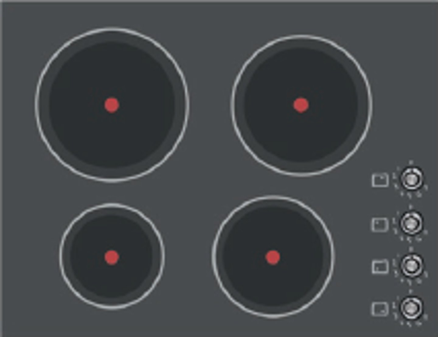
What is an example of bad mapping in usability design?
stovetop controls in a straight line
What are the 10 heuristics of design?
1. Visibility of System Status
2. Match between system and the real world
3. User control and freedom
4. Consistency and standards
5. Error prevention
6. Help users recognise, diagnose, and recover from errors
7. Recognition rather than recall
8. Flexibility and efficiency of use
9. Aesthetic and minimalistic design
10. Help and Documentation
What is the rule of thumb for providing feedback based on task duration?
If a task takes less than 1 second, no special feedback is required;
for 1 to 10 seconds, provide feedback;
and for more than 10 seconds, allow users to perform other tasks.
What should be avoided according to "Match between system and the real world"?
Avoid system-oriented jargon and use metaphors wisely to ensure clarity.
What does User Control and Freedom state?
users should have clear options to undo actions or exit areas they did not intend to enter e.g. breadcrumbs
What is a key note regarding the browser 'back' button in usability analysis?
The browser 'back' button is not part of the website/application and should not be included in the analysis of user control within the application.
What does consistency and standards in design help users with?
It helps users understand what they can do by building on knowledge they have acquired elsewhere.
What should be consistent in design according to the principle of consistency and standards?
Terminology, actions, and sequences should be in the same manner.
What is the purpose of error prevention in user interface design?
To prevent users' errors by providing confirmation messages.
How can error prevention overlap with other usability principles?
It overlaps with 'Constraints' and 'Feedback'.
What is an example of error prevention in user interfaces?
Using message boxes or tooltips.
What should error messages help users do?
Recognize, diagnose, and recover from errors.
What is the principle of recognition rather than recall in user interface design?
Designing the interface so it represents itself, reducing the need for users to memorise options.
Why is it important to make options visible in a user interface?
Humans are better at recognising options than recalling them from memory.
What is an example of recognition rather than recall in design?
Font lists where each font title is displayed in the actual font.
What does flexibility and efficiency of use mean in user interface design?
Having different ways to perform the same task to cater to both experienced and inexperienced users.
How does providing multiple methods for tasks affect user efficiency?
It allows users to choose their preferred method, which can increase efficiency.
What is the principle of aesthetic and minimalistic design?
Avoiding decorative elements that are irrelevant or rarely needed.
What should not be sacrificed for aesthetic and minimalistic design?
Usability should not be sacrificed.
What guidelines should be followed for writing help and documentation?
Use simple words, minimise word count, add screenshots, and provide step-by-step instructions.
What role do tooltips play in user interface design?
They provide instant related help and are a more efficient solution for assistance.
What are the 6 usability goals?
1. Effectiveness
2. Efficiency
3. Safety
4. Utility
5. Learnability
6. Memorability
What is a key aspect of good usability in a website?
Users should easily understand the purpose of the website without needing to read documentation.
What is the definition of EFFECTIVENESS in user experience?
how well a product achieves user goals accurately
What is the definition of EFFICIENCY in user experience?
Minimise steps and effort to achieve a goal
What is the definition of SAFETY in user experience?
Prevent user errors and harm
What is the definition of UTILITY in user experience?
Provides all necessary functions to help the function achieve the goal
What is the definition of LEARNABILITY in user experience?
The system is easy to begin using
What is the definition of MEMORABILITY in user experience?
Easy to remember the system after a while
What are some positive emotional responses users might have towards an application?
satisfaction, enjoyment, and ease of use
What are some negative emotional responses users might have towards an application?
frustration, confusion, and dissatisfaction.
What is the formula for increasing usability and achieving user experience goals?
design principles + heuristics principles = increasing usability -> user experience goals
What factors affect visual design?
1. target users
2. context of use, such as device type
What are the 7 VISUAL design principles?
1. Logical Flow
2. Symmetry and Asymmetry
3. Avoid Visual Noise and Clutter
4. Alignment (Whitespace)
5. Grouping
6. Colour Harmony
7. Contrast
What does logical flow mean in design?
concerns the flow of information that follows the natural reading pattern of users.
Why is symmetry vs. asymmetry used in visual design?
symmetry: allows a balanced visual layout.
asymmetry: allows a more dynamic layout.
How does a good interface utilize both symmetry and asymmetry?
Good interfaces incorporate a mix of symmetrical and asymmetrical designs to create visual interest and balance.
What is the impact of visual noise and clutter on user experience?
Too much clutter increases search difficulty and can detract from user focus.
What techniques can be used to avoid visual noise?
1. Minimise decorative elements that distract from key content
2. Use expandable menus for less important elements.
Why is alignment and whitespace important in visual design?
reduces visual noise, assists with balance and clarity, and attracts attention to important content.
What are the methods to group interface elements?
1. Group elements together in a box
2. Organise interface elements based on colour, similarity, layering, and proximity
How can colour be used to group elements in design?
recognising different groups e.g. headers vs. content
How can similarity be used to group elements in design?
Elements can be grouped based on similar shapes or function
How can layering be used to group elements in design?
divide tools into basic and advanced categories, allowing users to access more options by holding down on an interface element e.g. iPhone Control Centre
How can proximity be used to group elements in design?
Objects that are closer together are perceived as related
What is the purpose of color in visual interfaces?
Color can change user focus, make websites engaging, and define branding.
What are the three colour models?
RGB: additive
CMYK: subtractive
HSB: affect properties of the colours
What is meant by 'Hue' in color theory?
Refers to the colour itself
What is meant by 'Saturation' in color theory?
refers to the purity of the colour
What does 'Brightness' indicate in color theory?
Brightness indicates a scale from black to white.
What are the 5 rules for achieving good color harmony in design?
1. warm colours should be used for action elements
2. cool colours for status elements
3. muted and cool colours for backgrounds
4. similar colours = related
5. no more than 4 dominant colours on a page
What are the four formulas for colour harmony?
1. analogous: next to each other on colour wheel
2. complementary colours: opposite on colour wheel
3. triadic: form a triangle on colour wheel
4. colours in nature
What is the importance of contrast in design?
There needs to be an appropriate balance between background and foreground.
What should never be used as a background color?
Vivid colors; muted colors are preferred.
What are the 6 types of menus and give a benefit of each.
1. Drop down menus: good for few options
2. Contextual menus: overcomes navigation issues with cascading menus e.g. right click
3. Pop-up menus: decreases mouse movement
4. Expanding: good for many options
5. Flat lists: only shows one level at a time
6. hamburger menus: good for small screens
What is the card sorting process used for?
to find the optimal hierarchical grouping in menus; increases navigation usability
What is the benefit of using icons in user interfaces?
Icons help users remember where to find specific functions, are easier to learn than commands, and make the screen more tidy and compact.
What are the three types of icons?
1. Similar: uses the real shape of the object (e.g., a file icon). 2. Analogical: uses a picture whose concept can represent the function (e.g., scissors for cut).
3. Arbitrary: uses characters to represent operations (e.g., an X for delete).