Chapter 3: Organization and Presentation of Data
1/24
There's no tags or description
Looks like no tags are added yet.
Name | Mastery | Learn | Test | Matching | Spaced | Call with Kai |
|---|
No analytics yet
Send a link to your students to track their progress
25 Terms
Raw data
Data in their original form, and not yet organized or processed
Array
An ordered arrangement of data according to magnitude
Frequency distribution
A way of summarizing data by showing the number of observations that belong in the different categories/classes
Two general forms of frequency distributions
Single-value grouping
Classes are the distinct values of the variable
Grouping by class intervals
Classes are the intervals
Conditions for single-value grouping
Appropriate for categorical data and quantitative variables with FEW distinct observations
Conditions for grouping by class interval
Approrpiate for variables measured on interval or ratio level
Guidelines for constructing FDT via grouping by class interval
Determine adequate number of classes (Sturges’ rule: K = 1 + 3.322 log n)
Determine range (R = highest minus lowest values)
Compute C’ = R / K
Determine class size by rounding off C’ to a convenient number
Choose lower and upper class limits
Determine succeeding class limits by adding the class size to the lower class limit of the previous class
Tally all observed values in each class interval
Sum the frequency column
Relative frequency
The class frequency divided by the total number of observations
Relative frequency percentage
Relative frequency multiplied by 100
Open class interval
A class interval with no class limit nor upper class limit
e.g. first category as “less than or equal to __”
e.g. last category as “greater than or equal to __”
Class boundary
True class limits; actual boundary of each class interval
Lower class boundary (LCB)
The halfway between lower class limit of the class & upper class limit of preceeding
Upper class boundary (UCB)
The halfway between the upper class limit of the class and the lower class limit of the next one
Class mark
The midpoint of a class interval
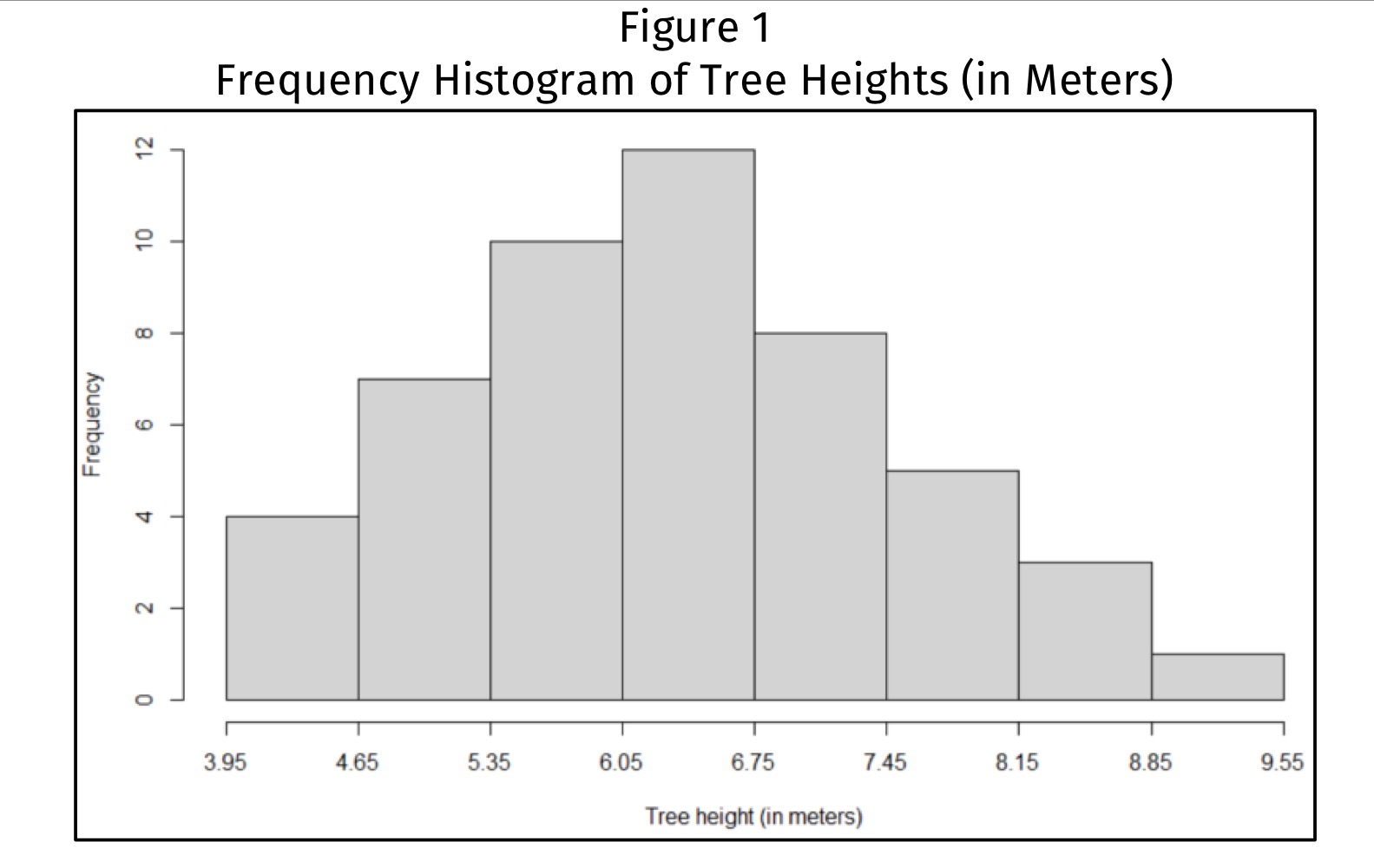
Frequency histogran
Shows the overall picture of the distribution of the observed values in the data set (as seen as vertical bars) → to show shape of distribution
Axes on a frequency histogram
Horizontal axis: class boundaries
Vertical axis: class frequency
Three modes of data presentation
Textual presentation
Tabular presentation
Graphical presentation
Examples of Graphs
Line charts
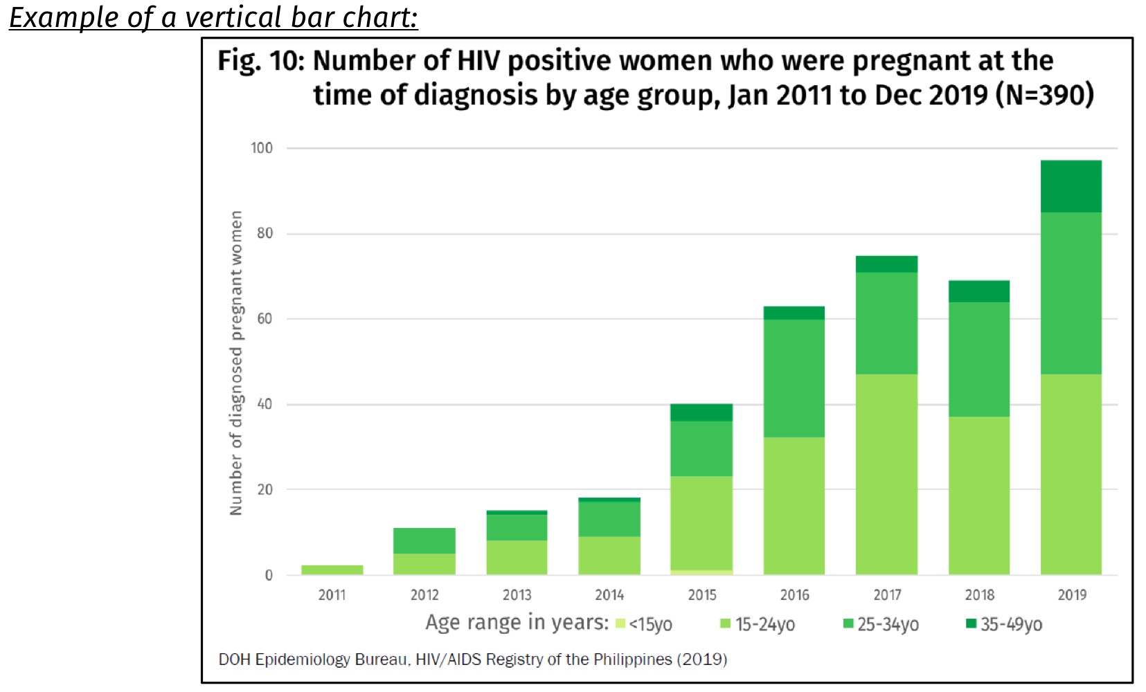
Vertical bars chart
Horizontal bar chart
Pie chart
Pictographs
Statistical maps
Advantage of graphical presentation
It can exhibit possible associations among the variables and can facilitate the comparison of different groups
Line chart
Graph that highlights movement of a time series (inc./dec.), wherein the variable assumes a different value for each time period
also used to compare the trend of two or more time series data
Vertical bar graph
Graph that highlights the magnitude of a time series (e.g. how big a variable is at a certain period)
can be used to show data changing over a period of time among several items
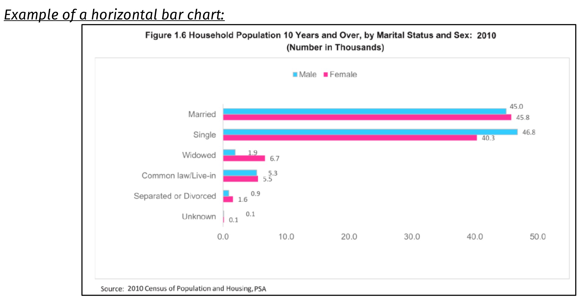
Horizontal bar chart
A graph that highlights the distribution magnitude of categorical variables
bars arranged according to length of bar
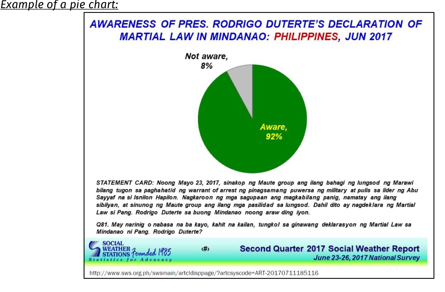
Pie chart
A graph that highlights percentage distribution of a categorical data
used if categories are less than six
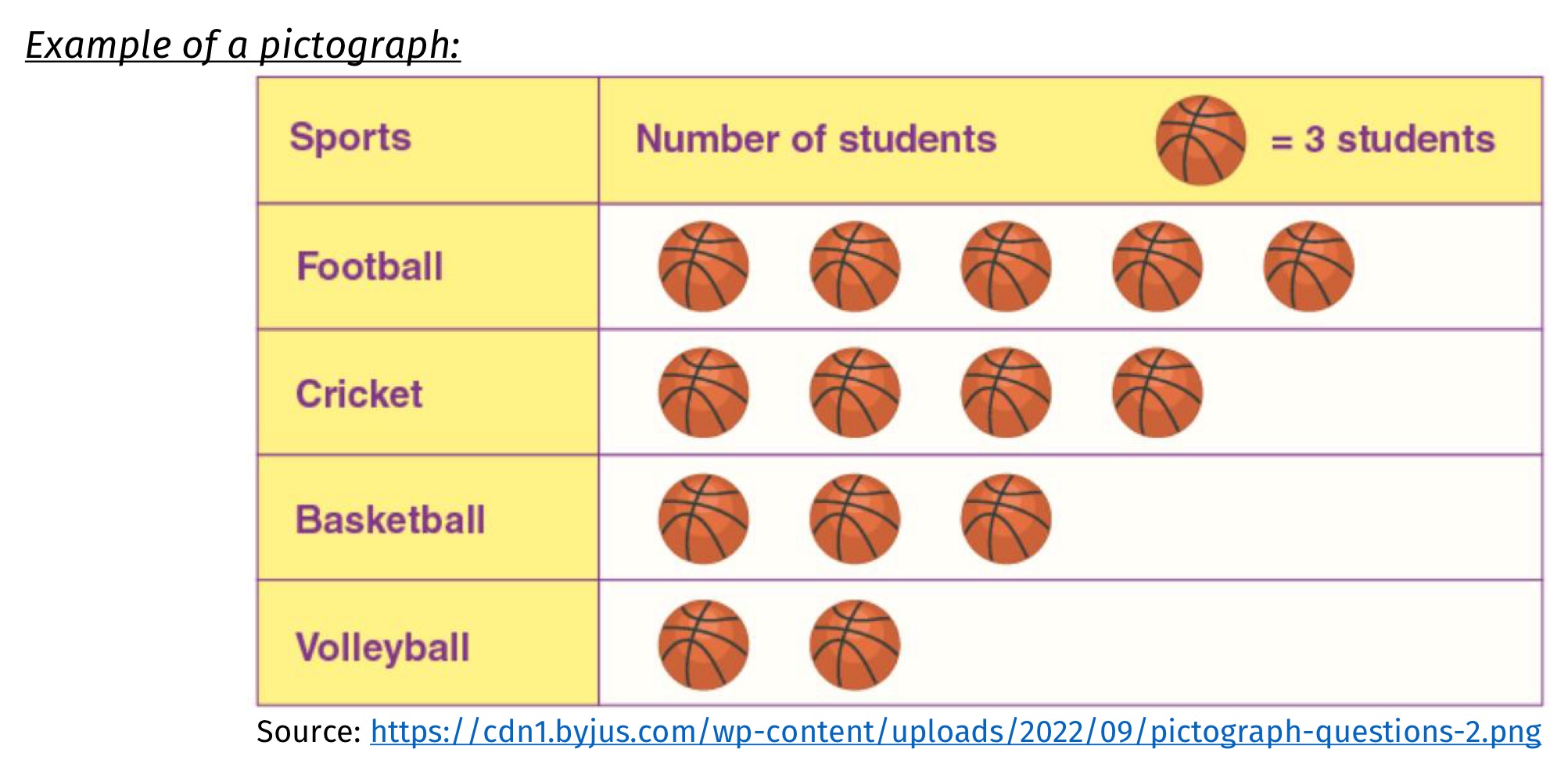
Pictograph
A graph similar to horizontal bar chart, and used to get the attention of a reader
a picture represents a unit of value
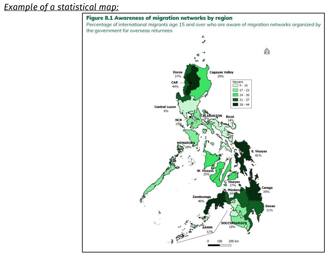
Statistical map
A graph that shows statistical data in geographical areas
figures may be ratio, rate, percentage, or indices.