Color
Pure Hue of pigment
Hue
The specific color.
Primary Colors
Red, Blue, Yellow, the Pure pigments.
Secondary Colors
Colors made from mixing two Primaries: Green, Orange Purple.
Tertiary Colors
A primary mixed with a Secondary Color; Red violet, Yellow Orange, etc
Color and Value
Hues of specific colors have a value; yellow is lighter than purple.
Complementary Colors
Colors directly across from each other on the color wheel.
Vibrating Colors
Using complements in complex designs right next to each other.
Split Complements
Colors to either side of complements on the color wheel; create tension in colors without jarring.
Warm Colors
Orange, red, yellow, colors in fire.
Cool Colors
Shades of greens, blues and purples, etc. the colors of the ocean.
Projecting / Receding Colors
Warm colors project forward; cool colors recede.
Simultaneous Contrast
The fact that a color is affected by a surrounding color.
Monochromatic
A Hue plus all its tints and shades.
Shade
A pure Hue plus black.
Tint
A pure Hue plus white.
Color Harmony
All of the colors in the piece must be in the same family so they work well.
Color Families
Groups of colors that are well harmonized together.
Jewel Tones
Dark pigments (Sapphire blue, Ruby red, Emerald green).
Candy Hues
Bright colors of Skittles, intense and plastic.
Color Associations
Different historical Eras resonate with a color palette and are known for those colors, earth tones of the '60's.
Color & Status
In medieval times, purple garments were expensive and they were reserved for royalty; it was death to wear them as a commoner.
Non-Facing Pages
Two pages whose margins are the same regardless of which side of the spread they are on; DO NOT create a unified spread
Facing Pages
Spread with mirror image inner and outer margins.
Using White Space
Allow white space to take up a significant part of the layout.
Foot Space
The margin at the bottom of the page.
Head Space
The margin at the top of the page.
Thumb space
Outer margins where we hold book.
Gutter
Inner margin where pages are bound.
Alley
Space between two columns of type.
Mix & Match
Use a Serif and a Sans Serif Family of fonts in a publication.
Hand Rendered Type
Can work in logo, headline or package, gives vintage feel.
What Color should you avoid for type on a white page?
Yellow, light pink or light blue.
Runovers after Bullets
Should be flush with type above.
In terms of hierarchy, the following is the order from first to last:
Headline Subheadline Initial Capital Standfirst Pull Quote Captions Divider heads Text type Byline Folio Dateline Photo credits
Goal of a designer is to make text
With an even tone of gray
Ideal number of characters per line
55-70
Ideal amount of leading
At least three points larger than the text size.
Hyphens (off keyboard)
Show breaking of syllables over two lines.
Key command to wrap type after bullet
⌘\
Soft Return
shift return and it returns the cursor to the left margin on the next line.
Bad Breaks
Period at the end of a line followed by a one or two letter word such as It or If or As.
Hyphenation Bad Breaks
When a long word is hyphenated, and hyphen falls after the first syllable as in es-tablishment.
Justified copy
is the second easiest to read.
Flush left copy
has a rag on the right.
Rivers
are vertically aligned enlarged word spaces in justified copy.
Rivers can be alleviated by adjusting
Tracking, adjust the column width a bit or by replacing a short word with a longer one.
When using centered type
address the phrasing of each line, so the breaks occur at natural places.
Never allow two hyphens in a row
at the end of subsequent lines of type.
Never track your body copy out too wide,
because you lose the word units and it is harder to read.
Set Solid
The point size and the leading are the same. 9/9.
You can shape your text boxes
to add interest to your layout.
Tracking your text type at -2 up to +10
usually about the best, but it depends on the particular font.
Widow
when the last line of a paragraph is less than half the column width.
Orphans
when either the first or the last line of a paragraph is in a different column from all the other lines.
Widows are undesirable
They interrupt the even tone of gray.
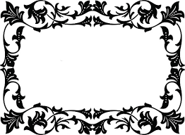
Cartouche ornaments
are ornate, decorative frames.
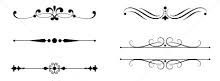
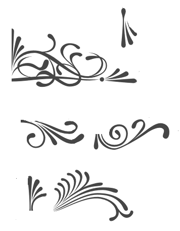
Fillet Ornaments
are ornate decorated lines used in text and titles.
Coin Ornaments
are designed to be mirror images of each other and used in corners.
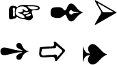
Directionals
arrows or hands that are used to point the eye.
Paragraph Divider Ornaments
Small tiles used to indicate paragraph breaks in place of space in text.
The Dot on the i
Tittle
⌥ ⇧ B
gives an i without the tittle ı
Bullet
⌥ 8
Cents Symbol
⌥ Shift 4
Trademark Symbol is ™
⌥ 2
Copyright Symbol is ©
⌥ G
Registered Symbol is ®
⌥ R
Aligning Type under a bullet
⌘ \
The grid
Series of column lines, margins and horizontal lines to organize information
Fillets
Directionals
Borders
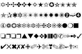
Dingbats
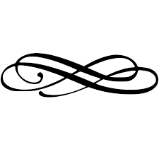
Flourishes
ParagraphDividers
Cartouche frames
Coins
Neutral Colors
Taupes, Tans, Grays
Analogous Colors
Colors next to each other on the color wheel; harmonious.
Neutral Colors
Neither warm nor cool, mid tone value.
Earth Tones
Browns, Tans, olive greens, russets, mustards.
Jarring Effect
Complementary colors cause the eye to vibrate back and forth.
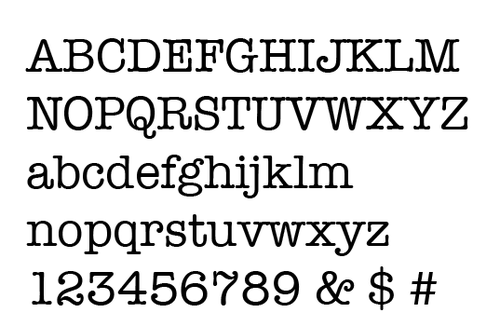
American Typewriter
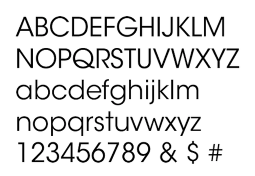
Avant Garde
Balmoral
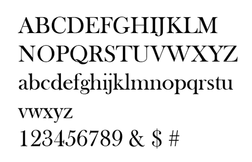
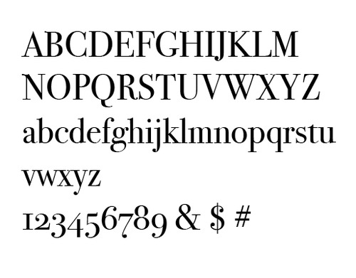
Baskerville
Bellevue
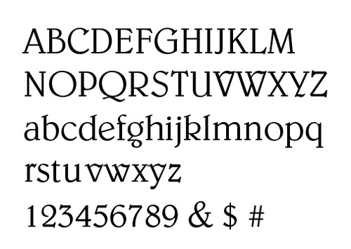
Belwe
Benguiat
Berkeley
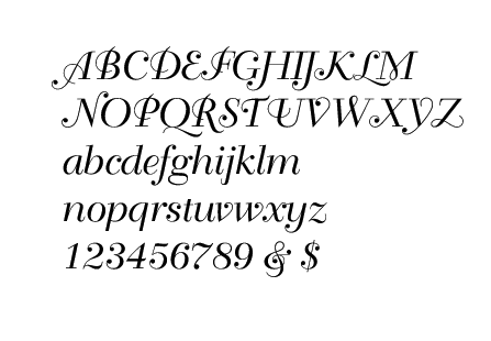
Bernhard
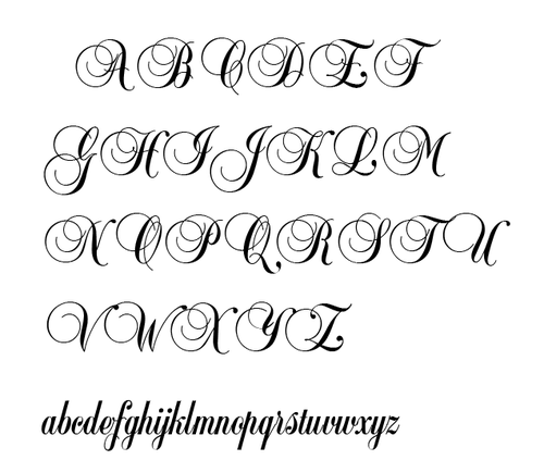
Berthold Script
Bodoni
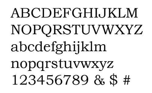
Bookman
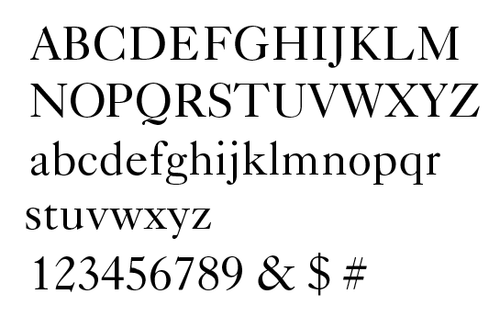
Caslon 540
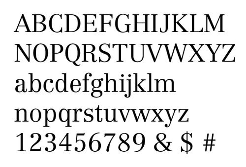
Centennial
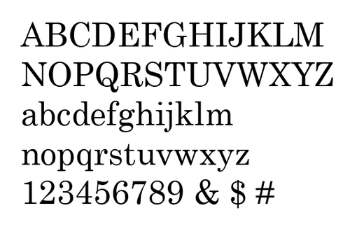
Century Schoolbook
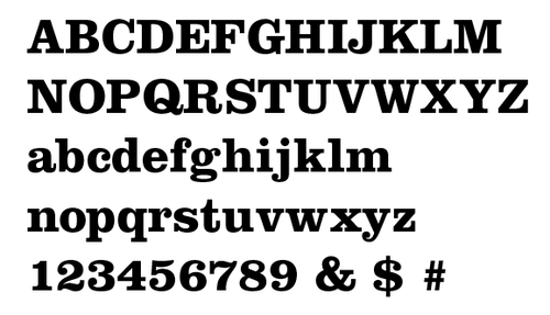
Clarendon Bold
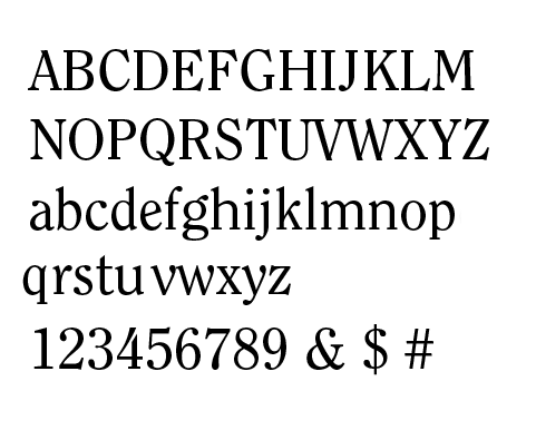
Clearface