GRE Data
1/30
There's no tags or description
Looks like no tags are added yet.
Name | Mastery | Learn | Test | Matching | Spaced | Call with Kai |
|---|
No analytics yet
Send a link to your students to track their progress
31 Terms
ways to present data
table, bar chart, segmented bar chart, histogram, pie chart, scatterplot, line graph
table (frequency distribution)
shows counts of observations in each category or interval. best for categorical data or grouped numerical data. example: apples (3), bananas (4), carrots (1)
table (relative frequency distribution)
shows proportion or percent in each category. best for comparing categories across different sample sizes. class frequency/total. example: apples (3), bananas (4), carrots (1) - apples = 3/8.
bar chart
shows frequency or percentage of categories.
data type: categorical (or discrete)
key feature: bars are separated
use when: comparing groups
segmented/stacked bar chart
shows: how a whole is divided into subcategories
data type: categorical & categorical
use when: comparing proportions within grfoups
example: gender breakdown within departments
histogram
shows: distribution of continuous numerical data
data type: quantitative, continuous
key feature: bars touch (because data is continuous)
use when: examining shape (skewness, symmetry, spread)
strength: reveals distribution patterns
pie chart
shows: parts of a whole
data type: categorical
use when: very few categories
weakness: bad for precise comparisons, sometimes misleading
scatterplot
shows: relationship between two numerical variables
data type: quantitative vs. quantitative
use when: looking for correlation, trends, outliers
strength: shows direction, form, and strength of relationships
line graph
shows: change over time or another ordered variable
data type: quantitative over an ordered sequence
use when: trends, growth, decline, seasonality
strength: best for time series data
what do measures of central tendency do?
indicate the “center” of the data
what are the measures of central tendency
mean, median, mode
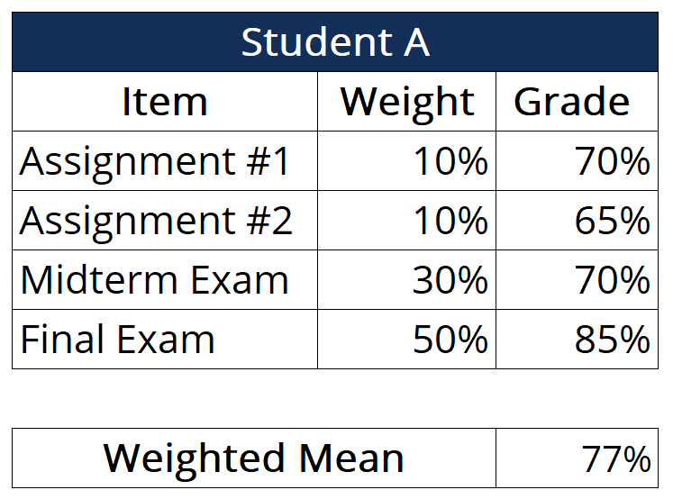
weighted mean
number * frequency / total number
measures of position
where a value sits relative to the rest of the data
properties of median
resistant to outliers, depends on position, not magnitude)
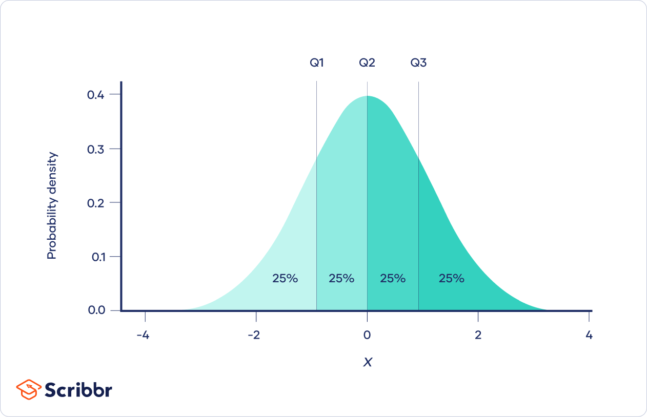
quartiles
divide data into four equal parts q1 - 25th percentile, q2 - 50th percentile (median), q3 - 75th percentile
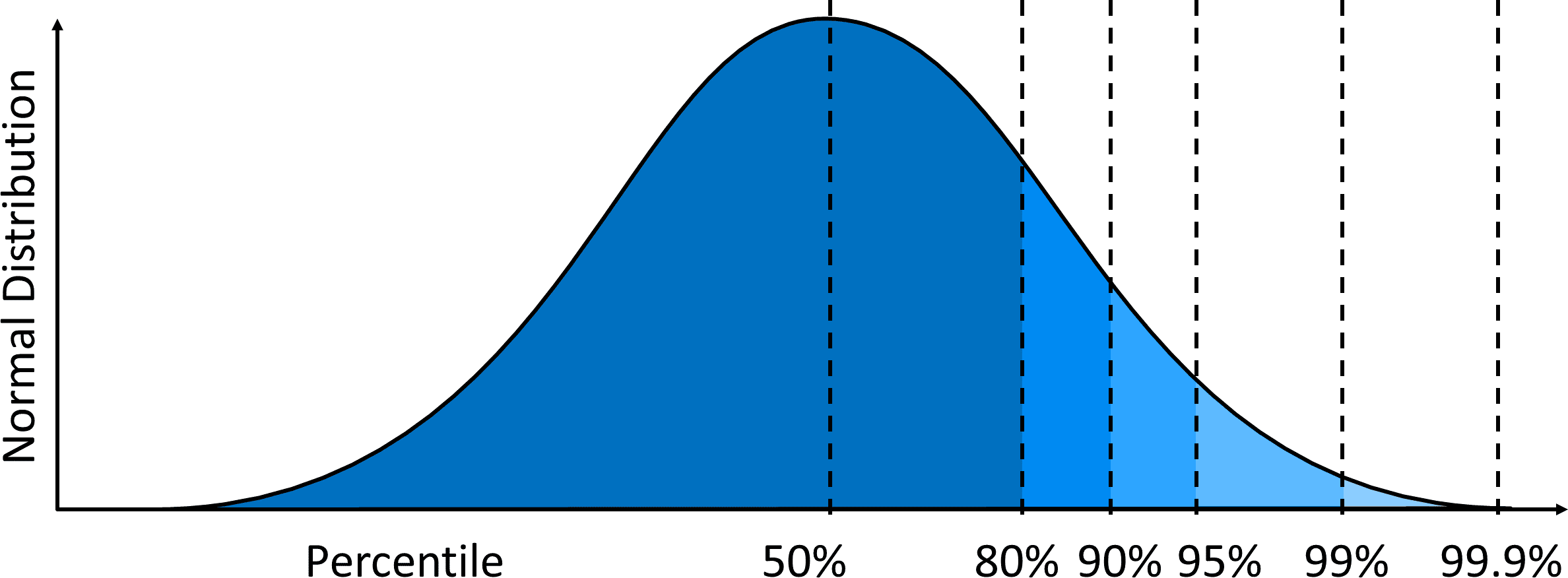
percentiles
value’s relative standing in the data
90th percentile - higher than 90% of observations, 90% are below you
interquartile range
iqr = q3 - q1
measures spread of the middle 50%
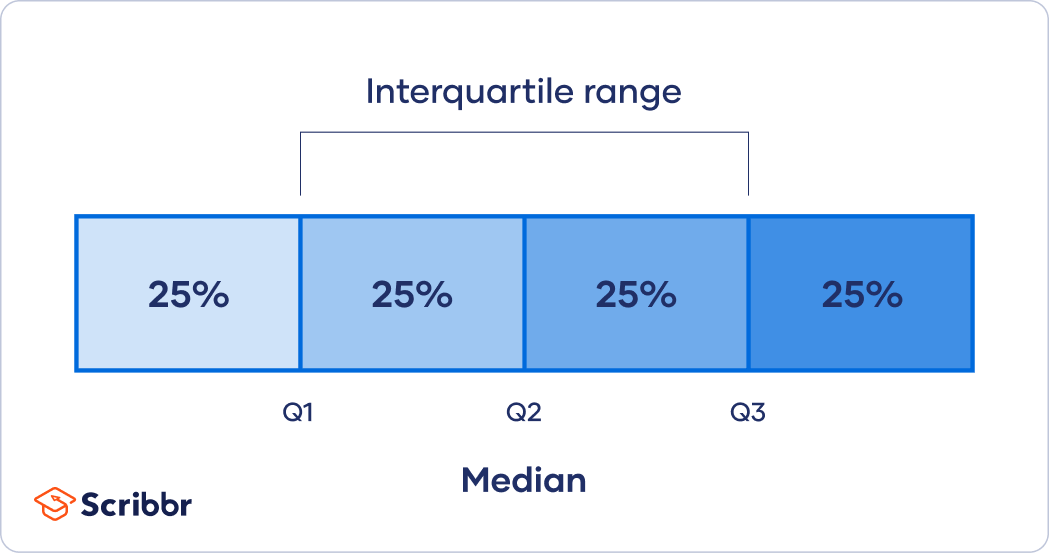
resistant to outliers
measures of position
median, quartiles, percentiles, interquartile range, z-scores
not measures of position
mean, range, variance, standard deviation
what do measures of position let you do
compare distributions without raw data
reason about rankings
handle boxplots and percentiles logically
measures of dispersion
how spread the data is (4, 4, 4 = no spread; 1, 5, 6, 10, 20 = high spread)
range
large number and subtract the smallest number
range is always positive or 0
boxplot
shows aspects of data
number line + lowest #, q1, median, q3, highest number
then box the q1, median and q3
standard deviation
sense of spacing between numbers
how far they are from the meant
three scenarios of standard deviation
large: numbers are spaced out
small: numbers are close together
zero: numbers are all the same
what happens to the standard deviation when you add a number to every term?
no change
what happens to the standard deviation when you subtract a number from every term
what happens to the standard deviation when you
what happens to the standard deviation when you multiply a number
multiply the standard deviation by that number
what happens to the standard deviation when you divide a number
divide the standard deviation by that numberh
how to calculate the standard deviation
find the mean
subtract the mean from each value
square each deviation
find the mean of the deviations
take the square root