Digital marketing - Chapter 2: Web design
1/34
There's no tags or description
Looks like no tags are added yet.
Name | Mastery | Learn | Test | Matching | Spaced |
|---|
No study sessions yet.
35 Terms
Hero image
A large image containing a call-to-action button with the intent of catching the user’s attention and inviting them to engage with the website; it has a large effect on user engagement
Guidelines when designing a hero image
The image should be high resolution and enticing
Text and the call-to-action button should be simple
Use A/B testing to find the best possible hero image
Make sure the image is displayed well on mobile and desktop
Trust symbols
Techniques that quell consumer fears and create trust
Examples of trust symbols
Professional photography
High-quality design
Guarantees
Good return policies
Testimonials
Color scheme and its guidelines
Use contrasting colours to direct attention to where users should look
Use the predominant color of the brand
Practise basic color principles
Videos
Can pack more information
Can provide credibility if they’re professional
Takes less effort than reading texts
Are equally useful between desktop and mobile
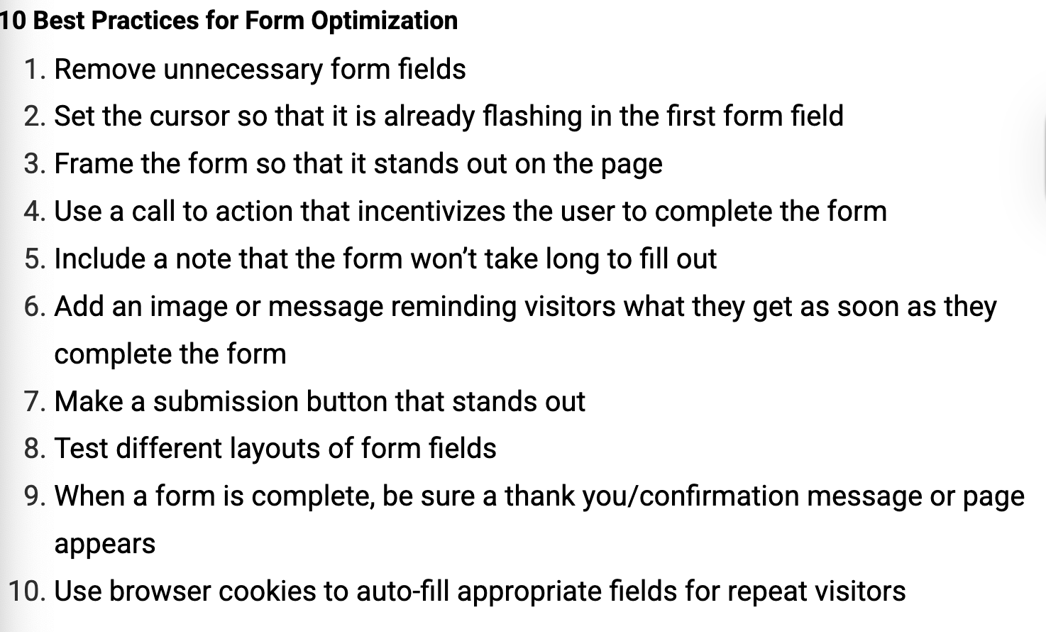
Forms
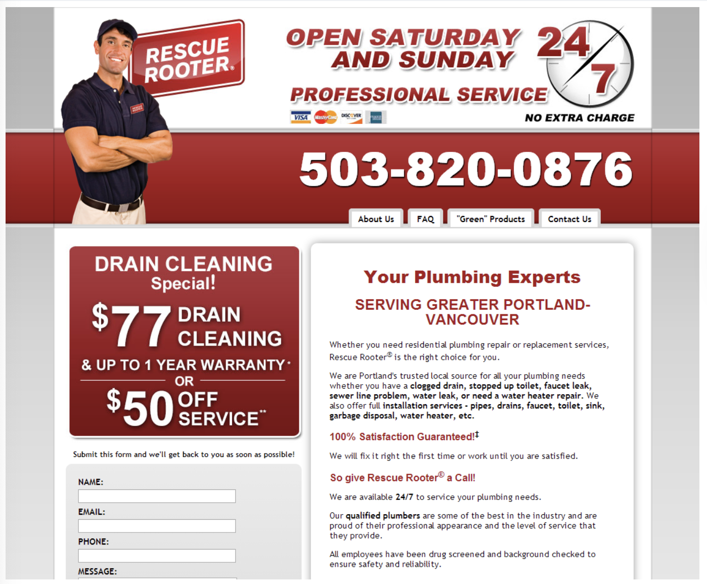
Phone numbers
Put the number in the top right corner of the screen as that’s where the user’s eyes tend to linger right after scanning the screen
Landing page
The first page a user sees upon visiting a site; they often have no link back to the main page
e.g. A home page, a web page made in collaboration with a marketing campaign
Landing page (con’t)
They should focus on:
The offering
Message
Visual components
Why do landing pages have higher performance than other pages
They can be crafted to perfectly match the advertisement’s message so expectations and interests are precisely addressed
Single product landing page
Is used when one specific product is advertised
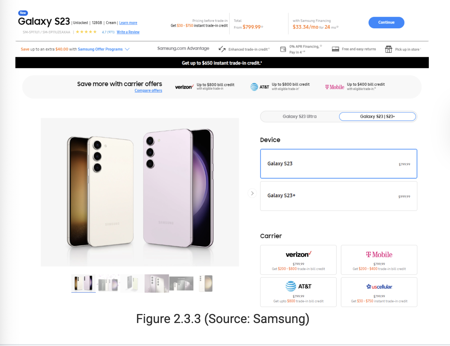
Multi-product landing page
Is used when a product category is advertised; it’s imperative to not give the user information overload with multiple products being displayed on screen
Design rules for single and multi product landing pages
Product image
Unique value proposition
Call to action
How to proceed
Familiar colors and logos
Lead generation landing pages
A page that has contact info (e.g. a phone number) and a call to action in a large visible font
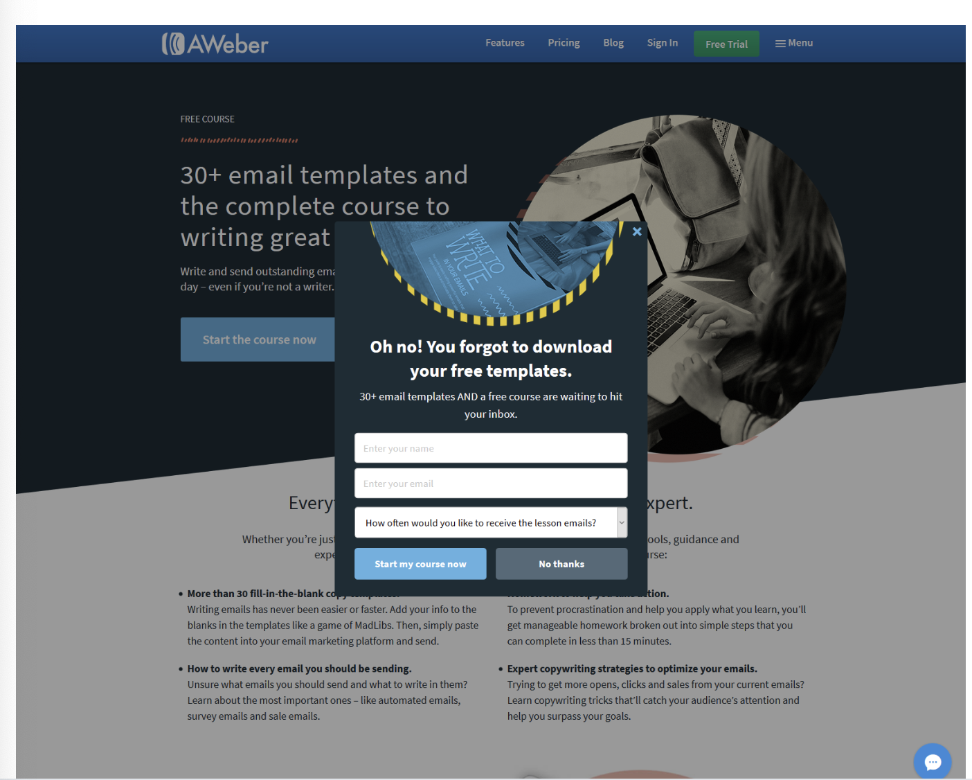
Subscription landing pages
Pages with site overlays which as the user to sign up for a subscription
Subscription landing pages (con’t)
When sites expect a piece of content to be popular (e.g a video, blog post, article, etc), they’ll run an ad to increase traffic to it along with a call to action
Single-purpose landing pages
A page with very little info (other than a short video) and only two options being “enter your email address or leave”
A.I and website design
Can be used for efficiency or efficacy, and can be used for purposes such as testing functionality and security, to creating first drafts of a website
Guidelines for making a useable website
Follow website conventions, and replicate how other firms structure their websites
Make important things larger and higher on the page; similar items should be grouped together
Break-up pages into clearly defined areas so people interested in different actions can easily find what they’re looking for
Guidelines for making a useable website (con’t)
Make it obvious what’s clickable
Eliminate distractions and include only the most important information
Structure content so that the user can easily scan the site with their eyes
Attention
The actions desired from potential customers
Context
Where the site visitors come from, and whether or not the content and message meet expectations
Clarity
The ability for a quick scan to tell the user what the site is all about
Congruence
Whether the words on the page encourage or distract from a conversion
Credibility
Giving potential customers reason to believe promises can be filled
Closing
Using positive messages to get users to the wanted click area
Continuance
How the customer knows whether or not they did the planned action and if they’re being encouraged to start the next conversion
The three questions to ask when making a website
*The quality of a site’s design is determined by how clearly is answers these questions
What are you offering?
Why should I pick you
What do you want me to do next?
Persona
A fictional person meant to represent a segment of consumers
e.g. Netflix can consider the needs of a new user persona when building their website, and create segments accordingly
Responsive web design
Coding elements of a webpage (e.g. Text, images, navigation) to find out the user’s screen size and resize the elements appropriately; can be very useful for the mobile-first design philosophy and catering to phone users
Conversion rate optimization
Using continuous A/B testing by taking an existing webpage (‘A’ version) and making a change to some element of the page, which makes the ‘B’ version
Upper fold
A banner at the top of a website that doesn’t go away while scrolling
What questions about a site should the upper fold answer?
What are you offering?
Why should I pick you?
What do you want me to do next?
The meaning of Never Start A Marketing Campaign Without A Dedicated Landing Page
(NSAMCWADLP)
Always direct users to a dedicated landing page instead of a homepage to increase the conversion rate