GD 30109 Colour Theory
What is a colour wheel?
Divided circle that illustrates the color hues, and how mixing primary colors produce secondary and tertiary colors
Primary colours for basic colour wheel
>Red
>Yellow
>Blue
1/49
Earn XP
Description and Tags
Name | Mastery | Learn | Test | Matching | Spaced |
|---|
No study sessions yet.
50 Terms
What is a colour wheel?
Divided circle that illustrates the color hues, and how mixing primary colors produce secondary and tertiary colors
Primary colours for basic colour wheel
>Red
>Yellow
>Blue
Primary colours for RGB colour wheel
>Red
>Green
>Blue
Primary colours for CMYK colour wheel
>Cyan
>Magenta
>Yellow
>Black
Types of colour schemes
>Monochromatic
>Tertadic
>analogous
>complement
>Split complimentary
>triadic
What are secondary colours?
Colours made by mixing two primary colors
What is hue?
>Colour in its pure state
>Pure pigment without added white or black.

What is chroma?
>Brightness or dullness of a color based on how much grey is added
>Chroma is the intensity or purity of a color, measured by how far it is from neutral gray
What is value?
>Degree of lightness or darkness in color
>Ways to change the value of a color:
Tinting: Lightens the hue by adding white
Toning: Softens hue by adding gray
Shading: Darkens hue by adding black
What are Colour Schemes?
>A way of using color to create visual interest
>Colour schemes go well together to create a sense of order and organization
>Not same as colour palette
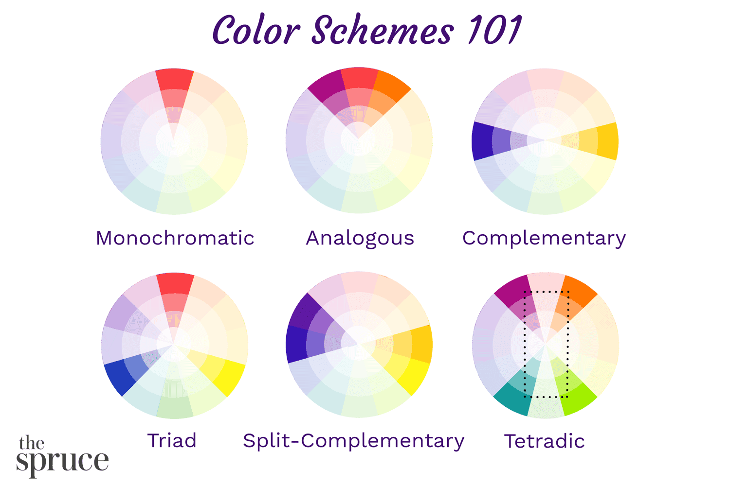
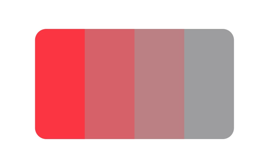
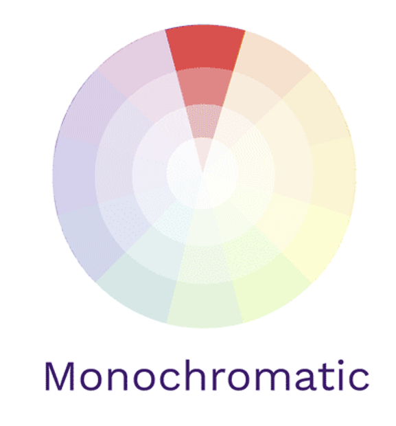
Monochromatic colour scheme
Tints and shades of same colour on the colour wheel
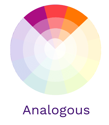
Analogous colour scheme
Three colors that are next to each other on the color wheel
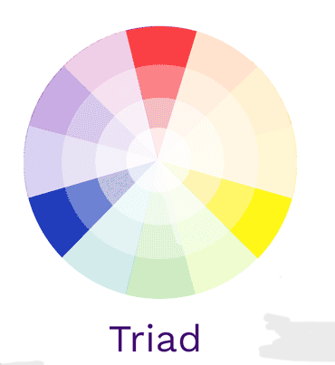
Triadic colour scheme
Three colours that are equal distance apart on the colour wheel
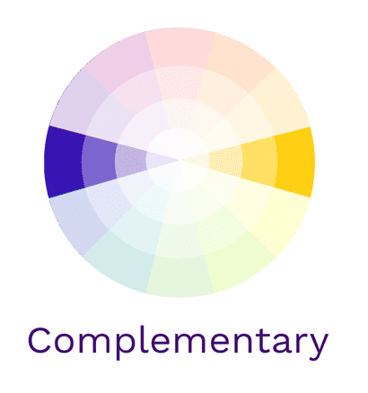
Complementary colour scheme
Colours opposite to each other on the color wheel
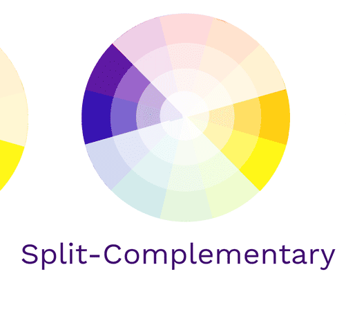
Split-complementary colour scheme
One color in the color wheel and the two colors lying on either side of its complementary color
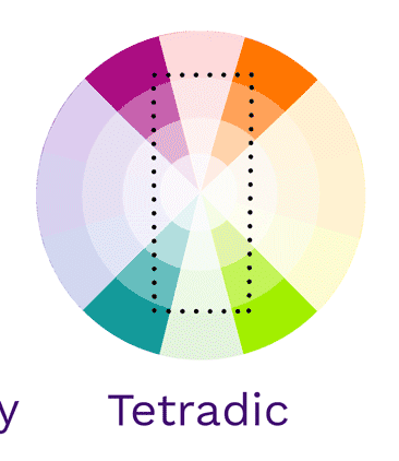
Tetradic colour scheme
Rectangular uses four colors broken into two complementary color scheme that pairs. This rich color scheme can be tricky to manage but allows for a lot of variety
Achromatic vs Monochromatic
>Achromatic: exclusively uses black, white, and shades of grey
>Monochromatic: takes one hue and creates a design based on different tints, tones, and shares of the hue
What is a colour model?
>The way humans can see color through wavelengths cannot be used in machines
>Machines use a color model to turn colors into numbers with a mathematical formula
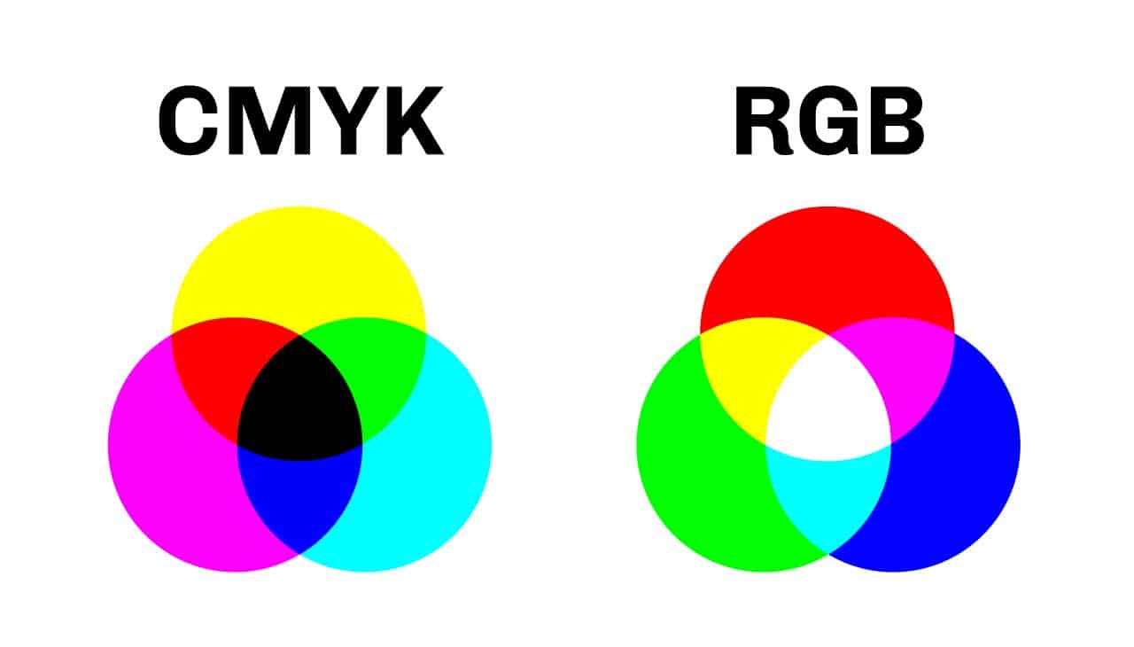
Difference between RGB and CMYK
>RGB
Additive (when you add colours, white appears)
Used for screen displays
>CMYK
Subtractive (when removing colours, white appears
Used for printing with ink
Mixing cyan, yellow, and magenta should make black, but it usually makes dark brown, so black pigment (called "K" for key) is added for better contrast
What is CMYK half tone printing?
Achieved by printing tiny dots of different colors next to each other, so when viewed from a normal distance, the eye blends them into a single, solid color
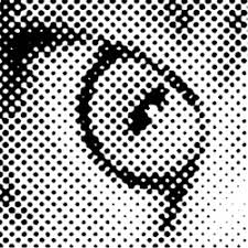
What is colour separation for four colour tone printing?
>To print a full color image, the image is first color-separated into four colours: Cyan, Magenta, Yellow and Black
>Each single colour, consisting of halftone dots, is then printed separately
>Then the colours are put one on top of the other to give the impression of a full color image
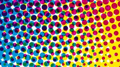
What are three factors affecting the CMYK printing system?
>Size of dots
>Distance between the dots
>Angle of overlapping dots
How does RGB work for screens?
>Each pixel in the screen consists of three-color slots Red, Green, and Blue
>The intensity of coloured light emitted from each pixel differs
>That is how the colors we see are created, as the three primary color beams add together to produce the secondary colors
>Combining light is the standard method of producing color images on digital screens
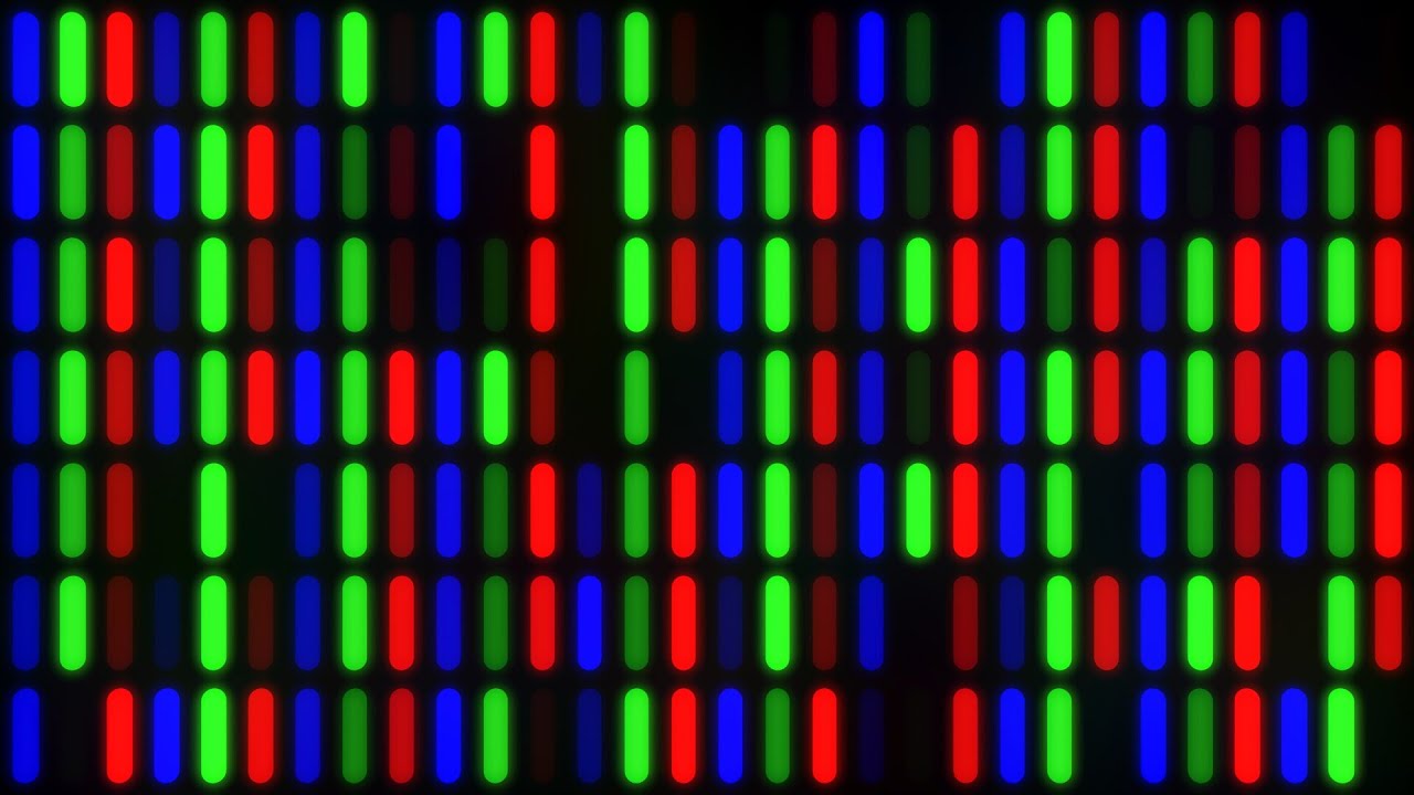
What if the three colored lights in RGB color model emit with the same intensity?
We will only see the gray scale grid of shades
RGB lights intensity is 50% = gray
RGB lights intensity is zero = black
RGB lights intensity is 100% = white
Warm colours emotions and examples
>Evoke energy and warmth since they are associated with things like the sun
>Warmth, excitement and energy
>Red, orange, yellow
Cool colours emotions and examples
>Evoke a relaxed and calming feeling since they remind people of things like water or grass
>Coolness, calmness and stability
>Blues, greens, purples
Is a colour considered warm or cool across all of its values?
Yes, a color is warm or cool in all its values (tinting - toning - shading)
Which colours are neutral?
>Grey
>Black
>White
The perceived temperature of a color is affected by:
>The color surrounding it
Ex a cool color appears colder when surrounded with warm color and vice versa
>The physics of colors (how our eyes perceive color )
The first color eye sees is yellow: because it is the brightest color on the color wheel
The last color eye sees is purple: because it is the darkest color on the color wheel
>Intensity of colour
Your eyes will see more intense colours first
While using cool and warm colors, eyes will see the colour of smaller amount in the space before color of dominate amounts
If you survey the use of color in almost any industry, you will find two big winners: red and blue
Colour temperature in branding
>Cool colours
Companies using cool colors want clients to take their time and feel relaxed
Give the feeling of relaxing, calming
>Warm colours
Companies using warm colors want clients to feel energized to make quick purchases and activities
Give the feeling of energy, happiness, and excitement
What is colour psychology?
>Study of how humans associate colours to feelings
>How colours affect human behavior and their subconscious
>Our brain links colors to emotions based on our surroundings and past experiences
Aims of studying colour psychology
>Establish how the colours we see affect our everyday decisions (items we buy, places we like to go, etc.)
>Colors influence our choices because they trigger different emotions and reactions, which is why color psychology is important in all areas of design
Where do colour meanings come from?
>Surrounding environment
Humans link colors they see in nature to certain feelings.
ex. red reminds us of the sun and feels warm, blue of the sea and feels calm, and black of darkness and feels serious.
Green is linked to forests and plants, so it makes us think of growth and health.
>Popular life events
People started to associate green with poison and death after the Paris Green scandal in the 19th century
Paris Green was a bright green pigment made with arsenic, a deadly poison
>Cultural and historical associations
ex. red symbolizes happiness and good fortune in Chinese culture and danger and violence in American culture
Goals graphic designer can accomplish using colour psychology
>Creating a specific mood
>Invoking a certain emotional response
Variables affecting color perception in surrounding environment
>Lighting effects
>Colours of surrounding environment
>Reflective characteristics of Texture and materials
How to ensure a design is well perceived
>Color contrast is key to guarantee that a design is well perceived
>Massive sized objects or catchy ideas
>Light source:
Natural light sources (sun, fire)
Artificial light sources (lamps, screens)
>A good color plan makes a design stand out by using contrast with its surroundings. That’s why brands create custom booths and store displays, to make sure their product gets noticed
How is sunlight different from artificial light?
>Natural light
Shows all colors clearly because it includes all colors in the spectrum
Dynamic spectrum, its intensity and color temperature change throughout the day (e.g., warm tones at sunrise/sunset, cool tones at midday)
>Artificial light
Emits a narrower spectrum, harder for the human eye to distinguish colors accurately
Static spectrum, its color output doesn't naturally change over time
Some types can be programmed to change like natural light
Why did Claude Monet paint The Rouen Cathedral series - between 1892 and 1894?
A collection of more than 30 paintings of the Rouen cathedral were painted to capture the changing of light and the passing of the seasons
What are the benefits of Advertising LED screens in public places?
>Can be changed at the push of a button at any time and location
>Allows designers to fully customize the color contrast to surrounding day light or evening light
How do texture and material affect the way we see colour?
>Different materials absorb and reflect light in different ways
>Key factors include:
Transparency
Roughness or smoothness
Reflective capacity
>Example:
Matte fabric absorbs light, making the color look slightly darker
Shiny fabric reflects light, making the color appear brighter
Yellow colour psychology
>Symbolizes optimism, sunshine, joy, cheerfulness, warmth, and caution
>Great for capturing attention—commonly used in signs and safety gear
>Can cause stress, frustration or irritability if overused
Orange colour psychology
>Evokes feelings of freshness, vitality, and warmth
>A cheerful and energetic color often used in marketing as a softer alternative to red
>Darker tones are associated with autumn or caution
>Used in traffic cones and safety vests due to its visibility
Red colour psychology
>Connected to the sun and daytime—symbolizes energy, urgency, and attention
>Associated with love, passion, excitement, and power
>Red indicates rising stock value in China but falling stock value in US
>Can also evoke anger, danger, and violence
Purple colour psychology
>Symbolizes luxury, royalty, wisdom, magic, and mystery
>Used in brands like Cadbury, Milka, and Nestle to suggest quality
>May not attract attention easily
Blue colour psychology
>Loyalty, stability, tranquility, harmony, and calmness—reminds us of the sea and sky
>Common in corporate logos (e.g., Facebook, LinkedIn, Twitter, IBM, HP)
>Can be linked to sadness or depression (e.g., “feeling blue”)
Green colour psychology
>Sustainability, growth, money, healing, safety, freshness, relaxation, environment, and life
>Eco-friendly brands and supermarkets promoting natural, organic products
>Linked to materialism, poison, and possessiveness or attention-grabbing
Black colour psychology
>Clean, timeless look
>Elegant, powerful, and sophisticated (e.g., Nike, Gucci, Adidas)
>Evoke feelings of loneliness, mourning, and depression
>Symbolizes death
White colour psychology
>Innocence, purity, cleanliness, rebirth, and new beginnings
>Makes spaces appear larger in design
>Can feel sterile or cold in excess (e.g., clinics)
>Worn at funerals in the east
Grey colour psychology
>Sophistication, stability, security, and strength
>Offers a modern, toned-down alternative to black in design
>Come off as dull, indecisive, or moody
>Paired with brighter colors to enhance appeal
Brown colour psychology
>Feels earthy, warm, safe, and reliable, linked to nature
>Used in interior design for a clean, comforting look
>Brands like Louis Vuitton and chocolate companies use brown to convey trust and natural quality
>Not very eye-catching