Looks like no one added any tags here yet for you.
data presentation is arranged in 3 types
text presentation
tabular presentation
graphical presentation
when you should do text presentation of the data
when the quantitative information that is conveyed consists of 1 or 2 numbers
there are how many types of tables and name them
4 types
1 frequency table
2 association table
3 correlation table
4 master table
principles of designing tables are 8
1) Should be numbered e.g. table 1, table 2, etc.
2) Should have a title: brief and self-explanatory
3) Clear and concise headings of columns or raws.
4) Data should be presented according to size, importance, chronologically, alphabetically or geographically.
5) Percentage (and numbers) or means to be compared should be placed closely.
6) Of suitable size.
7) Raws, columns and grand totals should be written.
8) Foot notes may be given to provide explanatory notes or additional information.
steps to cinstruct a simple frequency table are 5
1) Define the highest and the lowest value of data.
2) Define the range (range = highest minus lowest values).
3) Choose the number of classes which depends on: number of observations (the greater the number, the more the classes) and regularity of data distribution (more regulation distribution, the more the classes). Usually number of classes ranges from 5-20 classes.
4) Class interval of equal width. Class interval = range/number of classes.
5) Construct the simple frequency table of three columns: class, tally and frequency, from which the tally is discarded.
in relative frequency table each class contains ?
the sum of relative frequencies is ?
each class contains a proportion of the total frequency
the sum of relative frequencies is 100%
correlation table
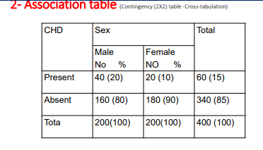
Shows the relationship between two quantitative variable. It gives idea whether there is negative or positive association between two variables in the same group
ACF and DCF are acronym for ? اختصار ل ايه يعني
ascending cumulative frequency
descending cumulative frequency
how are frequencies accumulated in ACF and DCF
in ACF frequencies are acumulated in a “less than” basis
in DCF frequencies are acumulated in a “more than” basis
association table
شبه اللي بناخده من اول السنه
master table contains what ?
Data which can be presented in numerous smaller tables is presented in one table only. It gives maximum inforamtion at a glance. Mater table should be differentiated from master sheet which containd the raw data (variables) for all studied population arranged in columns (variables) and raws (individuals)
graphical presentation is classified into 7 types
1. Pictogram
2. Pie chart
3. Bar Chart
4. Histogram
5. Scatter diagram
6. Box and whisker chart
7. Others
cartogram is
maps my man
pie (cycle)a pie chart disadvantage
is that it can only represent one variable. You will therefore need a separate pie chart for each variable you want to chart.
an alternative to the pie chart for a nominal variable
bar chart
when is grouped bar chart used
when there are more than one group
in component (proportional) bars
are stacked on top of each other
instead of appearing side by side the bars are stacked on top of each others in which graphical representation
components (proportional) bars
line graph explain structure
• A line graph connects individual data points that, typically, display quantitative values over a specified time interval. (value over time)
• Line graphs consist of two axes: x-axis (horizontal) and y-axis (vertical), graphically denoted as (x,y).
line graph are used in investing because they are
quite informative and allow the user to visualized trends
line graph most common function is ?
to create a graphical depiction of changes in values over time
line graph uses in finance
In finance, line graphs are used to create visual representations of values over time, including changes in the prices of securities.
line graph مزايا مش لاقي كلمه مناسبه
informative
allow user to visualize trends
a histogram is ?
a graph of the frequency distribution of a continuous variable
what does a histogram use to represent the number of observation for each class interval in the distribution
it uses adjoining columns
what does a histogram looks like and why
سؤال رخم غير واقعي بالمره بس يلزمني الهدف انك تحفظ الرابطه بين الجملتين وكدا كدا بعيد جدا يسالك علي معلومتين بيظهرو ورا بعض في سؤال
it looks like a bar chart but without any gaps between adjacent bars
to emphasize the continuous nature of the variable
similarity between histogram and pie chart
both can only represente one variable
one limitation of the histogram is ?
it can represent only one variable at a time (like the pie chart)
scatter diagram looks and stuff like that
scatter (x,y) plot has points that show the relationship between two sets of data
what graphical representation can read non parametric data and what is the other name of non parametric data
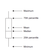
box and whisker shart
other name for non parametric data is skewed data
the central rectangle (box) represent what and what is the name of that what :)
represent data from the fisrt quartile to the 3rd quartile
its name is the interquartile range (inter معناها بين
quartile معناها ارباع فا اللي بين الارباع اكيد الاتنين اللي فالنص )
تاني حاجه هو اصلا اسمه كله box and whisker chart
فا بوكس دا اللي هو ال interquartile range
و whisker يعني الخط اللي طالع من النص فوق وتحت انا هحط معاه صوره عشان بس تتخيل شكله
فا الويسكر دا بيكون حدوده عند اقل رقم واكبر رقم
what are the 5 values that the box and whisker chart represent
minimum
first quartile
median
thirq quartile
max value
لما تشوف الصوره هتقول امال فين ال mean
ال mean يا صديقي
بيبقي في نص الجراف بالظبط فا اكيد اكيد مش هتحتاج تكتبه لانه كدا كدا موجود
وفي بعض الجرافات مش بيكتبوه فا رجعت في كلامي هو مش كدا كدا موجود
بس اذا وجد انت مش هتحتاج تدور علي قيمته
the whiskers above and below the box show ?
location of the mininmum and maximum values