statistics for midterm
1/103
There's no tags or description
Looks like no tags are added yet.
Name | Mastery | Learn | Test | Matching | Spaced | Call with Kai |
|---|
No analytics yet
Send a link to your students to track their progress
104 Terms
statistics
Statistics is a science that develops methods of data collection, analysis and presentation, thus transforming data into useful information for decision making at different levels
descriptive statistics
organizing and summarizing data using numbers and graphs, description of the state and population
inferential statistics
organizing and summarizing data using numbers and graphs, drawing conclusions about the population from a sample
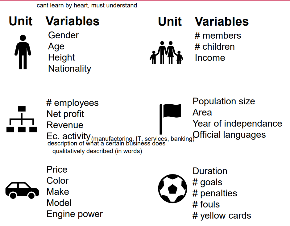
Who/what can be a unit of observation?
• a person • a couple • a family • a household • a company • a country • a car • a sports match
Unit vs. Variable vs. Value
= leonardo dicaprio example
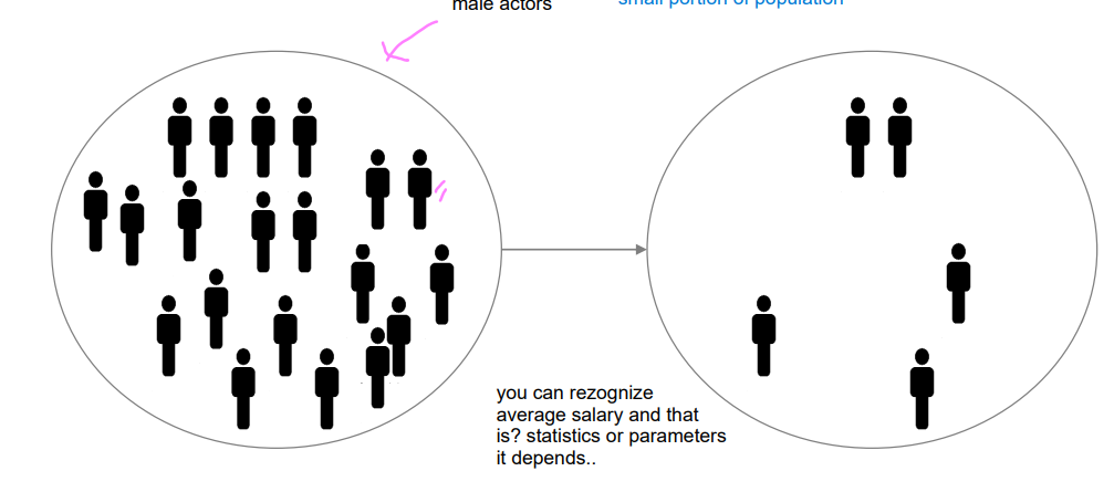
population vs sample (small portion of population) and measures
A population consists of all units that you want to describe or about which you want to draw a conclusion.
A sample is the portion of a population selected for analysis.
measures used to describe the population are called parameters.
Measures used to describe the sample are called statistics.
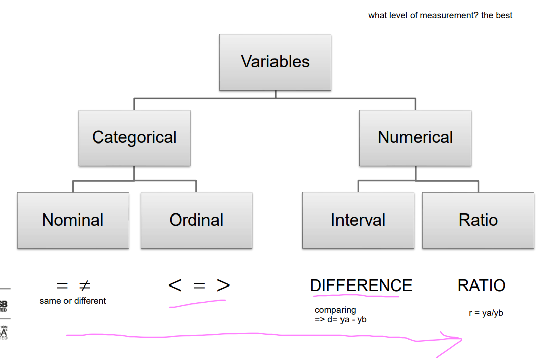
VARIABLES
A variable is a characteristic of a unit being observed that may assume more than one of a set of values.
DATA
Data are the different values of units associated with a variable. • Variables and variable values have to be interpreted the same way by everybody, i.e. they have to have universally accepted meanings explained with operational definitions
categorical and numerical variables
Categorical (qualitative, non-numeric) variables have values that can only be allocated to categories, such as “yes” and “no.”
they use words, the’re descriptive and based on observations, involves 5 senses (see, feel, taste, smell, hear):color, soft/hard, low/high, dead or alive, binary or dichotomous yes or no , 1 0, non-dichotomous 1 2
Numerical (quantitative) variables have values that represent quantities.
→Discrete numerical variables arise from counting and take only whole values (whole numbers, cant have 8.27 cats or 25.4 students)
→Continuous numerical variables arise from measuring and take any point along a continuum (speed, weight, distance from a to b can be 5.5km, many values etc in salary)
difference between mutually exclusive or exhaustive
mutually exclusive (in one category or in another) & exhaustive (include all possible options) categories.
nominal and ordinal scale
A nominal scale classifies data into distinct categories in which no order or ranking is implied.
An ordinal scale classifies data into distinct categories in which ranking is implied; it is possible to determine which category refers to larger, higher, more intensive…
interval or ratio scale
An interval scale is an ordered scale that also tells the size of intervals between measurements; the difference between measurements is a meaningful quantity. If there is a zero point, it is arbitrary.
A ratio scale is an interval scale with a true zero point
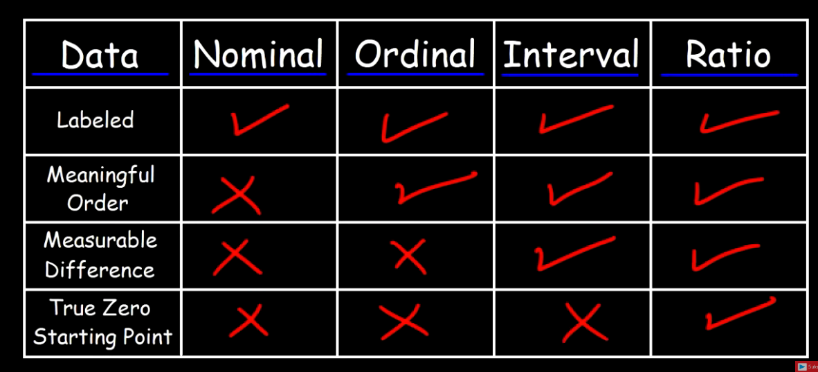
Levels of measurement
nominal: qualitative, names, colors, labels, gender, etc, order doesnt matter: 1-red, 2-blue, 3-green: cannot be used in calculation but responses can be used in calculations (most people voted for 1, 50% preferred red), individual colors cannot be used in calculations, qualitative
for other ORDER does matter
ordinal: ranking/placement, order matters, differences cannot be measures; used to rank things: 1st place, 2nd place or 3rd place winner, order matters, difference cannot be measured but it isnt same from 1 to 2 and 1 to 3; 1st person arrived at 4:53 and 2nd at 4:55 and only 2s difference, between 1 and 3 much higher, without time you cant measure the difference really, cant tell how much better 1st winner is; 2nd example: excellent, good, ok, bad
interval scale data: order matters, differences can be measured, no true zeroes starting points; temp 30C, 60C, 90C so 60 higher by 30 than 30, difference can be measured, cant measure ratio: 60 isnt 2x high as 30, if zou divide 60/30=2 it doesnt mean it is twice as hot; 0C isnt lowest, it can be -40C, no true 0 starting point, 30 lower than 60 lower than 90 so order matters
ratio scale data: order matters, differences are measurable (including ratios), contains a 0 starting point; grades: 30, 56, 70, 82, 90; order matters, difference can be measured 56-30+26 etc, ratio can be measured 90/30=3 student has 3x higher grade, has 0 starting point, student that has 0 either had all wrong answers or didnt show up: it has meaning, value, cant have score lower than 0, 0 is true starting point
ordered array
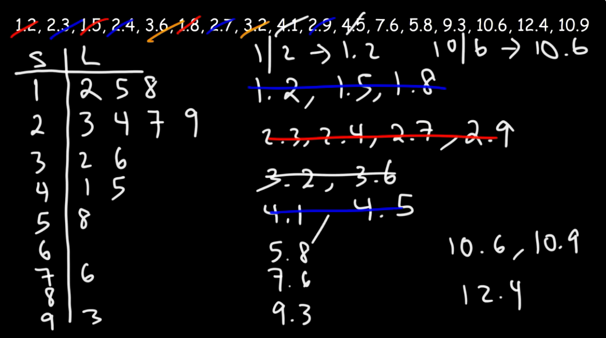
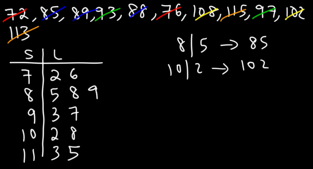
= a set of data arranged in ascending (from min value to max value) or descending order (from max value to min value)
A technique of exploratory data analysis.
• Shows all values Only for small data sets • Shows range (min - max) • Suggests variability • Suggests outliers
Read the numbers, Add the key
Construction:
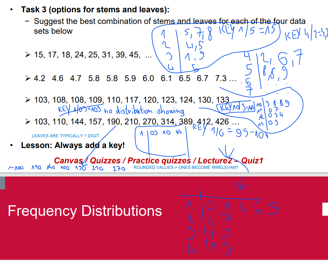
➢ put values in an (ascending) ordered array ➢ separate each value into a stem and a leaf ➢ put all (different) stems in the left column ➢ put all leaves in the right column
Advantages:
➢easy to create ➢preserves each particular value (often in raw form), which is highly informative ➢shows the distribution of values ➢indicates largest clustering of values ➢suggests outliers
• Disadvantages:
➢not for very small or very large data sets
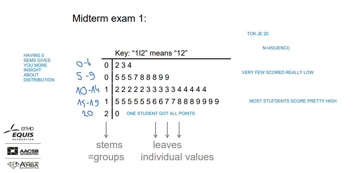
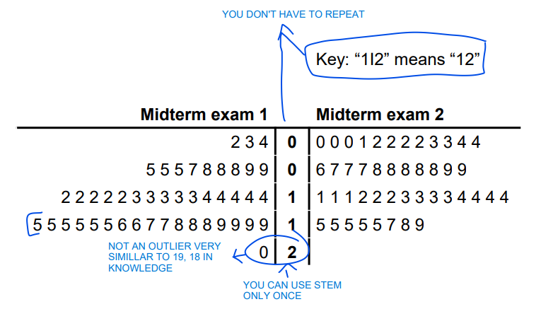
midterm example
A side-by-side stem-and-leaf display
Task 2 (comparison of two displays): What conclusions can you make? − You can display the two displays separately, or use the same stems and flip around the left stem-and-leaf display (to be used for an easier comparison (e.g. before – after, male – female, class A – class B etc.)
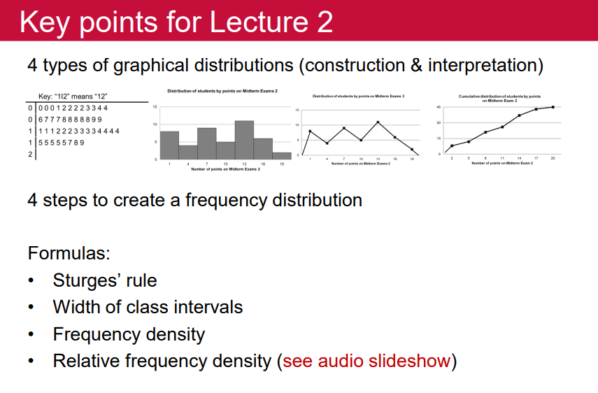
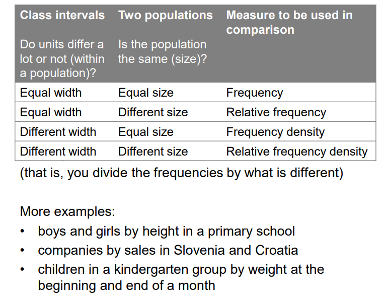
Frequency, Frequency Distribution
Frequency = the number of instances, observations or occurrence
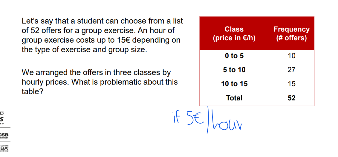
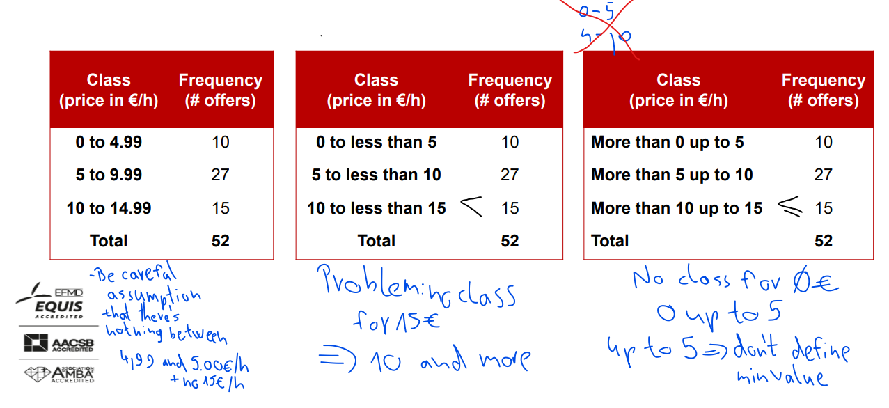
• Frequency distribution = an arrangement of (all) data into (several) classes ⇒ TABLES and/or CHARTS
Classes: • Mutually exclusive • Exhaustive • Numerically ordered
all frequencies = size in total
Frequency distribution offers insight into the main characteristics of the data, especially: ➢ where the units are clustered (center) ➢ the approximate range ➢ possible outliers…
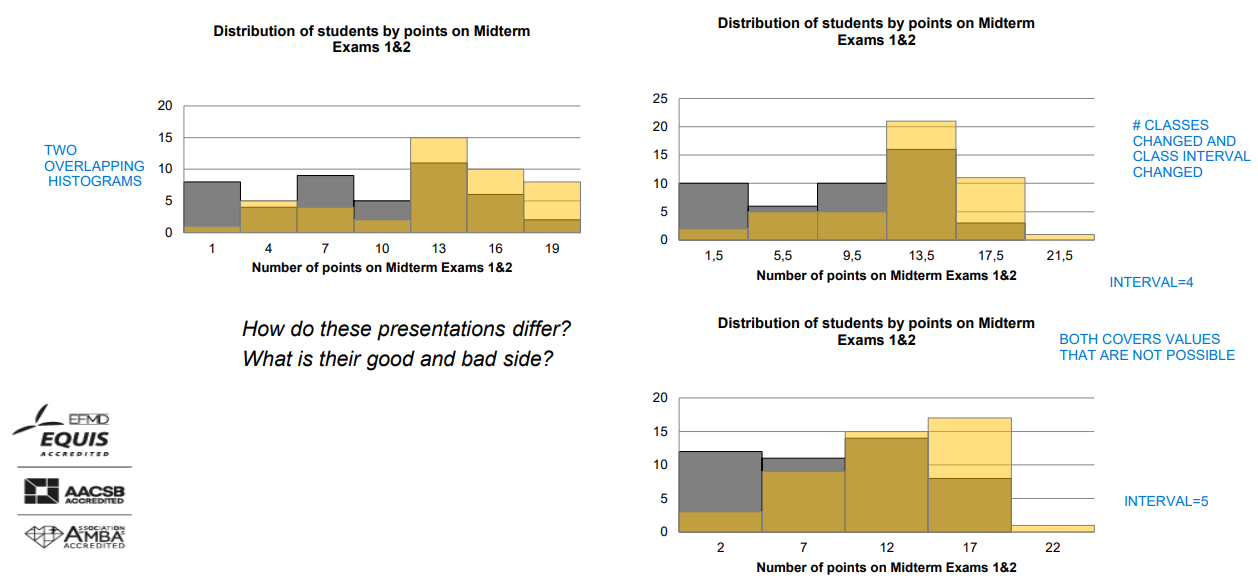
• Different class bounds may result in: ➢ different visualisations of the same data set ➢ different modes (peaks) but the larger the data set (more units included), less impact of class bounds on interpretation
• Frequency distributions can also be applied to categorical data but you cannot draw a histogram!
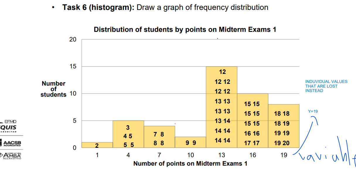
histogram
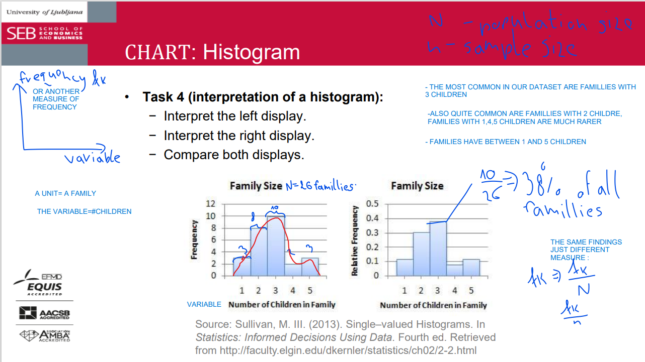
histogram 2
• a special vertical bar chart with no gaps between adjacent bars • horizontal axis (X) = a numerical scale; shows the values (variable of interest) • vertical axis (Y) uses units, percentages,… to show clustering of units • each bar represents one class: ➢ bar width = class interval ➢ bar height = frequency, relative/percentage frequency, density
IF THERE IS A GAP IN TH HISTOGRAM IT HAS A MEANING
usually it has not the space in between, if it does, it has a meaning
space without meaning-bar chart
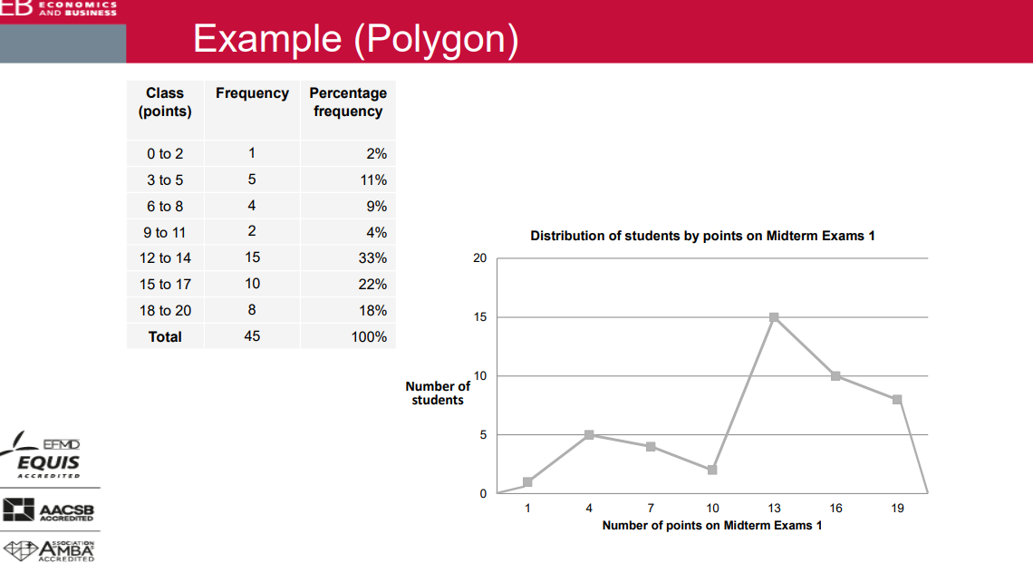
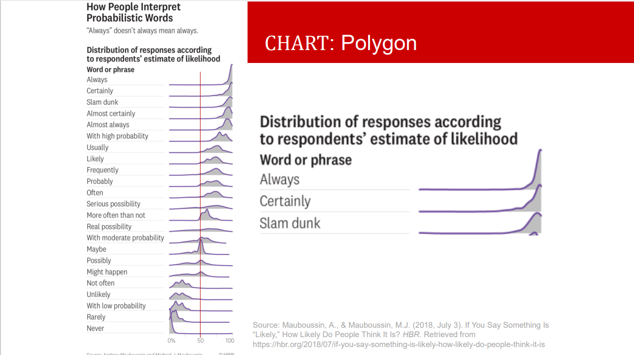
polygon
when will you use equal and when unequal intervals?
Always consider equal intervals first: easy to draw and explain
Unequal intervals = increasing intervals • for data with high variation • when the higher values are a few times larger than the lower values • frequency becomes irrelevant for comparison!
unequal-> density
company size: micro: 0-9(employes)
small: 10-49
medium: 50-249
large: 250+
number of classes
Enough classes to show variation without being (nearly) empty.
• In practice this means between 5 and 15(20).
• Sturges' rule suggests where to start:
= 1 + 3.322 * log10 (n) where n is the total number of observations (sample size, population size)
try to avoid empty classes
n is size
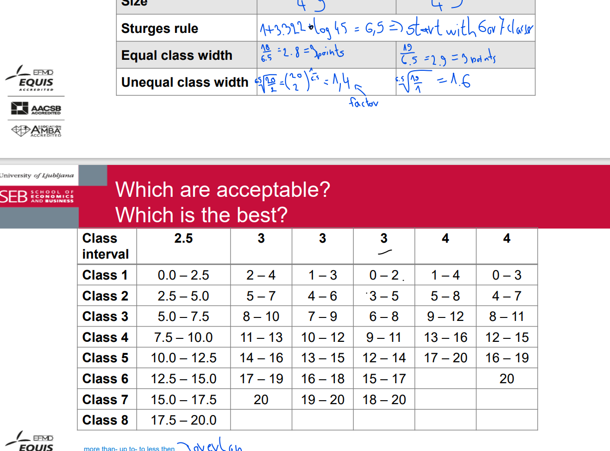
width of class intervals
• Rounded bounds or limits
• If possible, avoid open classes
NUMBER OF CLASSES
upper - lower bond
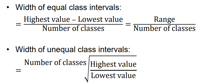
range
ymax - ymin
size
number of units
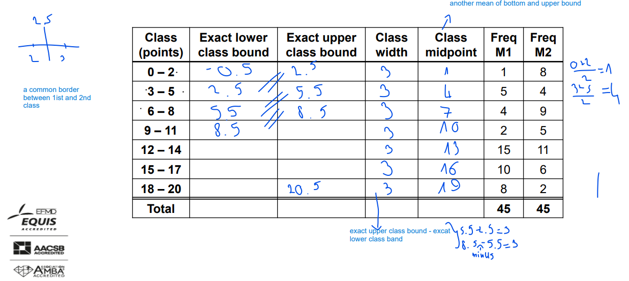
lower and upper class bound

class midpoint
(y0+y1) /2
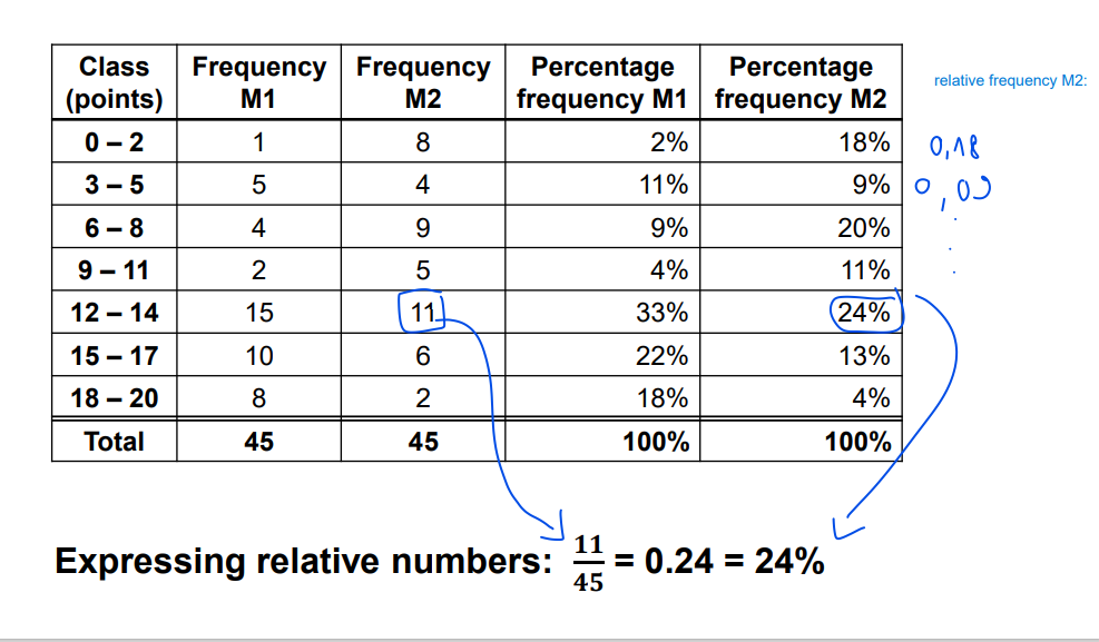
relative frequency
frequency / size
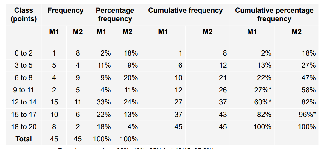
cumulative frequency
adding previous frequency and then for cumulative frequency calculate % of total size, last class should be equal to 100%
* Rounding error (e.g. 82%+13%=95% but 43/45=95.6%) It is safer to calculate cumulative percentage frequency from absolute figures (frequencies or cumulative frequencies) than from percentage frequencies.
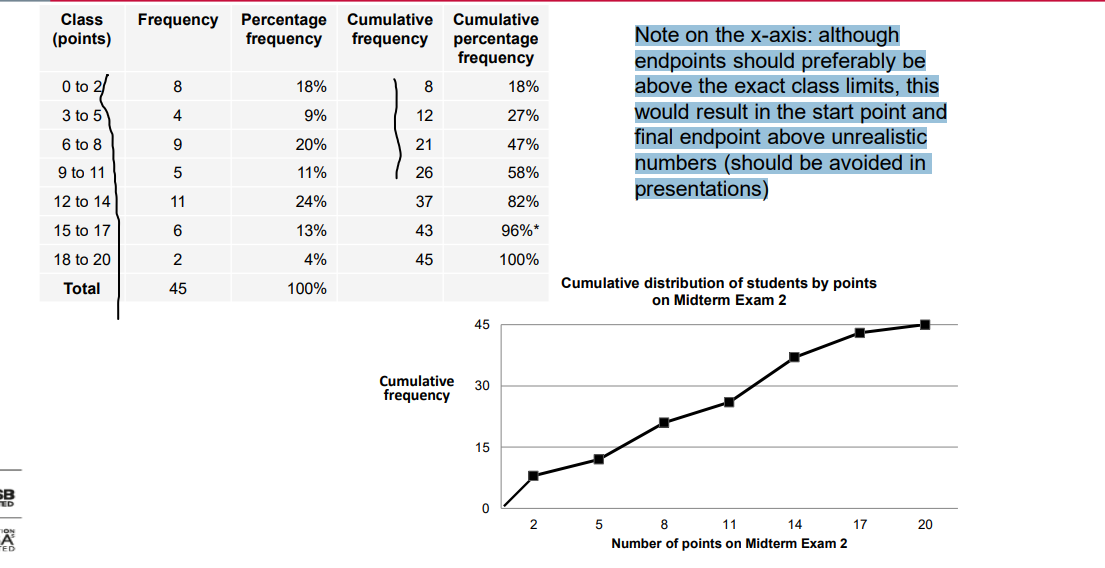
ogive
Note on the x-axis: although endpoints should preferably be above the exact class limits, this would result in the start point and final endpoint above unrealistic numbers (should be avoided in presentations)
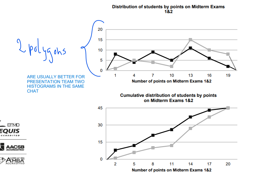
Polygon & Ogive
• Line graphs derived from a frequency distribution with the variable of interest along the x-axis.
• Polygon is similar to a histogram: each bar/class is represented by the class midpoint (in the middle of the bar top); all points are connected with lines; the two endpoints are on the x-axis.
• Ogive is based on cumulative frequencies: each class gets a point above the (exact) upper class limit; all points are connected with lines; the left endpoint is on the x-axis.
• Useful when there are two or more distributions to compare.
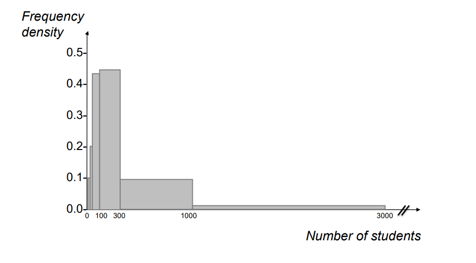
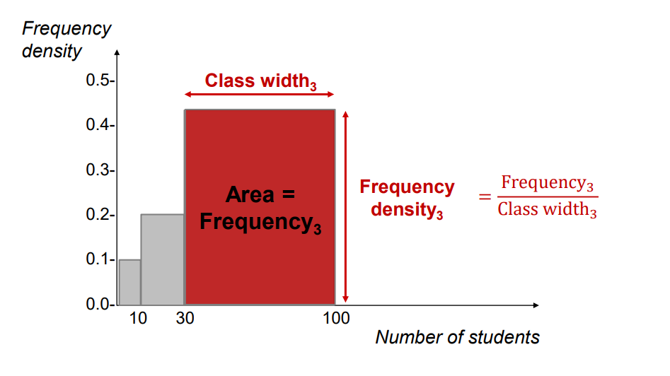
Frequency Density
• If you have k-classes of unequal width (differently wide intervals), you have to compare frequency density across these classes or populations (not frequencies because you have to adjust for different class width)
unequal class width → frequency density
Frequency density𝑗 = Frequency𝑗 / Class width𝑗
• adjusted for different class width
• used on the y-axis of the histogram and polygon
Overview of lecture 2
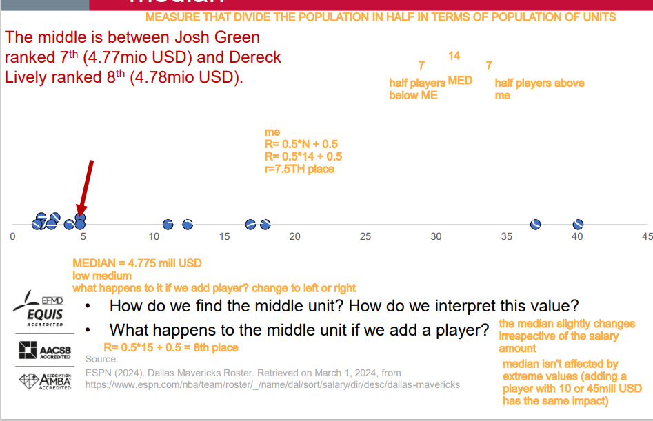
median
The second quartile (Q2 ) or the median is the value of which half of the observations have smaller values and the other half have larger values.
=> NOT COMPLETELY OK. The boundary value is missing in this interpretation. • By convention, the boundary value is included among the smaller values: Half of the units have values up to the median and the other half of the units have larger values.
(So, while the median isn't inherently a boundary value, it does separate the dataset into two parts, and depending on the dataset's size, there can be one or two boundary values associated with it.)
the median is just the middle value of a set of numbers. If you line up all the numbers from smallest to largest, the median is the one in the middle. If there are two middle numbers, you average them to find the median. It's a way to describe where the "center" of the data is, and it's helpful because it's not influenced by extreme values as much as the average (mean).
quartiles
Q1 : 25% or ¼ of all units have up to the value of Q1 and 75% or ¾ have larger values. • Q2 : half of the observations have values up to the median and the other half have larger values. • Q3 : 75% or ¾ of the data have values up to the Q3 and above which there are 25% or ¼ of the data. • By convention, the boundary value is included among the smaller values.
Quartiles are values that split a dataset into four equal parts.
The first quartile (Q1) marks where the first 25% of the data falls.
The second quartile (Q2) is the same as the median, marking the midpoint of the data.
The third quartile (Q3) marks where the first 75% of the data falls.
Quartiles help us understand how data is spread out and if there are any extreme values.
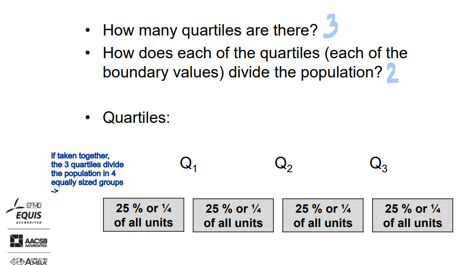
we have 3 quartiles that split the population in 4 equally sized groups
the box of the box-plot
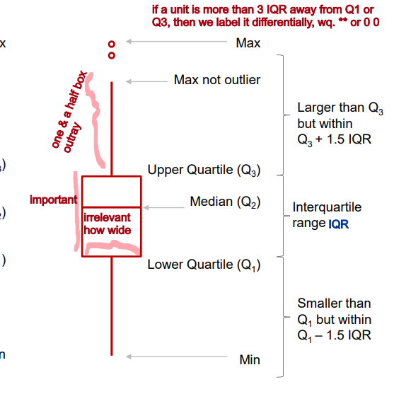
A visual presentation of the five-number summary: boxplot, also known as box-and-whisker diagram or plot. • May be drawn horizontally or vertically.
The box in a box plot represents the middle 50% of the data. It starts at the first quartile (Q1) and ends at the third quartile (Q3). This area of the box plot shows where the majority of the data lies.
indicator that we can calculate and interpret for the box is interquartile range.
interquartile range
indicator that we can calculate and interpret for the box is interquartile range.
The interquartile range (IQR) is a measure of how spread out the middle portion of a dataset is. It's the difference between the value that separates the bottom 25% of the data (Q1) and the value that separates the top 25% (Q3). Essentially, it shows us how much the middle part of the data stretches.
Imagine you have a box of toys. Now, let's say you divide those toys into four equal groups. The interquartile range, or IQR for short, is like measuring how much space the toys take up in the middle two groups.
First, you look at the toy that's in the middle of the first half of the toys. Let's call it the "25% mark". Then, you find the toy that's in the middle of the second half of the toys. We'll call it the "75% mark".
Now, if you take away the toys from the 25% mark to the 75% mark, you're left with only the toys in the middle. The difference in space between these two marks is the interquartile range. It's like saying, "This is how much space the toys in the middle take up."
So, the interquartile range tells us how much the toys in the middle spread out. If it's big, it means those toys are spread out more. If it's small, they're closer together.
q3 - q1 = interquartile range
whiskers
Whiskers can represent different values but most commonly: ➢ min and max ➢ the smallest observation between Q1 and Q1 – 1.5*IQR and the largest observation between Q3 and Q3 + 1.5*IQR
short whisker
Short whiskers in a box plot indicate that the data is less spread out. This means that there's a smaller range between the smallest and largest values in the dataset. In other words, the data points are more concentrated and there is less variability. Short whiskers suggest that the majority of the data points are clustered closer together without many outliers.

long whisker
Long whiskers in a box plot indicate that the data is more spread out. This means that there's a wider range between the smallest and largest values in the dataset. In other words, there's more variability in the data points. Long whiskers suggest that there might be outliers or that the data is more dispersed, while short whiskers indicate less variability and a tighter concentration of data points.
outlier
Values treated as outliers: 1.5*IQR or 3*IQR below Q1 and above Q3 (suspected outliers vs. outliers; outliers vs. extreme outliers). Graphically outliers are any data beyond whiskers and can be specially marked (e.g. with dots, stars etc.).
Imagine you have a group of friends, and you're all comparing your scores on a test. Most of your friends got scores around 80-90, but one friend got a score of 10. That friend's score is an outlier because it's much lower than everyone else's.
So, in simple terms, an outlier is just a data point that's very different from the others in the group.
threshold
A threshold is like a boundary or limit that determines when something happens or changes. It's like a cutoff point that separates one state from another.
For example, let's say you have a threshold of 60% on a test. If you score below 60%, you fail the test. But if you score 60% or above, you pass. In this case, 60% is the threshold that determines whether you pass or fail.
q3 + 1.5 IQR = threshold
q1 - 1.5 IQR = threshold
the last unit before the threshold becomes the end of the whicker and points beyond this threshold are outliers
two possible box plot orientations
Vertical Orientation: The box plot looks like a standing box. The box shows where most of the data lies, and the whiskers extend upwards and downwards. It's like a vertical snapshot of the data.
Horizontal Orientation: The box plot looks like a lying-down box. The box shows where most of the data lies, and the whiskers extend to the left and right. It's like a horizontal snapshot of the data.
Both types help us understand the spread and distribution of the data, just in different orientations.
how many quartiles are there?
3
The first quartile (Q1)
The second quartile (Q2), which is also the median
The third quartile (Q3)
These quartiles divide a dataset into four equal parts, each containing approximately 25% of the data.
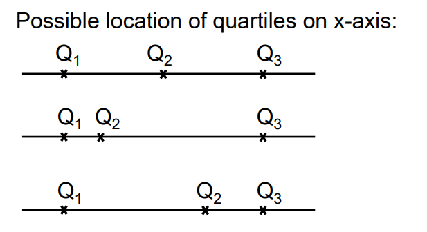
How does each of the quartiles (each of the boundary values) divide the population?
First Quartile (Q1): This divides the population into two parts. Approximately 25% of the data falls below Q1, while about 75% of the data falls above it.
Second Quartile (Q2): This is the median and divides the population into two equal parts. 50% of the data falls below Q2, and 50% falls above it.
Third Quartile (Q3): This also divides the population into two parts. Approximately 75% of the data falls below Q3, while about 25% of the data falls above it.
taken together, the 3 quartiles divide the population in 4 equally sized groups.
Five-Number Summary
The five numbers that help describe the distribution of data:
Minimum: lower extreme
First Quartile (Q1): lower quartile, Where the first 25% of the data lies.
Median (Q2): second quartile, The middle value, separating the data into halves.
Third Quartile (Q3): Where the first 75% of the data lies, upper quartile
Maximum: upper extreme
A visual presentation of the five-number summary: boxplot, also known as box-and-whisker diagram or plot. • May be drawn horizontally or vertically.
mean
Mean is sometimes indicated besides the median.
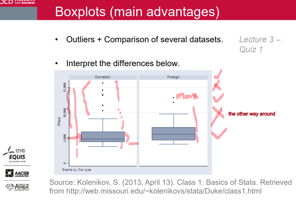
Boxplots (main advantages)
Quantiles
Most frequently used quantiles:
➢ percentiles
➢ deciles
➢ quintiles - inequality and measures of concentration
➢ quartiles
➢ median
• Quantiles divide a data set into equal-sized groups, e.g. all 99 percentiles / 9 deciles / 4 quintiles / 3 quartiles / the median divide(s) a data set into 100 / 10 / 5 / 4 / 2 equal-sized groups.
=> each group has an equal number of units
=> quantiles are values marking the boundaries between the groups (it depends on the distribution of values, if these values are close or distant to each other).
Quantiles are essentially the same concept as quartiles, but they're a more general way to divide a dataset into equal portions. While quartiles divide a dataset into four parts, quantiles divide it into any number of parts.
Quantiles are useful for understanding how data is distributed across different parts of a dataset, just like quartiles, but they offer more flexibility in dividing the data into different portions.
The simplest approach (FYI)
• Step 1: determine quantile rank P
• Step 2: determine the location (=rank) of the quantile: R = (N + 1) * P
• Step 3a: if you get an integer, the value with that rank is the quantile
• Step 3b: if you get a fraction, round it down to the nearest integer and round it up to the nearest integer, take the values at these two locations and compute the mean to get the quantile.
A more precise approach (in exams!)
• Step 1: determine quantile rank P
• Step 2: determine rank RP = N * P + 0.5
• Step 3a: if you get an integer, take the value at that rank.
• Step 3b: if you get a fraction, use linear interpolation to calculate the value.
• Take into account that average ranks should be determined in case there are several observations with the same value.
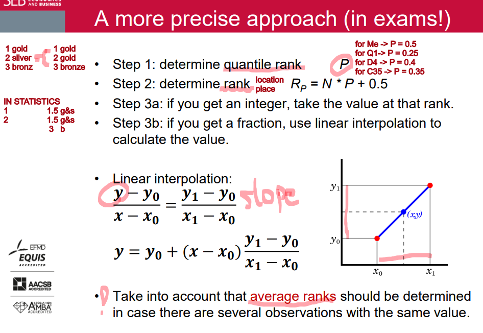
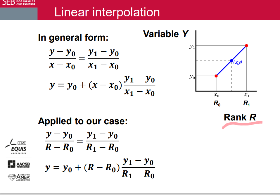
Linear interpolation
Exercise
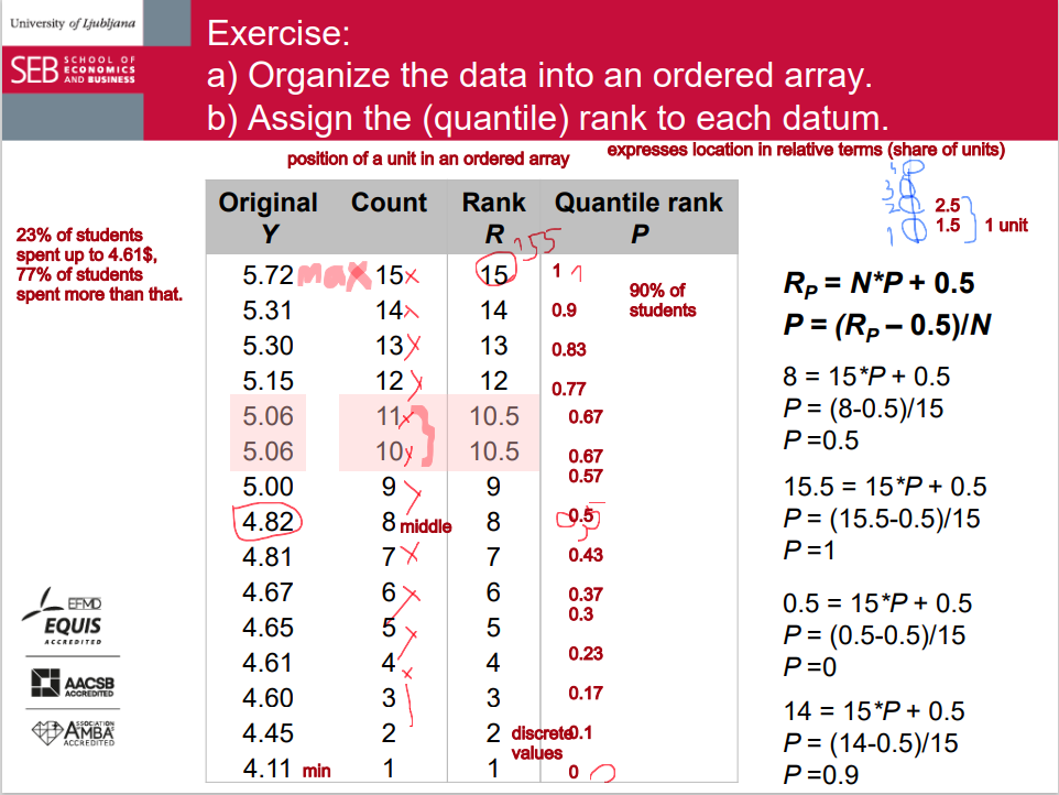
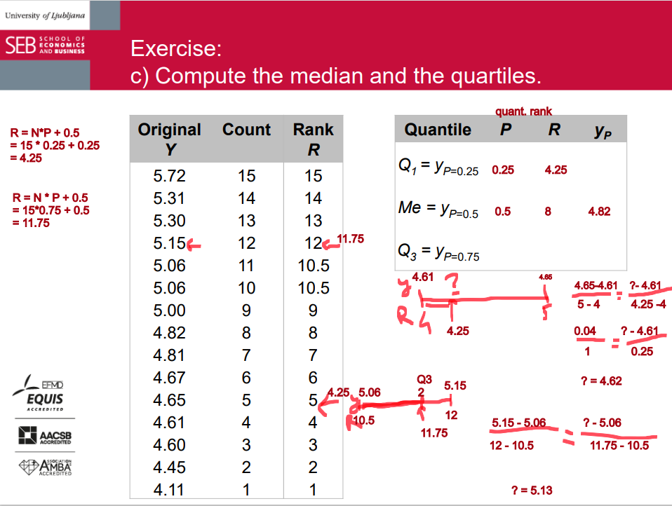
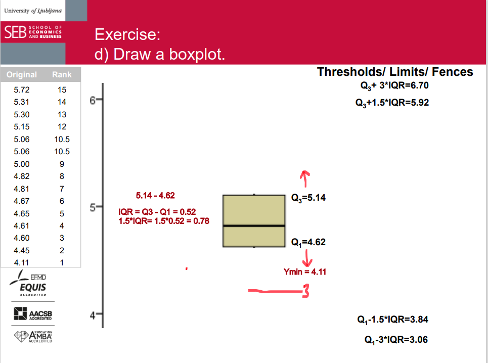
• Analyze data on weekly cost of calls from mobile phones for a group of 15 students (EUR):
4.11; 5.31; 4.82; 5.06; 5.00; 5.72; 4.45; 5.06; 5.30; 4.61; 4.65; 4.67; 4.60; 4.81; 5.15
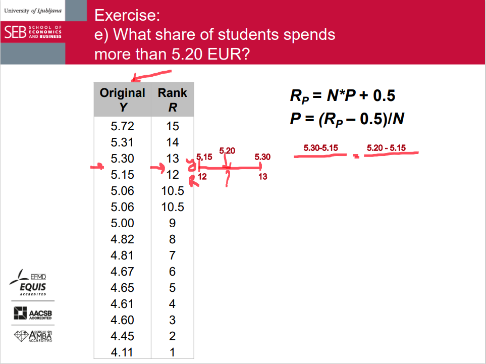
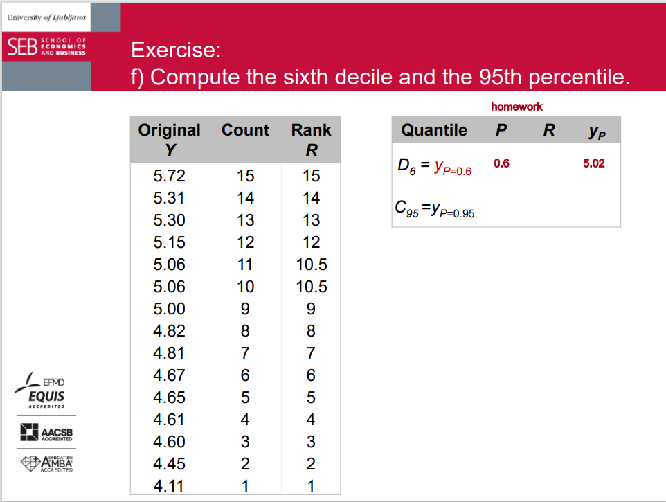
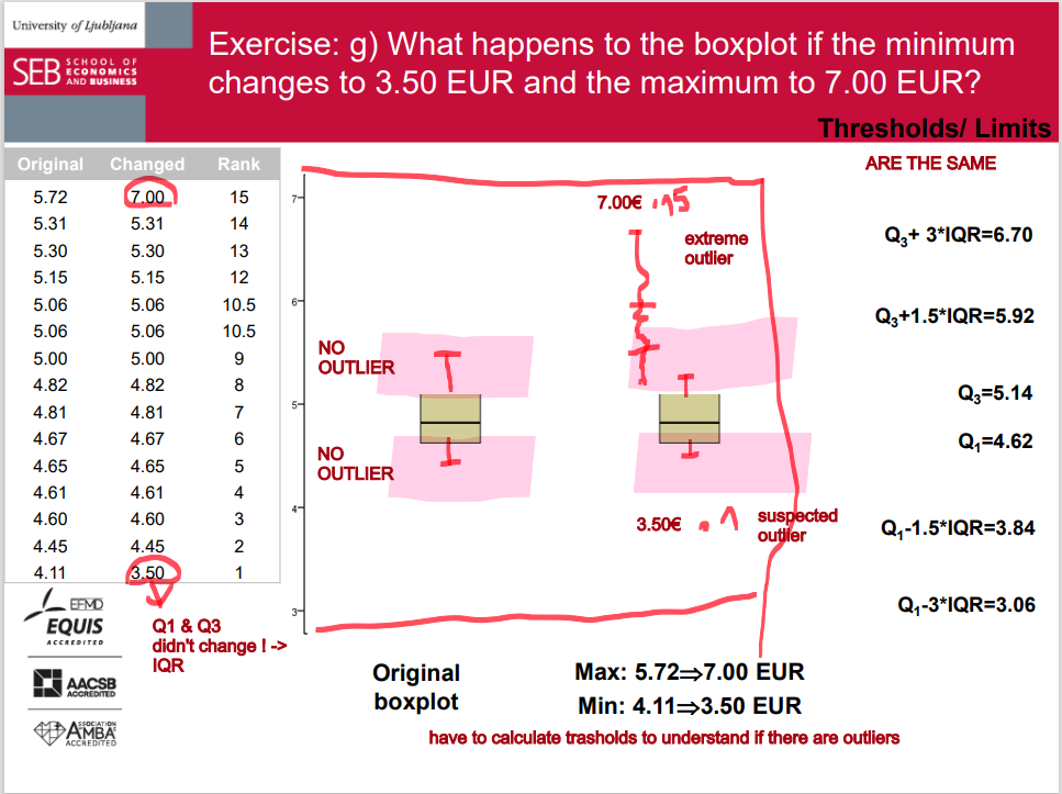
a) Organize the data into an ordered array. b) Assign the (quantile) rank to each datum. c) Compute the median and the quartiles d) Draw a boxplot. e) What share of students spends more than 5.20 EUR? f) Compute the sixth decile and the 95th percentile. g) What happens to the boxplot if the minimum changes to 3.50 EUR and the maximum to 7.00 EUR?
continuation 1
continuation 2
Measures of Central Tendency = Averages
Most common averages in statistics:
(Arithmetic) mean
Median
Mode - how different values in data set are
Other averages:
Geometric mean
Harmonic mean
...
mean
Arithmetic mean: often called the mean or average.
The most common measure of central tendency.
Individual values vary around the mean.
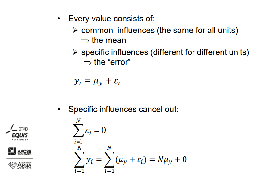
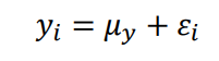
Mean is such a value that the sum of squared deviations of individual values from the mean is minimized.
For numerical variables only (interval or ratio measurement scale).
Sensitive to extreme values; not robust.
The mean, also known as the average, is a measure of central tendency in statistics. It's calculated by adding up all the values in a dataset and then dividing by the number of values.
Here's a simplified explanation:
Imagine you have some numbers: 2, 4, 6, 8, and 10. To find the mean, you add up all these numbers (2 + 4 + 6 + 8 + 10 = 30) and then divide by how many numbers there are (5). So, the mean is 30 divided by 5, which equals 6.
In simple terms, the mean tells you the "middle" of your data. It's like finding a balance point where the values on one side are the same as the values on the other side when added up.
Mean: population vs. sample
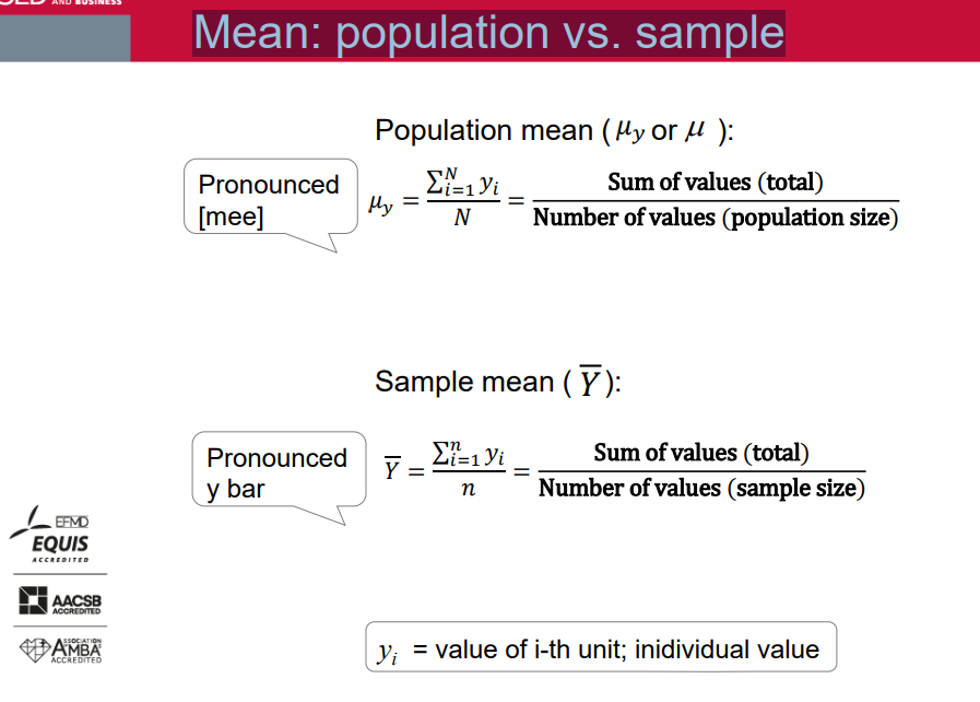
Mean: the main characteristic
Mean: illustration
• mean is such a value that the sum of squared deviations of individual values from the mean is minimised
Mean: example
Points from Midterm exam 1; Calculate the mean based on individual values: 2 3 4 5 5 5 7 8 8 8 9 9 12 12 12 12 12 13 13 13 13 13 14 14 14 14 14 15 15 15 15 15 15 16 16 17 17 18 18 18 19 19 19 19 20
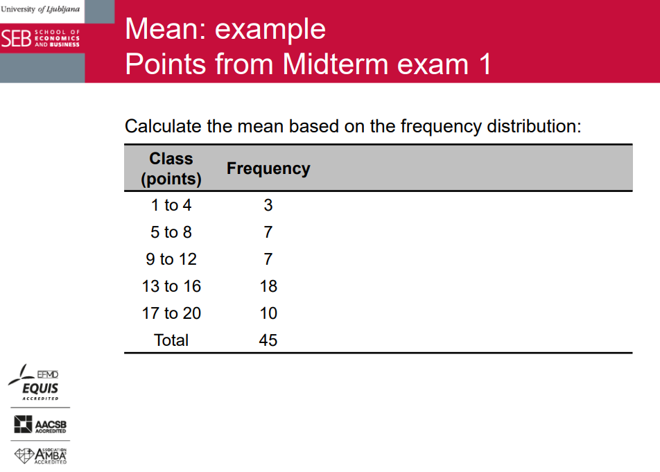
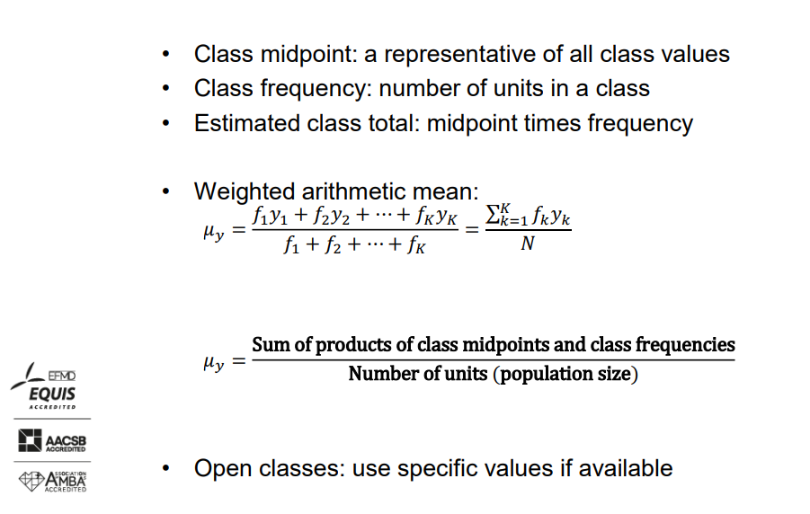
Mean: frequency distribution
Class midpoint: a representative of all class values.
Class frequency: number of units in a class.
Estimated class total: midpoint times frequency.
Weighted arithmetic mean:
𝜇𝑦 = (𝑓₁𝑦₁ + 𝑓₂𝑦₂ + ⋯ + 𝑓ₖ𝑦ₖ) / (𝑓₁ + 𝑓₂ + ⋯ + 𝑓ₖ)
= σₖ=₁ (𝑓ₖ𝑦ₖ) / 𝑁 where 𝜇𝑦 is the weighted arithmetic mean, 𝑓₁, 𝑓₂, ..., 𝑓ₖ are class frequencies, 𝑦₁, 𝑦₂, ..., 𝑦ₖ are class midpoints, 𝑁 is the number of units (population size).
𝜇𝑦 = Sum of products of class midpoints and class frequencies / Number of units (population size).
Open classes: use specific values if available.
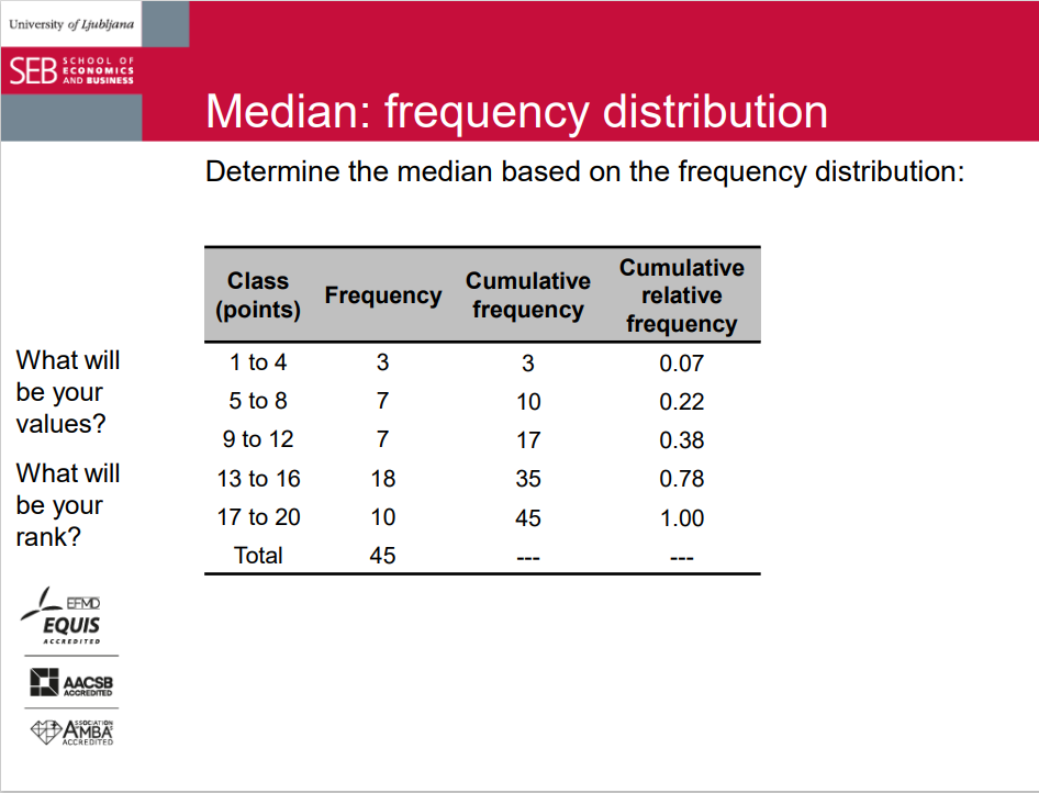
Median
- The only quantile that divides the population (or sample) in two equally numerous parts.
- Which quantiles are the same as the median?
- Median is such a value that the sum of absolute deviations of individual values from the median is minimized.
- For numerical and ordered categorical variables (ordinal, interval, or ratio measurement scale).
- No need to know all values.
- Not sensitive to extreme values.
- Depends on the number of units.
- Easy to determine if repeated values are ignored. The middle value of ordered units:
- odd number of units ⇒
- even number of units ⇒
The median is another measure of central tendency in statistics, like the mean and mode. It's the middle value of a dataset when the values are arranged in order from least to greatest.
Here's a simple explanation:
Imagine you have a list of numbers: {3, 5, 7, 8, 10}. To find the median, you arrange these numbers in order: {3, 5, 7, 8, 10}. Since there are five numbers, the middle one is the third number, which is 7. So, 7 is the median of this dataset.
If you have an even number of values, you take the average of the two middle values. For example, for the dataset {3, 5, 7, 8, 10, 12}, you'd arrange the numbers in order: {3, 5, 7, 8, 10, 12}. Now, there are six numbers, so the two middle numbers are 7 and 8. The average of these two numbers is (7 + 8) / 2 = 7.5. So, 7.5 is the median of this dataset.
The median is often used when there are extreme values (outliers) in the dataset because it's less affected by them than the mean.
Median: determination & example
• Calculate the median based on individual values: 2 3 4 5 5 5 7 8 8 8 9 9 12 12 12 12 12 13 13 13 13 13 14 14 14 14 14 15 15 15 15 15 15 16 16 17 17 18 18 18 19 19 19 19 20
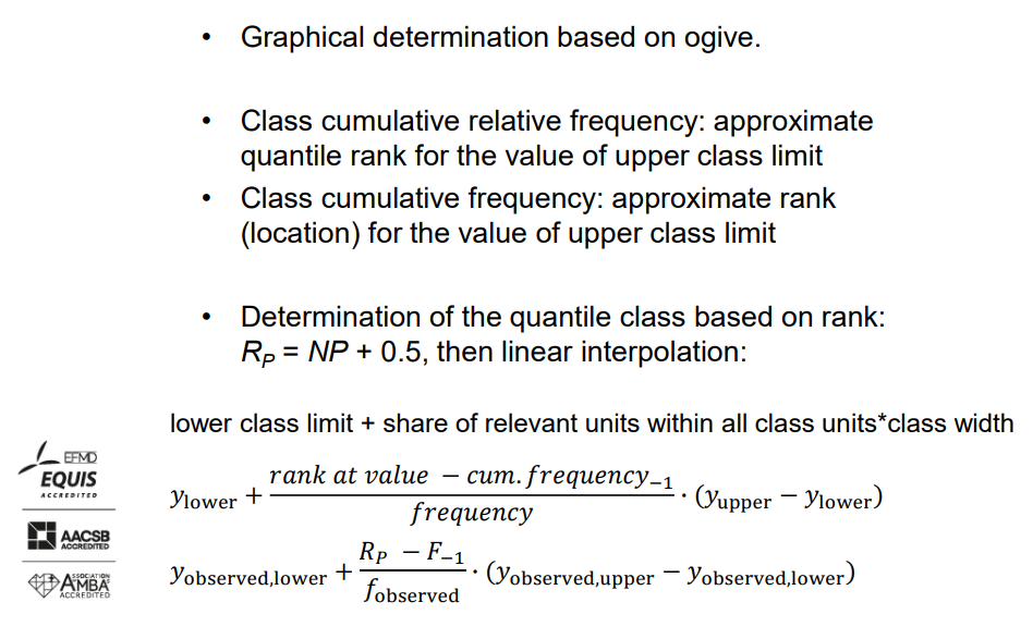
Quantiles: frequency distribution
- Graphical determination based on ogive.
- Class cumulative relative frequency: approximate quantile rank for the value of upper class limit.
- Class cumulative frequency: approximate rank (location) for the value of upper class limit.
- Determination of the quantile class based on rank: RP = NP + 0.5, then linear interpolation:
- lower class limit + share of relevant units within all class units * class width
𝑦lower +
(rank at value - cum. frequency - 1) / frequency * (𝑦upper - 𝑦lower)
- 𝑦observed,lower + (RP - F−1) / 𝑓observed * (𝑦observed,upper - 𝑦observed,lower)
Mode
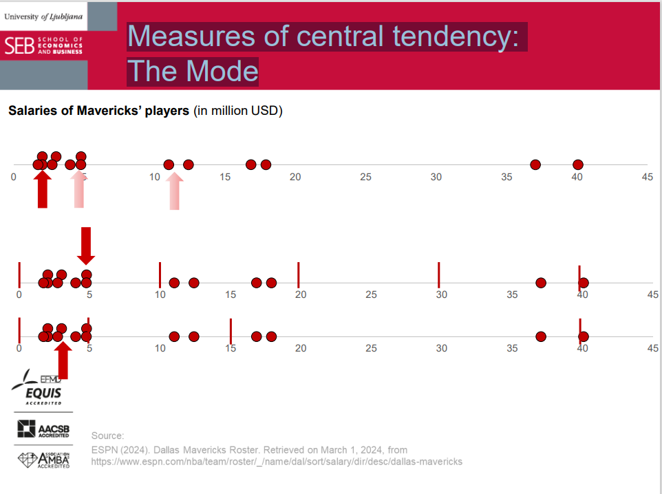
- The value that appears most frequently in a dataset (= the 'peak' in the frequency distribution).
- For all types of data (all measurement scales):
- The only measure of central tendency for nominal categorical data.
- Makes sense for a sufficiently large number of units.
- What about continuous numerical variables?
- Not affected by extreme values.
- There may be no mode or more than one mode:
- Unimodal distribution.
- Bimodal distribution.
- Multimodal distribution.
The mode is a measure of central tendency in statistics that represents the most frequently occurring value in a dataset. In simpler terms, it's the number that appears most often.
For example, consider the dataset {2, 3, 4, 4, 5, 5, 5, 6, 7}. In this dataset, the number 5 appears most frequently, so the mode of the dataset is 5.
Unlike the mean and median, the mode can be applied to any type of data, including categorical data where the values represent categories rather than numerical quantities.
The dataset can have one mode (unimodal), multiple modes (multimodal), or no mode if all values occur with the same frequency.
mode example
Determine the mode based on individual values: 2 3 4 5 5 5 7 8 8 8 9 9 12 12 12 12 12 13 13 13 13 13 14 14 14 14 14 15 15 15 15 15 15 16 16 17 17 18 18 18 19 19 19 19 20
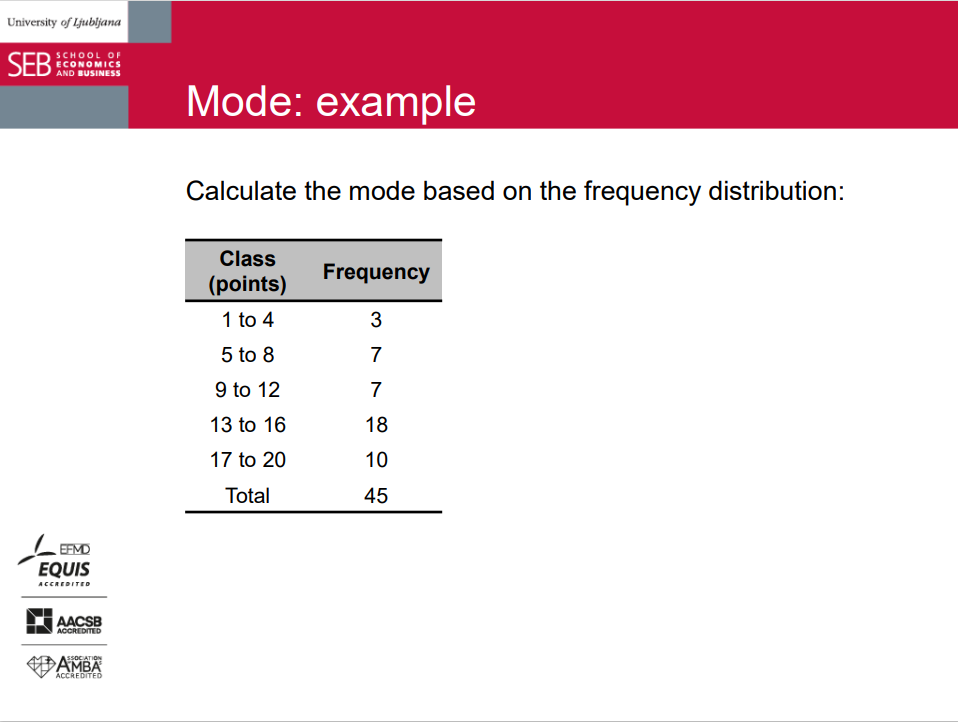
Mode: frequency distribution
- Graphical determination based on histogram.
- The simplest approach: midpoint of the class with the highest frequency (for equally-sized classes).
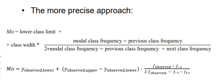
- The more precise approach:
- Mo = lower class limit + class width *
(modal class frequency - previous class frequency) /
(2 * modal class frequency - previous class frequency - next class frequency)
- 𝑀𝑜 = 𝑦observed,lower + (𝑦observed,upper − 𝑦observed,lower) ∙
(𝑓observed − 𝑓−1) / (2∙𝑓observed − 𝑓−1 − 𝑓+1)
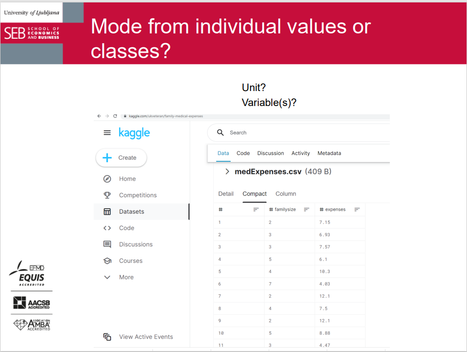
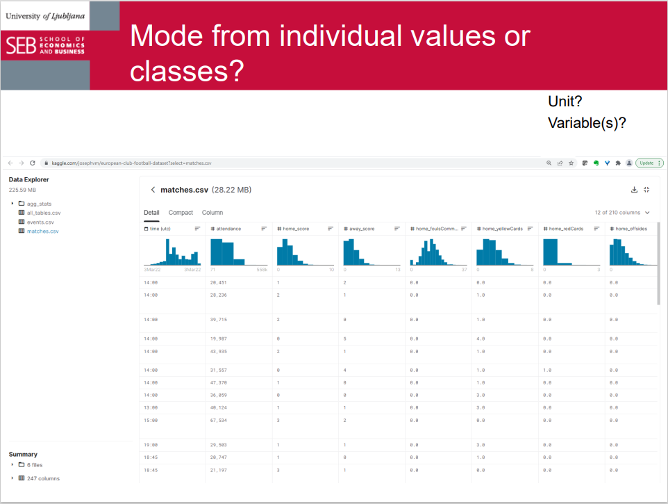
Mode from individual values or classes?
Measures of central tendency compared,
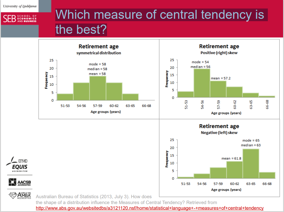
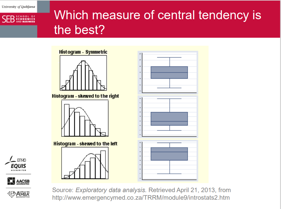
Which measure of central tendency is the best?
The mean:
For numerical variables.
Most often used. Not the best choice if extreme values exist.
The median:
For ordinal variables (any beyond).
Good complement of the mean (the best to report both).
Better if extreme values exist; if the distribution is skewed; if the values are suspected to contain measurement errors; if we have open classes in a frequency distribution...
The mode:
For nominal variables (and beyond).
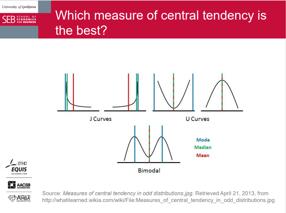
Be careful with specific distributions (e.g., bimodal, highly asymmetric, U-shape, or J-shape, etc.).
Which measure of central tendency is the best?
Which measure of central tendency is the best?
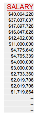
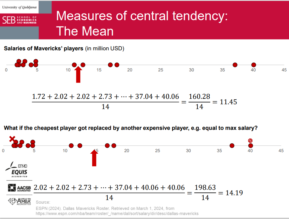
Case: Dallas Mavericks roster by salary
Measures of central tendency: The Mean
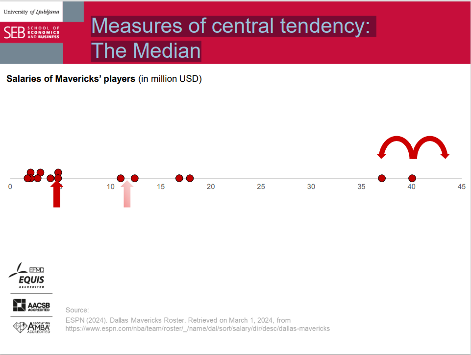
Measures of central tendency: The Median
Measures of central tendency: The Mode
Key points for Lecture 4
A Measure of Central Tendency = An average = A number representing the usual or typical value in a data set.
(Arithmetic) Mean: calculated from all (numerical) values; sensitive, not robust.
Median: determined with location of ordered data; not sensitive, robust.
Mode: most frequent (sufficiently repeated) value.
Formulas:
Mean (individual data; frequency distribution; mathematical characteristics)
Quantile rank (precise approach)
Linear interpolation
Mode (precise approach)
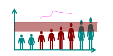
Measures of Variation
Several expressions: variation, variability, dispersion, scatter, spread, deviation…
They show how different the values in a dataset are (how different the observed units are with respect to a certain variable).
Together with measures of central location, they help describe the shape of a dataset and identify outliers.
They tell us how informative any single measure of central tendency is; how well measures of central tendency represent all units.
here's a simplified explanation of measures of variation:
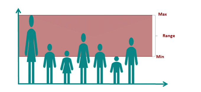
Range: Imagine you have a line of numbers from smallest to largest. The range is just the difference between the largest and smallest numbers. It tells you how spread out the numbers are.
Variance: This is like asking, "How much do the numbers vary from the average?" It's calculated by taking the average of the squared differences between each number and the average of all the numbers.
Standard Deviation: It's similar to variance but in simpler terms. It's the square root of the variance. It tells you, on average, how far each number is from the average.
Interquartile Range (IQR): Imagine you divided your numbers into four equal groups. The interquartile range is the difference between the numbers that separate the middle 50% of the data from the lowest and highest 25%. It shows you how spread out the middle of the data is.
Range: general
Here's the text formatted with correct punctuation and capitalization:
The simplest measure of variation.
Easy to compute and understand.
Range = 𝑦𝑚𝑎𝑥 − 𝑦𝑚𝑖𝑛 = maximum value – minimum value.
Not very informative:
There may be huge differences between two distributions even if they have the same range because data can be spread very differently between the two extreme points.
Sensitive to outliers.
Performs even worse for frequency distributions, especially with open classes.
Range = 𝑦𝐾,𝑢𝑝𝑝𝑒𝑟 𝑙𝑖𝑚𝑖𝑡 − 𝑦1,𝑙𝑜𝑤𝑒𝑟 𝑙𝑖𝑚𝑖𝑡 = highest upper limit – lowest lower limit.
Interquartile range (IQR): general
The range for the middle 50% of the data.
interquartile range = Q3 - Q1 = third quartile - first quartile
Not sensitive to outliers - robust
Any difference for data in frequency distribution? No, apart from the calculation procedure.
How to summarize deviations?
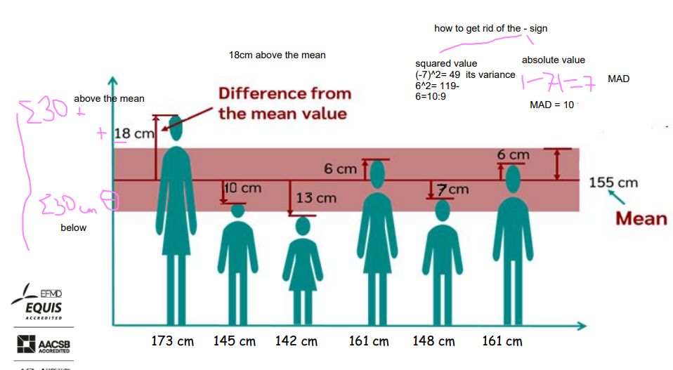
Mean (absolute) deviation: general
The mean of absolute deviations (=distances) of values from the mean:
Removes the sign of deviation.
Represents the average distance from the mean.
Formula for a sample: N → n and 𝜇𝑦→ 𝑌.
It takes into account all values.
(Somewhat) sensitive to extreme values.
Averaging distances can hide large distances.
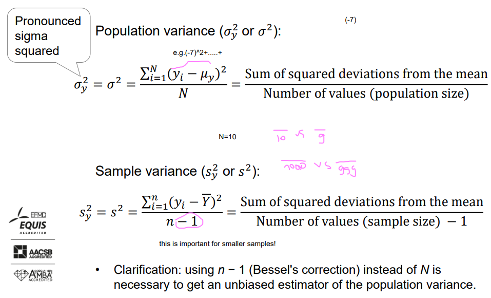
Variance: general
The mean of squared deviations of values from the mean:
Removes the sign of deviation.
More weight on more extreme values.
Units of measurement would be squared.
It takes into account all values.
(Very) sensitive to extreme values - much more than MAD
Different calculation for population & sample.
we have to be careful about outliers and eliminate them if needed
Variance: population vs. sample
variance
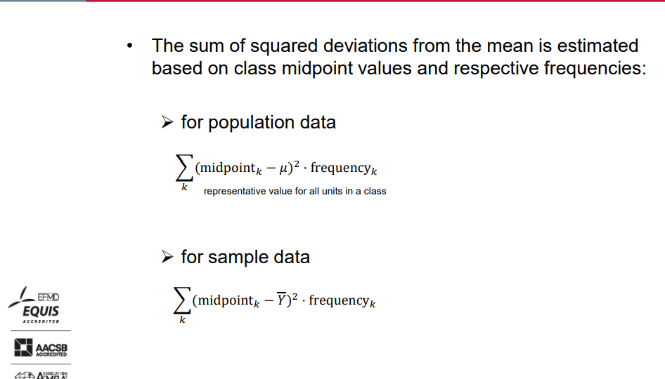
The sum of squared deviations from the mean is estimated based on class midpoint values and respective frequencies:
For population data-representative value for all units in a class
For sample data.
∑𝑘 (midpoint𝑘 − 𝜇)² ⋅ frequencyk.
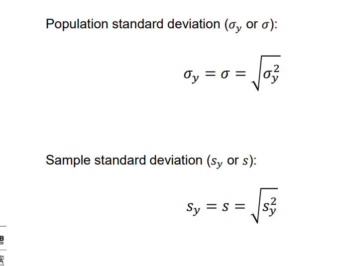
Standard deviation: general
Most commonly used measure of variation.
Shows variation of values around the mean.
Square root of variance: more intuitive interpretation and easier comparison with the mean.
Never negative.
Units of measurement the same as original data.
Still sensitive to extreme values-but much less than the variance
Easy calculation from the variance. √cm²=cm
Standard deviation: population vs. sample
Computation of variance and standard deviation
Here are the calculation steps:
Compute the mean.
Subtract the mean from each value.
Square each resulting difference.
Add the squared differences.
Divide this total by N to get population variance or by n-1 to get the sample variance!!!!!
Take the square root of the variance above to get the standard deviation.
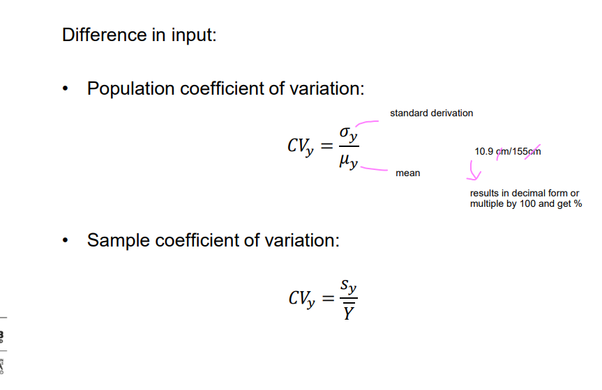
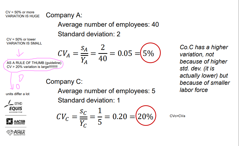
Coefficient of variation: general
Indicates how large the standard deviation is compared to the mean.
A relative measure of variation.
Often expressed as a percentage.
Appropriate to compare the variability of datasets:
With different means.
In different units of measurement.
Coefficient of variation: population vs. sample
Comparing variation – I and II
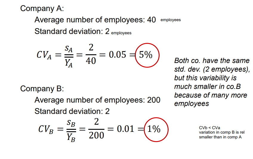
Examples
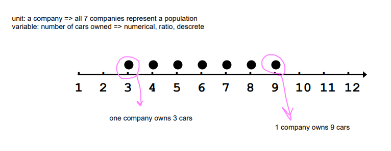
Example A: Number of cars owned
Examples A-D: Number of cars owned
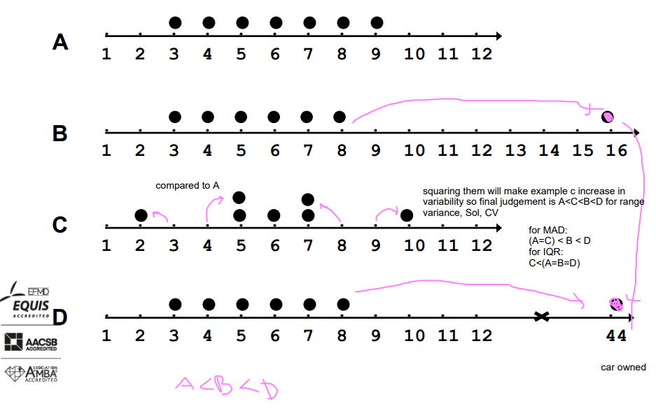
continuation
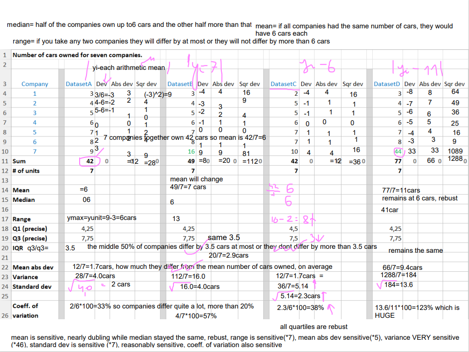
median= half of the companies own up to6 cars and the other half more than that
range= if you take any two companies they will differ by at most or they will not differ by more than 6 cars
mean= if all companies had the same number of cars, they would have 6 cars each
mean is sensitive, nearly dubling while median stayed the same, rebust, range is sensitive(*7), mean abs dev sensitive(*5), variance VERY sensitive (*46), standard dev is sensitive (*7), reasonably sensitive, coeff. of variation also sensitive
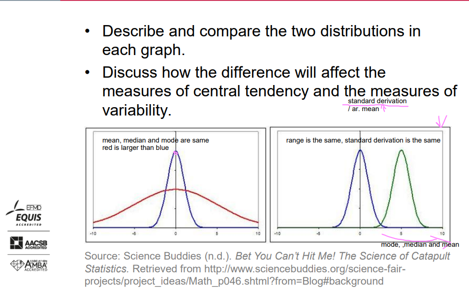
Exercise – Quiz2
Describe and compare the two distributions in each graph.
Discuss how the difference will affect the measures of central tendency and the measures of variability.
Comparison of range, variance and standard deviation
The more the units are different to each other (i.e., data are spread out), the greater the range, variance, and standard deviation. On the contrary, the more the units are clustered (i.e., the data are similar), the smaller the range, variance, and standard deviation.
If the values are all the same (i.e., there is no variation among units), all these measures will be zero.
All these measures have units (original or squared) and cannot be negative-we dont use them
These measures may be problematic for comparison purposes. Solution? CV as a relative measure
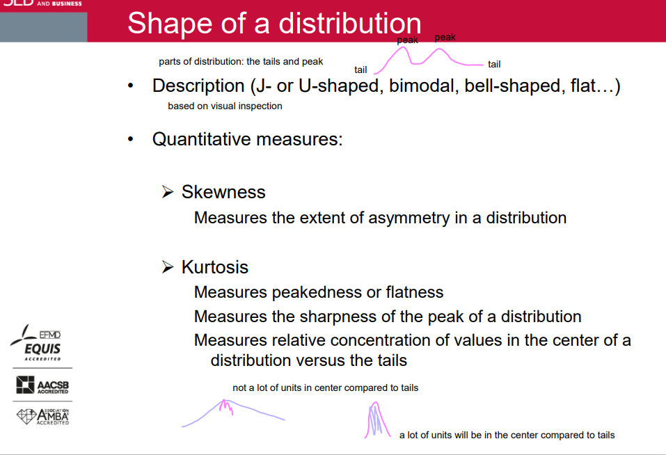
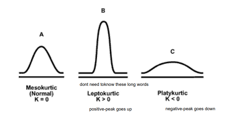
Shape of a distribution
• Description (J- or U-shaped, bimodal, bell-shaped, flat…)
• Quantitative measures:
➢ Skewness Measures the extent of asymmetry in a distribution
➢ Kurtosis:
Measures peakedness or flatness
Measures the sharpness of the peak of a distribution
Measures relative concentration of values in the center of a distribution versus the tails
Skewness statistic
Skewness statistic >0 (positive skew)
Skewness statistic =0
Skewness statistic <0 (negative skew)
if skewnes stats =5, the skew is very large
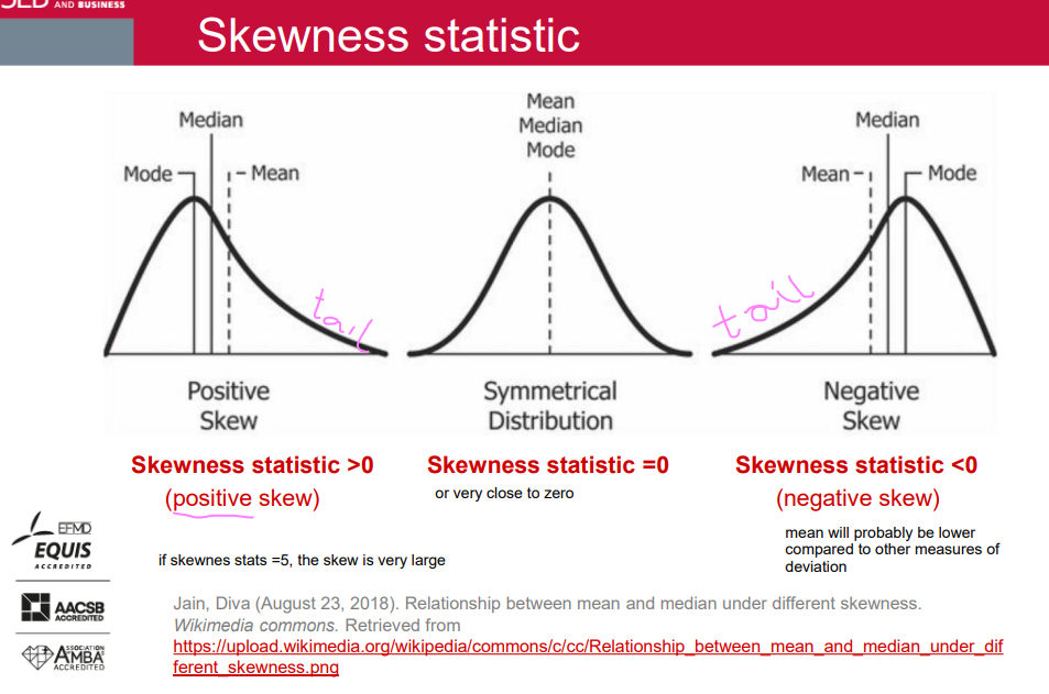
Skewness
A rule of thumb (not every time):
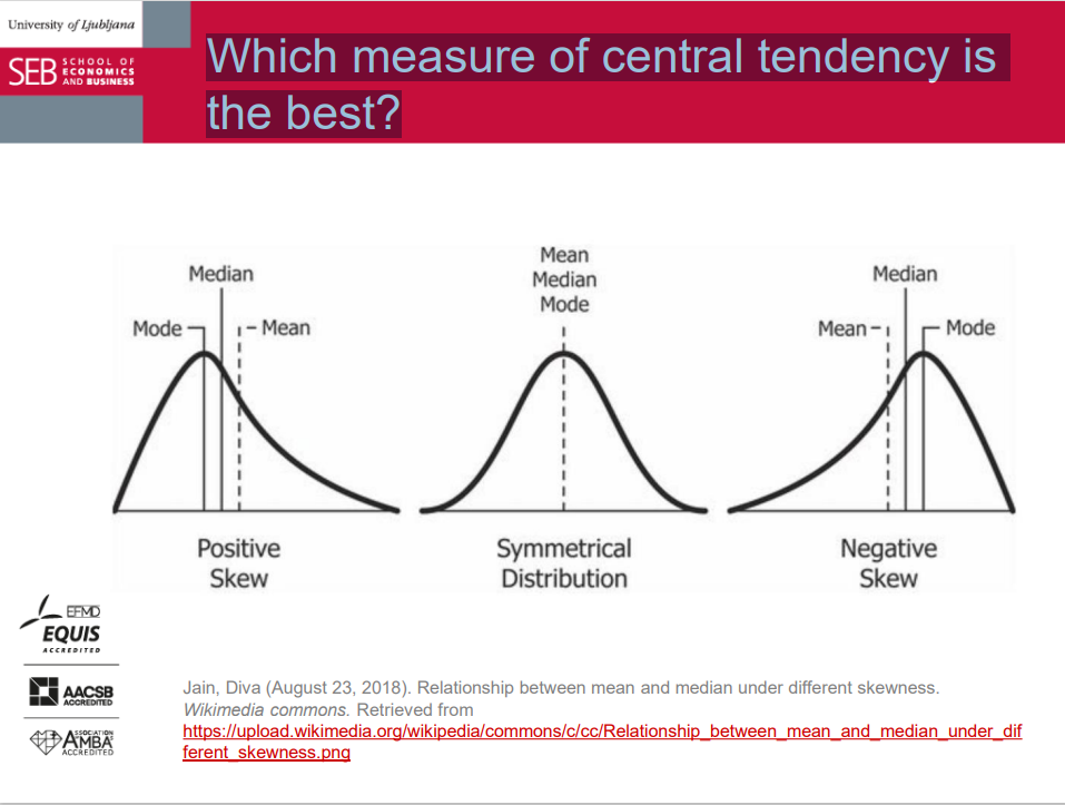
Mean is "pulled into the direction of the skew".
Median < mean for positive skew. usually
Mean < median for negative skew. usually
Careful with this rule:
It holds most of the time for continuous variables with a unimodal distribution.
It frequently fails for discrete variables and bimodal distributions (e.g., some tails are heavy/fat and others are long).
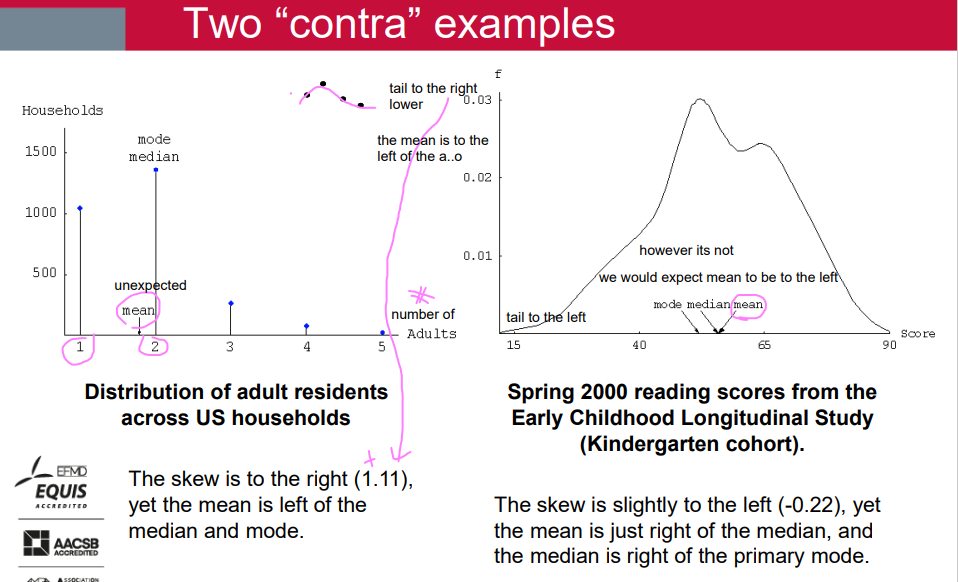
Two “contra” examples
Kurtosis
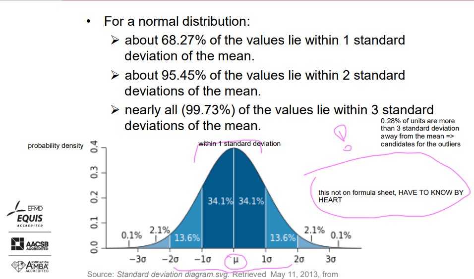
Empirical rule = three-sigma rule = 68 – 95 – 99.7 rule
For a normal distribution:
About 68.27% of the values lie within 1 standard deviation of the mean.
About 95.45% of the values lie within 2 standard deviations of the mean.
Nearly all (99.73%) of the values lie within 3 standard deviations of the mean.
(0.28% of units are more than 3 standard deviation away from the mean => candidates for the outliers)
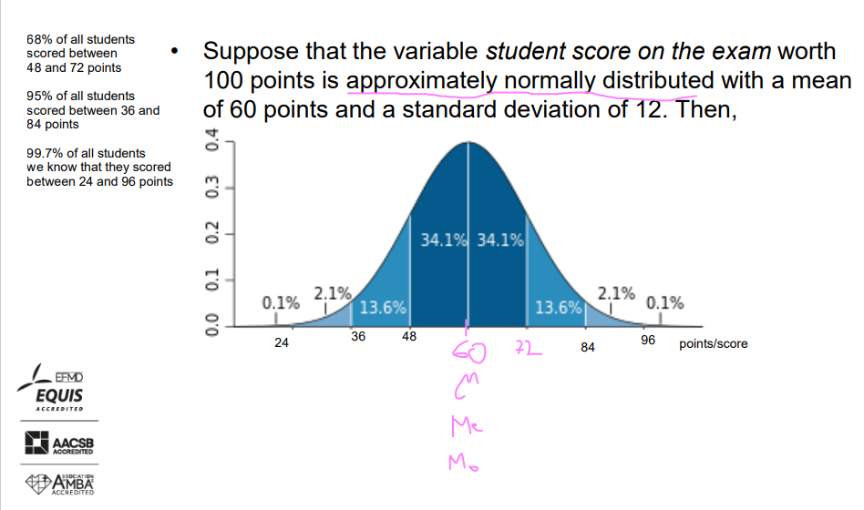
Example
Suppose that the variable student score on the exam worth 100 points is approximately normally distributed with a mean of 60 points and a standard deviation of 12. Then, picture.
68% of all students scored between 48 and 72 points.
95% of all students scored between 36 and 84 points.
99.7% of all students scored between 24 and 96 points.
Example
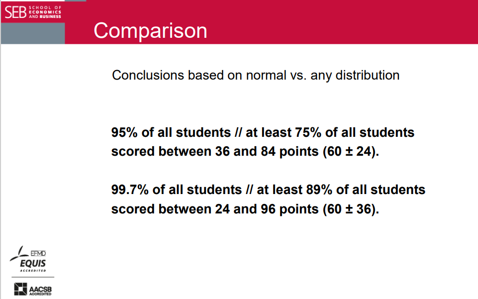
Suppose you do not know the population distribution of the variable "student score" on the exam worth 100 points. You calculate a mean of 60 points and a standard deviation of 12 based on the sample. Then:
At least 1 - 1/2^2 = 75% of all students will be within 36 and 84 points (60 ± 24).
At least 1 - 1/3^2 = 89% of all students will be within 24 and 96 points (60 ± 36).
Chebyshev Rule
For any (or unknown) distribution of a variable, looser bounds can be determined than for normal distribution.
At least (1 - 1/k^2) of the values are within k standard deviations of the mean (for k > 1), that is:
At least 1 - 1/2^2 = 75% of all values will be within 2 standard deviations of the mean (k=2; μ ± 2σ).
At least 1 - 1/3^2 = 89% of all values will be within 3 standard deviations of the mean (k=3; μ ± 3σ).
NORMAL vs ANNY
95% at least 75%
99.7% at least 89%
we are happy to have normal distribution