AP Stats Unit 1
1/35
There's no tags or description
Looks like no tags are added yet.
Name | Mastery | Learn | Test | Matching | Spaced | Call with Kai |
|---|
No analytics yet
Send a link to your students to track their progress
36 Terms
Frequency table
Shows the number of individuals having each value
Relative frequency table
Shows the proportion or percent of individuals having each value
Bar graph
Shows each category as a bar. The heights of the bar show the category(frequency table) frequencies or relative frequencies
Pie chart
shows each category as a slice of pie. The areas of the slices are eproportional to the category(frequency table) frequencies or relative frequencies.
Misleading
pictographs: have different areas, making some look bigger
vertical scale: may not start at 0
intervals: all intervals may not be consistently spread out
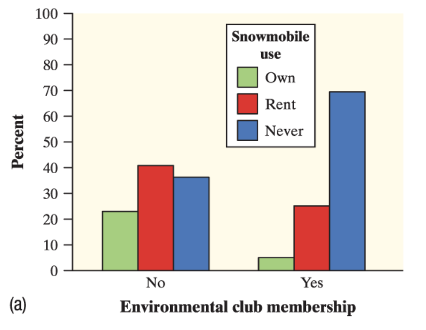
Two-way table
summarizes data on the relationship between two categorical variables for some group of individuals
categorical data
data that represents categories, labels or qualities. Doesn’t have mathematical meaning.
ex: eye color, yes/no responses,car brand
quantitative data
Data that represents numbers and quantities. Can be discrete (finite, whole numbers, countable) or continuous(measurable , any value within a range, )
ex:height, weight, hours studying
Marginal relative frequency
gives the percent or proportion of individuals that have a specific value for one categorical variable.
Joint relative frequency
gives the percent or proportion of individuals that have a specific value for one categorical variable and a specific value for another.
Conditional relative frequency
gives the percent or the proportion of individuals that have a specific value for one categorical variable among individuals who share the same value of another categorical variable(the condition).
side by side bar graph
displays the distributions of a categorical variable for each value of another categorical variable. The bars are grouped together based on the values of one of the categorical variables and placed side by side.
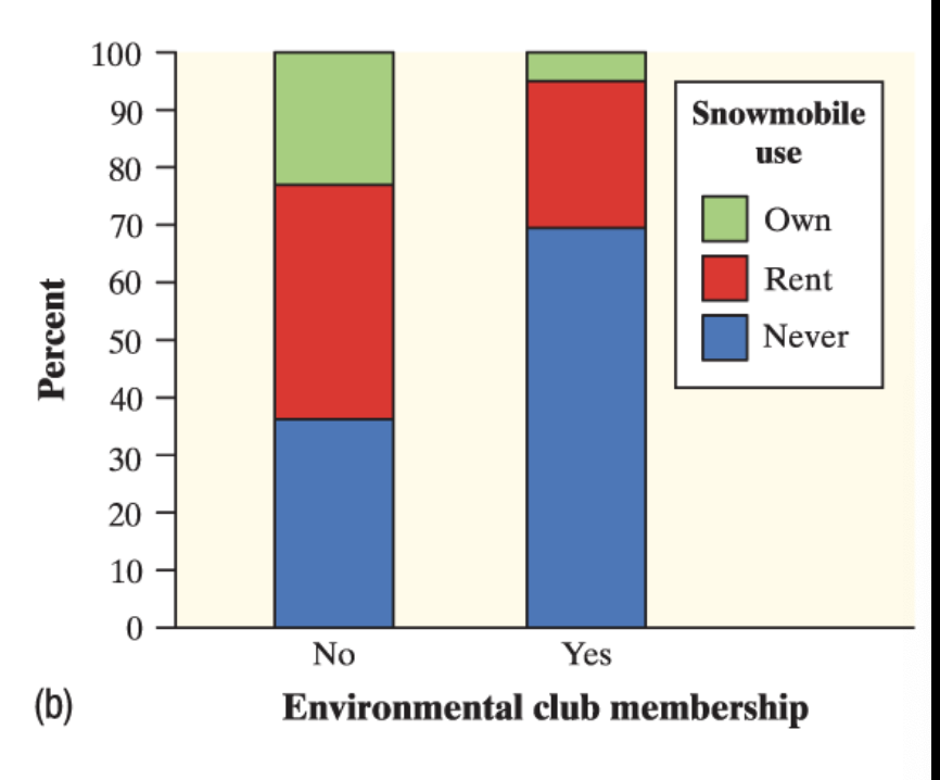
segmented bar graph
displays the distribution of a categorical variable as segments of a rectangle, with the area of each segment proportional to the percent of individuals in the corresponding category.
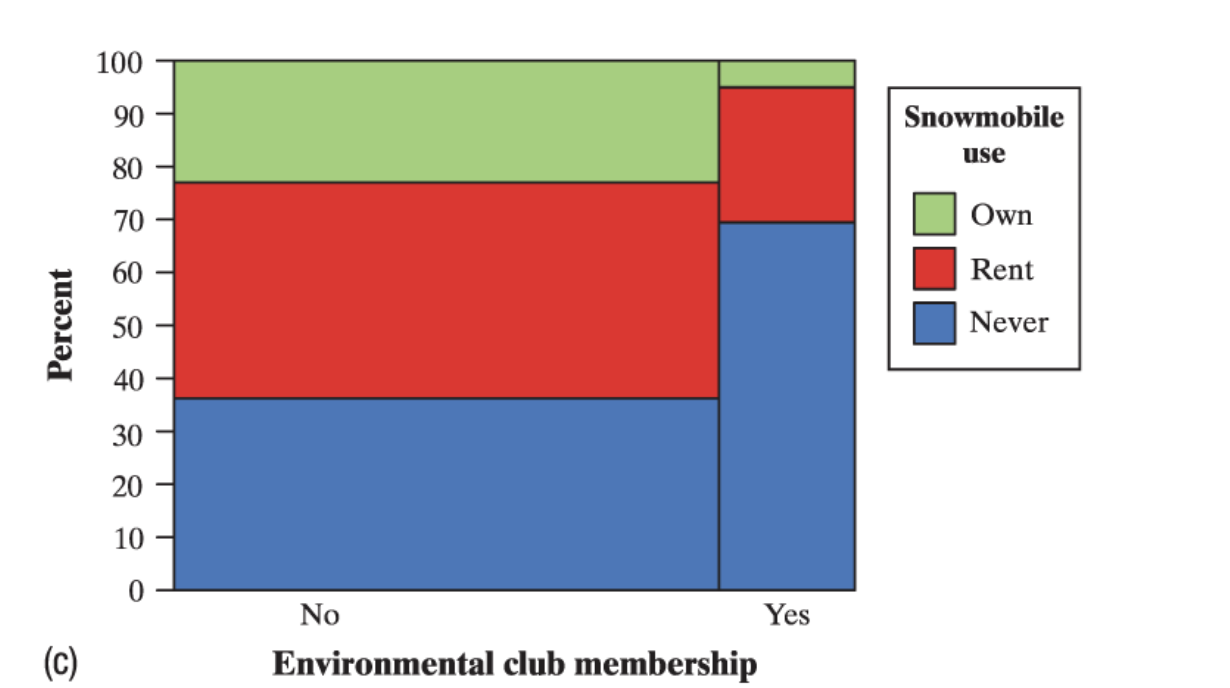
mosaic plot
a modified segmented bar graph in which the width of each rectangle is proportional to the number of individuals in the corresponding category.
Association
between two variables if knowing the value of one variable helps us predict the value of the other. If knowing the value of one variable does not help us predict the value of the other, then there is no association between the variables.
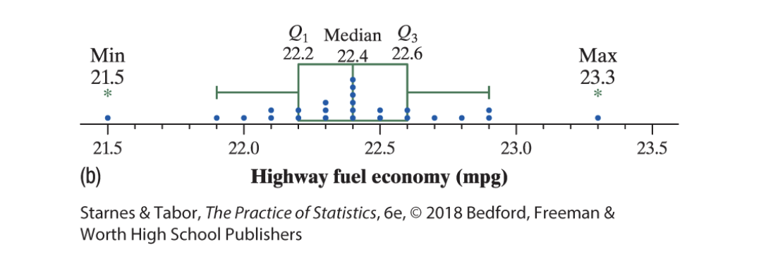
Dotplot
shows each value as a dot above its location on a number line
symmetric
if the right side of the graph is approximately a mirror image of the left side.
Skewed right
if the right side of the graph is much longer than the left side
skewed left
if the left side of the graph is much longer than the left side.
How to describe distributions
Shape- Approx symmetrical, skewed right, skewed left
Outlier: lower fence(Q1 - 1.5x IQR), upper fence(Q3+1.5xIQR). If it is below or above those ranges, it is an outlier. Als,o multiple first.
Center: median(center value) or Mean total of all values/ total number of values. Mean for approximately symmetrical and median for skewed data because it is resistant to outliers and gives us a more accurate center.
Spread: range (max - min)
Stemplot
shows each value separated into two parts:a stem, which consists of all but the final digit and a leaf, the final digit. The stems are ordered from lowest to highest and arranged in a vertical column. The leaves are arranged in increasing order out from the appropriate stems. (make sure to include a key)
Histogram
shows each interval of values as a bar. The heights of the bars show the frequencies or relative frequencies of values in each interval. (bars are connected)
Mean
the mean of a distribution of quantitative data is the average of all the individual data values. To find the mean you add all the values and dived by the total number of data values.
Statistic
is a number that describes some characteristic of a sample
parameter
is a number that describes some characteristic of a population
Resistant
A statistical measure is resistant if it isn’t sensitive to extreme values(outliers)
Median
is the midpoint of a distribution, the number such that about half the observations are smaller and about half are larger.
if the number of values is odd, the median is the middle value in the ordered list
if the number of values is even, the median is the two middle values added and divided by two.
Range
the distance between the minimum value and the maximum value.
Standard Deviation
measures the typical distance of the values in a distribution from the mean.
Variance
the average squared deviation is called the variance. (standard deviation but without a squared root)
quartiles
divide the ordered data set into four groups having roughly the same number of values, to find the quartiles, arrange the data values from smallest to largest and find the median.
first quartile
the median of the data values that are to the left of the median in the ordered list
third quartile
the median of the values that are to the right of the median in the ordered list
Interquartile range
the distance between the first and third quartiles of a distribution
Five number summary
a distribution of quantataive data consists of the minimun, the first quartile, the median,the third quartile, and the maximum.
Boxplot
a visual representation of the five number summary. Calculate the fences and thats were the line ends.The outliers are shown outside of the fences as points on the number line.