Diagrams
1/34
There's no tags or description
Looks like no tags are added yet.
Name | Mastery | Learn | Test | Matching | Spaced |
|---|
No study sessions yet.
35 Terms
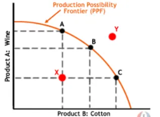
Production Possibility Frontier
A graph showing the different possible combinations of economic goods which can economy may produce is resources are utilised to their full potential.
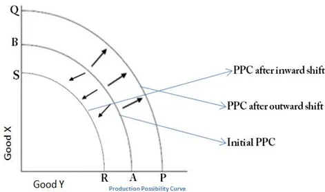
Shifting PPF
A shift in this graph indicated a change in the productive capacity of the economy, due to a change in either the quantity or quality of the factors of production.
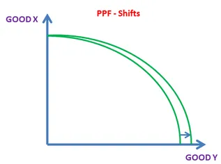
Partially Shifting PPF
If only one side of this graph shifts it indicates an improvement in the effiency of the production of one good and not another.
Contraction
A decrease in the supply of or demand for a good moving along the same curve.
Expansion
An increase in the supply or demand of a good moving along the same curve.
Equilibrium Price
The price at which demand is equal to supply, when a good is sold at this price all of the products supplied will be sold (as demand is equal to supply).
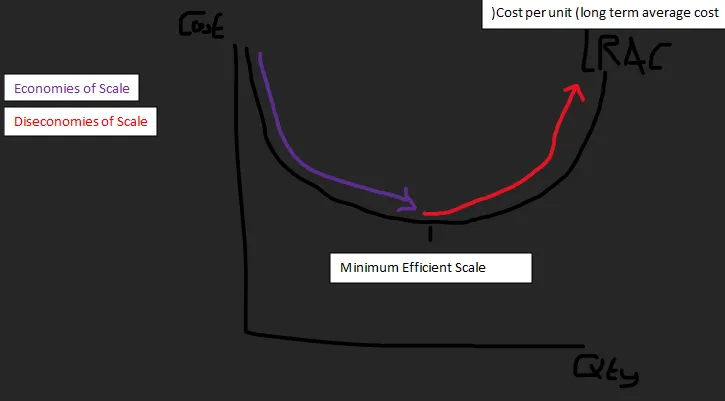
Economies of Scale Graph
This graph shows the effect of economies of scale on the long run average costs of a business. It curves downwards as economies of scale are harnessed, until the minimum efficient scale is reached, at which point the firm begins to experience diseconomies of scale, and the LRAC curves upwards again.
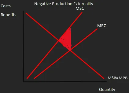
Negative Production Externality
A Graph showing that the costs to everyone of the production of a good are greater than the costs to just the producer, thus there is an overall negative cost to production.
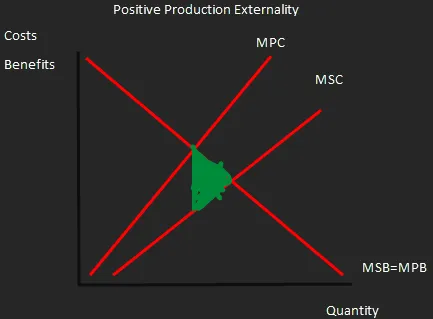
Positive Production Externality
A graph showing that the costs to everyone of the production of a good are less than the costs to just the producer, thus there is an overall positive to production, as it has a third party benefit.
Positive Consumption Externality
A graph showing that the benefits to everyone of the consumption of a good are greater than the benefits to just the individual consumer, it has an overall positive effect on third parties.
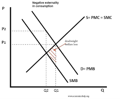
Negative Consumption Externality
A graph showing that the benefits to everyone of the consumption of a good are less than the benefits to just one consumer, meaning it has an overall negative effect on third parties.
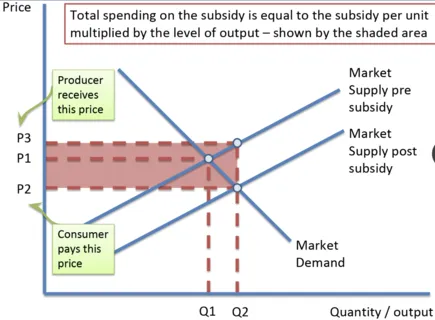
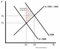
Subsidy Graph
This graph shows the decrease in cost to consumers, increase in revenue for producers and cost to the government of implementing a subsidy.
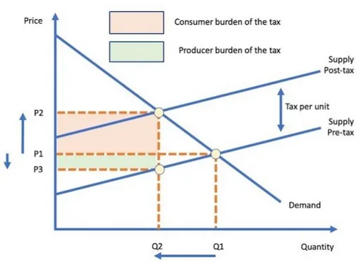
Indirect Tax Graph
A graph which shows the effect on supply of an indirect tax, as well as how much of this tax is paid by consumers and producers.
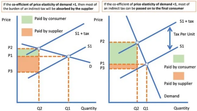
Variation of Indirect Tax with PED
As PED varies, the slope of the demand curve varies, which changes at what level the equilibrium points occur, and thus how much tax is paid by both consumers and producers.
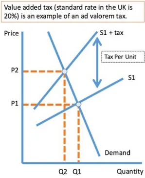
Ad Valorem Tax Graph
Since the tax charged is a % of the existing price the gap between the 2 curves of this graph gets wider the greater the price becomes.
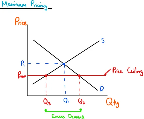
Price Ceiling Graph
Where the government introduces a maximum price that can be charged for a specific good, causing an increase in demand and a drop in supply, thus creating a supply shortage.
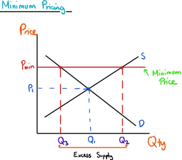
Price Floor Graph
Where the government introduces a minimum price that must be payed for a good, causing an increase in supply and a drop in demand, creating an excess supply. This excess is purchased by the government and either stored for future use or destroyed.
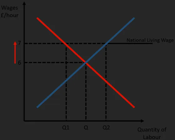
National Minimum Wage Graph
A graph similar to a price floor, except for the labour market, it shows the effect that introducing a minimum wage has on the level of unemployment, due to the excess in the supply of labour it causes.
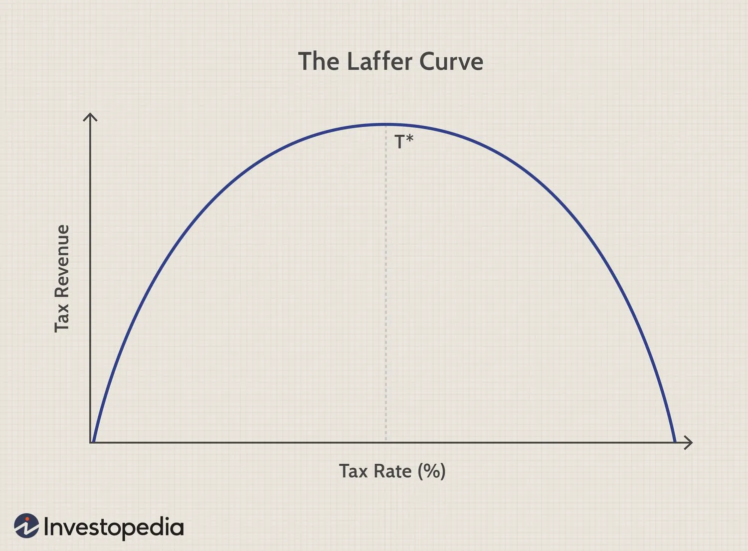
The Laffer Curve
A curve which shows the effect that tax rate has on tax revenue, as when tax rate is pushed too high people will leave the economy or cease working, meaning the government make less revenue.
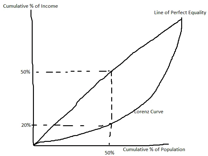
Lorenz Curve
A curve which shows the difference between a perfect distribution of income amongst the population and the reality, the area between the curve and the line of perfect equality demonstates the severity of this.
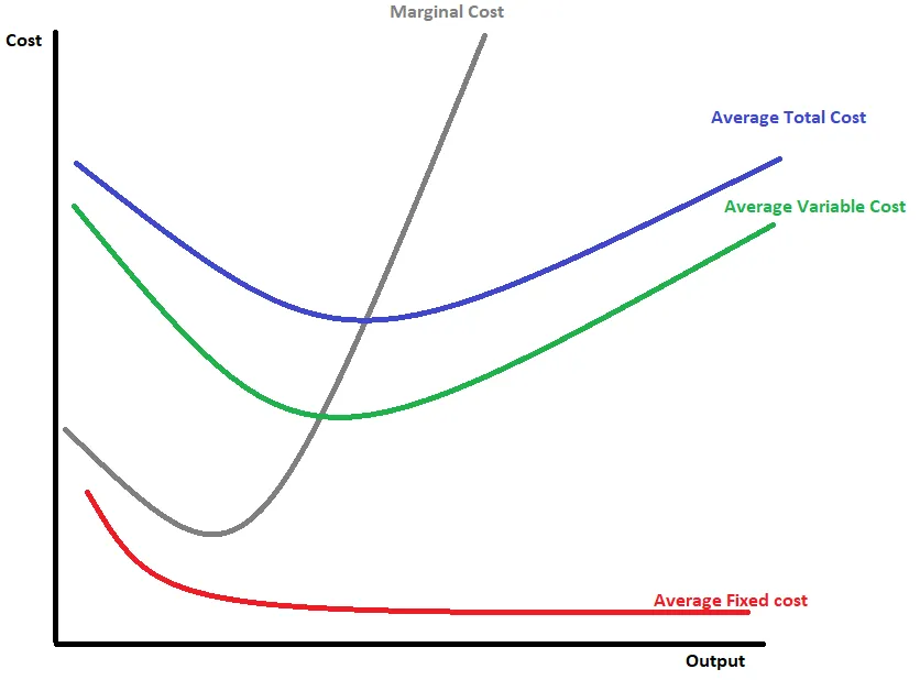
Cost Curves For a Firm
A graph which shows how how fixed and variable costs combine to create an average total cost curve, intersected at the minimum point by the marginal cost curve.
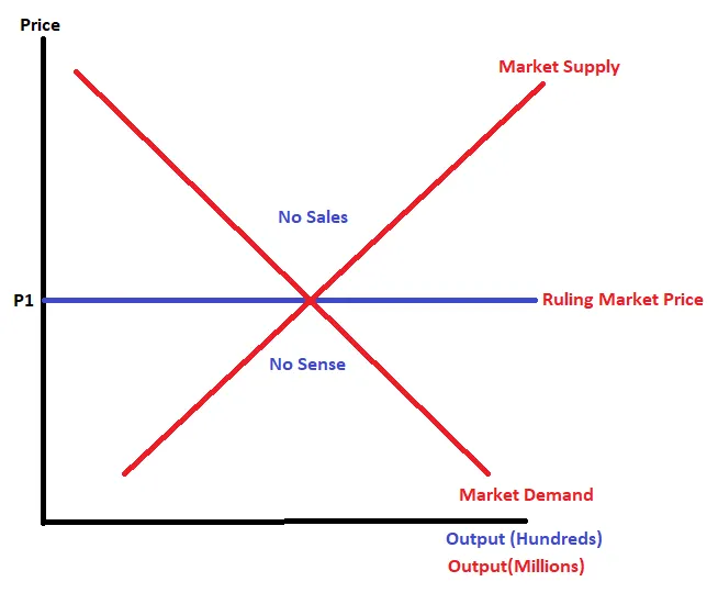
Perfect Competition Graph
There is no sense in suppliers changing the amount of a good they supply as if they go below the market price then they won’t make any additional sales and if they go above then nobody will buy their products.
Monopolistic Profit Maximisation
When selling for profit maximisation, firms will sell at the quantity where MR = MC, but charge the price where quantity intersects with AD (The demand curve).
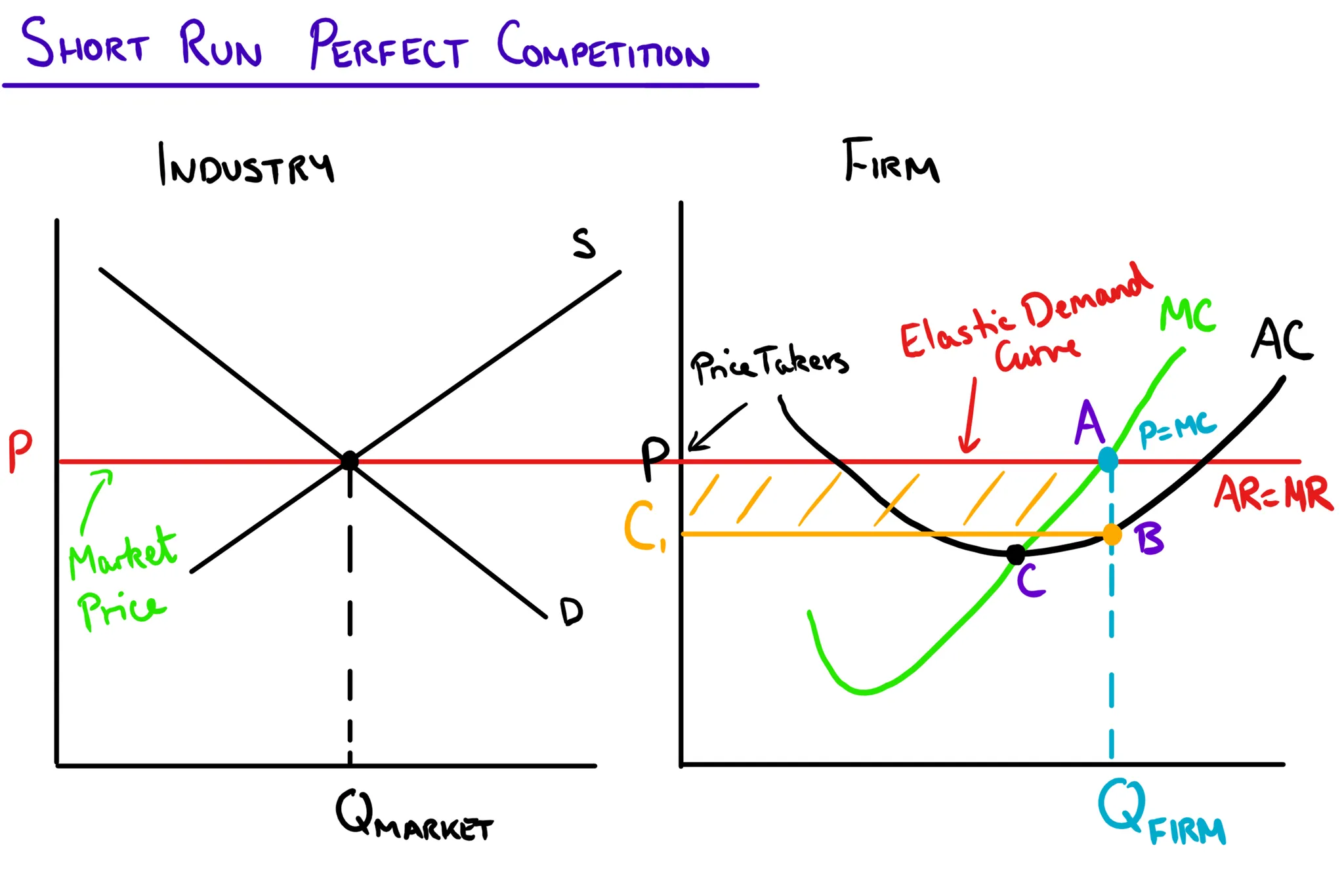
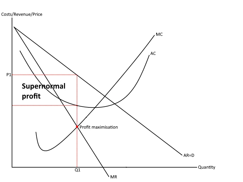
Short Run Perfect Competition
Within this market firms will always charge the ruling market price, meaning in the short run individual firms make supernormal profit due to the gap between the AC and MC curves.
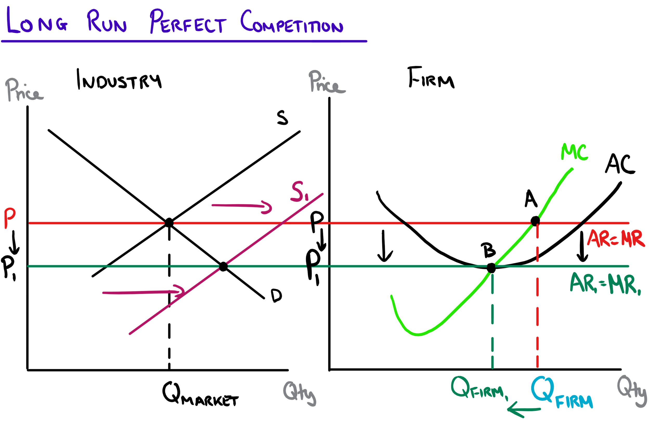
Long Run Perfect Competition
In the long run firms can enter and leave a market, and incentivised by the supernormal profit in the market, firms will enter the perfect competition, leading to a rightward shift of the overall market supply, causing a downward shift of the ruling market price and causing a decrease in the quantity each individual firm supplies, menaing they only make normal profit as not MC, AC and AR=MR are all intersecting.
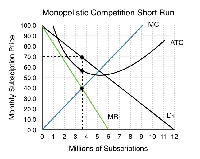
Short Run Monopolistic Competition
The AR curve is above the MR curve, meaning that when selling at the profit maximisation point the firm makes a supernormal profit.
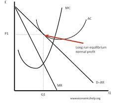
Long Run Monopolistic Competition
Thanks to the supernormal profit made in the short run additional firms are attracted to the market, shifting the demand curve to the left until it is tangential to the average cost curve and meaning that firms no longer make supernormal profit.
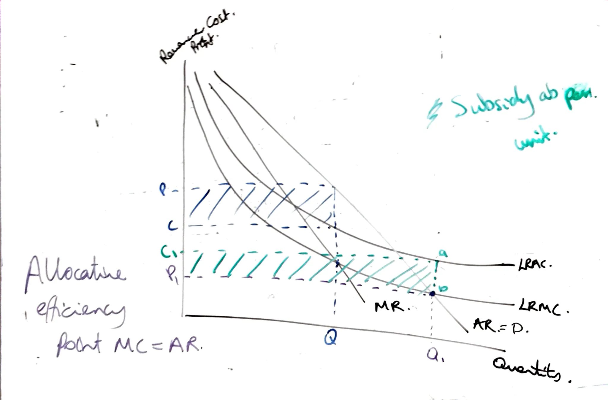
Long Run Monopoly Diagram
Where LRAC and LRMC are both downward sloping, in a natural monopoly goods are produced at the profit maximisation point , and regulators will make them produce at a greater level because the good is a necessity.
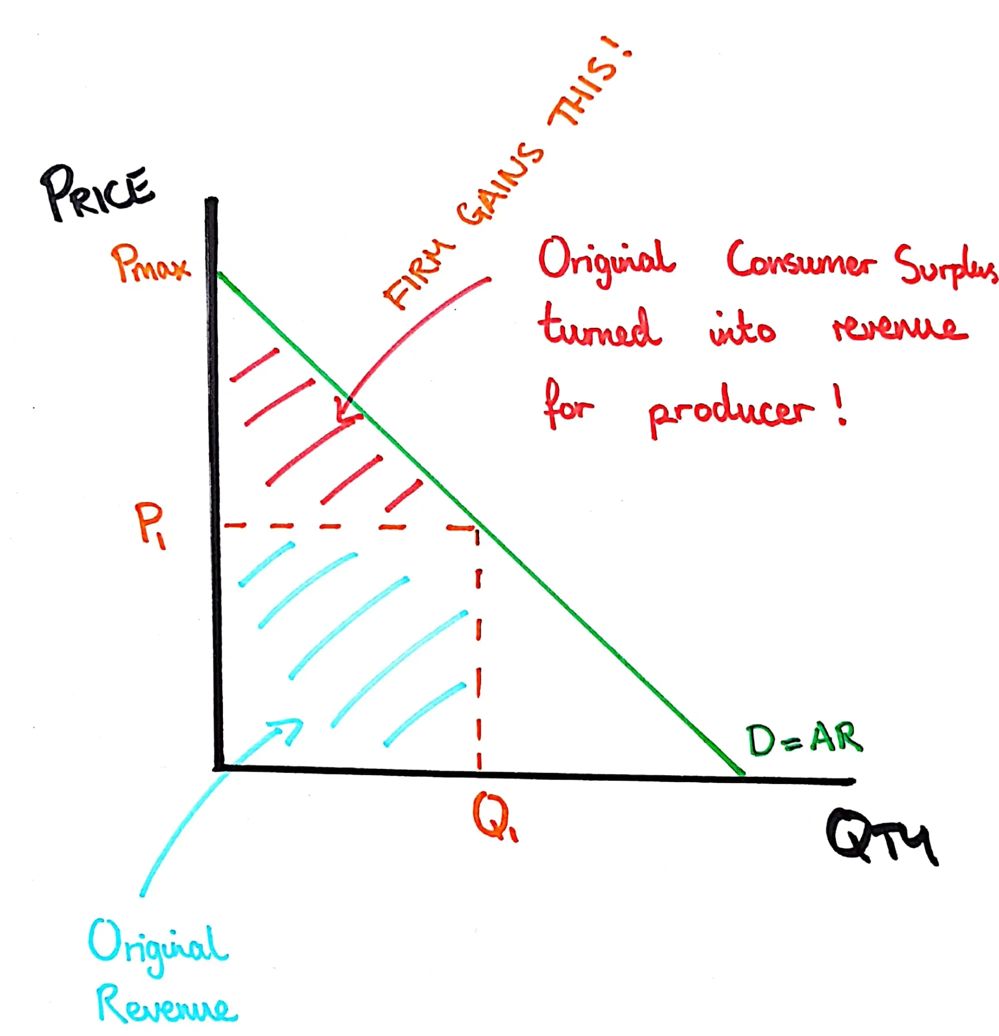
First Degree Price Discrimination Graph
A graph which shows The additional revenue a producer gains through the use of price discrimination where every consumer pays exactly what they are willing to.
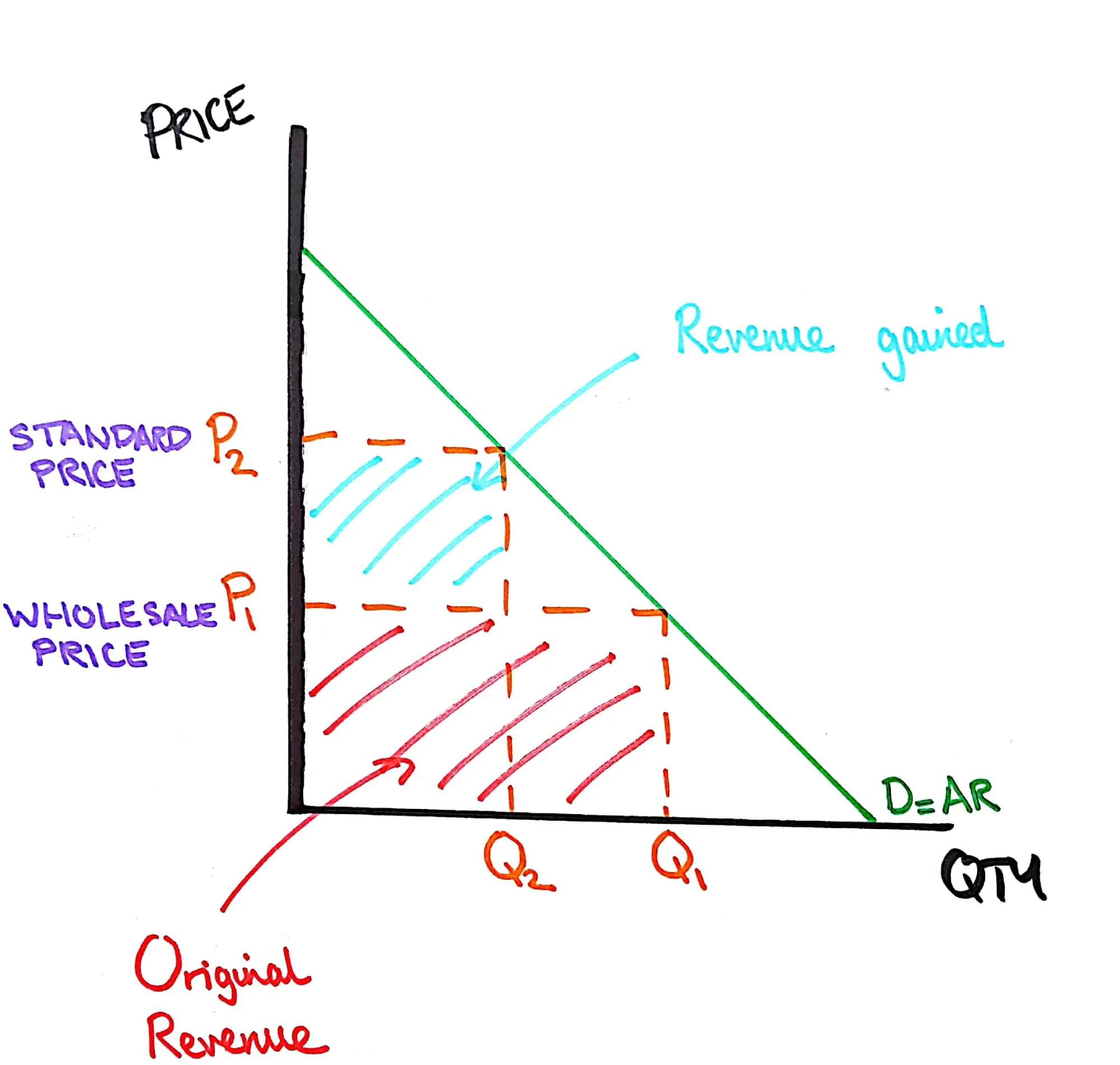
Second Degree Price Discrimination Graph
A graph showing the additional revenue a firm gains by reducing the price for customers buying a larger quantity of items.
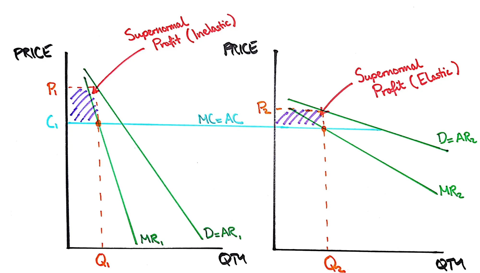
Third Degree Price Discrimination
A graph showing the additional profit a firm can make by charging different prices to people in the market depending on the PED for that group.
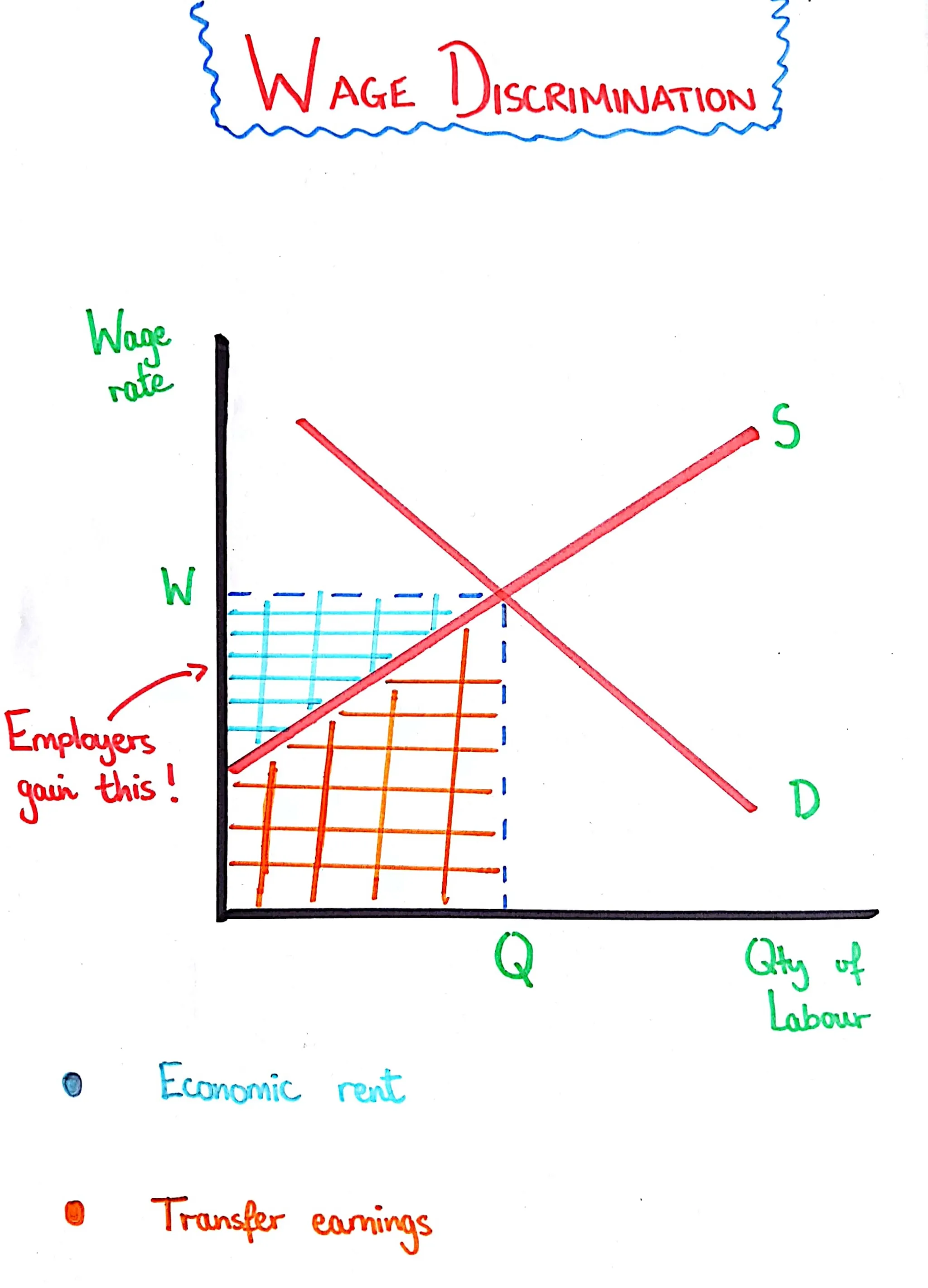
Wage Discrimination
A graph showing the additional money employers can keep by charging each employee the minimum amount they will work for.
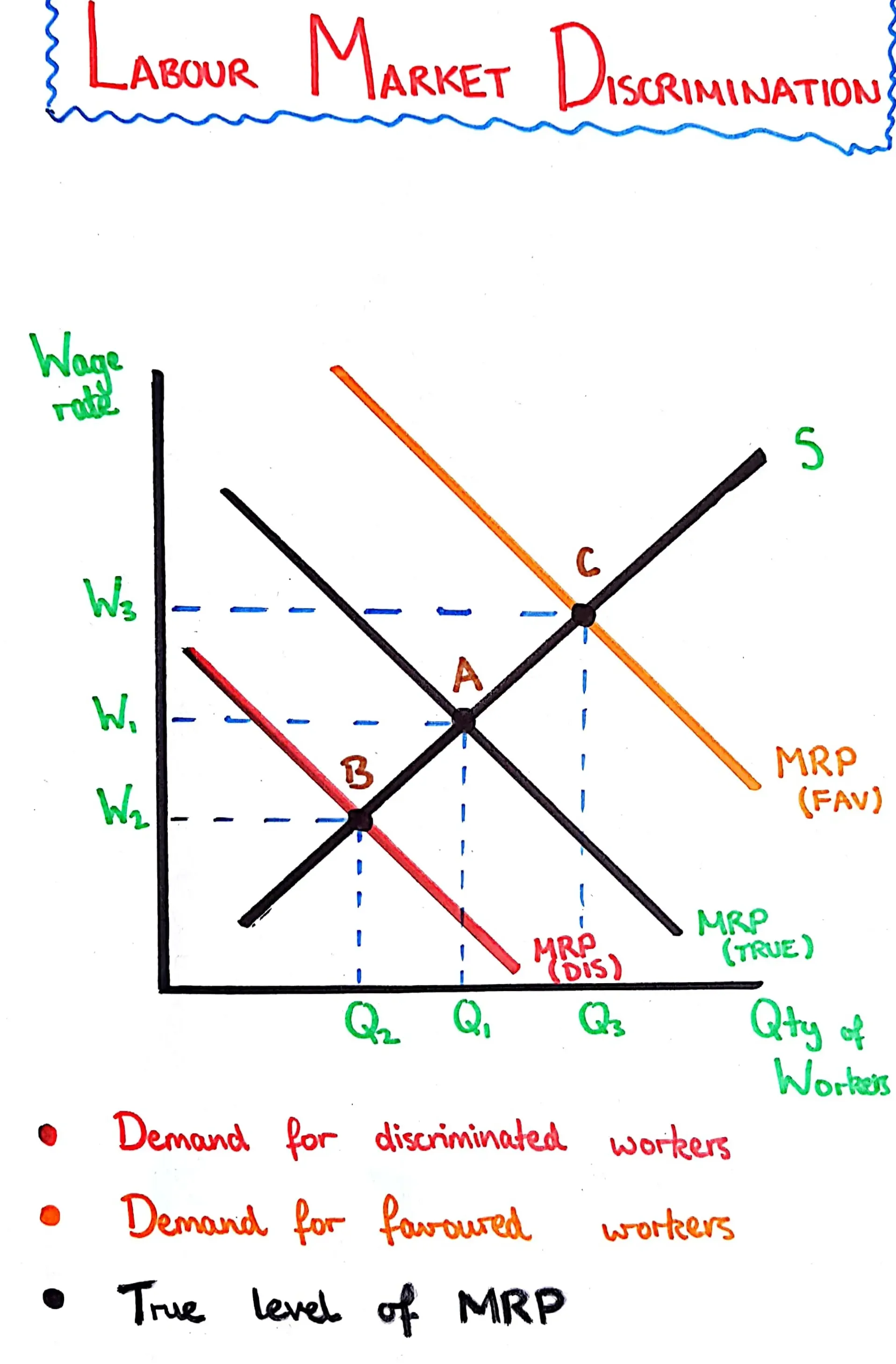
Labour Market Discrimination
A graph showing the various MRP curves of favored and discriminated workers and their pay because of this discrimination.
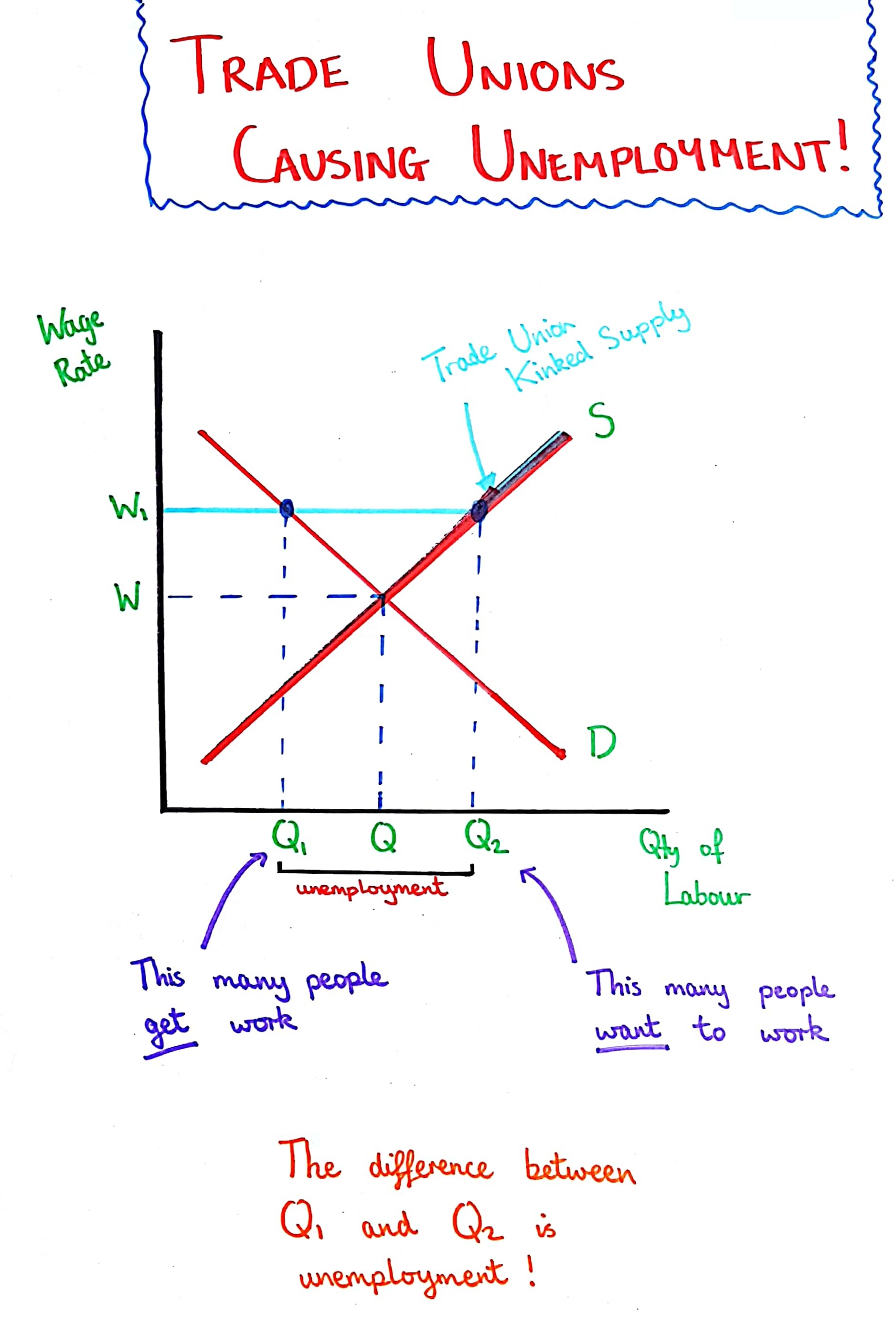
Trade Union in a Perfectly Competitive Labour Market
Trade unions will bargain for a greater wage rate, but this means employers will want to employ fewer workers, leading to increased unemployment post trade union action.
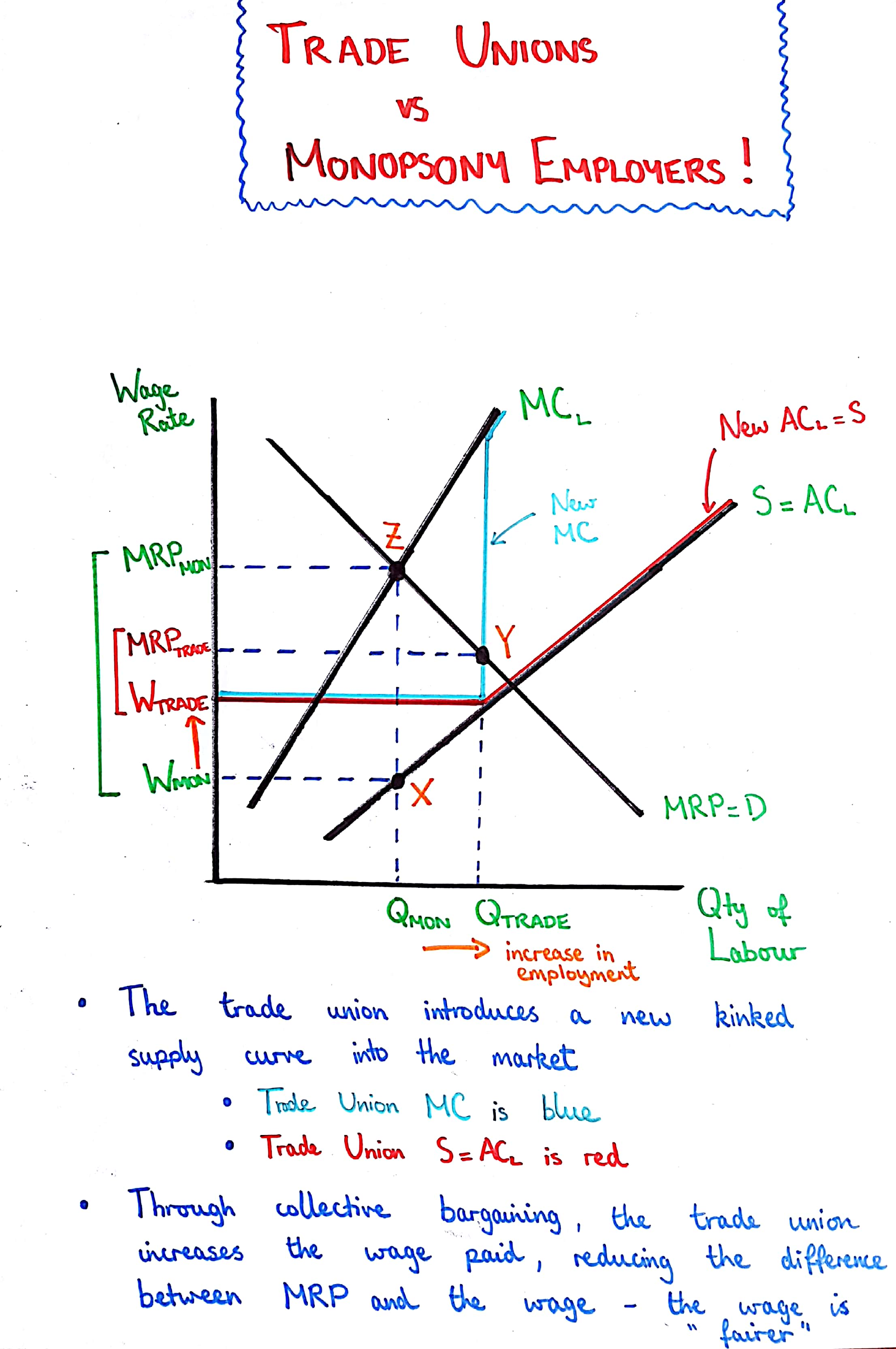
Trade Union in a Monopsony Labour Market
Trade Unions bargain for a greater wage rate and due to this also cause an increase in employment within the market.