Q1 Stat Cumulative
1/120
Earn XP
Description and Tags
Name | Mastery | Learn | Test | Matching | Spaced | Call with Kai | Chat |
|---|
No analytics yet
Send a link to your students to track their progress
121 Terms
Response Variable(y)
Dependent variable, the outcome of a study
Explanatory Variable(x)
Independent variable, attempts to explain observed outcomes.
Direction, Form, Strength, Outliers, and Context
Requirements for describing scatterplots
Direction
Positive or negative association of a graph
Form
Is the line of best fit linear or some other pattern
Strength
The strength of correlation between explanatory and response variables(r)
Outliers
Points which don’t follow the pattern
Context
The context of the explanatory and response vcariables
Correlation(r value)
Measures the strength and direction of the linear relationship between two quantitative variables. Does not have units, and is heavily influenced by outliers.
Positive r value
There is a positive correlation between the two variables, the slope of the graph is positive.
Regression Lines
The “trendlines“ which describe how y changes with respect to x. Has an equation of the form y^ = a + bx
y-hat (y^)
The predicted y value or value of the response variable given a explanatory variable
Extrapolation
Using the regression line far outside the range of x used to create it. Often makes inacurate predictions.
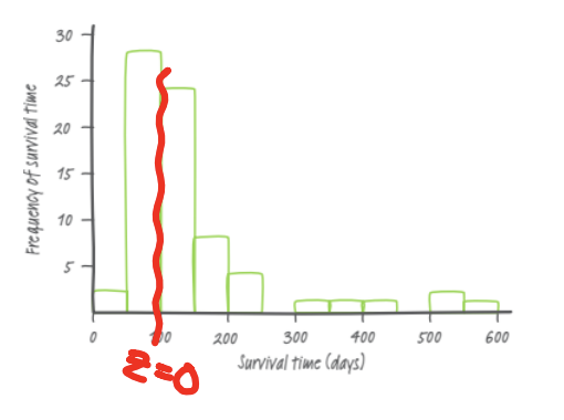
Residual
y-hat minus y, the difference between an observed value and the predicted value.
note: a residual of 0 means the point is on the regression line.
LSRL(Least-squares regression line)
Minimizes sum of squared residuals, always goes through (x̄, ȳ). Equation is found through y^ = a + bx. minimizes the sum of the residues squared.
Standard Deviation of Residuals(S)
Approximate size of average residue when using the LSRL.
There is a [strong/moderate/weak] [positive/negative] [shape] relationship between [x-context] and [y-context]. There [do/do not] appear to be any outliers.
Interpreting scatterplots
There is a [strength], [direction] linear relationship between [variable1] & [variable2].
Interpreting correlations(r)
As [explanatory variable] increases by one [unit], the predicted [response variable] [increases/decreases] by [b] [units].
Slope of a regression line(b)
When [x-context] is zero, the predicted [y-context] is [a] [units].
Interpreting y-intercept of a regression line(a)
[y-hat] is the predicted value of [response variable y] when [explanatory variable] is [input amount].
Interpreting predicted value (y-hat)
The actual/true [y-context] is [higher/lower] than the predicted [y-context] by [residual].
Interpreting residuals
When using the LSRL, the predicted number of [y-context] is typically [s units] off from the actual number.
Interpreting standard deviation of the residuals
About [r2]% of the variability in [y-context] is accounted for by the least-squares regression line.
Interpreting coefficient of determination (r2)
Coefficient of determination (r2)
Shows how well the regression line accounts for variance within your collection of points.
stat, calc, 8
Finding regression line, r, and r² on calculator
stat, calc 8, use vars, Y-vars, function, y1
Storing and graphing the regression line
stat, calc, 8, to find linear regression line, then plot residual plot using stat plot, scatterplot, Xlist: L1, Ylist: 2nd, stat, RESID, then Graph.
Graphing a Residual Plot
Categorical Variable
Names, labels
ex: marital status, eye color, race
Quantitative Variable
Makes sense to average
ex: height, test scores
Frequency
How many times something occurred
Marginal Distribution
Subset out of the whole sample.
Conditional Distribution
Parts out of a group/subgroup
Individuals
Subjects described by data set
Variable
Characteristic of individual
Association
One variable influences the other. The two are associated, but do not use correlated instead of associated.
Stacked/Segmented Bar Graph
Displays all components of a whole on top of each other as part of a whole bar.
Mosaic Plot
Segmented bar graph but widens the bars to be proportional to their respective sample sizes.
Dot Plot
Each data value is shown as a dot above its respective value on a number line.
Stem and Leaf Plot
Vertical Bar Graph but denotes the points as numbers with EVENLY SIZED BUCKETS.
Requires a key for the buckets, can just say “5-9” for one bucket
Bar Graph
Denotes the amount of people who answered each response by a vertical y axis.
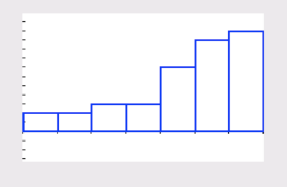
Histogram
Divides points by frequency and graphs similar to a bar graph, but with conjoined bars and buckets.
MUST INCLUDE A KEY FOR THE BUCKET SIZES. Can be 5 - 9
SOCCS
Shape, Outliers, Center, Context, Spread
Shape
Noteworthy features of graph. Unimodal(one hump), Bimodal(two humps), multimodal(many humps), Skew, or irregular(doesn’t fit any description).
Skew
Distribution of individuals on one side or the other of a graph. Usually the lower, more severe portion of the graph determines the skew.
ex: if the graph is a histogram with most people answering 50-60, but a fair few answered 60-70 and 70-80, we would say the graph is skewed right.
Outliers
Points that are statistical anomalies, that are greater than Q3 + 1.5(IQR) or less than Q1 - 1.5(IQR).
Center
Can be median or mean depending on the skew of the graph, but describes the center.
Context
Context behind the data. Say “The (variable) typically varies from the mean by about…(sx with units)“ or “on average, a (variable) is about (sx with units) away from mean.“
Spread
Describes the distribution of the graph. Can use range, standard deviation, or IQR.
Range
Max - Min
IQR
Q3 - Q1
Standard Deviation
Formula given on equation sheet but essentially the average difference between an individual and the mean.
denoted by sx on equation sheets and in writing
Median
The middle term of a distribution.
ex: in a sample of 11 people, the 6th person’s (after ordering from least to greatest) response would be the median. If the group was reduced to 10, the median would be the average of the 5th and 6th people’s answers.
Q3
The median of the upper half of the graph, excluding the median if it is just the middle term. If the median is the average of the two closest terms, take the greater term and include it in the median calculation.
Q1
The median of the bottom half of the graph, excluding the median if it is just the middle term. If the median is the average of the two closest terms, take the lower term and include it in the median calculation.
IQR
Q3 - Q1
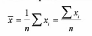
Mean
Average of all responses from the sample. denoted by x with a bar on top in the equation sheet.
5 number summary
Min, Q1, Median, Q3, Max
Box Graph
Uses the 5 number summary to graph the distribution. Uses the Q1, median, and Q3 values to draw the box in the middle, with the median denoting the line in the middle of the graph. Min and Max describe the outer “stops“ of the graph.
Outliers in Box Graphs
Outliers are denoted either by an asterisk if wished, with the max/min being reduced to the next greatest/lowest point. If not denoted, nothing is needed.
Getting 1 Var Stats on graphing calculator
STAT —> CALC —> 1-Var Stats
How to create a list on graphing calculators
STAT —> EDIT —> input values into a list, likely L1
How to graph various graphs with graphing calculator
STAT —> WINDOW(set appropriate range) —> STAT PLOT(turn appropriate list on) —> GRAPH
Effect of adding to set values to mean, std dev, and shape
std dev and shape unchanged, mean is increased by the constant added to every value.
Effect of multiplying set values by a constant on mean, std dev, and shape
The mean and std dev are multiplied by the proportionate amount but the shape is unchanged.
Cumulative Frequency Line Graph
Shows the relative frequency as the values of x increase, the frequency increases to 100%. Can show percentile very easily as it shows what % of the total population has a value less or equal to every given value.
z-score
Shows the value of an individual member of the population as a function of the mean and std dev. Found by dividing the difference between the point and the mean by the std dev.
Density Curve
Curve that traces the top of a histogram and has an area under the curve of 1. Is an approximate shape of the histogram, and is always above the x axis.
mean < median = skewed left, mean > median = skewed right.
Required notation given mean “µ“, std dev “σ”, where x = height of adult american males(m)
x ~ N(µ, σ), x = height of american male(m)
Notation showing proportion of the whole of x population with a value of less than c
P(x<c)
< vs ≤
Interchangeable in this unit.
Normal distribution
A symmetric unimodal bell-shaped curve, which abides by the empirical rule.
Points of inflection on a normal curve
At ± 1 std dev
Empirical Rule(68, 95, 99.7)
Rule which states that 68% of a population lies between ±1 std dev, 95% between ± 2 std devs, and 99.7% between ± 3 std devs.
Table A
Shows the proportion less than a given z score and vice versa.
How to calculate the percentile given a max
2nd → Distr → normalcdf → set max, min, std dev, paste and calculate
How to calculate z-scores given percentile
2nd → Distr → Inv norm → Set max, min, mean, std dev, paste and calculate.
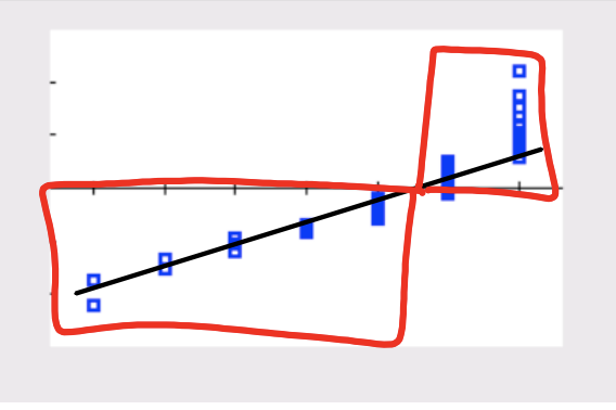
How to create a normal probability plot to prove whether a distribution is normal
Insert data into list → 2nd → stat plot → 6th graph option → plot. A normal distribution will have a linear pattern, while skewed graphs will be warped.
Using the normal probability plot to determine leftward skew
A normal probability plot which is skewed left will have a flatter slope and the points of z-score < 0 clumped together as a greater proportion of the population would be clustered on the left.
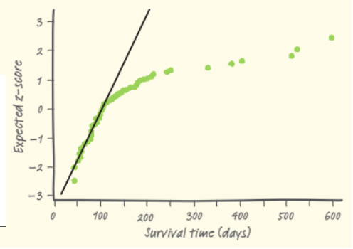
Using the normal probability plot to determine rightward skew
A normal probability plot which is skewed left will have a steeper slope and the points of z-score > 0 clumped together as a greater proportion of the population would be clustered on the right.
Convenience Sample
A sample which is convenient for the surveyors
ex: choosing the closest 5 students as a sample
Simple Random Sample(SRS)
Simple random selection such that each individual has a equal chance of being selected.
ex: label each person with a number from 1-100, write numbers on 100 slips of paper and randomly choose a certain amount of slips corresponding to the size of your groups.
Population
The group that a statistical study can be extrapolated to
Census
Data from every individual in the population
Sample
Subset of population from which data is actually collected
Bias
Consistent underestimation or overestimation of the value you are studying.
Voluntary response bias
Bias derived from a sample volunteering themselves for a study/experiment
Random Sampling/assignment
Using random chance to assign a sample
Strata
Groups of similar individuals, for random selections for sampling. “some of all“, choosing samples randomly from subcategories of the population.
ex: splitting a school into grades in preparation of randomly choosing 50 people from each grade. The grades are:
Stratified random sample
Sampling method where the population is divided into several strata of similar individuals prior to simple random sampling to take some individuals from each strata.
Clusters
”All of some” groups of individuals within a population
Cluster sample
Simple random sample of clusters, then averaged to an overall sample
ex: think “all of some“. if only a few high schools in all of Massachusetts are selected for a experiment but all students within those schools are selected its a cluster sample.
Inference
Drawing conclusions about a population based on the results derived from a sample
Undercoverage
Response bias resulting from some members of population being unable to participate.
Nonresponse
When a subcategory of the population refuses to be part of the sample
Response bias
Systematic pattern of inaccurate responses leading to incorrect results
ex: unemployed people in sample claiming to be employed and lying in a experiment.
Question wording
Confusing wording that leads to profoundly different results in surveys or orientation of separate questions that leads to profoundly different results to the survey question
Systematic sample
Selecting a sample by every nth individual
ex: within a population, assign each person a number, then take every 9th person starting from a random initial person. These people make up your sample.
Random Number Generator(RNG) Method
Assigning each member of the sample a number then using a random number generator to assign separate unique numbers to different treatments.
Hat Method
Assigning each member of your sample a number, writing them on equal sized slips of paper and placing them in a hat, then manually drawing the slips of paper out to make up your separate samples/treatments