WEEK 3: DATA PRESENTATION
1/41
There's no tags or description
Looks like no tags are added yet.
Name | Mastery | Learn | Test | Matching | Spaced | Call with Kai |
|---|
No analytics yet
Send a link to your students to track their progress
42 Terms
What are three types of data presentation?
Textual
Tabular
Graphical
The purpose of this is to:
Communicate information about the data to the user
Displays the data clearly and effectively
Summarizes the quantities of information
Purposes of Data Presentation
The characteristic of this is to:
Display data
Avoid distortion of data
Allow the viewer to make comparisons
Allow the reader to think what the data conveys
Allows description, exploration, tabulation, or decoration
Be closely related to the statistical and verbal description of the data set
Characteristics of Data Presentation
Describing the data by the use of statements with few numbers
Presented in paragraphs or sentences
Explain results and trends
Provide contextual information
Textual Presentation
The purpose of this type of data presentation is to stress or emphasize significant information
Textual Presentation
The advantages of using this type of data presentation are:
Give emphasis to significant data
Use for a few data (1-2)
The disadvantages of using this type of data presentation are:
Data becomes incomprehensible when large quantitative data are included in the paragraph
Paragraph including many figures can be tiresome to read
Textual Presentation
This type of data presentation is for 3 or more data
Data is converted into words or numbers into rows and columns
It should be simple, clear, and direct
Tabular Presentation
The purpose for this type of data presentation are:
Data checking and editing
Summarizing and presenting data
Basis, aid in graph or chart construction
Purposes of Tabular Presentation
Components of this should be:
Table number
Title
Column headings/caption
Body of the table
Row headings
Source note
Foot note
Tabular Presentation
What are the types of tabular presentation?
Master table
Dummy table
Tables by number of variables presented
This type of tabular presentation is:
All variables are put in this table only
Single table that allows the distribution of observations across many variables of interest in a given study
Each observation is cross classified across the variables which may be quanti or quali data
Master Table
The purpose of this type of tabular presentation is to:
Store information with an aim od presenting detailed statistical data
Facilitate generation and tabulation of smaller table
Master Table
This type of tabular presentation is:
Done before research implementation and experimentation
Will give us a preview of what data should be collected and what output to get
Complete except for the data
Dummy Table
The purpose of this type of tabular presentation is to:
Helps researcher clarify instrument
Help protocol reviewer and computer programmer
Dummy Table
What are the 3 types of tables by number of variables presented?
One-way Table
Two-way Table
Multi-way Table
This type of tabular presentation of tables by number of variables presented is only used for 1 variable
One-way Table
This type of tabular presentation of tables by number of variables presented is only used for 2 variables
Two-way Table
This type of tabular presentation of tables by number of variables presented is only used for 3 or more variables
Multi-way Table
The advantages of using this type of data presentation are:
Easy to understand
Compact and concise than textual form
Presents greater detail of data than graph
Readily points out trends, comparisons, and interrelations
Facilitates analysis of categories of given variable
The disadvantages of using this type of data presentation are:
Too many rows and columns could make it difficult for the reader to understand the data
Requires more time to construct
Tabular Presentation
This type of data presentation is:
Pictorial representations of certain quantities plotted with reference to a set of axes (x and y)
Simplify complex information by using images and emphasizing data patters or trends
Useful for summarizing, explaining, or exploring quanti data
Present both large and small amounts of data
Graphical Presentation
The uses of this type of data presentation are:
Visually summarize the variables (data set is large)
Emphasize particular statement about data set
Enhance readability
Appeal the visual memory
Graphical Presentation
What are the types of graphical presentation?
Pie Chart
Bar Graph
Component Bar Graph
Line Graph
Histogram
Frequency Polygon
Stem-and-leaf Plot
Box Plot
Scatter Plot
Circles are subdivided into number of slices
Area of each slice represents relative proportion data
Use to show a whole is divided into its component parts
Pie Chart
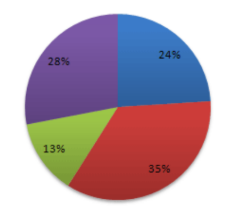
Pie Chart
Used for Discrete Quantitative data
Consists of bars of the same width
Horizontal or vertical with gaps between to emphasize discontinuities
Also known as one dimensional diagram
The height of the bars/rectangles is the quantity of variables
Bar Graph
What are the types of bar graph?
Horizontal Bar Graph
Vertical Bar Graph
Component Bar Graph
This type of bar graph is used for qualitative variables where the X-axis is the measure and the Y-axis is the category
Horizontal Bar Graph
This type of bar graph is used for discrete quantitative variables
Vertical Bar Graph
This type of bar graph is used for nominal qualitative data where each bar is divided into smaller rectangles representing the parts and is preferable over pie situations where the compositions of 2 or more groups are to be compared
Component Bar Graph
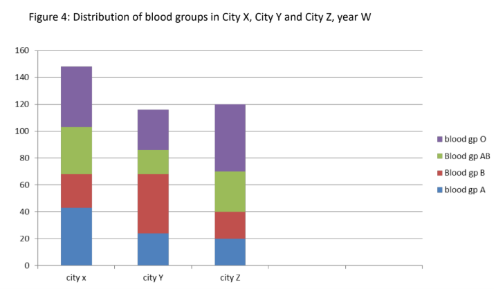
Component Bar Graph
Used for predicting trends or looking at trends
Plots of dots joined with lines over some period of time in a sequential series
Also called as time series charts
X-axis contains the date
Y-axis contains the measure/value
Line Graph
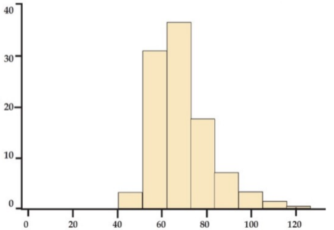
Similar to the bar graph but this has no gaps because it is used for continuous quantitative data
Bars are drawn over the true limit of the classes
Horizontal axis: continuous quantitative
Vertical axis: number of relative frequencies
Preferred for grouped interval data
Histogram
Histogram
Similar to histogram except that frequencies are plotted against the corresponding midpoints of the classes
Adjacent points are joined with lines and the plot is tied down to the horizontal axis resulting in a multi-sided polygon
Frequency Polygon
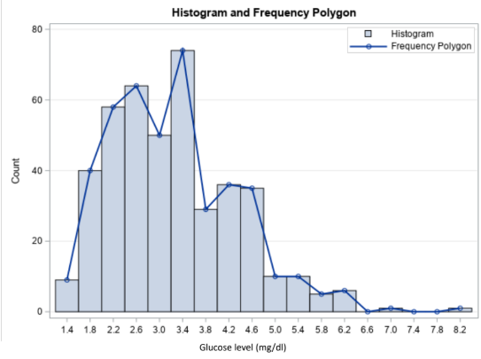
Frequency Polygon
Used for discrete quantitative data
Provides rank-ordered lists and its easier to restore the original value of the observation
Line gives more information than bars in histogram
Used to show the actual data value instead of using bars to represent the height of an interval
Stem-and-Leaf Plot
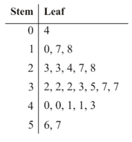
Stem-and-Leaf Plot
Shows description of a large quantitative data that includes the center, spread, shape, tail length, and outlying data points
Can be horizontal or vertical
Height of the rectangle has no meaning
Used for comparing the distributions of several variables or the distribution of a single variable in several groups on the same scale
Box Plot
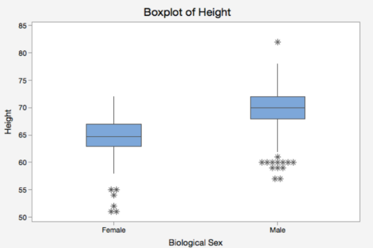
Box Plot
Shows the relationship between two quantitative variables
Gives rough estimate of the type and degree of correlation between the variables
Scatter Plot
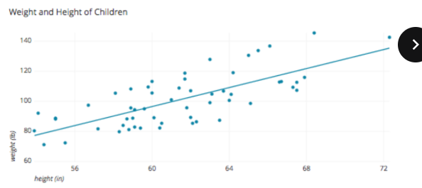
Scatter Plot
The advantages of using this type of data presentation are:
Main feature and implications of the body of data can be grasped at a glance
More attractive and appealing to a wider range of readers
Simplifies concepts that would otherwise have been expressed in so many words
Shows trends and aptterns of a large set of data
Comparisons could be made more striking
Can be readily clarify data
The disadvantages of using this type of data presentation are:
Cannot show as many sets of facts
Can require only show approximate results
Require more time to construct
May be used to misinterpret results
Graphical Presentation