development designs : to emulate design planning text
1/13
There's no tags or description
Looks like no tags are added yet.
Name | Mastery | Learn | Test | Matching | Spaced |
|---|
No study sessions yet.
14 Terms

Design 1
Lack of contrast between green and pink makes flowers less visually impactful. Adjusting shades or adding complementary colours could strengthen contrast.
Dominant green creates an unbalanced composition. Consider introducing more pink to enhance floral representation.
Use of quilting cotton means design relies on visual texture to mimic tactile ( senss of touch) quality of flowers and foliage (plant leaves collectively).
Scale of the pink ‘flowers’ in relation to green‘foliage’requires adjustment. Larger flowers could create a focal point within the composition.
rhytmn
continuous, recurrent (occuring often or repeatedly) , or organized movement. It is a principle that allows an underlying unity and evolving variety in design. There are four types of rhythm in design.
REPETITION Rhythm through repetition can be as simple as repeated shapes, colors, textures, or patterns.

more about design 1
Design 1 represents a literal application of the project inspiration, depicting small pink flowers on
a green bush set against a sky backdrop (lie behind or beyond; serve as a background to) . In this execution, however, the colours are unbalanced
as the overwhelming amount of green detracts from the pink floral representation. The blue,
intended to evoke the sky (to call or summon up (a memory, feeling, etc), esp from the past), does not achieve the desired effect and appears flat. Additionally, the
rhythm created by the geometric shapes do not effectively convey the softness and whimsy of
the intended floral aesthetic. Overall, while the concept is strong, adjustments in colour
balance, rhythm, and shape are needed to enhance the visual narrative.
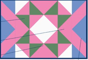
developmetn design 2
Green components are balanced with the
other colours, but the layout lacks the
organic fluidity of natural leaf forms.
Coherent visual path is improved by the addition of
line and direction elements, however could be
simplified to create overall design unity.
The interaction between pink
The blue hues do not contribute effectively to design, creating unnecessary complexity without enhancing the overall composition.
Design 2 represents development with a more creative application of the inspiration.
While the balance of colour is improved, the prominent use of blue coupled with the geometric arrangement created by the pink and green components creates a visual dissonance and distracts from the desired organic flow.
The bold lines created by HST (half squar triangle ) arrangement on each side create strong direction, but is disruptive to the overall unity of the design as there is no logical path guiding the eye around the remainder of the design.
The aesthetic impact of the design could be improved by the introduction of organic shapes, and a harmonious colour palette will enhance the visual narrative of the textile artwork.

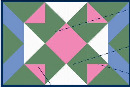
design develop 3
Multiple colour values of pink create visual texture and add visual interest.
Layout of triangles creates an overall organic shape in the
centre of the design.
Placement of green components references leave, reinforcing
the floral motif.
Introduction of white creates a harmonious colour palette.
Layout of white HSTs creates strong sense of line and direction
more about design development 3
design 3 balances the creative and literal application of concepts, resulting in a design which clearly reflects both the floral motif and it representation of of intergenerational connection.
The interplay (the way in which two or more things have an effect on each other) of multiple values of pink create visual texture, and a stronger link to the inspiration images that previous design iterations the repetition of a process or the action of saying or expressing something aloud).
The introduction of white creates harmony, balancing the shades of pink and green.
The layout of triangles at the centre forms an organic shape, effectively drawing the eye inward and enhancing the overall flow of the design (irregualr).
The placement of green components, reminiscent (tending to remind one of something) of leaves, reinforces (strengthen :an existing feeling, idea, or habit).the floral motif (a decorative image or design, especially a repeated one forming a pattern) and complements the pink tones.
The design could be further improved by altering the direction of the lines created by the white triangles. In this design they direct away from the centre, creating visual discord (disagreement between people) and diminish the representation of togetherness.
Final Development

A variety of pink values has been employed to create visual texture, enriching the overall aesthetic.
The use of line and direction in the design points inward, reinforcing the emphasis on the central focal point and symbolising the concept of togetherness.
The harmonious colour palette throughout the design enhances the feeling of comfort and warmth, inviting viewer engagement.
Reintroduction of blue, in a navy shade, a the quilt binding
The layout of the central motif closely mimics the greenery found on an azalea bush, drawing inspiration from reference photos.
Visul Design development: design justification
The final design serves as an expression of my identity, reflecting the value I place on intergenerational connections, and how this is represented in my life through a pink azalea bush.
The final design drawing effectively synthesises (to make (something) by combining different things) visual and conceptual inspiration through the application of elements and principles of design, particularly colour, texture, line, and emphasis.
Visul Design development: design justification (2)
The colour palette is inspired by the multiple values of green and pink found in the azalea bush. This harmonious palette, particularly the varied pink tones, creates visual texture while eliciting (evoke or draw out (a reaction, answer, or fact) from someone.) a feeling of calm and comfort.
This thoughtful use of colour and texture elevates the design's aesthetic value, making it both appealing and relevant to its intended display in a home environment.
The layout of white half square triangles forms lines that converge inward, symbolising connection and creating visual unity.
This intentional directionality encourages the viewer's eye to focus on the central motif of the flower.
Visul Design development: design justification (3)
The focal (relating to the centre or most important part) point of the design is a motif representing a single azalea flower, symbolising the connections within my family and the visual reminder of our shared experiences.
Complemented by green half-square triangles that mimic foliage, principle of emphasis is used to create clarity of concept by reinforcing the value of importance of this representation of intergenerational (relating to, involving, or affecting several generations.) connection.
relating to the centre or most important partBy centring the design around this motif, the design fulfils the functional requirements of this textile art piece, serving as a perennial (lasting or existing for a long or apparently infinite time; everlasting.) reminder of the blooms.
Visul Design development: design justification (4)
This final design reflects and communicates importance of intergenerational connections to my personal identity.
Through the application of colour, texture, line, and emphasis, the design creates a visual focus that highlights the significance of the azalea flower.
Functionally, the design elicits emotion and communicates a clear message, meeting the requirements of textile art and making it suitable for hanging in a home environment.
The final piece is highly decorative and effectively conveys its intended message, making it a successful integration of inspiration, development, and both functional and aesthetic values.