Lesson 3 - Advance Decline Line & Chart Construction
1/20
There's no tags or description
Looks like no tags are added yet.
Name | Mastery | Learn | Test | Matching | Spaced | Call with Kai |
|---|
No analytics yet
Send a link to your students to track their progress
21 Terms
Range Trading is not a good idea because
1) Rnges dont last forever
Net Advances
NA=Number of Advancing Stocks−Number of Declining Stocks
Positive NA → More stocks increased in price than decreased.
Negative NA → More stocks decreased in price than increased.
Advance-Decline Line (AD Line)
Used to confirm market trends and detect divergences.
a breadth indicator based on Net Advances, which is the number of advancing stocks less the number of declining stocks. Net Advances is positive when advances exceed declines and negative when declines exceed advances. The AD Line is a cumulative measure of Net Advances, rising when it is positive and falling
when it is negative. Chartists can use Net Advances to plot the AD Line for the index and compare it to the performance
of the actual index. The AD Line should confirm an advance or a decline with similar movements. Bullish or
bearish divergences in the AD Line signal a change in participation that could foreshadow a reversal.
Advance / Decline Line Interpretation
the market is considered weak when
he AD Line moves to new lows along with the underlying index
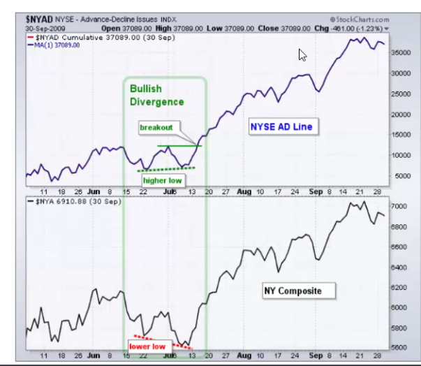
Bullish divergence forms when
the AD Line record a higher low along with the index. This means fewer stocks are declining and the decline in the index may be nearing an end.
Bullish Divergence signs
The index makes a new low but the A/D Linemakes a higher low. It is a signal that fewerstocks are participating to the downside and thatthe market MAY be ready to change trend.
The ad line records an even lower low than what the index does
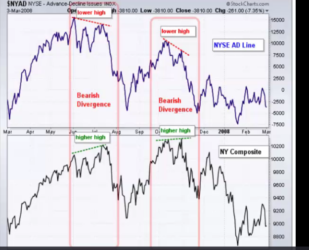
Bearish Divergence
The index makes a new high but the A/D Linemakes a lower high. It is a signal that fewer stocks are participating to the upside and thatthe market MAY be ready to change trend.
The high on the A/D Line is lower than the high on the market index."
Line Chart
Plot price over time. Price is on the y-axis; time is on the x-axis. The mostrecent data is on the right
● Useful for studying long-term trends
● Good for comparing two or more markets at the same time
● Delete useful information
Bar Chart
● Uses the high, low and close of the day. Sometimes the opening price is used as well.
● Shows you the trading range for the day
● Adds information: gaps, range, where is the close within the range, etc...
● Not good when looking at long-term trends
How Do Chartists Use the AD Line?
They compare it to the actual index’s performance.
A rising AD Line confirms an advancing market, while a falling AD Line confirms a decline.
Bullish or bearish divergences in the AD Line may signal a trend reversal.
How is the AD Line Updated?
A/D Line (previous value) + Net Advances = Updated AD Line.
What Does the AD Line Measure?
measures the degree of participation in an advance or a decline. An AD Line that rises and records new
highs along with the underlying index shows strong participation that is bullish. An AD Line that fails to keep pace with
the underlying index and confirm new highs shows narrowing participation. Market strength is undermined when
fewer stocks participate in an advance. Narrowing participation is often identified with a bearish divergence between
the AD Line and the underlying index.
On the downside, the market is considered weak when the AD Line moves to new lows along with the underlying index.
This reflects broad participation in the decline. A bullish divergence forms when the AD Line fails to record a lower low
along with the index. This means fewer stocks are declining and the decline in the index may be nearing an end.
The Advance / Decline Line History and Theory
Dates Back to the 1920s and 1930s
● Developed by Colonel Leonard Ayers who was the head of a firm called Standard Statistics. He eventually merged his firm with a company called Poor’s to form the Company Standard and Poor’s. This is the company that produces the S&P 500
Index that is widely followed to this day.
● A healthy bull market is characterized by a broadening number of stocks which are
rising. The more stocks that participate in an advance, the stronger it is.
● Individual stocks tend to peak and move lower before the broader market and before the fundamentals of the company show signs of breaking down.
● The highest quality stocks tend to be the last to be sold at the end of a bull market.
These also tend to be the largest stocks based on market capitalization. This was the story of 2022!
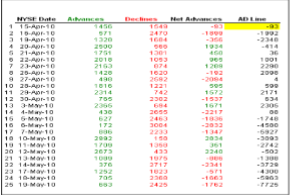
The Advance / Decline Line Construction
Find the Number of Advancing Stocks Today
● Find the Number of Declining Stocks Today
● Subtract Declining from Advancing
● Add the Difference to the Previous Day’s Total
History of Charting
● The Japanese have the best history of charts going back to around 1870
● Early charts just captured closing prices or in many cases the only price of the
day
● The first type of chart was likely just a record of the date and price
● As markets evolved and began to trade more frequently during the day,
traders were able to obtain more data
● In 1869, Thomas Edison created the ticker tape which captured all of the
prices at which a security traded during the day
● Early construction was done by hand
Candlestick Charts
A form of Japanese charting that has become popular in the West. A narrow line
(shadow or wicks) shows the day's price range. A wider body marks the area between
the open and the close. If the close is above the open, the body is white (not filled); if the
close is below the open, the body is black (filled).
● Plot price over time. Price is on the y-axis; time is on the x-axis. The most recent
data is on the right.
● Uses the open, high, low and close of the day. Plots four data points per time
period. Similar to bar charts but for the body.
● Shows you the trading range for the day
● Adds information: gaps, range, where is the close within the range, if the close is
below the open, etc...
Point & Figure Chart