GIS
1/36
Earn XP
Description and Tags
week 1-3: Research, Scale, Data Types and Graphic Design Basics and GIS Feature Visualization
Name | Mastery | Learn | Test | Matching | Spaced |
|---|
No study sessions yet.
37 Terms
map types
cognitive, reference, thematic, virtual
cognitive map
amental map of neighborhoods, not very accurate
reference map
shows boundaries/names of geographic areas (roads/coastlines)
thematic map
shows specific data (qualitative/quantitative)
virtual map
exists on digital devices, gps, uber, ect
3 major tasks
visualization, data collection, data analysis
visualization
representing geographic area through mapping, design, visualization
data collection
way of obtaining information without physical contact
data analysis
using statistical methods for understanding/manipulating/displaying primary data or secondary data sources
qualitative (categorical) scale
nominal scale, ordinal scale
quantitative scale
interval scale, ratio scale
nominal scale
no hierarchy, just categories. Assigns #’s as labels, but the numbers don’t have any value. Just used to identify categories on the map.
ordinal scale
used to determine whether an object has more or less of an attribute than another. Has no scale, just categories. EXAMPLE: if showcasing the average income level of each area of a state, it will start with the lowest income level category and go up from there. Each category is a range of numbers
interval scale
Has a gradient scale ex: temperature
ratio scale
indicates the absolute lack of the property being measured. EXAMPLE: if looking at income levels of a state, it will start at $0 and go from there. This has a scale, and is ranked
Points - drawing style
shows data as a point - example: CA universities
lines - drawing style
can be used to display streets
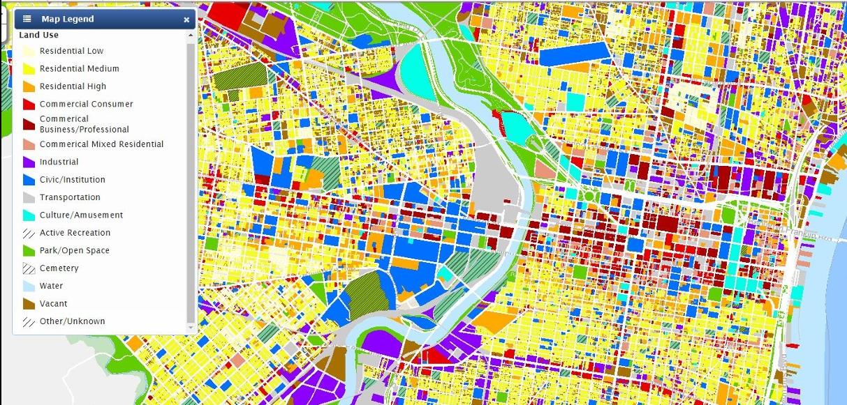
polygons - drawing style
can be used to display categorical data. example: redlining
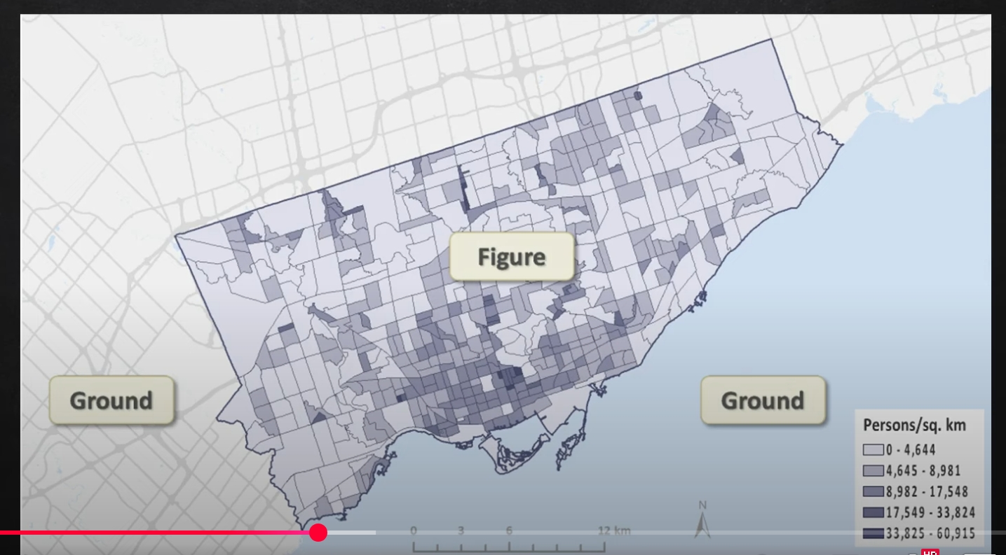
choropleth map
data based on predefined data - good for displaying statistical data like population
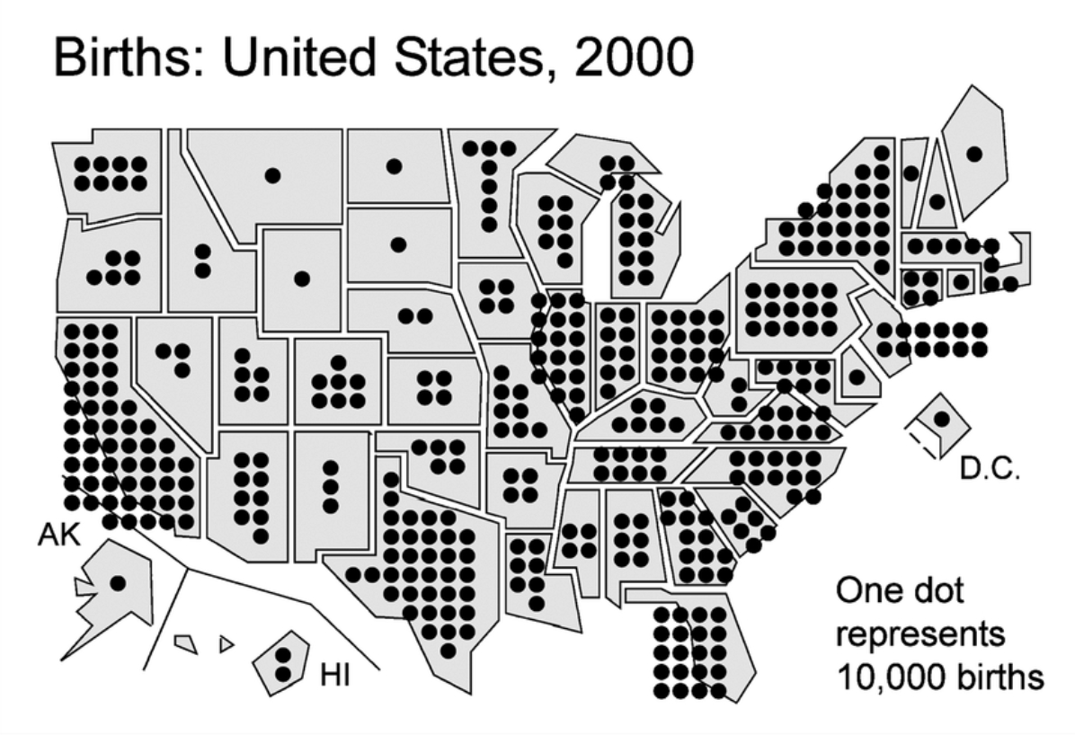
dot distribution
each dot has same # value that has been assigned to them. Shows spatial patterns/distribution
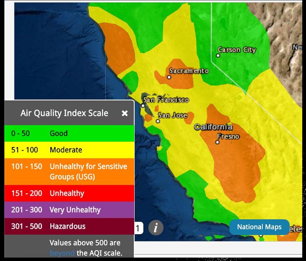
Isoline map
uses line symbol to display temperature/elevation/distance
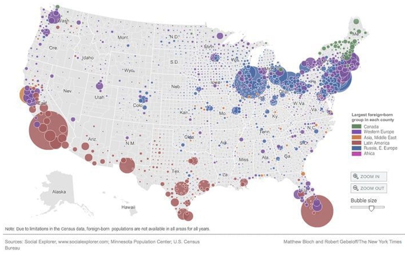
proportional symbol/graduated symbol
symbol size varies based on the value is represents
5 design principles
contrast
hue v value
color wheel
visual hierarchy
color scale (monochromatic/dichromatic)
Contrast
the greater the different of value btw data sets, the greater the contrast
hue v value
hue: basic color
value: amt of black in the color (saturation/intensity)
color wheel
adjacent colors for harmony - opposite colors to differentiate data more easily
visual hierarchy (bright/drab)
content organized to visually communicate order/importance - creates depth
bright (figure): assign to important features
drab (ground) graphic elements that provide context
monochromatic
same hue with different values (intensity)
dichromatic
2 monochromatic scales combined (ex: hot/cold)
3 types of points (symbolizing data)
unique points: no correlation to each other
graduated points: ranking system based on size
icons: easily identifiable points (grocery store icon)
scale
ratio of map distance to ground distance
large scale map
detailed map - should have graphic scales
small-scale map
highly generalized map
visibility base map
simplifies countries to polygon shapes
inaccurate representation of boundaries/coastlines
makes smaller states much more legible/identifiable
intensity data vs count data
intensity data: choropleth maps - light/dark color values indicate the correlation to each other
count data: graduated symbols to represent the #’s
dot array map
distinguishable dots on a map separated by clear state boundaries. Good for count data
bivariate correlation
combines 2 different data sets to reveal patterns/relationships - ex: rural vs urban population