Lesson 12: Using the Appropriate Type of Visualization
1/19
There's no tags or description
Looks like no tags are added yet.
Name | Mastery | Learn | Test | Matching | Spaced |
|---|
No study sessions yet.
20 Terms
Pie Chart

A circle broken inot slices to represent percentages of information
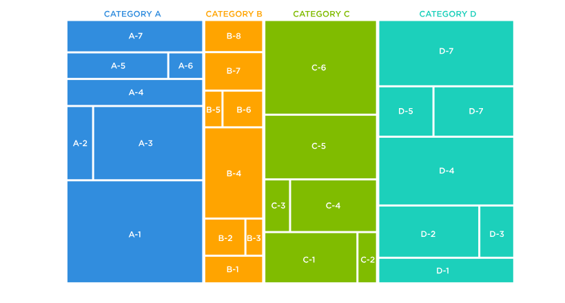
Tree Map
A rectangle that shows the proportion of values using smaller rectangles within the larger one
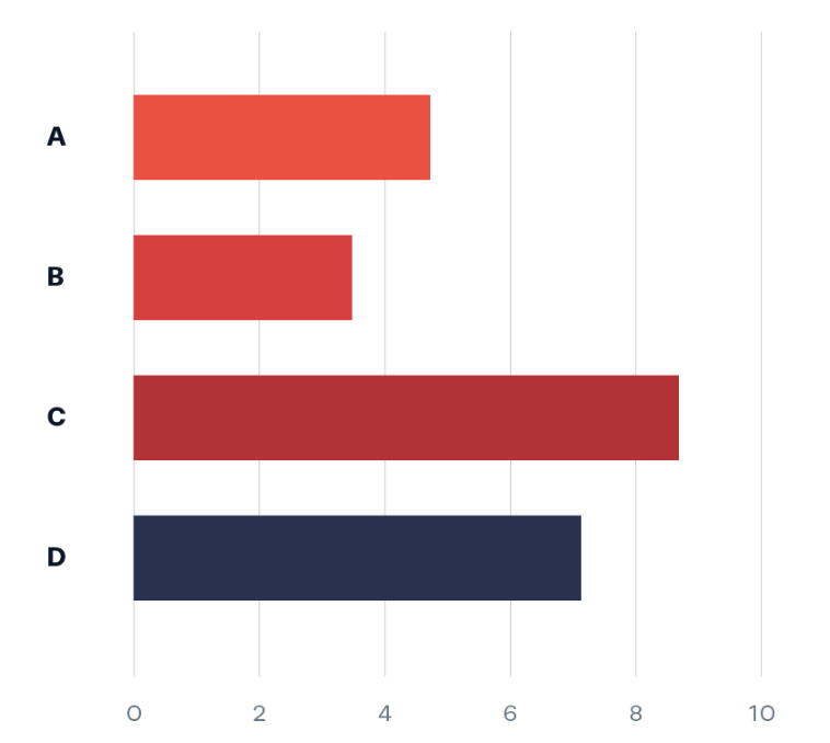
Bar Chart
A chart that displays information about, listing the categories on y axis and the discret values on the x axis
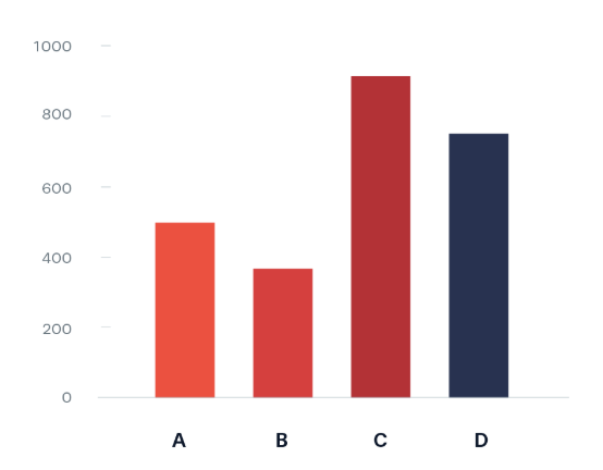
Column Chart
Displays information listing the categories on the x axis and the discrete values on the y axis.
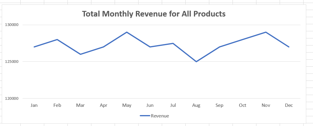
Line Graph
A graph that consists of either a single horizontal line or a group of multiple lines that represent different data points at different times
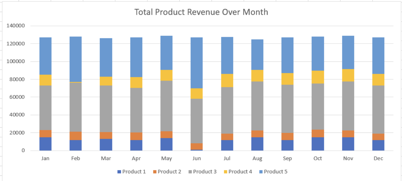
Stacked Chart
Breaks the bar or column into separate portion, each representing an additional data point
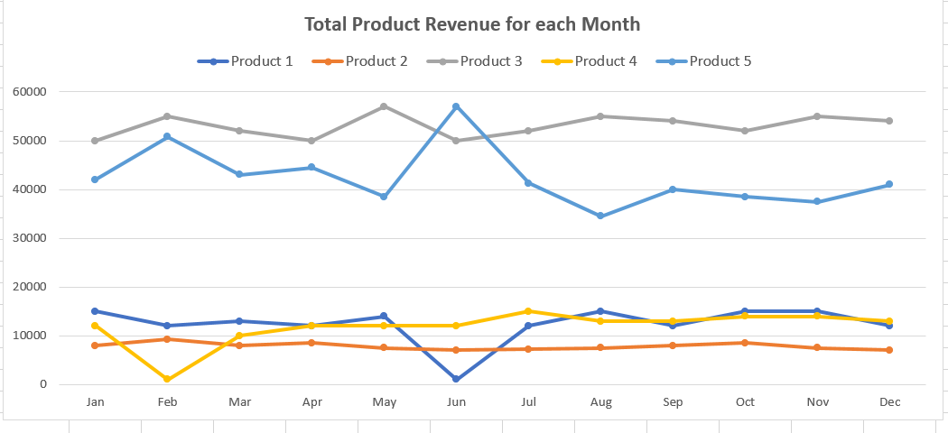
Line Graph with Multiple Lines
Similar to a regular line graph with one line, it has multiple lines thus can portray multiple data points that can represent different categories or series over the same period of time, allowing for direct comparison between them.
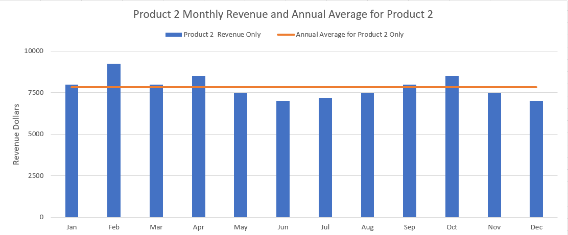
Combination Chart
A chart that combines columns and lines to compare one or more data points (columns) against a trend (line)
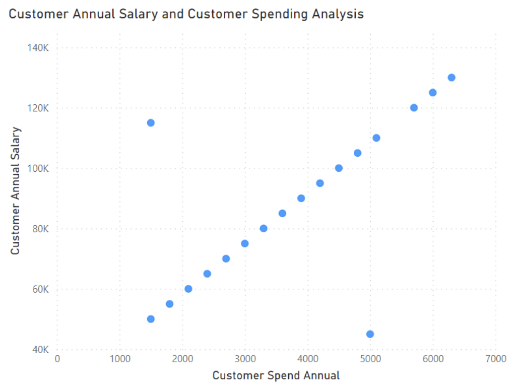
Scatter Plot
A visual that consists of two variables plotted on the x-axis and y-axis, with a dot placed on the graph where the two data points converge on both of the axes
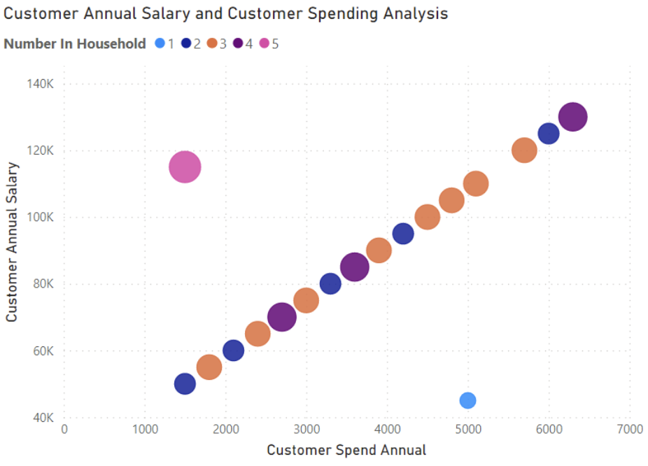
Bubble Chart
A visual that plots points on an x-axis and y-axis similar to a scatter plot, but with the addition of the size of the dot representing a third variable
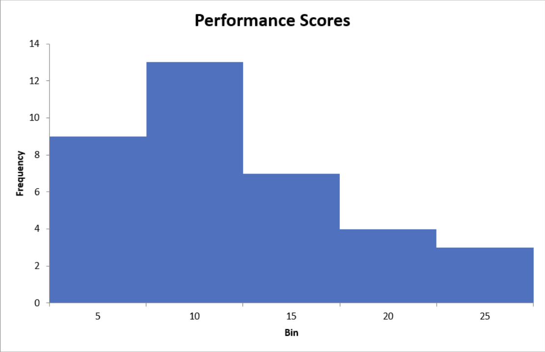
Histogram
A chart that groups values into bins, or class intervals, on the x-axis and lists the metric we want to assess against on the y-axis
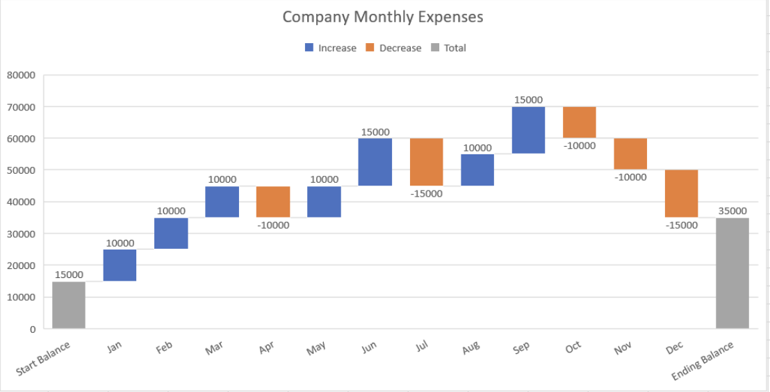
Waterfall Chart
A chart that visualizes performance over time with a series of columns that depict positive and negative changes, showing the cumulative effect on a starting point.
Tools that provide mapping
Power BI
Tableau
Maping dedicated tool
ArcGIS
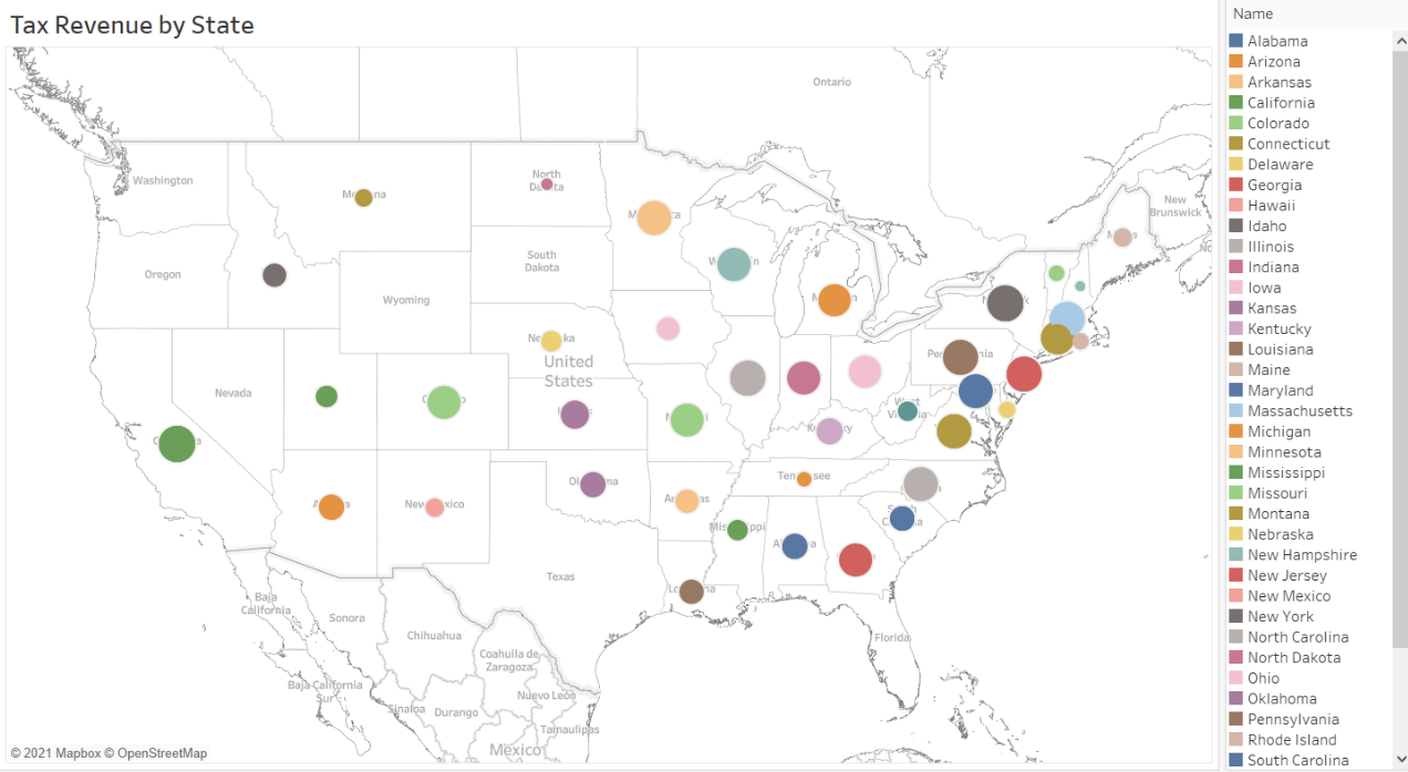
Dot Maps
A map that displays geographic data using markers to not specific spots on the map (pinpoint a location)
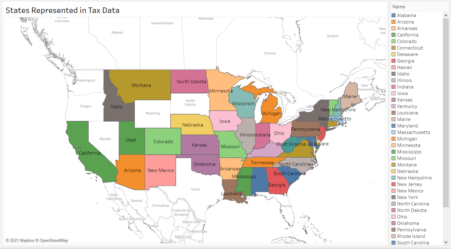
Filled Map
A map that displays geographic data by filling in the borders of a location
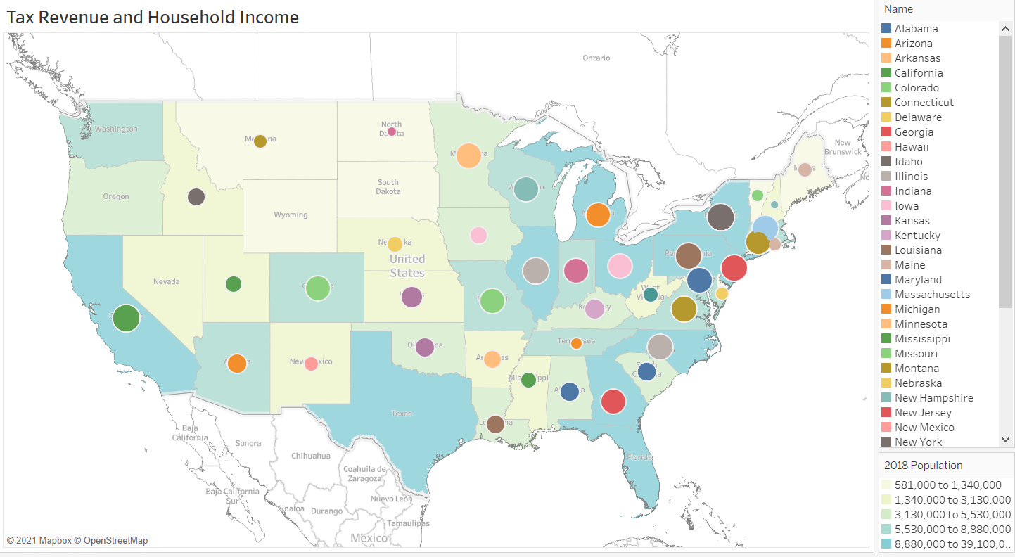
Layered Map
Maps that display geographic data by both using markers and filling in borders
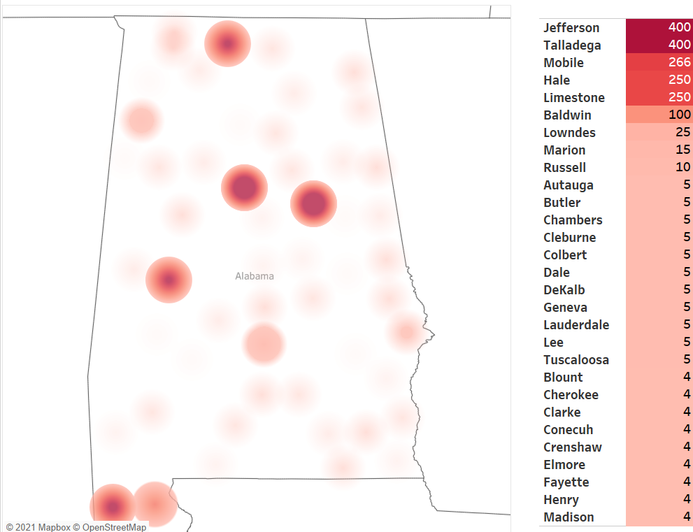
Heat Map
A visual that uses color to draw attention to a "hot" spot, or a part of the visual that needs to be pointed out
More dense/darker colors indicate a higher number of locations
Word Cloud
A visual representation of the words used in a particular body of text

Infographic
Any combination of visuals, artwork, photos, and language that tells the story of your data in a compelling and graphically appealing way