Graphs
0.0(0)
Card Sorting
1/6
There's no tags or description
Looks like no tags are added yet.
Study Analytics
Name | Mastery | Learn | Test | Matching | Spaced |
|---|
No study sessions yet.
7 Terms
1
New cards
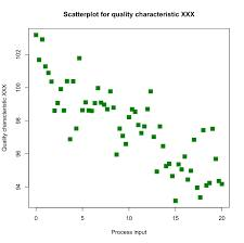
Scatter plots
best when looking for correlation between two variables.
2
New cards
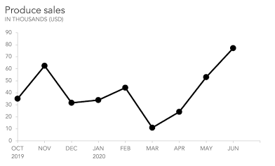
Line graphs
best when looking for trends and Changes (often over time).
3
New cards
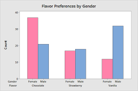
Bar graph
best when comparing amounts for categories of data.
4
New cards
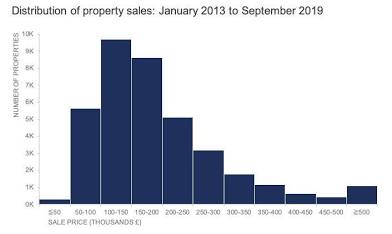
Histograms
best when comparing the distribution of a variable. The height of each column corresponds to the count within that range of values.
5
New cards
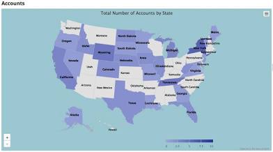
GeoCharts
GeoCharts with different countries or cities.
6
New cards
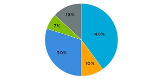
Pie charts
best when comparing percentages of the whole.
7
New cards
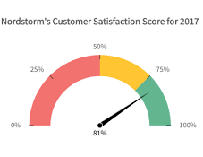
Gauge charts
Gauge charts are useful for comparing values when there is a lower limit and an upper limit to the values.