STAT 201 MT 1 code
1/6
Earn XP
Description and Tags
3, 4
Name | Mastery | Learn | Test | Matching | Spaced | Call with Kai |
|---|
No analytics yet
Send a link to your students to track their progress
7 Terms
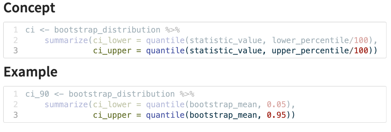
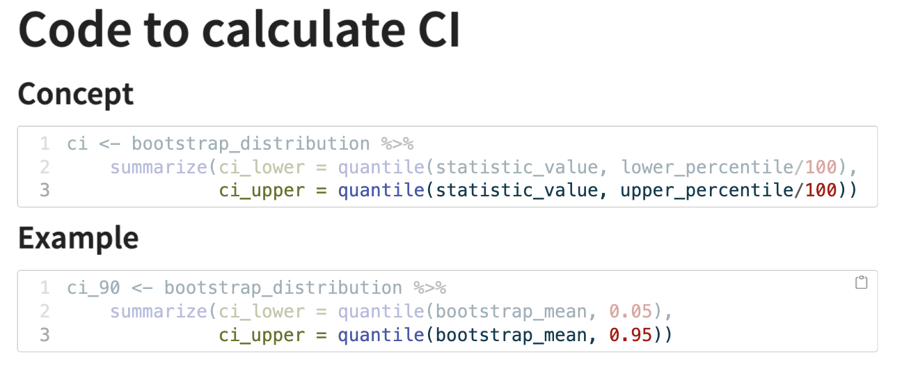
calculating the CI from a bootstrap distribution
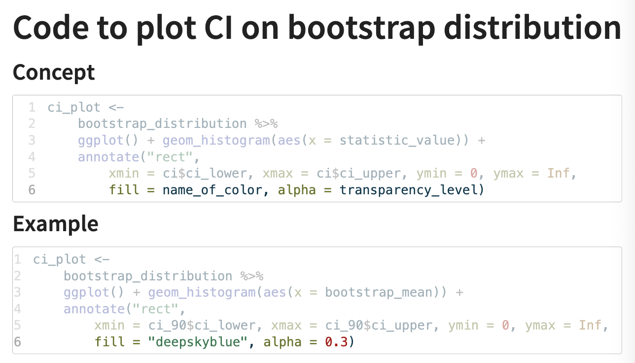
plotting a CI on a bootstrap distribution
quantile()
used to calculate quantiles of a dataset; returns data points that divides the data set into equal sized groups
syntax:
quantile(x, prob)
x = a numeric vector containing your data
probs = a numeric vector of probabilities (0-1) for which you want to find the quantiles
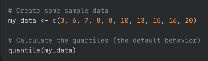
*if you do not specify the probs argument, R will calculate the quartiles by default; 0, 25, 75, 100
code for the normal approximation of sampling distribution
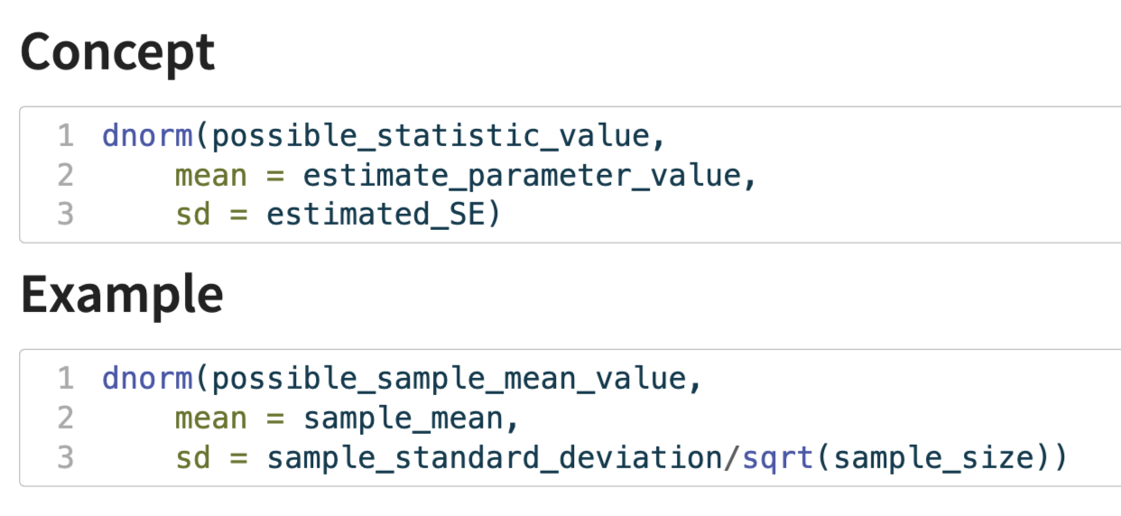
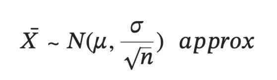
(this is for the sampling distribution of means, in this case sd = sigma/sqrt(n))
plotting the normal distribution/bell curve
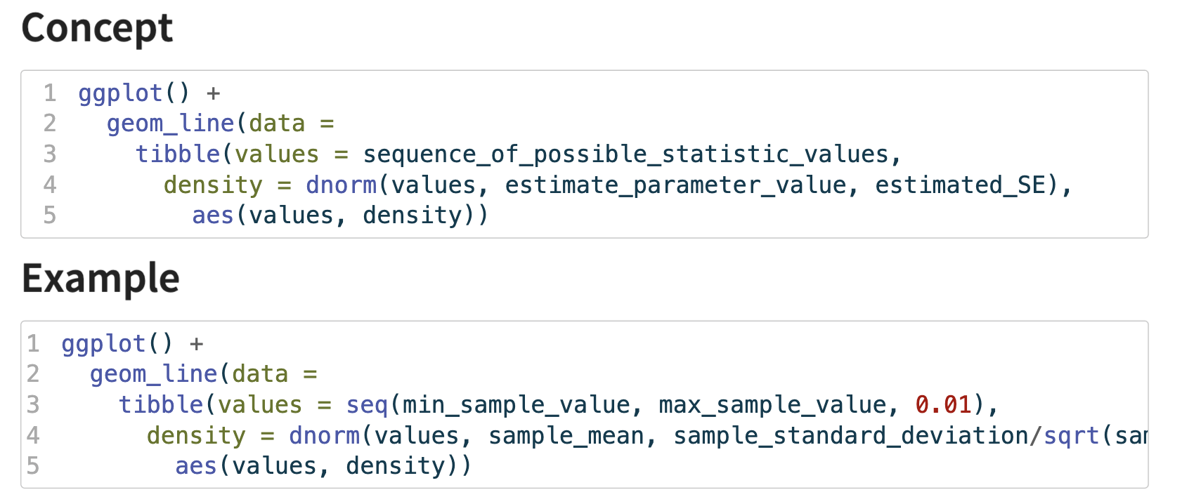
geom_line : specifies that we want to add a line
data = tibble() : instead of using a pre-existing data frame, this code creates the data for the line (on the fly) using the tibble() function; this tibble has two columns:
values: a sequence of numbers that will serve as the x-coordinates for the curve
density: calculates the corresponding y-coordinate for each value in the values column
dnorm(…) : calculates the height (probability density) of the normal distribution curve for each point in values
aes(values, density) : aesthetic mapping that tells geom_line() which columns to use for the plot: map the values column to the x-axis and the density column to the y-axis
*in short the code generates a series of (x, y) coordinates for a perfect normal curve with a specific mean and standard deviation and then connects them with a line to visualize the curve
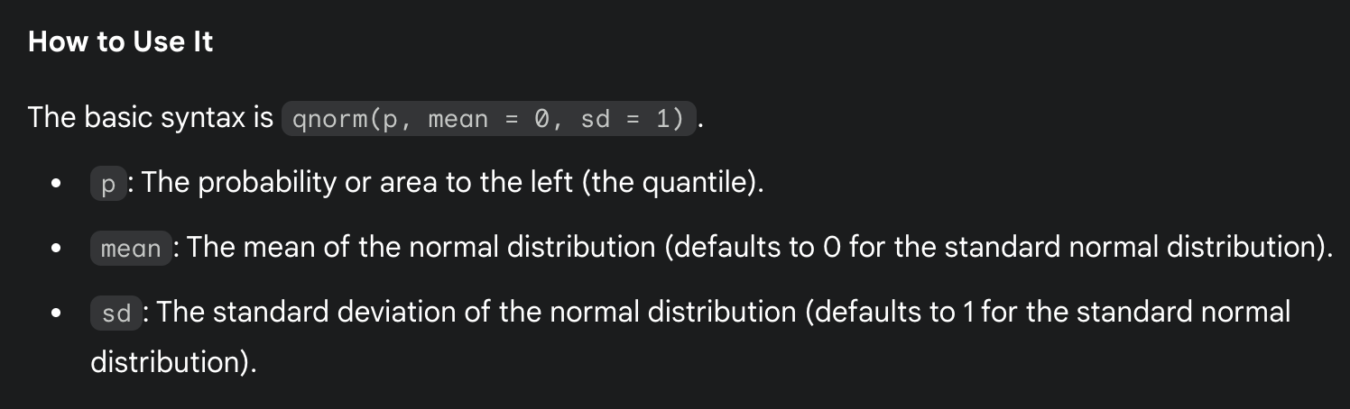
qnorm()
calculates the quantile function for the normal distribution; give qnoem a probability (value between 0 and 1) and it gives back the corresponding z-score (the value on the x-axis of a standard normal curve)
density vs frequency
use frequency (the default) to see how many observations are in each bin
use density to see the shape of the distribution and to compare it to a theoretical probability distribution
when using density (eg. freq = FALSE) the y-axis is rescaled so that the total area of all the bars in the histogram equals 1