Web development
 Studied by 1 person
 Learn
Learn Practice Test
 Spaced Repetition
 Match
Match Flashcards
1/86
There's no tags or description
Looks like no tags are added yet.
Name | Mastery | Learn | Test | Matching | Spaced |
|---|
No study sessions yet.
87 Terms
Alignment
Alignment helps us to create a sense of unity by providing structure and connecting elements in a subtle, yet powerful way.
Horizontal and vertical
Emphasis
The dominance of one or more particular elements that creates a focal point in website design. • You can create emphasis by: Size, Color, Density, Value, Whitespace, proportions, leading lines… etc.
Dominance ___> focal point
Leading Lines
Leading lines can draw the user eye to the most important part of the image.
Proportions
Emphasis created by nice proportions that get our attention to what the site is about and also to the donate button'; color
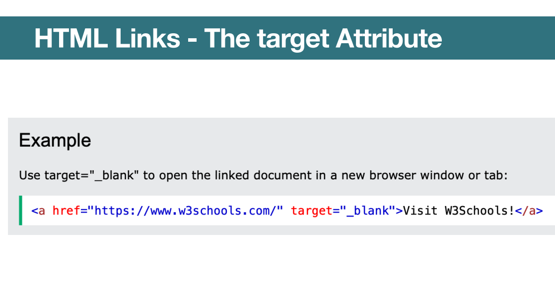
HTML links
By default, the linked page will be displayed in the current browser window. • To change this, you must specify another target for the link. • The target attribute species where to open the linked document.
Target attribute
• self - Default. Opens the document in the same window/tab as it was clicked • blank - Opens the document in a new window or tab • parent - Opens the document in the parent frame • top - Opens the document in the full body of the window.
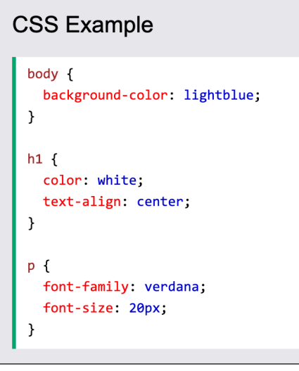
CSS
Cascading Style Sheets (CSS) is a stylesheet language used to describe the presentation of a document written in HTML. • CSS is the language we use to style an HTML document. • CSS describes how HTML elements should be displayed. • The style denitions are normally saved in external .css les. • CSS Saves a Lot of Work: With an external stylesheet le, you can change the look of an entire website by changing just one file
Css syntax
A CSS rule consists of: a selector and a declaration block. • The selector points to the HTML element you want to style. • The declaration block contains one or more declarations separated by semicolons. • Each declaration includes a CSS property name and a value, separated by a colon. • Multiple CSS declarations are separated with semicolons, and declaration blocks are surrounded by curly braces.
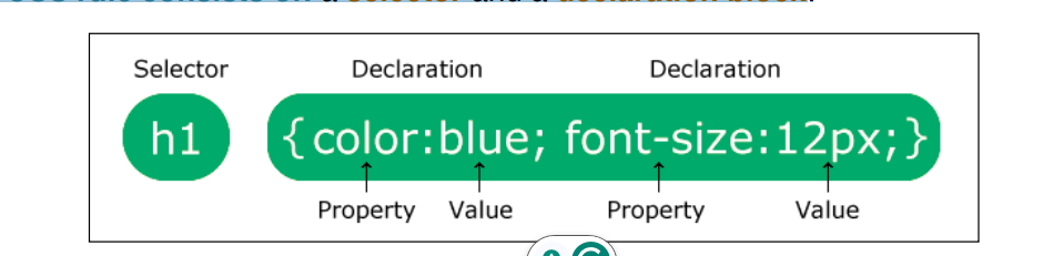
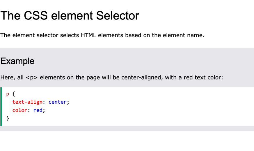
CSS selector
p is a selector in CSS (it points to the HTML element you want to style:
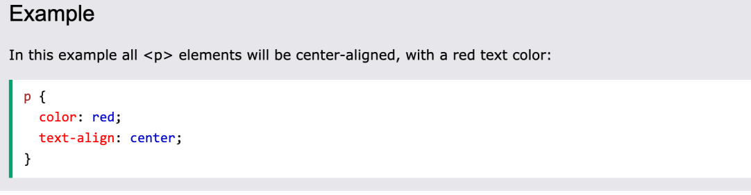
• color is a property, and red is the property value. • text-align is a property, and center is the property value.
CSS element selector
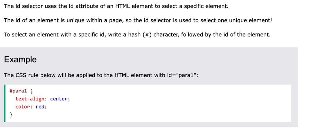
CSS id sector
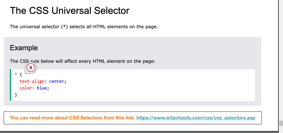
CSS universal sector
three ways to insert CSS
External, Internal, Inline
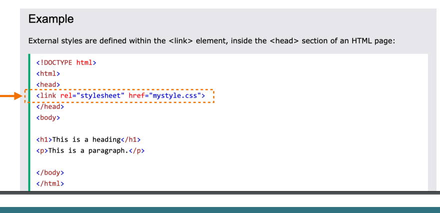
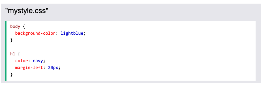
External CSS
With an external style sheet, you can change the look of an entire website by changing just one le! • Each HTML page must include a reference to the external style sheet le inside the element, inside the head section.An external style sheet can be written in any text editor, and must be saved with a .css extension. • The external .css le should not contain any HTML tags. • Here is how the "mystyle.css" le looks:
MYstyle.css
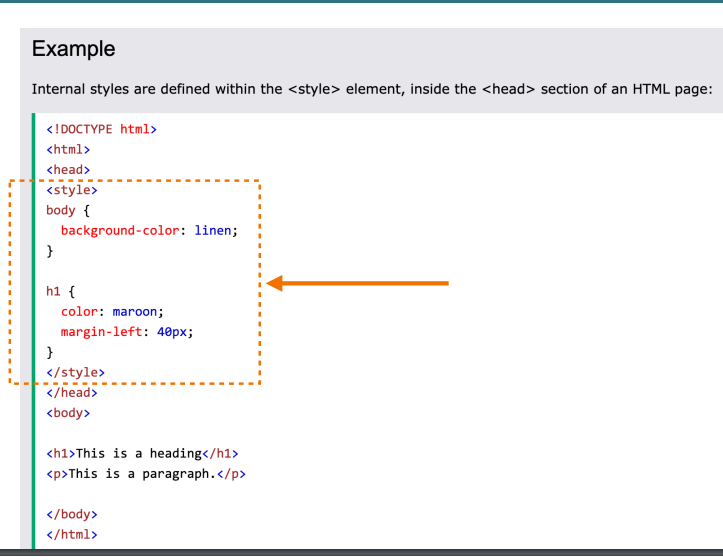
Internal CSS
An internal style sheet may be used if one single HTML page has a unique style. • The internal style is dened inside the head section
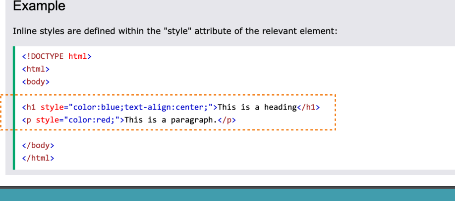
Inline Css
An inline style may be used to apply a unique style for a single element. • To use inline styles, add the style attribute to the relevant element. The style attribute can contain any CSS property.
Clarity
In UI design, the term clarity means using recognizable features and elements that are intuitive to interact with. This is especially important for interactive elements such as buttons and navigation menus. • There's a reason why the majority of websites place the main navigation menu at the top of the page and the company logo in the top left corner. It has to do with creating clarity for users, since this is where people first look to find those elements, as evidenced in eye tracking studies. The majority of websites place the main navigation menu at the top of the page and the company logo in the top left corner.
3. Visual hierarchy:
Visual hierarchy in web design is crucial as it organizes design elements in order of importance, directing user focus. • It employs size, color, contrast, and space to delineate priority, guiding users effortlessly through the content and ensuring a harmonious, intuitive user experience.
Prototyping
Prototypes are early models of a product that simulate its design and functionality. • Prototyping is the process of developing a digital draft of a design or product, allowing a developer to explore how the creation will function before making the final product. It provides a ways to test and explore the design without using too many resources. • A website prototype can be any mock-up or demo of what a website will look like and function when it goes live. It can be anything from a paper sketch to a clickable prototype
Importance of Prototyping in Web Design and Development:
1. Prototyping Bridges the Gap Between Design and Development: • While web design focuses on the visual aspects of a website, and development handles the technical side, prototyping helps bridge the gap between the two. 2. Improved User Experience (UX) Through Prototyping: • User experience is at the heart of any successful website, and prototyping is an excellent tool for refining the UX. Prototypes allow designers to test user flows, navigation paths, and interactive elements that are essential for a smooth user journey.
3. Faster Iterations and Reduced Development Costs: • One of the primary benefits of prototyping is the ability to iterate quickly. Since prototypes are built with fewer resources than a full website, designers can test different concepts, receive feedback, and make adjustments faster before investing time and money in development.
Low-Fidelity Prototypes:
These are simple, static wireframes that illustrate the basic layout and structure of a website. They’re usually quick to create and are perfect for early-stage brainstorming and testing of concepts.
High-Fidelity Prototypes:
These are more detailed and interactive, simulating the actual user experience. High-fidelity prototypes often include actual content, colors, and interactive elements, allowing designers to test more specific interactions and get a closer feel for the final product.
Clickable Prototypes
These allow users to click through different pages and interact with elements like buttons, menus, and forms. Clickable prototypes are particularly useful for user testing and demonstrating the website’s functionality to clients and stakeholders
HTML/CSS Prototypes
These are prototypes built using HTML and CSS to create a more realistic and functional version of the website. They allow for advanced interactivity and are often used to simulate a more developed prototype before full-scale development begins.
HTML Tag <!--EndFragment--> </body> </html>
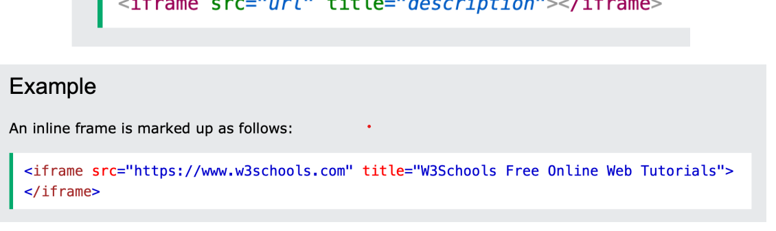
The tag specifies an inline frame. • An inline frame is used to embed another document within the current HTML document.<!--EndFragment--> </body> </html>
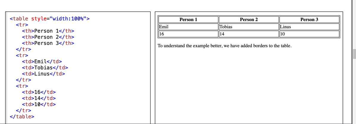
HTML Tables
HTML tables allow web developers to arrange data into rows and columns. Table Cells • Each table cell is defined by a and a tag. • td stands for table data. • Everything between and is the content of a table cell. • Note: A table cell can contain all sorts of HTML elements: text, images, lists, links, other tables, etc. HTML tables allow web developers to arrange data into rows and columns. Table Rows • Each table row starts with a and ends with a tag. • tr stands for table row.Table Headers • Sometimes you want your cells to be table header cells. In those cases use the tag instead of the tag. th stands for table header.
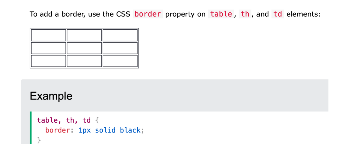
How to add a border
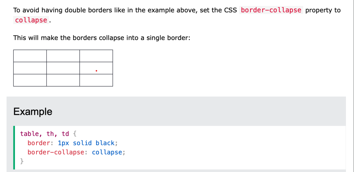
Collapsed Table Borders
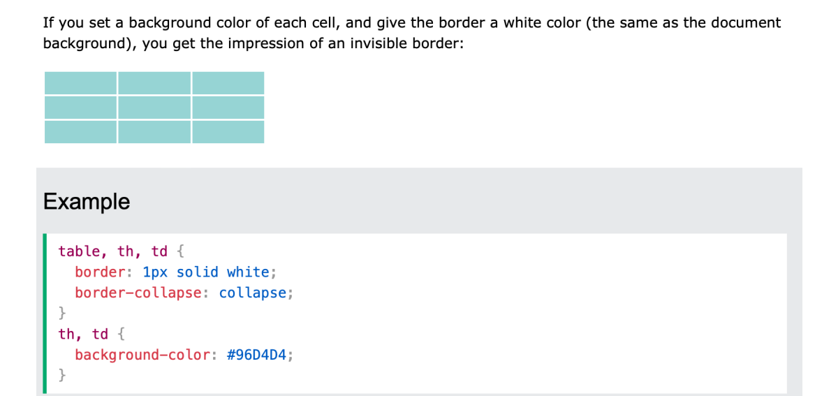
Style Table Borders
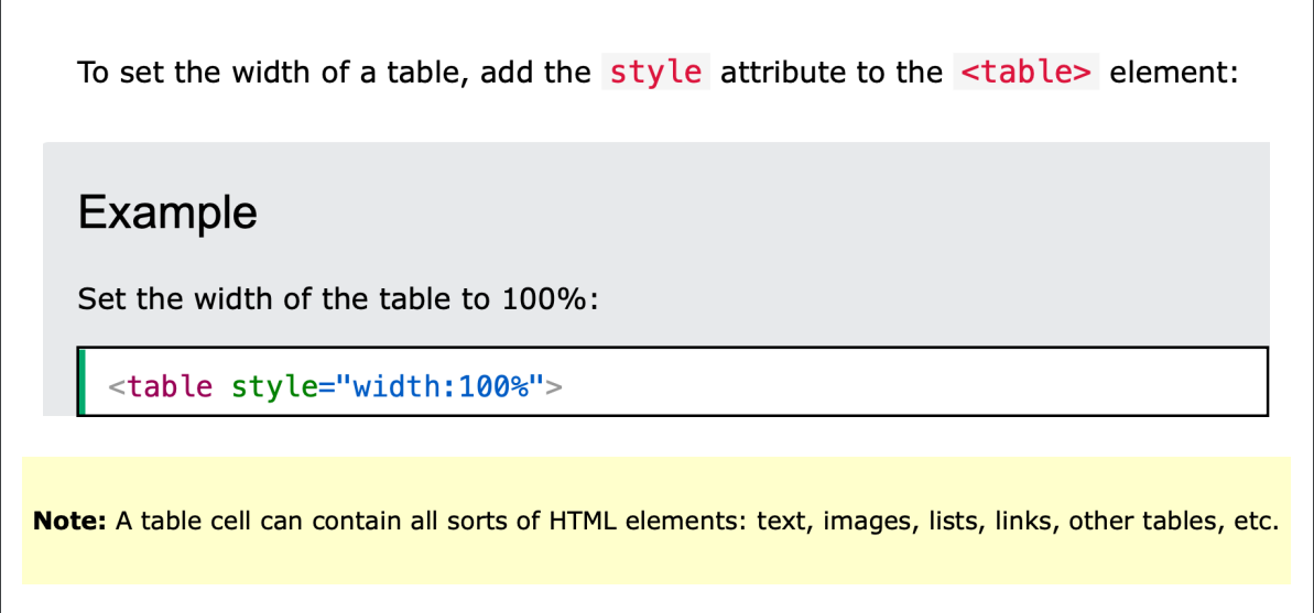
HTML Table Width
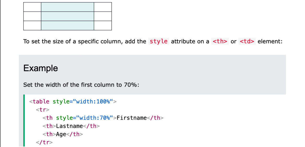
HTML Table Column WidthHTML Table Column Width
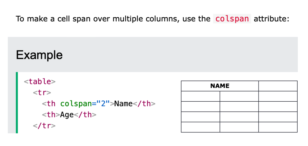
HTML Table - Colspan
HTML Table - Rowspan
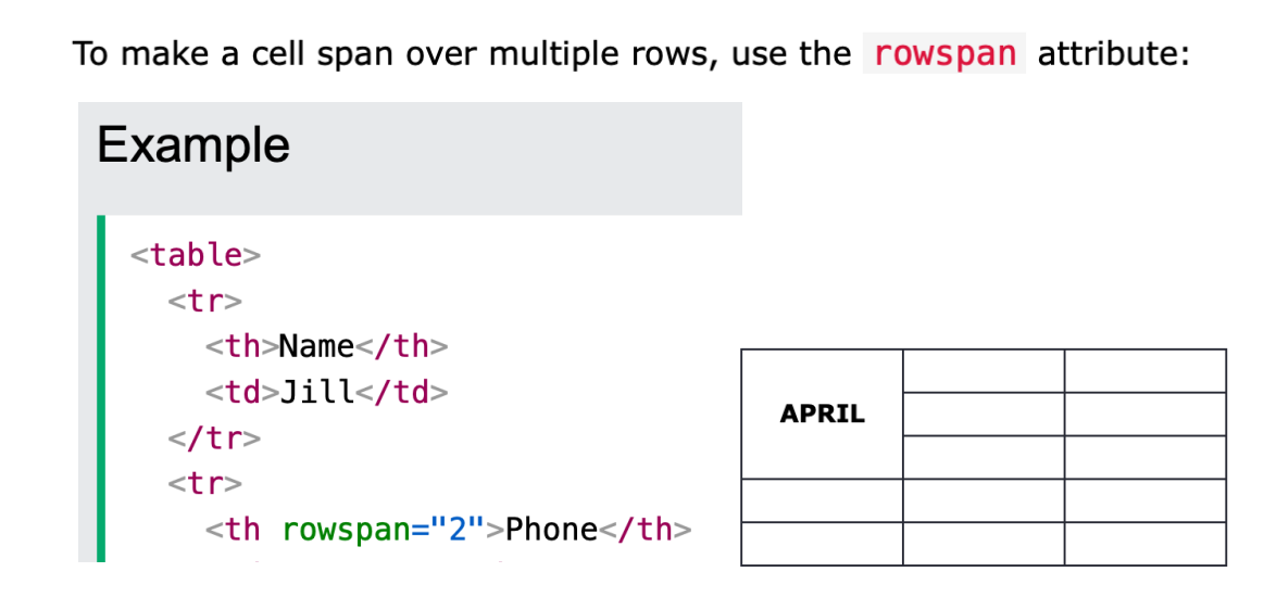
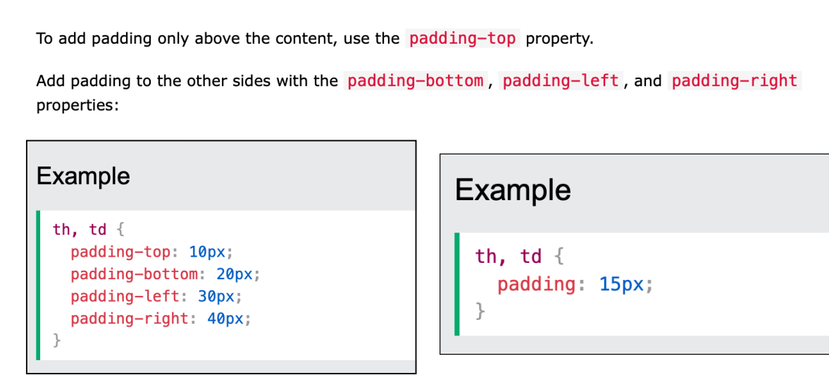
Table Padding
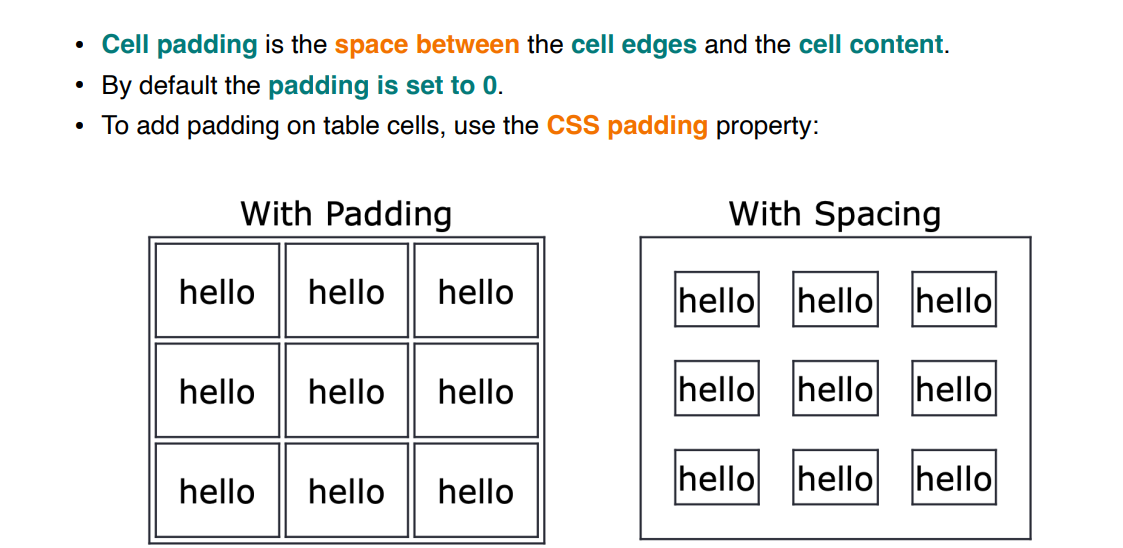
HTML Table - Cell Padding
HTML Table - Cell Spacing
Cell spacing is the space between each cell. • By default the space is set to 2 pixels. • To change the space between table cells, use the CSS border-spacing property on the table element:
Website Usability
Website usability is a feature of websites and a way of designing them that focuses on the user’s needs. It utilizes user-centric design processes to ensure that websites are efficient and easy to use for the people who actually use them, rather than the people who designed them. • Making your website usable (by making it simple) is one of the most complex tasks in web design. • Clarity and utility are the two goals of website usability. • Web designers are tasked with making websites that don’t just look appealing, but work exactly how users expect them to work.
1. Availability.
Availability is simply how easy it is to access your website. Your website’s availability can be affected by the web hosting platform you use and by how compatible it is with the devices users are accessing it with.
Clarity
Clarity is the core of website usability. • Visitors come to your site with specific goals in mind. • If your website’s design distracts or confuses visitors, they’ll either need more time to find what they came for, or they might forget their initial goal altogether and leave. In either case, they’re leaving dissatisfied and unlikely to come back
Recognition
Recognition is a way of describing the learning process users undertake when they visit a new site. • All sites require at least a few seconds of assessment before a user can interact with them. The vast majority of users will, for instance, need to navigate back to your homepage at some point, and most will look for a logo in the top left corner of their screen to do so (If the website is English). • If your website works differently, they’ll have to spend a few seconds learning how to get back to the homepage. When you design for usability, strive to keep this learning curve as short as possible.
Practices you can use to provide a more learnable interface to your users: • Consistency • Feedback • Sticking to known UI elements • Familiarity
Feedback
One of the most rudimental forms of feedback is hyperlink feedback. • A hyperlink can have three different states. First of all, a hyperlink sits in its normal state. When the user hovers the hyperlink with its cursor, the link color changes or the user sees a small transition animation. This small feedback moment tells the user that the element is clickable. • Once the hyperlink has been clicked, you’ll see its active state. Again, this is a form of feedback to tell the user that the click request has been received and is being processed.
Feedback can be very subtle. We refer to this as micro-interactions. Microinteractions can take the shape of: • animations or transition effects • color changes • a checkbox being checked • These micro-interactions are crucial, as a user needs evidence that what they’ve done affected the page
button features
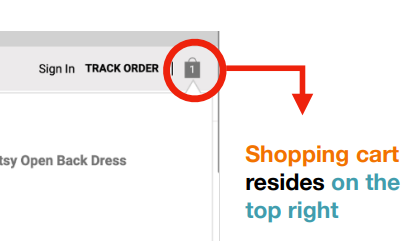
Sticking to known UI elements:
Make use of already existing design solutions to add familiarity to your design. • Stick to industry best practices. Stick with what works and what has been used over and over. • For example, a shopping cart resides on the top right of your website. Don’t get funky and place your shopping cart at the left bottom. This will only confuse users.
Familiarity:
Familiarity allows a user to learn new interfaces quicker based on previous knowledge. This means they can use pre-existing knowledge of similar interfaces to adopt a new interface quicker. • For example, if you apply Google’s Material Design language to your website, users can recognize elements and know how to interact with them. Therefore, they’re not afraid to click a particular button as they know what action to expect. For example, if you apply Google’s Material Design language to your website, users can recognize elements and know how to interact with them.
Credibility.
Even if customers can easily find the content or functionality they’re looking for, if they don’t trust it, the website is worse than useless for them. There are a lot of ways to demonstrate your credibility through your website design, like being transparent about your business and goals.
How to Build Credibility on Your Website: • 1. Welcome visitors with a professional website design. • 2. Use testimonials to build trust. • 3. Showcase your expertise with great content. • 4. Ensure your contact information is prominent on the site. • 5. Incorporate authentic images and video. • 7. Highlight your certifications and professional partnerships
Relevance.
Relevance is perhaps the most complex issue in usability because it describes whether the content that your customers see on your site is engaging. • Creating engaging content involves carefully defining your target audience, determining what they want and meeting their needs as clearly as possible.
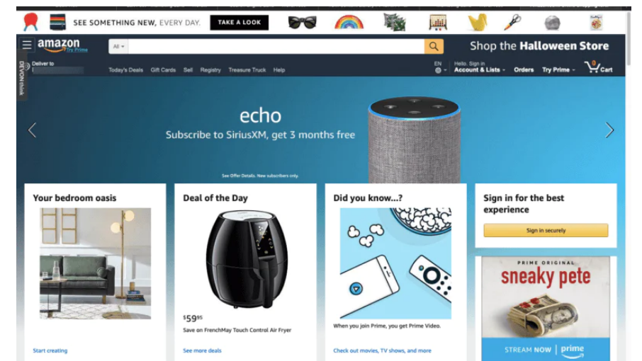
Example: Amazon Website:
Amazon is optimized for usability in lots of ways: • The desktop version of the site is optimized for both tablets and desktop screens. • Every page is dynamic, and the basic layout of each page adjusts to the size of the user’s screen. • The separate mobile site has a cleaner interface and a clear hierarchy of content and has been optimized to work well with slower internet connections. • Amazon.com also has almost no downtime, despite the millions of users on the site every day. • Amazon explicitly states their commitment to usability: “We’re always looking for ways to improve the usability of the site for our customers, including those with disabilities.”
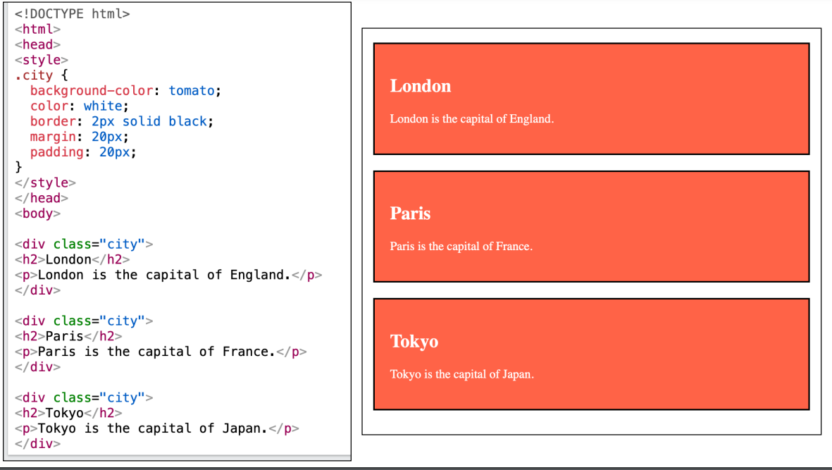
HTML class Attribute
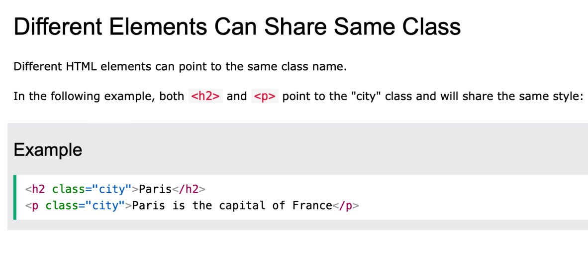
The HTML class attribute is used to specify a class for an HTML element. • Multiple HTML elements can share the same class. • The class attribute is often used to point to a class name in a style sheet. It can also be used by a JavaScript to access and manipulate elements with the specific class name. • The class attribute can be used on any HTML element. • In the following example we have three
elements with a class attribute with the value of "city". All of the three
elements will be styled equally according to the .city style definition in the head section:
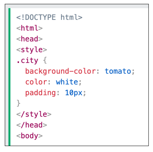
The Syntax For Class
To create a class; write a period (.) character, followed by a class name. Then, define the CSS properties within curly braces {}:
HTML Class attribute
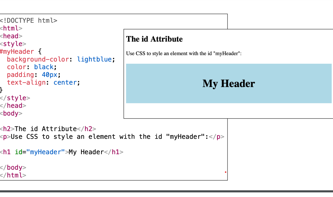
HTML id Attribute
• The HTML id attribute is used to specify a unique id for an HTML element. • You cannot have more than one element with the same id in an HTML document. • The value of the id attribute must be unique within the HTML document. • The id attribute is used to point to a specific style declaration in a style sheet. • It is also used by JavaScript to access and manipulate the element with the specific id. • The syntax for id is: write a hash character (#), followed by an id name. Then, define the CSS properties within curly braces {}
In the following example we have an
element that points to the id name "myHeader". This
element will be styled according to the #myHeader style definition in the head section:
What Is Responsive Web Design?
Responsive Web Design is the technique for developing websites and web portals in a more interactive way with the robust UX (user experience) optimal view solutions on a web page with the best browser compatibility that can run and operate in various types of devices.
As per the latest trends and business requirements in user experience in smartphones and tablets with different Operating Systems(OS), a web design should be more responsive to these devices. Responsive web design is a suitable, and fast solution that enables lesser efforts from the developers’ end. • Responsive layouts automatically accommodate and adjust to any device's screen size, using a desktop, a laptop, a tablet, or a mobile phone.
How Does It Perform?
Bootstrap’s grid system uses a sequence of containers, rows, and columns to layout and align content. • It is constructed with a flexbox and is comprehensively responsive. • Flexbox is a layout method for arranging items in rows or columns.
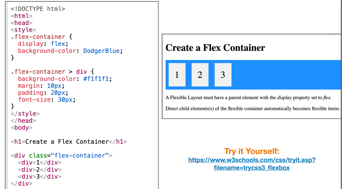
CSS Flexbox Components
A Flexbox always consists of: • a Flex Container - the parent (container)
element • Flex Items - the items inside the container
A Flex Container with Three Flex Items • To start using CSS Flexbox, you need to first define a flex container. • The flex container becomes flexible by setting the display property to flex.
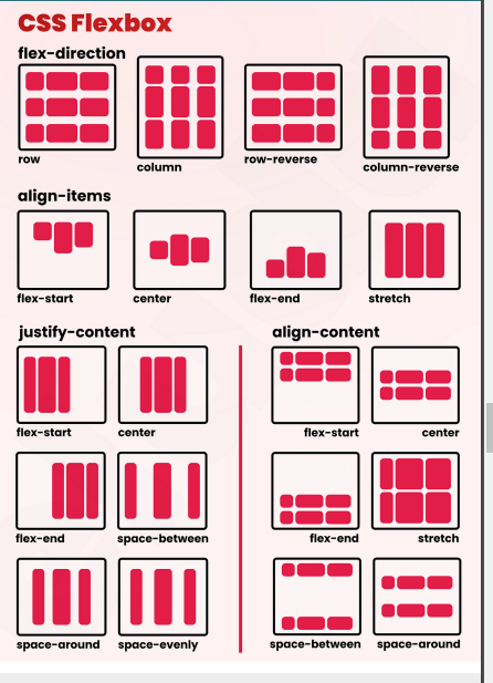
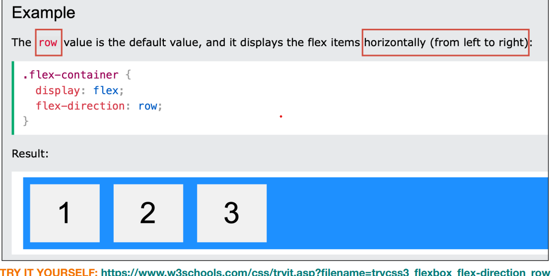
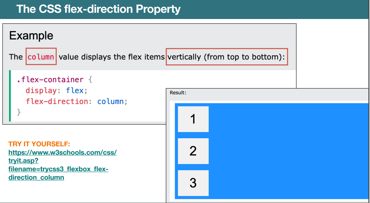
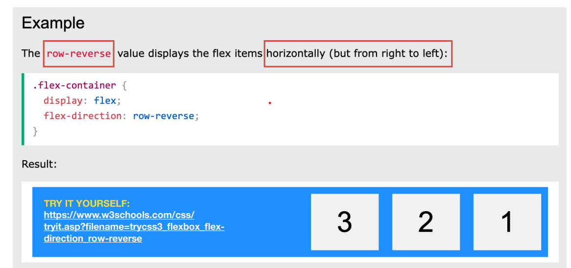
The CSS flex-direction Property
The flex-direction property specifies the displaydirection of flex items in the flex container. • The flex-direction property can have one of the following values: • row • column • row-reverse • column-reverse
Row CSS Flex direction property
Column
Row Reverse
Seeking Inspiration Importance in Web Design
The goal of seeking design inspiration is to generate fresh ideas and unique perspectives to help designers create something new and original. • The process of seeking inspiration is essential to the design process and allows designers to create compelling, functional, and aesthetically pleasing designs. • Good design inspiration keeps you up-to-date, enabling you to incorporate modern aesthetics and techniques into your projects.
What is Usability Testing?
Usability testing is a method of testing the functionality of a website, app, or other digital product by observing real users as they attempt to complete tasks on it. • Typically, during a test, participants will try to complete typical tasks while observers watch, listen and takes notes. The goal is to identify any usability problems, collect qualitative and quantitative data and determine the participant's satisfaction with the product.
• Simply, usability refers to how easy or hard something is to use. • Website usability refers to the ease with which the average user or visitor can navigate and operate a website, meet their goals, and find what they want.
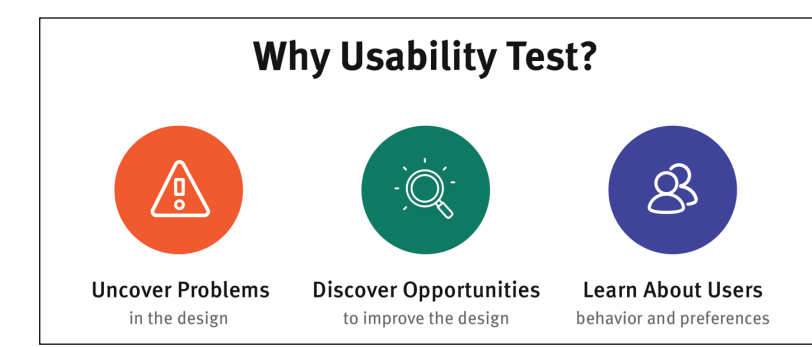
Goals of Usability Test
The goals of usability testing vary by study, but they usually include: • Identifying problems in the design of the product or service • Uncovering opportunities to improve • Learning about the target user’s behavior and preferences
Factors to Judge Website Usability
1. Learnability: How easily can new visitors maneuver the site and get what they want? 2. Efficiency: How smoothly can users complete tasks/actions on the website? 3. Satisfaction: How happy are users with the website’s design, functionality, and offerings? 4. Errors: How many errors are showing up in usability testing? How severe are the errors? Can the errors be resolved quickly and with minimum effort? Determining and improving the overall website usability requires the execution of website usability testing.
How does Website Usability Testing work?
1. In website usability testing, QAs put the website through several user scenarios likely to be encountered when using it. 2. While user actions are being executed, another QA monitors the same to judge how usable the site is. 3. Feedback is immediate, as the observer can immediately notice and note any difficulties revealed in the test process.4. Note that web usability testing must be conducted by individuals not connected to that website’s development. Ideally, this should include actual users who would potentially use the site when it goes public. 5. However, if not feasible, usability tests can be conducted by QAs from another team in the same organization to avoid any bias in the ultimate goal of making a website user-friendly
Comparative
This method compares multiple versions of the same website (different designs, features, functions, etc.) and evaluates the pros and cons of each.
A/B testing
It ) is a methodology for comparing two versions of a webpage or app against each other to determine which one performs better.
Explorative
This method judges the usability and efficacy of early-stage designs or prototypes. • It pays particular attention to users’ intentions, needs, and preferences early on to align the site with customer expectations from the beginning
. Assessment:
This method checks overall usability, usually at specific points during development. Think of these as milestones that periodically check how the website is faring as it is being designed, and coded. Generally, real-time trials as part of UI testing are helpful
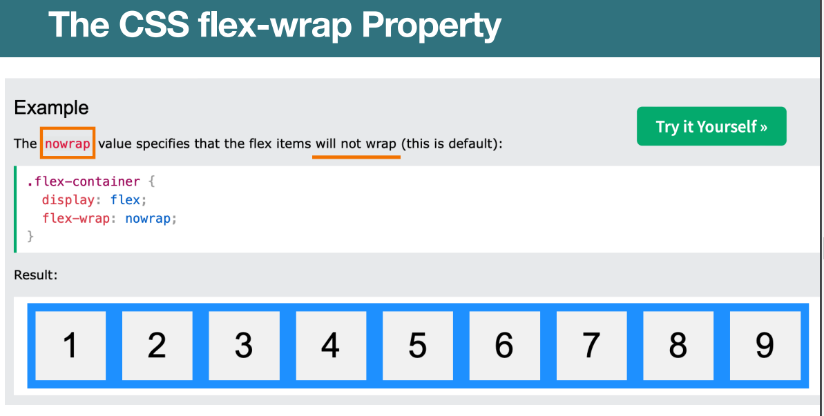
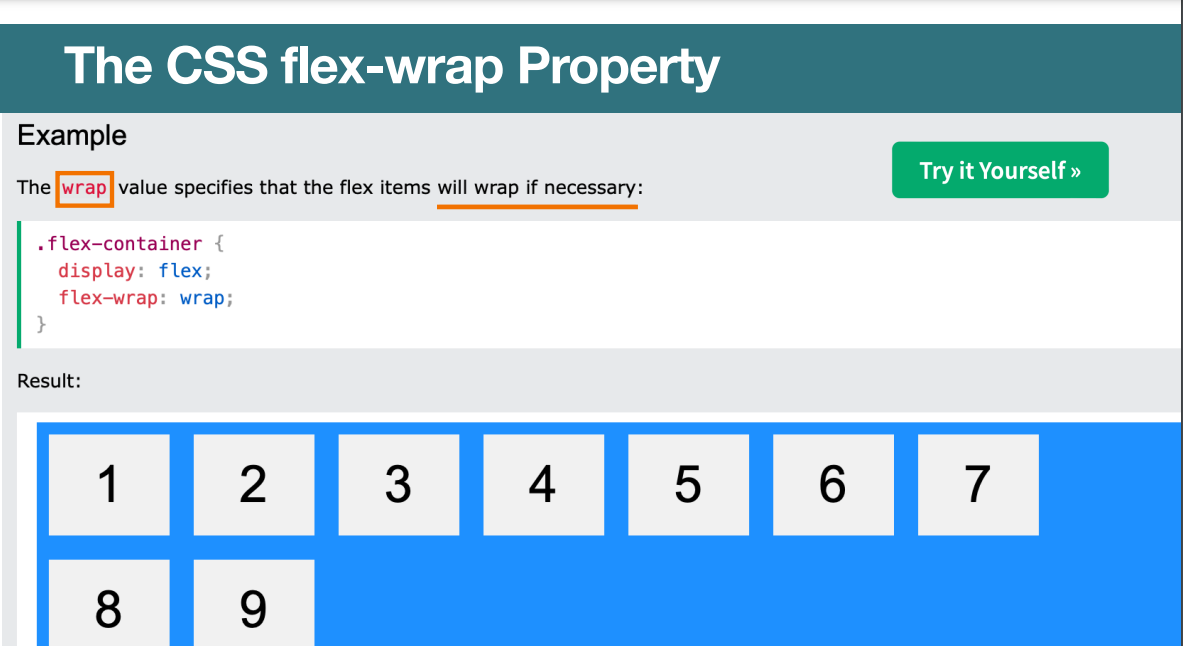
The CSS flex-wrap Property
The flex-wrap property specifies whether the flex items should wrap or not, if there is not enough room for them on one flex line. • The flex-wrap property can have one of the following values: • nowrap • wrap • wrap-reverse
Nowrap
Wrap
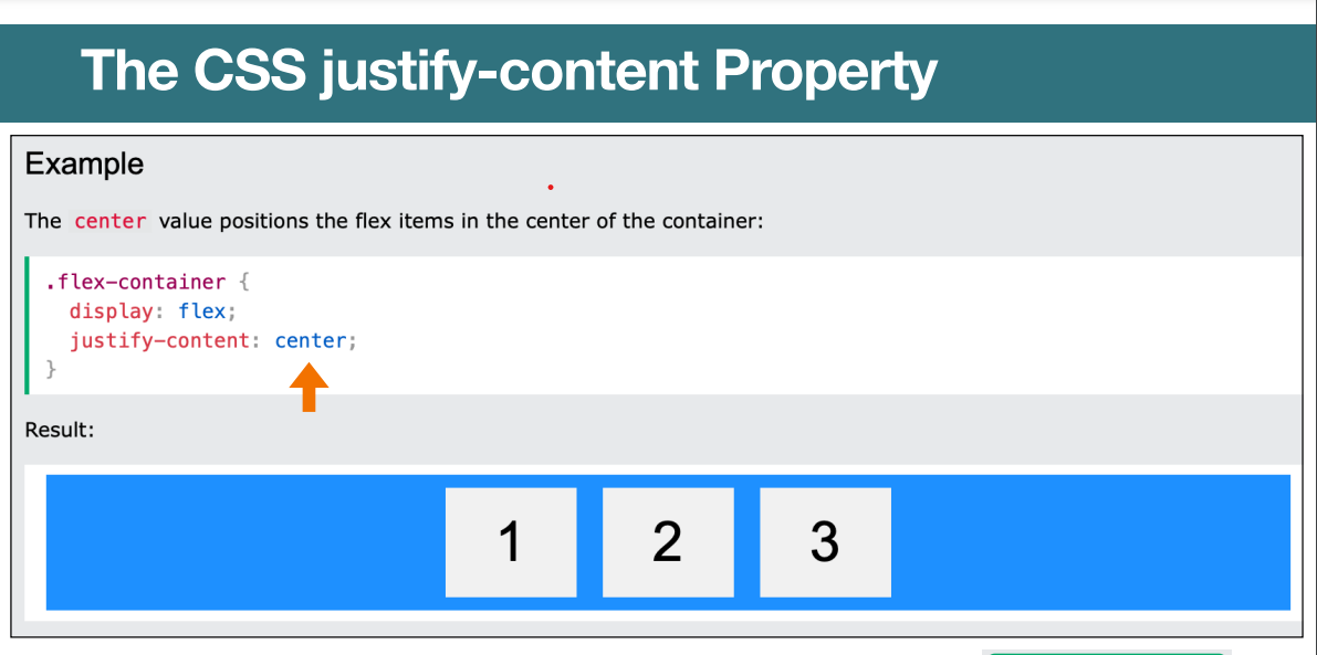
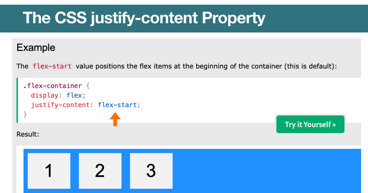
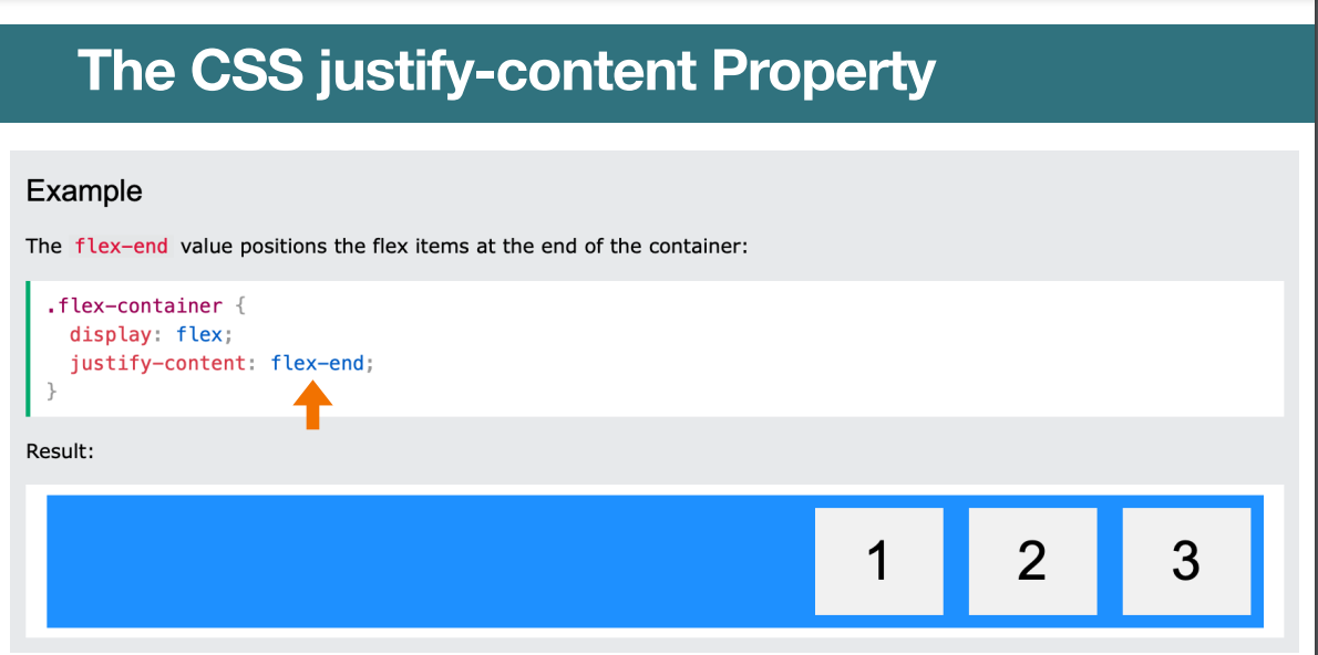
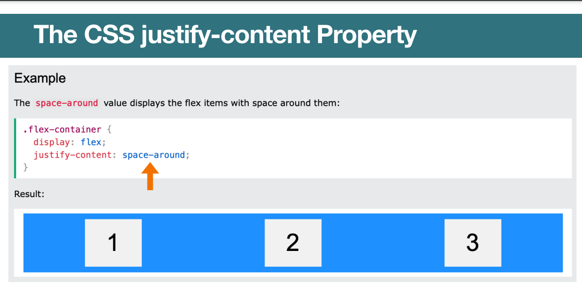
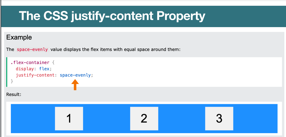
The CSS justify-content Property
The justify-content property is used to align the flex items when they do not use all available space on the main-axis (horizontally). • The justify-content property can have one of the following values: • center • flex-start • flex-end • space-around • space-between • space-evenly
center
Flex start
Flex end
Space Around
Space Evenly
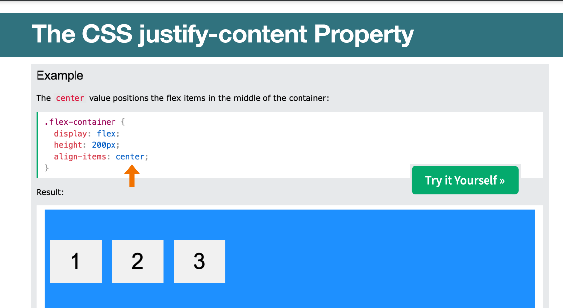
The CSS align-items Property
The align-items property is used to align the flex items when they do not use all available space on the cross-axis (vertically). • The align-items property can have one of the following values: • center • flex-start • flex-end • stretch • baseline • normal
The CSS justify-content Property
The Benefits of AI in Website Development
By leveraging artificial intelligence technology, developers can easily optimize content for search engine rankings. 2. AI in Website Development can detect trends in user behavior and generate automated recommendations for website structure and design. 3. Through machine learning, developers are able to improve their customer experience by understanding customer needs, preferences and behaviors.
AI can help identify broken links or errors on a website which provides information about which areas need improvement. • AI also improves the speed at which webpages are loading. This is achieved by using various optimization techniques such as compressing images, minifying code and caching. By utilizing such techniques, AI ensures that websites are running smoothly with no latency issues that can cause potential visitors to leave the page frustrated or disinterested.
Coding Assistants
Coding programs can be used by experienced programmers to help them write more code without typing as much themselves. • Programs like Codex or GitHub Copilot can help programmers by suggesting the next line of the code they’re working on or assembling small blocks of code for the programmer to use.
Artificial Design Intelligence (ADI)
An ADI creates complete and functional websites for users, covering everything from aesthetic design to structure and content. By asking users a few simple questions and drawing on the masses of data it’s been trained on, an ADI can design a site that fits any purpose and any sense of taste. • Wix ADI can either generate a website from start to finish or guide a user on how to build the site themselves.
Smart Chatbots for a Personalized End-User Experience
Utilizing an AI-powered chatbot helps users instantly find the information they need without having to search for it manually. Users can type a natural language question to the chatbot and receive answers and links instantly. • Intercom provides AI-based chatbots to companies that integrate right into websites, apps, or other software.
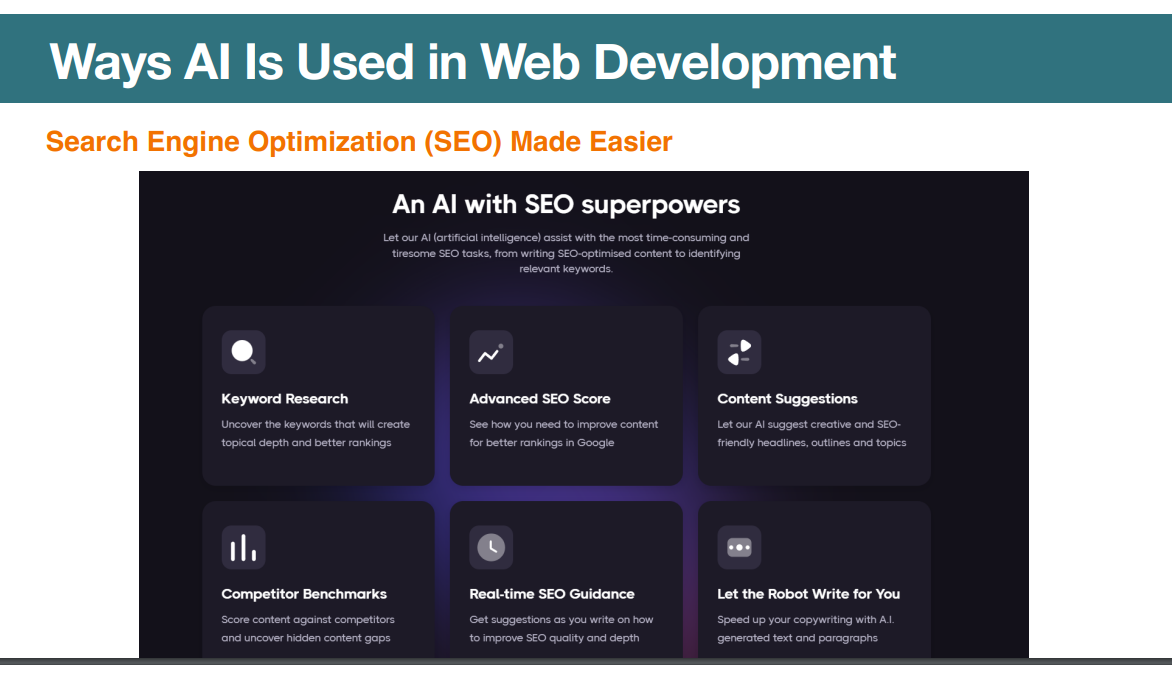
Search Engine Optimization (SEO) Made Easier
Search engine optimization can be a grueling process, requiring extensive research into the right keywords, phrasing, and content topics. • An SEO AI, however, can provide all of this information for you. It can generate top-performing headlines and topics for you to write about, and give you all the keywords you need to include to make it rank well. • SEO.ai is a search engine optimization software that helps people craft highperforming content quickly and efficiently.
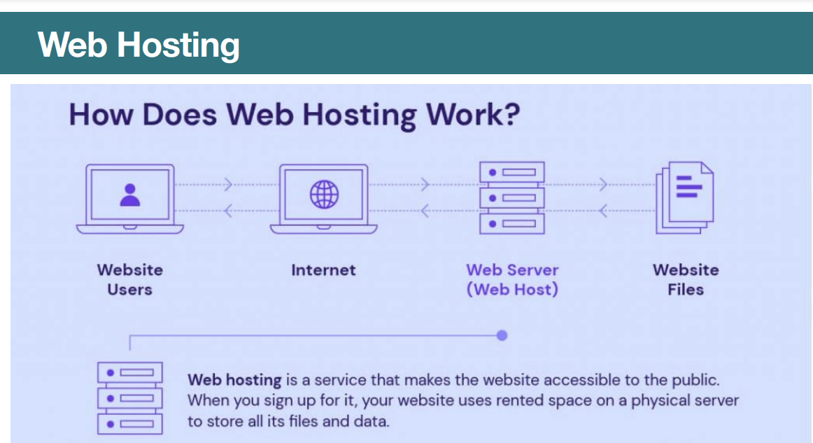
Web Hosting
Web hosting refers to the service that allows individuals and organizations to make their website accessible via the World Wide Web. In simpler terms, it is like renting a space on the internet to store and display your website for all to see. • When you sign up for a web hosting service, you are essentially renting space on a server (a powerful computer) that is constantly connected to the internet. This server is where all of your website’s files, such as images, videos, and HTML documents, are stored..
Deployment
Deployment, on the other hand, refers to the process of making your website live and accessible to users. It involves uploading your website’s files to a web server and configuring the necessary settings to ensure that everything is working properly. Once a website has been deployed, it is accessible to anyone with an internet connection
Key Differences Between Web Hosting and Deployment
While web hosting and deployment are both crucial elements in getting a website online, they are fundamentally different concepts. • Web hosting is the service that provides the infrastructure for storing and displaying your website, while deployment is the process of making your website live and accessible to users. In simple terms, web hosting is like renting a space on the internet to store your website, while deployment is like putting up a sign that says “open for business.”
• Web hosting is the foundation of your website, providing the storage space, bandwidth, and technical support needed to keep your website running smoothly. • Deployment, on the other hand, is the final step in the web development process, making your website accessible to users and ensuring that everything is working as intended.
 Note
Note  Flashcards (25)