BCOM 9 Chapter 10: Managing Data & Using Graphics
1/24
There's no tags or description
Looks like no tags are added yet.
Name | Mastery | Learn | Test | Matching | Spaced | Call with Kai |
|---|
No analytics yet
Send a link to your students to track their progress
25 Terms
quantitative
With ____ data, readers generally want to know proportions or ratios. These are often presented as part of a total. EXAMPLE: 82% of ICC students receive financial aid.
common
Fractions, ratios, percentages, and other items are examples of ____ language which reduces difficult figures to language and ideas. (p. 177)
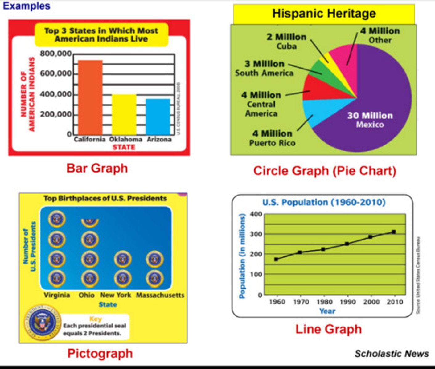
graphics
_____ includes tables, bar charts, line graphs, pie charts, pictograms, maps, flow charts, diagrams, photographs, etc. These are used in written and verbal reports to keep your reader interested and clarify difficult topics. (p. 178)
adapt
To ____ a presentation for YouTube, I should keep it short (2.5 min average viewing time), use good audio, and avoid bulleted PPT slides. (p. 178)

determine
To ____ if a graphic is needed, I may ask 1) is it necessary to clarify a point, 2) does it add to the overall understanding, 3) is it easy to understand, 4) does it have a consistent design, 5) do my titles reinforce my point, 6) is it honest, and 7) can it be seen by all viewers? (p. 178-179)
chartjunk
Decorative visuals that distract from important information are called ____. This includes extreme colors, complicated symbols, and odd typefaces. (p. 178-179)
talking
Our textbook recommends using a ____ title rather than a descriptive one. EXAMPLE: ICC Enrollment Slowly Increasing in Fall 2017 rather than Enrollment for Heartland Community College in Fall 2017. (p. 179)
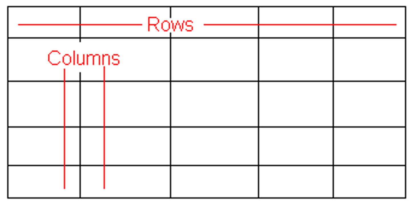
table
A ____ shows data in columns and rows. This helps your reader understand lots of information in a small space. Be sure to 1) number graphics consecutively, 2) use a title that clarifies, 3) label columns, 4) indent 2nd line of row labels, 5) use superscript for explanation notes, 6) document your source. (p. 180-181)
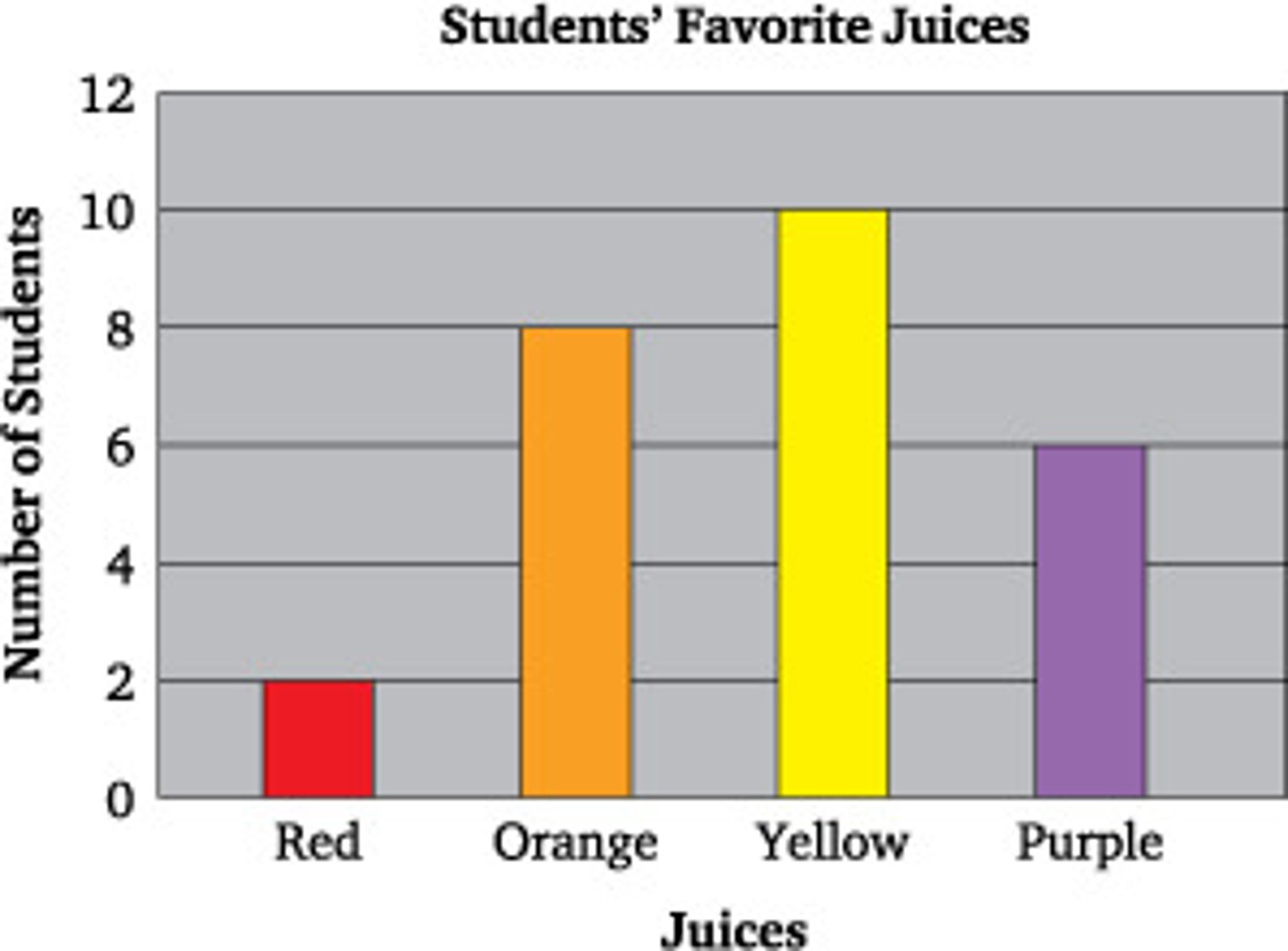
bar
A ____ chart is a graphic used to compare quantities. (p. 181)
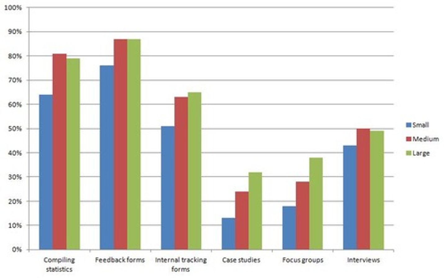
grouped
A ____ bar chart or "clustered" bar chart compares more than one quantity. (p. 181-182)
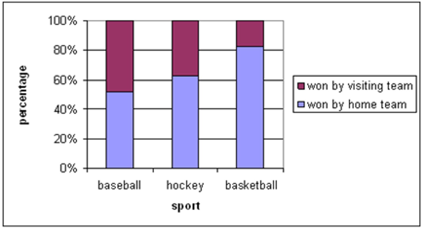
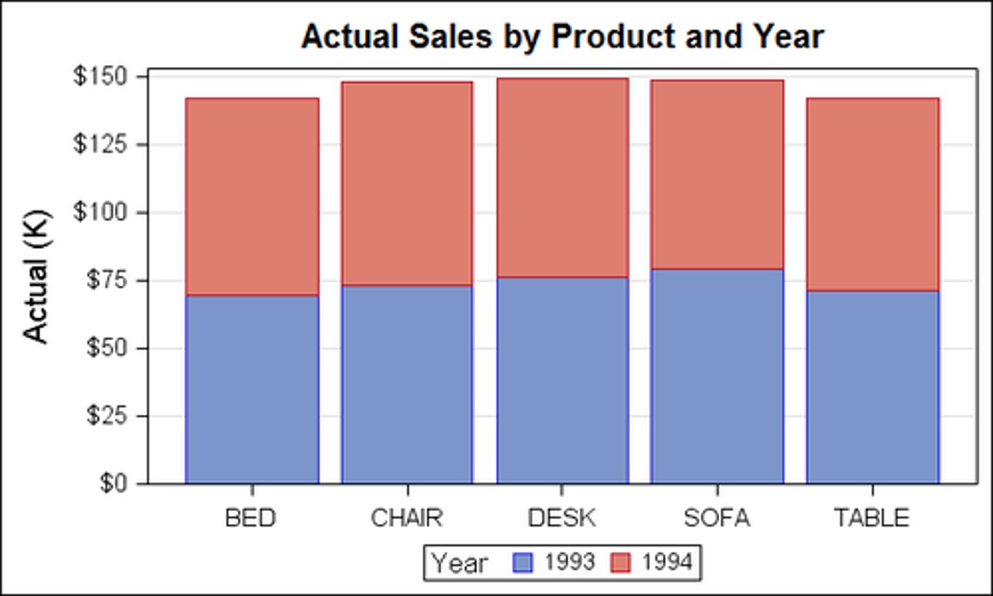
segmented
A ____ bar chart or subdivided bar chart shows how components contribute to a total. (p. 181-182)
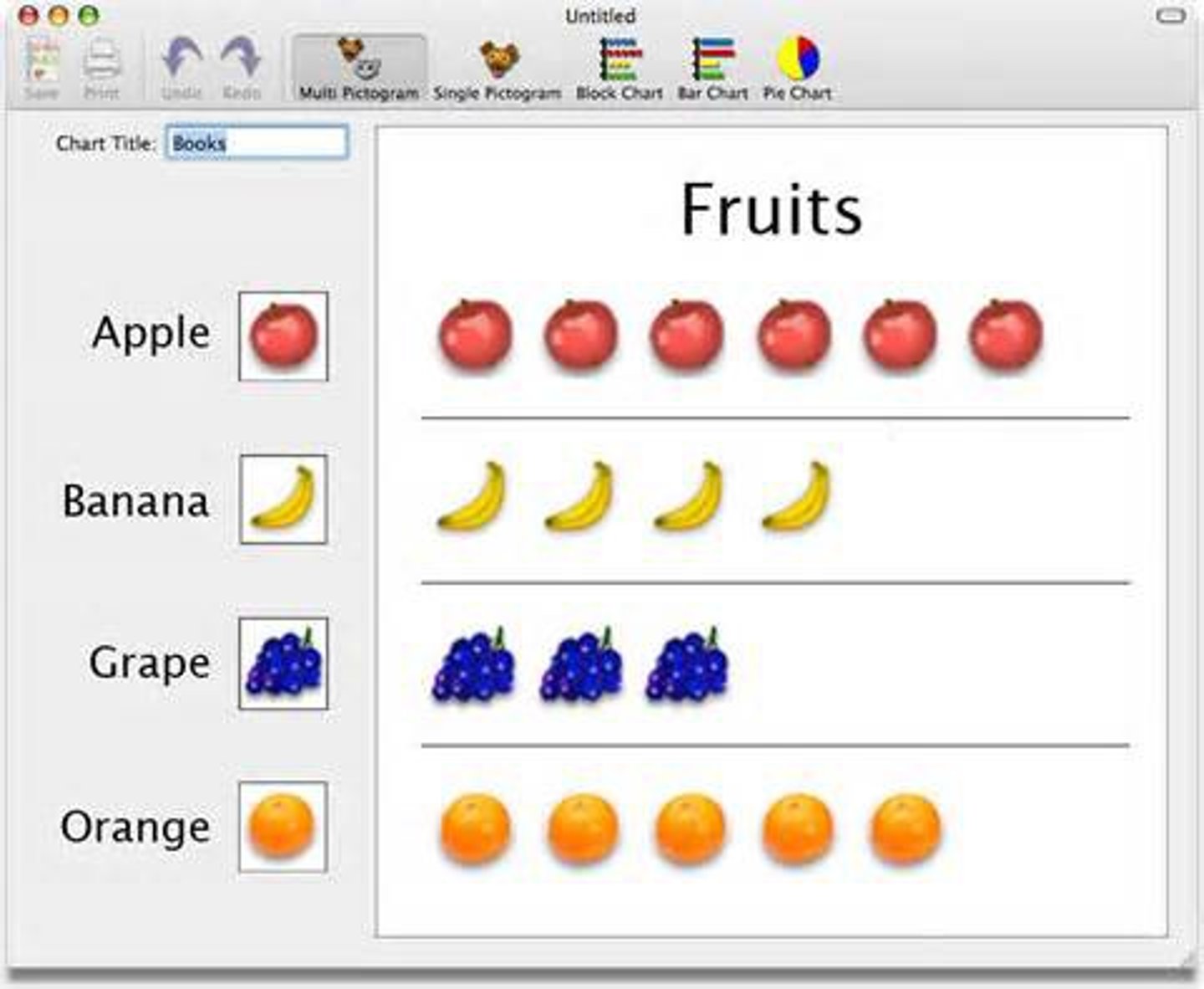
pictogram
A ____ or pictograph uses pictures or symbols to show objects, concepts, or number values. (p. 181-182)
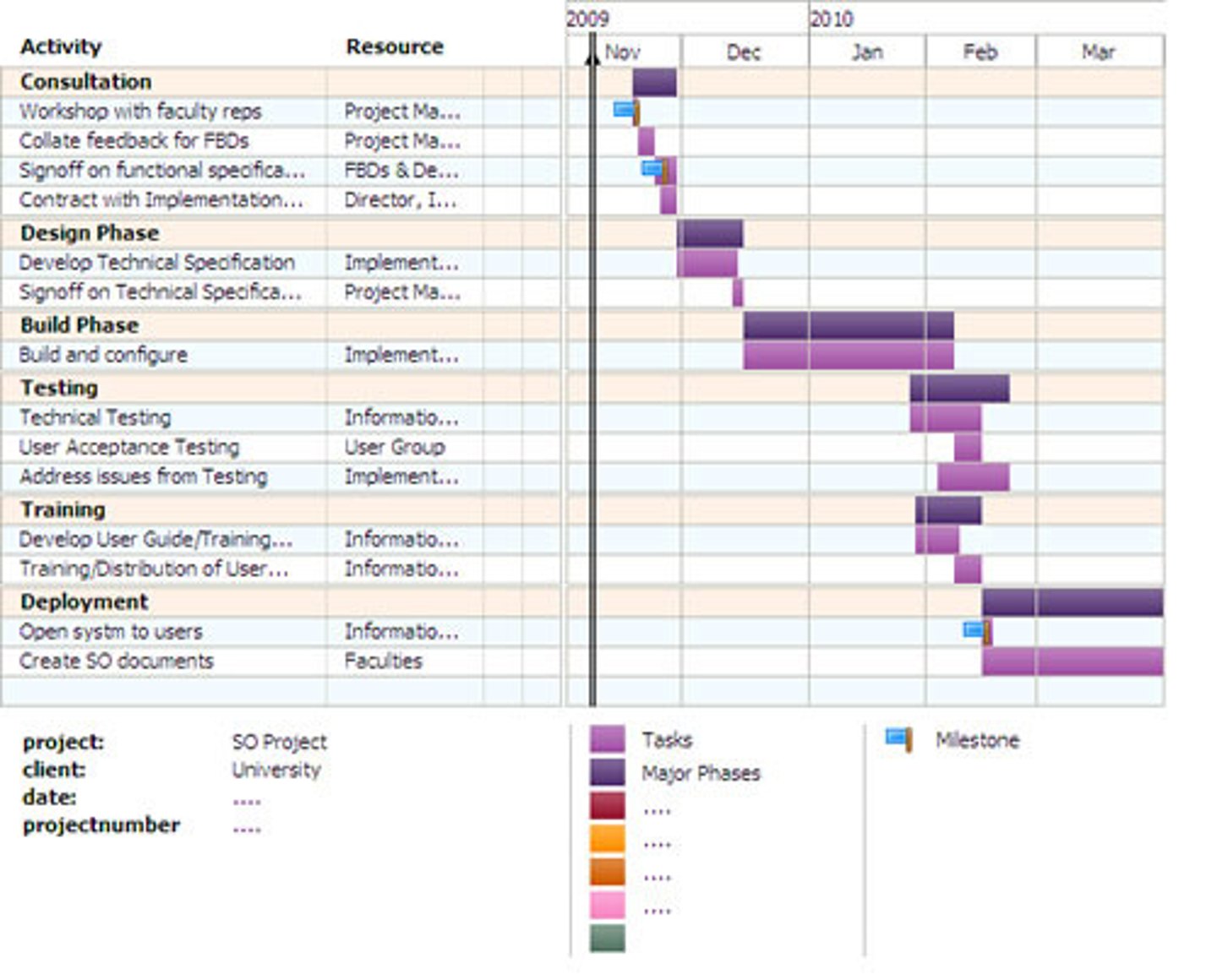
Gantt
A ___ chart is used for tracking progress toward completing a series of events or steps over time. (p. 181-182)
suggestions
_____ for bar charts include: 1) don't visually distort, 2) put in logical order, 3) use color to give meaning, 4) avoid fancy formatting or effects, and 5) keep labeling simple. (p. 182)
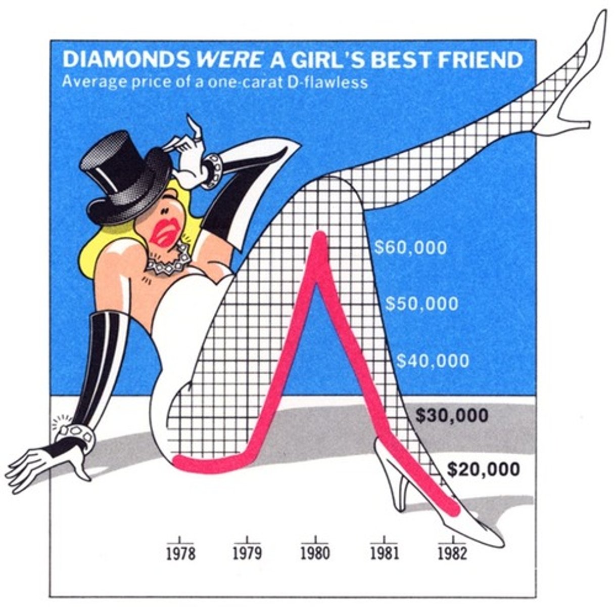
line
A ____ chart shows changes in quantitative data over time and reflects trends. (p. 182)
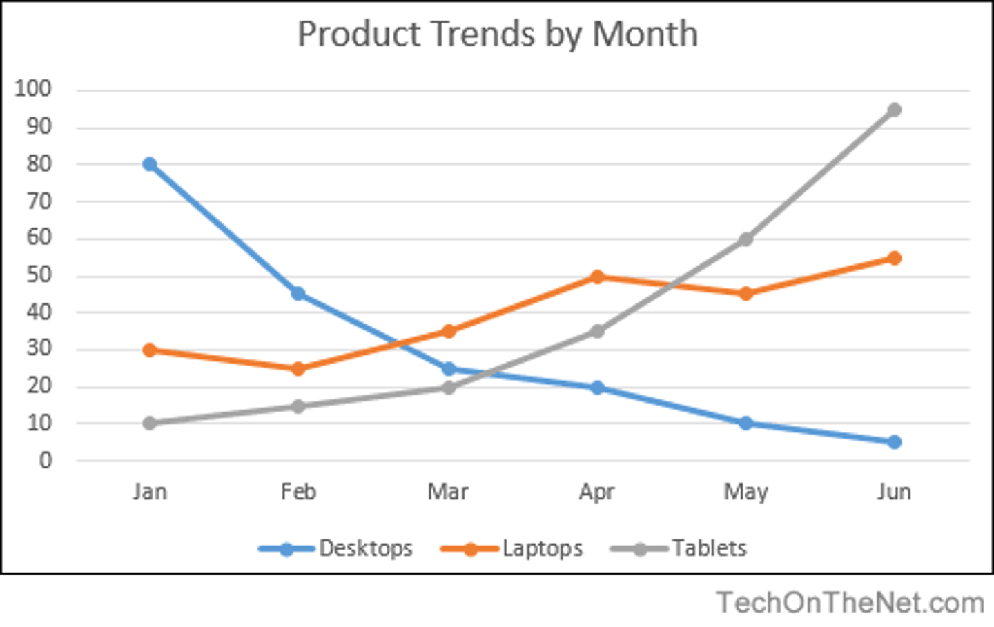
guidelines
_____ for line charts include 1) use the vertial axis for amount & horizontal axis for time, 2) begin the vertical axis at zero, 3) divide the vertical & horizontal scales into equal increments. (p. 182)
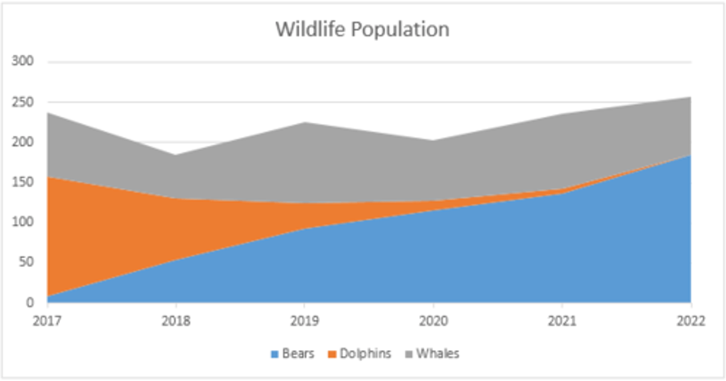
area
An ____ , or "surface" chart is like a segmented bar chart, showing how different factors contribute to a total over a period of time. (p. 182)
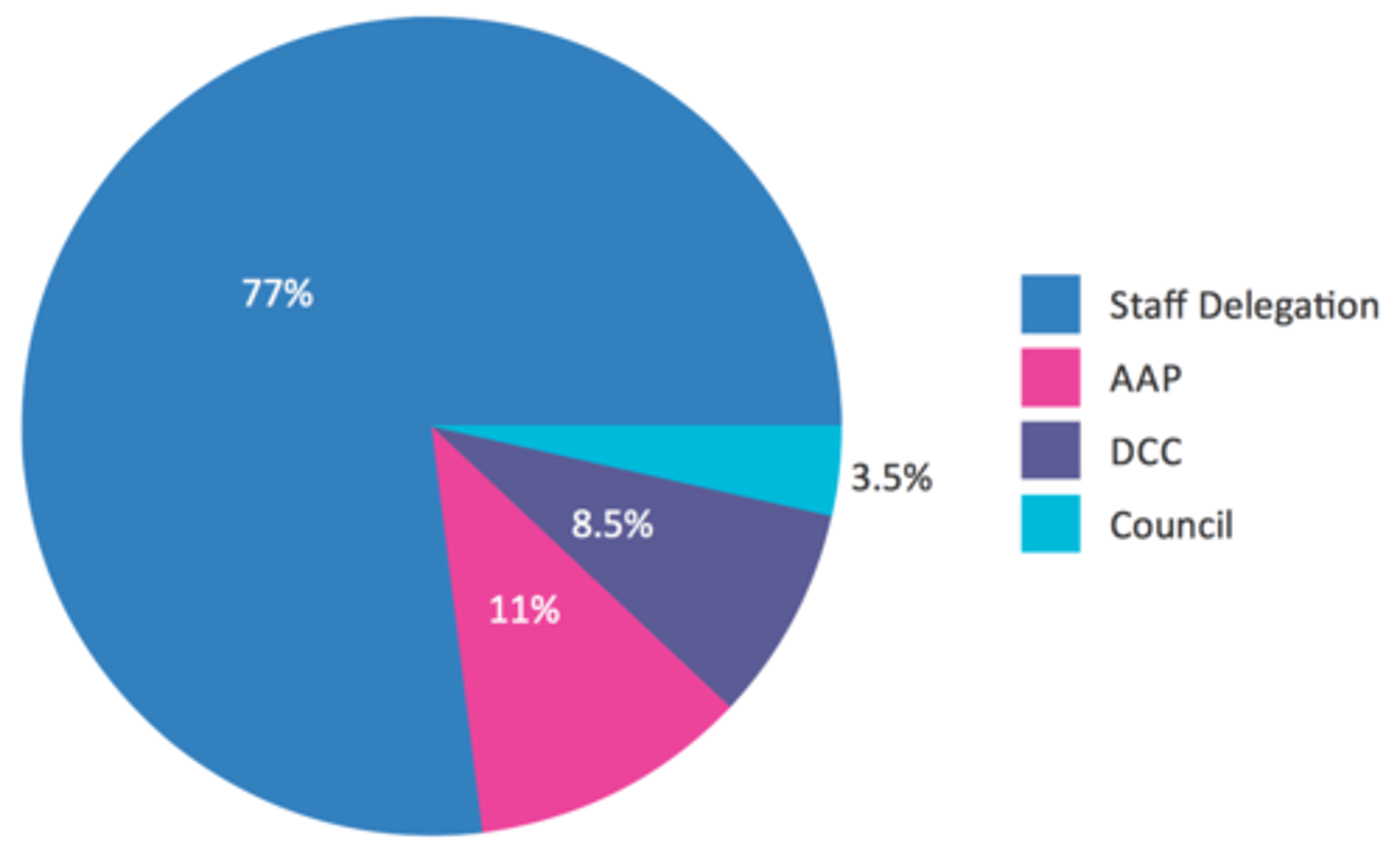
pie
A ____ chart shows how parts of a whole are distributed. They're great at showing percentages, but poor at showing quantity totals. (p. 182)
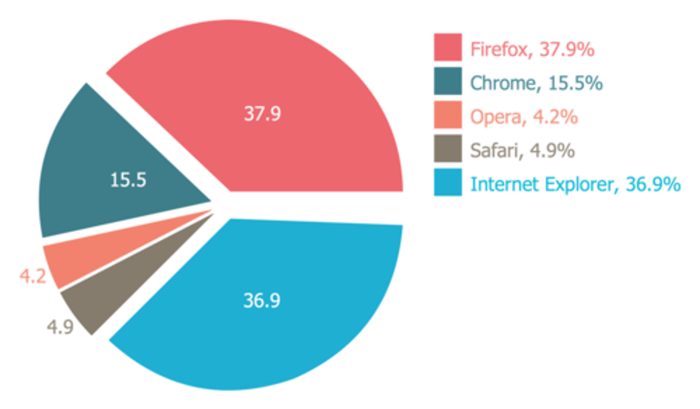
construct
To ___ a good pie chart, position the most important or largest segment at the 12 o'clock position, 2) label each slice and show quantities, 3) emphasize 1 or 2 slices, and 4) avoid using 3-d effects. (p. 182-183)
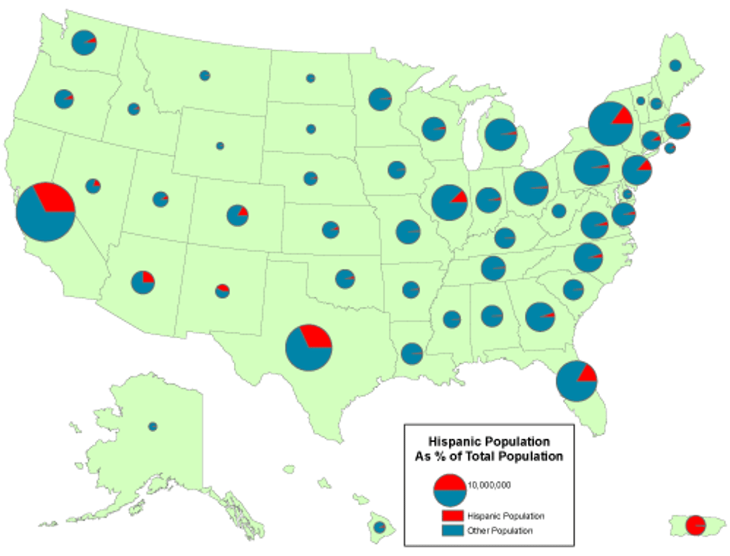
map
A ____ gives information in a more visual format on a map. It's less confusing, more concise, and more interesting than simply writing out facts. (p. 184)
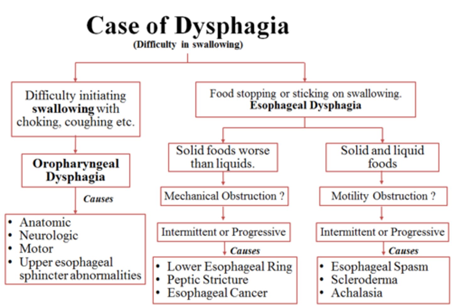
flowchart
A ____ is a step-by-step diagram of a procedure, or visual depiction of a system or company. (p. 184)
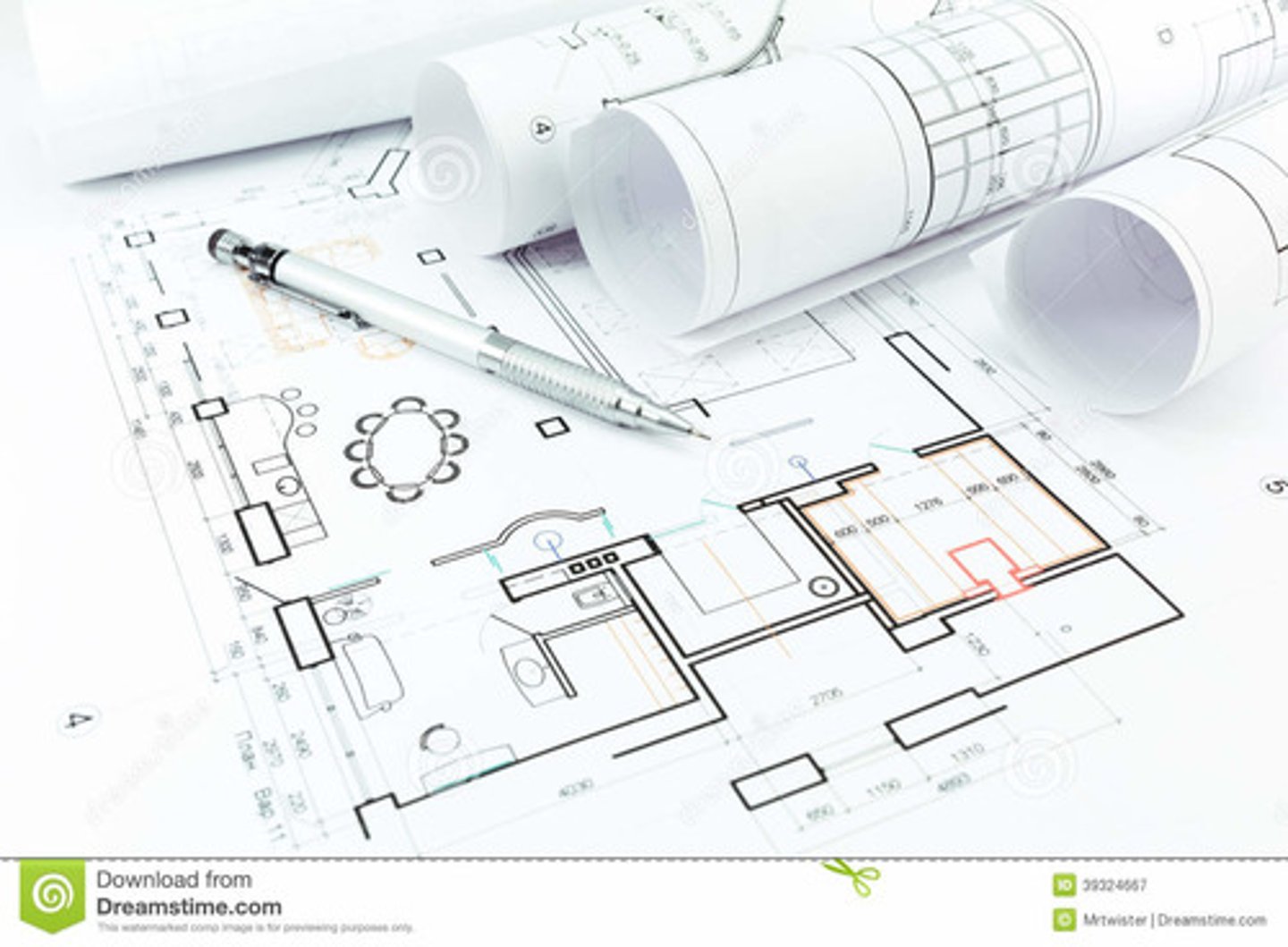
other graphics
______ may include architectural plans, photographs, blueprints, cartoons, and lists. (p. 184)
partners
Text and graphics should be _____ in the communication process. If they're close together with the visual coming just after the text, the reader will understand better. (p. 184)
restate
When writing about graphics, don't simply _____what's in the graphic. Instead, put the emphasis on the main point. (p. 186)
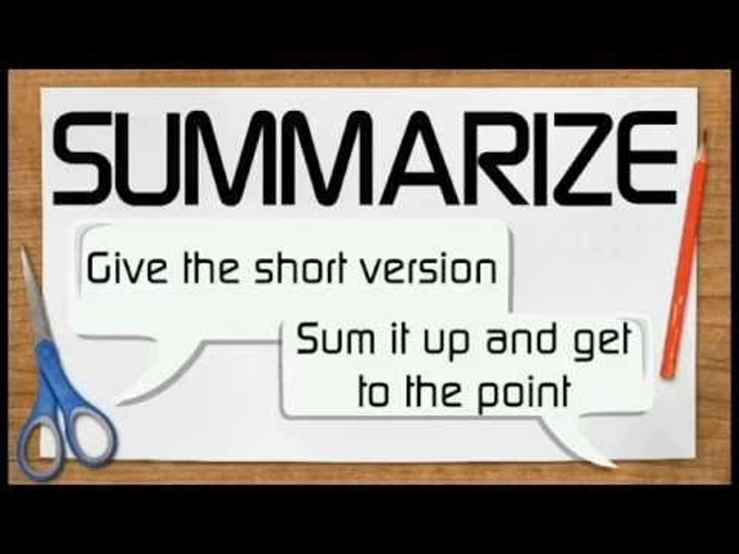
summarize
When you write about (or analyze) a graphic, you can ____ what's in the visual, compare information to another visual, or speculate on what the graphic means--then, try to transition to the next graphic. (p. 188)