data cleaning exam 1
1/23
There's no tags or description
Looks like no tags are added yet.
Name | Mastery | Learn | Test | Matching | Spaced | Call with Kai |
|---|
No analytics yet
Send a link to your students to track their progress
24 Terms
You want to compare your product's performance over the past year against competitors. What type of chart is recommended?
bar chart
The following chart type is commonly used to show?
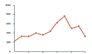
Pattern over period
What is the first step in creating effective visuals for communication?
Selecting proper visual types for the task
Which narrative strategy is recommended when you are trying to build credibility?
Chronological
You must have slides to make a good presentation.
false
If you see three groups of dots in the following images, which of the following Gestalt principles of visual perception is used?
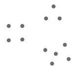
Proximity
In the following chart, which Gestalt principle(s) are used? Choose all that apply.
Similarity and proximity
Which of the following preattentive attributes carries strong perceived quantitative magnitude?
Line length
The design principle that makes design obvious how the product is to be used is
Affordance
Which of the following is an example of good affordance in product design?
A switch that clearly looks like it should be flipped up to turn on and down to turn off
From kamishibai, the following tip is.
“Visuals should be big, bold, clear, and easy to see.”
true
The following image on Hurricane Katrina can be used to improve which of the six principles of slide design?

emotion
a story has…
a beginning, middle, and ending
story + speaker + visual =
persuasive presentation
path to effective visuals
choose appropriate visuals for the task
remove clutter
add a story
design and details
tools for exploratory analysis
power BI, tableau, R, python
tools for explanatory analysis
excel, adobe
using text
highlight one or two numbers
using bar or column charts
shows comparison between categories
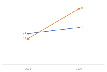
using a slope chart
shows a comparison between two time periods (or categories)
using a scatterplot
shows the relationship between two numerical values
using a table
shows detailed numbers
what makes design usable by people of widely varying technical skills
accessibility
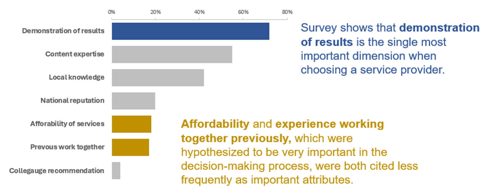
What is this picture showing
annotations