Color Theory
1/32
Earn XP
Description and Tags
Color Theory Notes for Exam
Name | Mastery | Learn | Test | Matching | Spaced | Call with Kai |
|---|
No analytics yet
Send a link to your students to track their progress
33 Terms
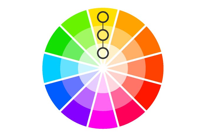
Monochromatic
Uses only one hue with variations in tints, tones, and shades to create a subtle and cohesive palette.
Analogous
Uses colors located next to each other on the color wheel (e.g., yellow, yellow-green, and green). These schemes are often harmonious and consistent in temperature.
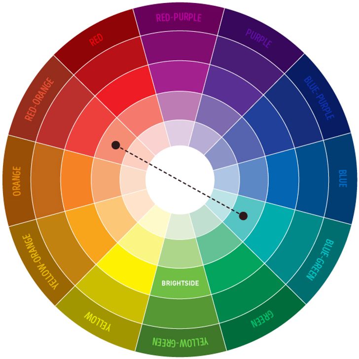
Complementary
Uses colors directly opposite each other on the color wheel (e.g., red and green, blue and orange). This creates a high-contrast, vibrant look.
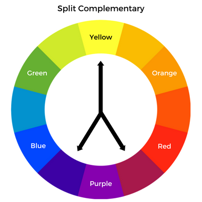
Split-Complementary
Uses one base color and the two colors immediately adjacent to its direct complement (e.g., blue with red-orange and yellow-orange). This scheme offers strong contrast with less visual tension than a direct complementary scheme.
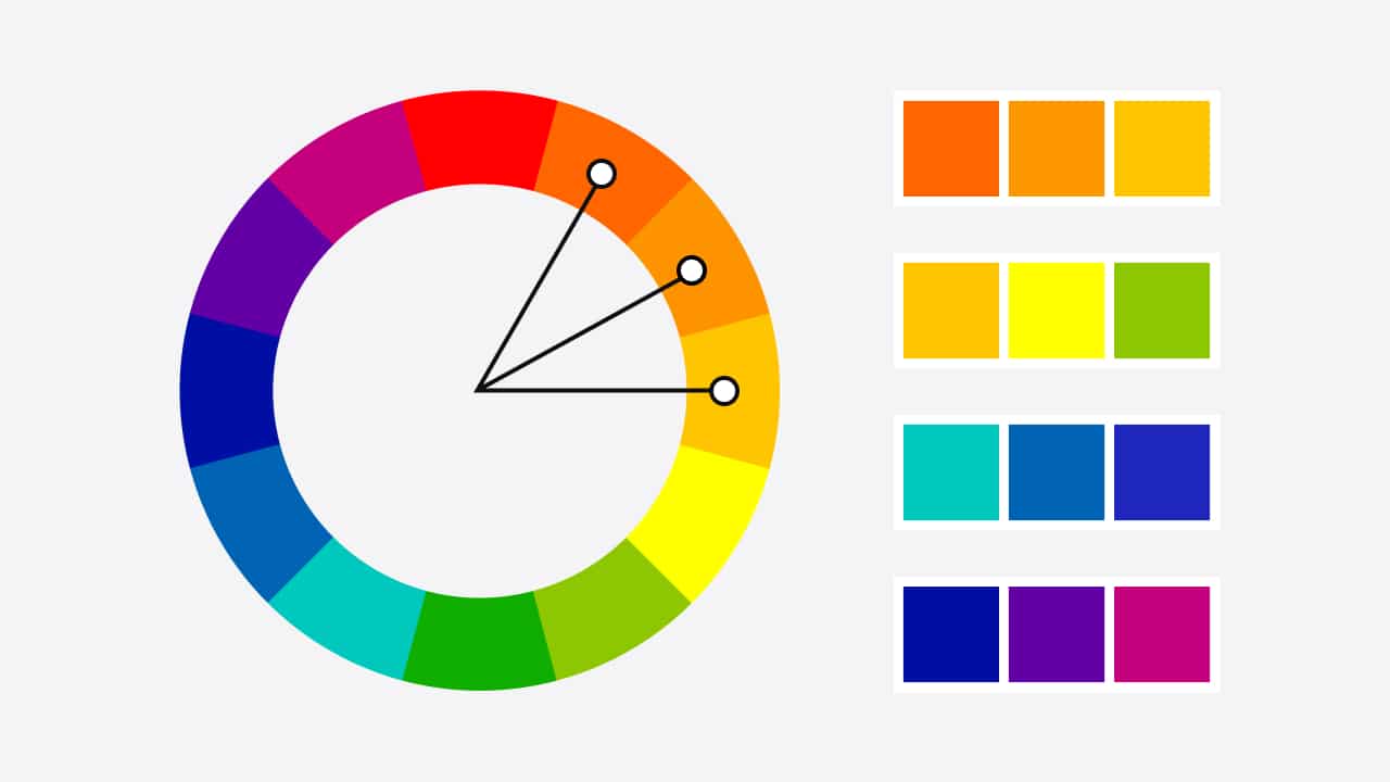
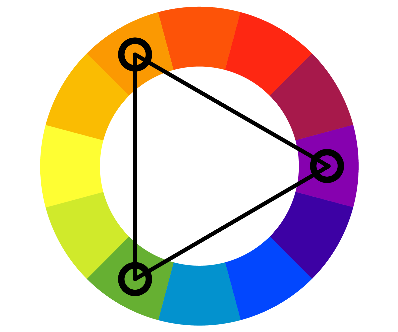
Triadic
Uses three colors that are evenly spaced around the color wheel, forming an equilateral triangle (e.g., the primary colors red, yellow, and blue). This offers a balanced, vibrant effect.
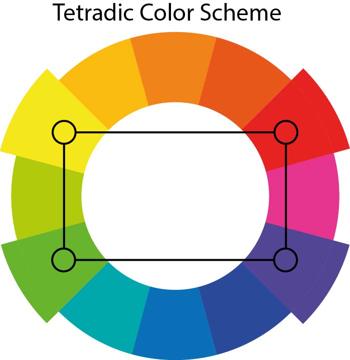
Tetradic
(Rectangular): Uses four colors arranged into two complementary pairs (e.g., red and green with blue and orange).
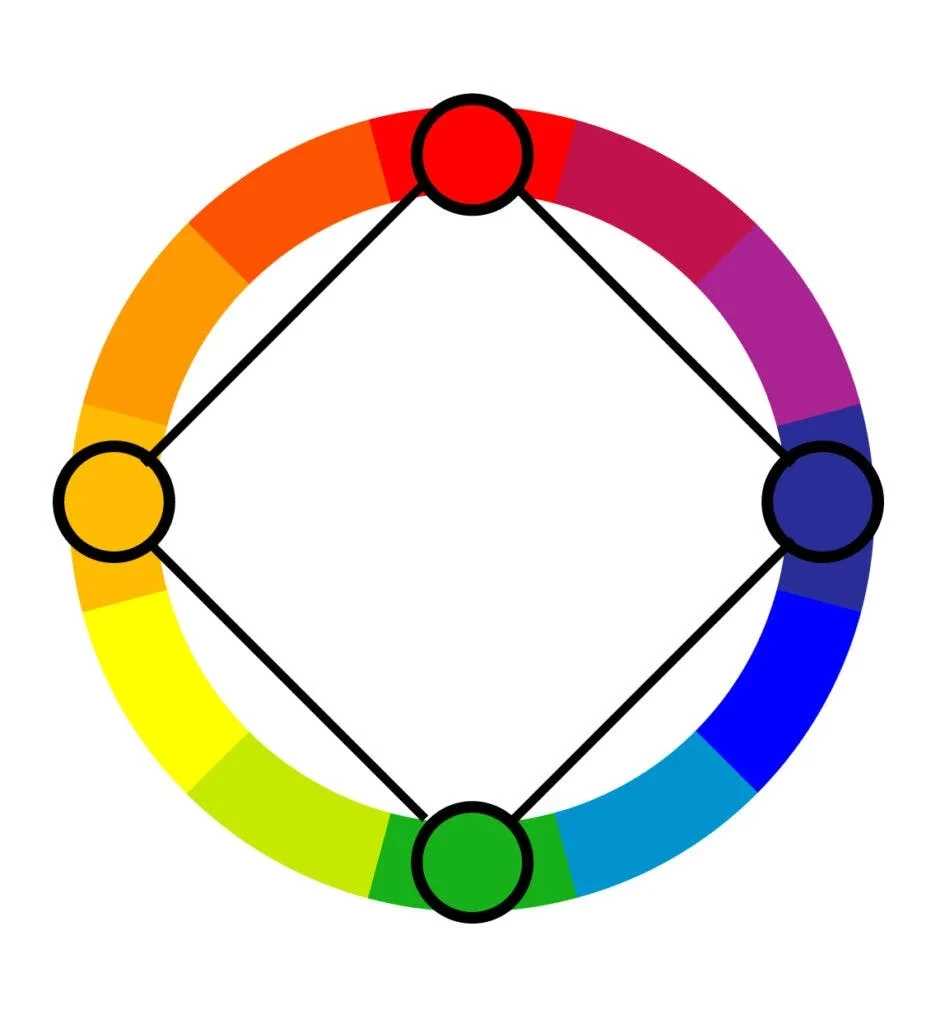
Square
A variation of the tetradic scheme using four colors that are evenly spaced around the color wheel, forming a square.
Neutral
Colors such as black, white, gray, and brown that are not part of the color wheel and generally combine well with other, more saturated colors.

Hue
The name of a pure color, such as red, blue, or yellow.
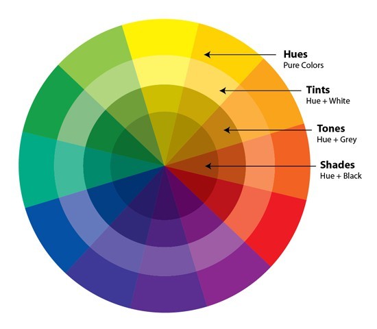
Value
The lightness or darkness of a color, ranging from black (lowest value) to white (highest value).
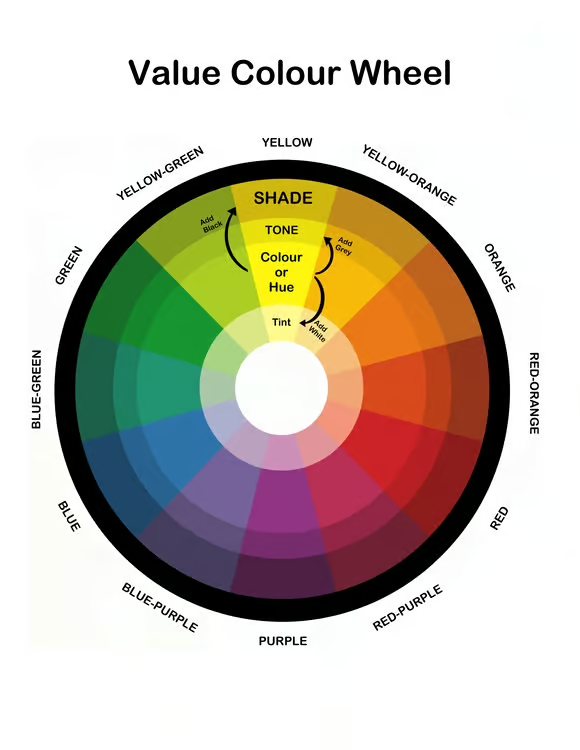
Saturation
(Chroma/Intensity): The purity, strength, or intensity of a color. A fully saturated color is vivid, while a less saturated one is duller or more muted (closer to gray).
Tint
A hue mixed with white to lighten it (e.g., pink is a tint of red).

Shade
A hue mixed with black to darken it (e.g., navy is a shade of blue).

Tone
A hue mixed with gray (or both black and white), which desaturates and subdues the color.

Primary Colors
Red, yellow, and blue (in the traditional pigment system; red, green, and blue for light/digital displays), which cannot be created by mixing other colors.
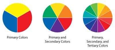
Secondary Colors
Orange, green, and purple/violet, created by mixing two primary colors.

Tertiary Colors
Colors created by mixing a primary color with an adjacent secondary color (e.g., red-orange, blue-green).

Color Wheel
A circular diagram that illustrates the relationships between primary, secondary, and tertiary colors.

Warm Colors
Hues from red through yellow, associated with fire and sun, which tend to feel energetic or appear to advance in a composition.
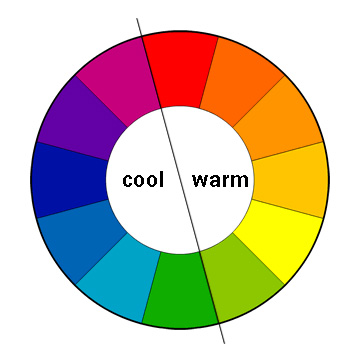
Cool Colors
Hues from green through blue and violet, associated with water and sky, which tend to feel calm or appear to recede.

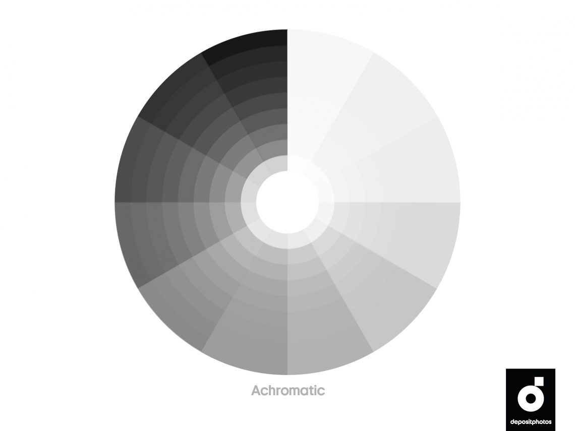
Achromatic
Without color; referring to neutrals such as black, white, and gray.
Design Principles
Balance
Balance is a cornerstone of graphic design. It refers to the distribution of visual “weight” in a design
Contrast
Contrast is about making elements stand out by highlighting the differences between them. It’s a powerful tool in design because it creates visual interest and draws the viewer’s attention.
Emphasis
Also known as focal point, emphasis is about giving certain elements in a design more prominence.
Unity
Unity refers to the cohesion and consistency of a design.
Proximity
Proximity is about the arrangement of elements in a design. Objects that are close to each other are perceived as related, while those that are further apart are perceived as separate
Repetition
Repetition involves using the same or similar design elements throughout a piece to create a sense of consistency and cohesiveness.
Alignment
Alignment ensures that all elements in a design are visually connected and positioned purposefully.
Hierarchy
Hierarchy is the organization of content to convey the relative importance of different elements.
Simplicity
The principle of simplicity encourages designers to eliminate unnecessary elements and distractions.
Negative Space
Negative space, (sometimes known as white space), is the empty or unused space in a design.