Y11 Geography Human Fieldwork Test
1/46
Earn XP
Description and Tags
Name | Mastery | Learn | Test | Matching | Spaced | Call with Kai |
|---|
No analytics yet
Send a link to your students to track their progress
47 Terms
wimbledon village fieldwork aim
to investigate how the quality of the urban environment changes along wimbledon high street
wimbledon village fieldwork enquiry question
to what extent does the quality of the urban environment change along wimbledon high street?
justification of wimbledon village location
wimbledon village in south west london
walking distance of school - only takes a few mins to get there. so could collect all data in a short amount of time & didn’t need the whole day
small area = not too much time needed to carry out data collection
wimbledon village transect sites
12 sites along the transect selected by systematic sampling sampling so we could get an overall view of the whole area
wimbledon village risk assessment
getting lost from the group - stay in groups, stay in contact, don’t wander off
traffic (injury/collision) - remember safe procedures for crossing the road, only cross at crossings, wait for traffic lights
environmental hazards (litter/poor air quality) - don’t touch/pick up litter, avoid areas with lots of litter/visible pollution, wear appropriate footwear
wimbledon village methods: sound mapping
recording the main sound you hear at each site, tick box to record the dominant sound
another way to collect qualitative data about the environment without relying on sight. used to investigate the quality of the urban landscape
less bias (live noise, indicate what you hear), not been edited so is reliable, set options make it more objective, can compare between sites
depends on area & time of day, loud noises can drown out others, hard to distinguish individual sounds, no quantitative data, no change between sites
wimbledon village methods: soundscape
teacher gathers sound data at each site using a decibel app to record sound levels in dB. 3 recordings at each site & take average
quantitative data (can compare & do statistical tests), digital tools are more accurate + precise
heavily dependent on time of day, better tech could be used (less accuracy/reliability), precision can be lost through anomalous measurements eg big truck passing by, sound levels vary a lot
wimbledon village methods: observations
make observations describing the environment around us using words, looking at surfaces & spaces
live data, can be used to support EQS, gives more info & context
subjective, not quantitative, influenced by time of day, can choose what to include, can’t compare/test that much, can be not detailed enough
wimbledon village methods: environmental quality survey
uses an observer’s judgements to assess environmental quality against a range of indicators (cleanliness, traffic, pollution, green spaces, street furniture etc). uses a bi-polar scale (-2 to +2) to indicate a negative/positive assessment. 0 = neither good or bad
tick score for each indicator at each site. have 1 person do it so data is consistent & less subjective & varied
quantitative data that can be analysed, gives a picture of the whole transect, can compare between sites
very subjective, biased, opinionated, dependent on time of day, took a long time, lots of repeats, data didn’t change much between sites
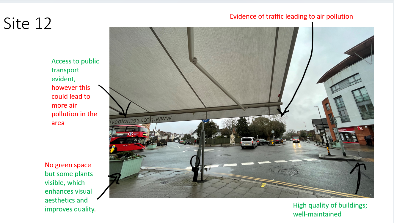
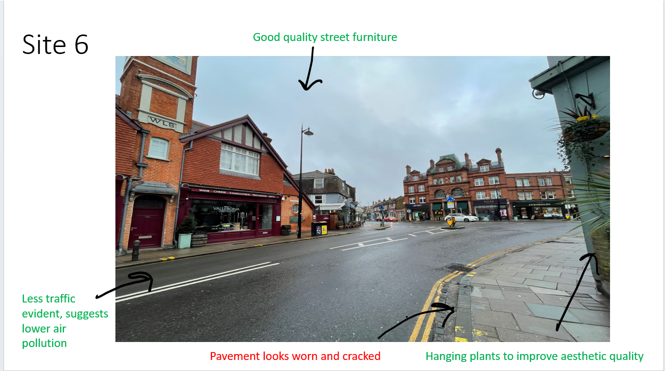
wimbledon village methods: photos
take a photo at each site & annotate them back in the classroom. colour code annotations to reflect positive & negative aspects of the urban environment (shocks, cleanliness, traffic & congestion, people & cars, positive & negative effects)
live data, gives context, can annotate later, very quick & easy, can get an overview of area studied
dependent on time of day, biased (can choose direction/area), can be edited, don’t show the whole picture, qualitative (can’t analyse/test/compare), only one view
wimbledon village methods: land use survey
record the land use function of buildings along the whole transect. use RICEPOTS system while walking from site 1-12 to show land use on both sides of the room
later use digimaps to create a digital map for the area
includes every building - no bias, can compare across transect, specific, objective, reliable
some overlap in categories, qualitative data, some buildings are 2-storey, can take a while, can be hard to figure out what code to use (time consuming), some buildings don’t fit into code
data presentation: EQS
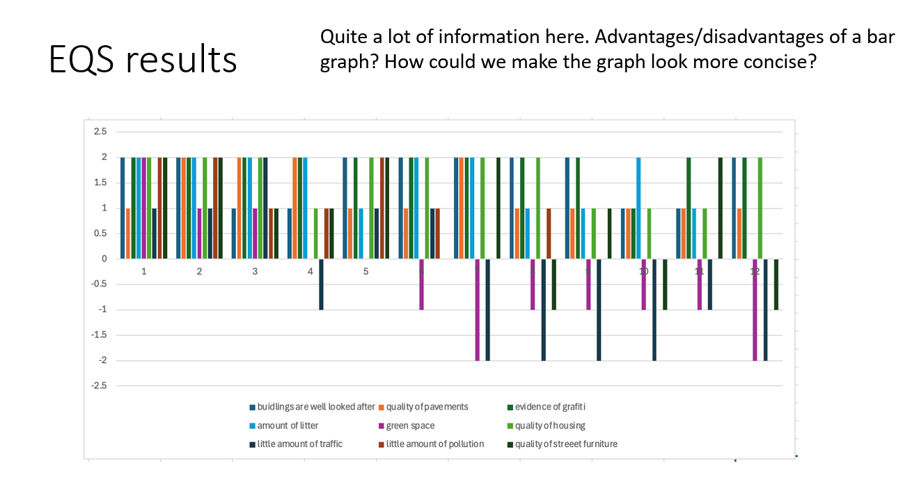
bar graphs
visual (can clearly see patterns & trends between sites), can see change across the transect, quantitative data
lots of info/data, (1) can’t see overall environmental quality, not geolocated (can’t identify where areas are), (2) doesn’t give lots of data
data presentation: observations
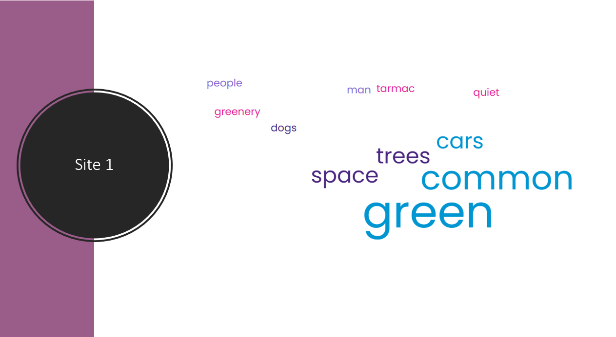
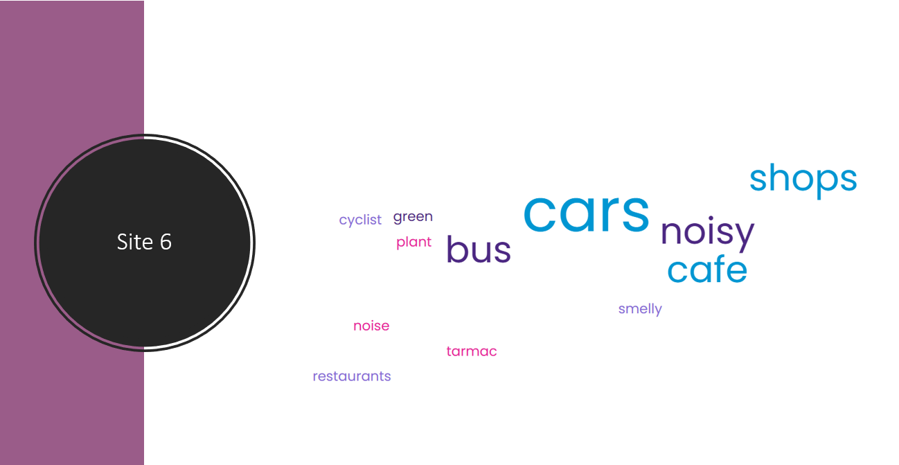
word cloud
easy to see overall descriptions of areas quickly
no qualitative data, no data about how often words came up, not a lot of words in total
data presentation: soundscape
goe-located decibel readings using Arc-GIS software. put data into a spreadsheet then uploaded it to website
geo-located so you can clearly see change, can extract quantities from key
less precise - no exact measurements
data presentation: photo annotations
annotated photos using colour coding of positive & negative observations
how to do data analysis
describe what results show, use actual numbers from results, use TEA
explain results, think about urban environments (environmental quality) & factors that influence the quality of these spaces (pollution, green space, noise, traffic, building quality, service provision)
link back to enquiry question, say what your results suggest about it
conclusion
where you get to answer the main question. draw on your evidence to back up your answer. mention anything that supports is + anything that goes against it
evaluation
at the end of the whole process look back over each stage & evaluate for WWW + EBI (problems, improvements to make results more accurate/reliable)
evaluate each stage of enquiry (data collection, planning, analysis, conclusions)
aims vs hypotheses
aim: explains what the enquiry is attempting to achieve (investigate how the quality of the urban environment changes along wimbledon high street)
hypothesis: a statement that can be tested & is clear, directional & measurable
primary data
data collected by the student eg questionnaire data, river / sea measurements, videos, photos, interviews
data is reliable & valid, specific to the enquiry, as much as needed can be collected, collection method is known, up to date
time consuming, may need specialist equipment / resources, sample size needs to be large to be accurate
secondary data
data collected by someone else but used by the student eg census results, weather data, old photos, maps, newspaper articles, websites
easy + quick to access, low cost / free, large amount of sources available
not specific to enquiry, no control over quality, may be biased or out of date
quantitative data
data that records quantities eg numerical data from questionnaires, traffic counts, river data (velocity, discharge), weather data
can have larger sample size, can be collected quickly, data collection can be duplicated, more objective, more reliable
meaning behind results isn’t clear, human error / equipment error can lead to mistakes
qualitative data
data that records descriptive information eg field sketches, photos, non numeric questionnaire data, interview answers
more in-depth, more valid
often a small sample size, enquiries aren’t easy to duplicate, hard to compare, low reliability, time consuming
other methods: questionnaires/interviews
questionnaires can be used to gather a large sample of data. interviews are more in-depth and tend to gather a smaller data sample
different question types:
closed questions: answers are limited to single words, numbers or a list of options
statements: use a scale to judge people’s views eg strongly agree / disagree
open questions: respondent can give any answer
sampling methods
sampling gives an overview of the whole feature/population as there isn’t enough time/equipment/access to measure the whole area. provides a representative & statistically valid sample of the whole
random: each member of the population is equally likely to be included in the sample. least biased, can be used with a large population. representation may be poor, some sites selected might not be accessible / safe
systematic: samples are selected at regular intervals eg every 500m or 10th person. quick & easy, more straightforward, covers the whole study area equally. possible bias increase, possible over or under representation
stratified: population is split into groups & a proportionate number of measurements is taken from each group to ensure everyone is represented. can be used alongside other types, comparisons can be made between groups. proportions of groups need to be known & accurate
continuous data
can be any value in a range et temp, noise level
discrete data
can only be certain values eg number of cars
bar graph
one of the simplest methods to display discrete data. useful for comparing groups of data & changes over time
summarises a large set of data, easy to interpret & construct, shows trends clearly
requires additional info, doesn’t show causes / effects / patterns, only possible with discrete data
compound/divided bar chart
bars are subdivided to show information with all bars totalling 100%. main use is to compare numeric values between levels of a variable like time
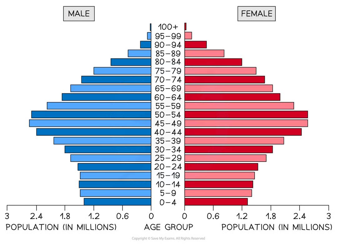
population pyramid
type of histogram used to show the age-sex of a population. can be used to show the structure of an area / country. patterns are easy to identify
line graphs
one of the simplest way to display continous data. both axes are numerical & continuous. used to show changes over time / space
shows trends & patterns clearly, quicker & easier to construct than a bar graph, easy to interpret, needs little written explanation
doesn’t show causes / effects, can be misleading if scales on axis were altered, can be confusing with multiple lines
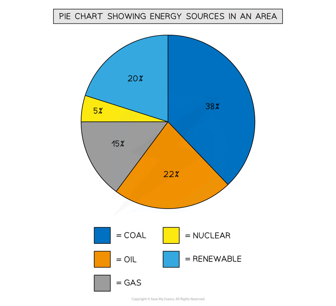
pie chart
used to show proportions, area of circle segment representing proportion. can also be drawn as a proportional circle. can be located on maps to show variations at different sample sites
clearly shows proportion of the whole, easy to compare different components, easy to label, info can be highlighted by separating segments
doesn’t show changes over time, hard to understand without clear labelling, hard to compare 2 sets of data, can only be used for a small number of categories (lots of segments becomes confusing)
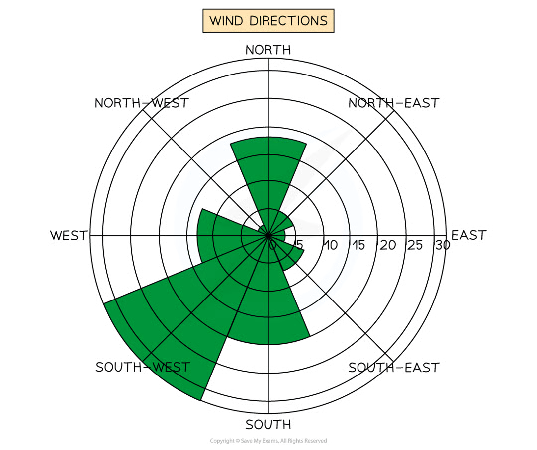
rose diagram
uses multidirectional axes to plot data with bars. compass points used for axis direction. can be used for data like wind direction, noise or light levels
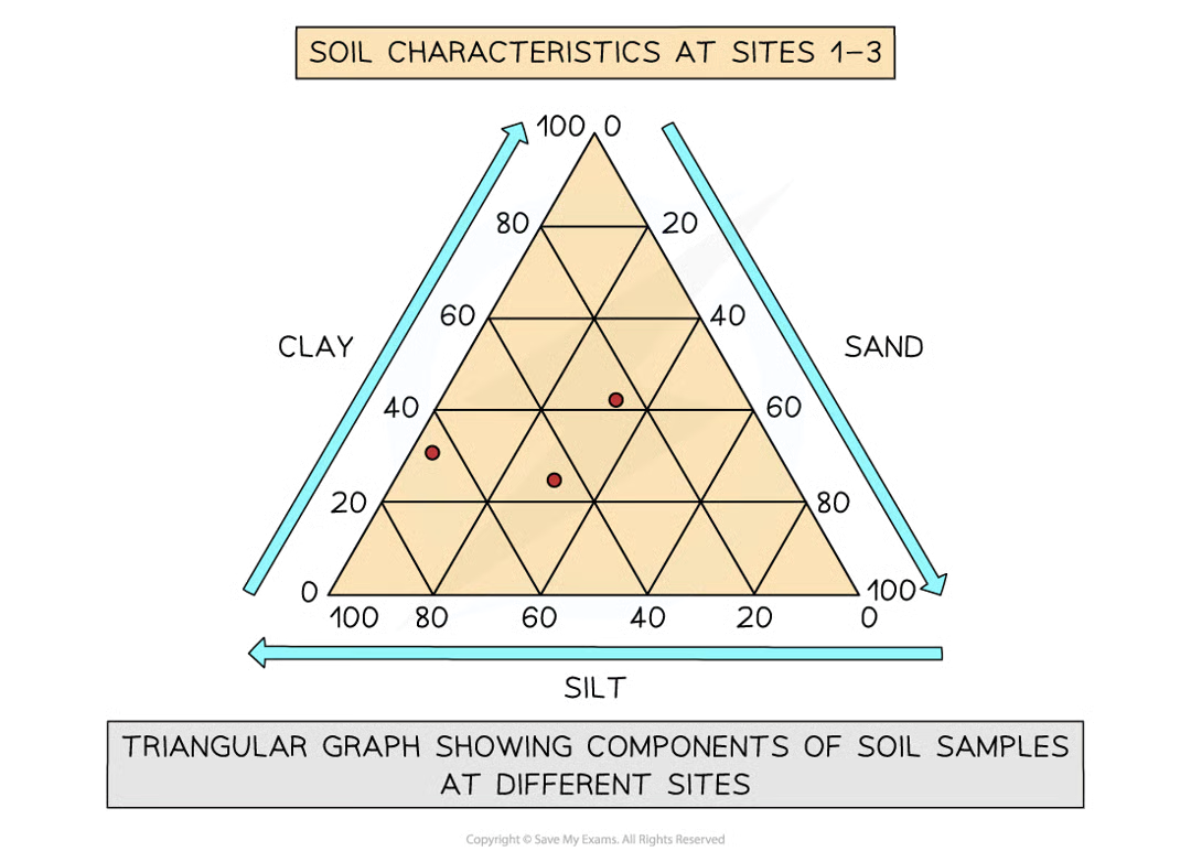
triangular graphs
axes on all 3 sides going from 0-100. used to display data that can be divided into 3 eg soil content, employment. must be in percentages
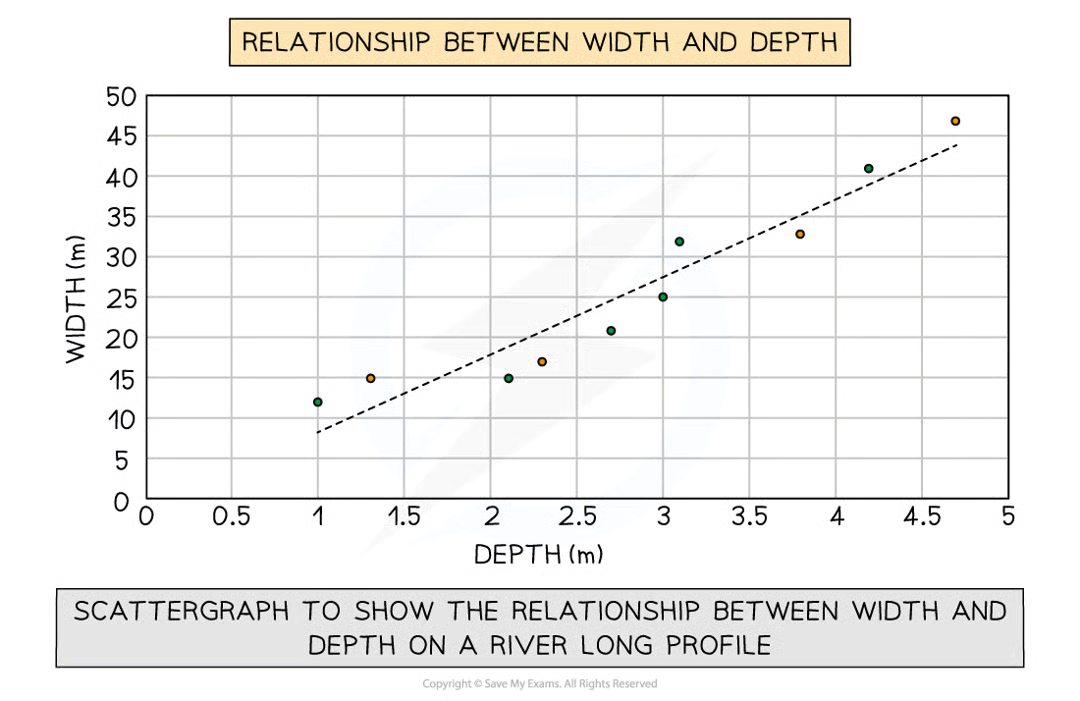
scatter graph
used to show relationship between 2 variables eg river characteristics. points not connected. best-fit line can be added to show relations.
clearly shows data correlation, shows spread of data, easy to identify anomalies & outliers
points not labelled, too many points can be hard to read, only show 2 sets of data
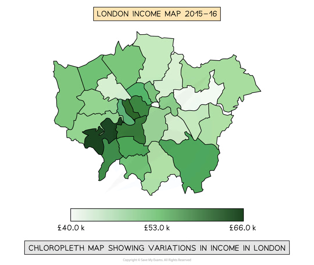
choropleth map
maps are shaded according to a pre-arranged key. each shade represents a range of values. often one colour in different shades. can be used for a range of data eg annual precipitation, population density, income levels
clear visual impression of changes over space, shows large amount of data, groupings are flexible
makes it seem like an abrupt change at boundary, hard to distinguish between shades, variations withing value set aren’t visible
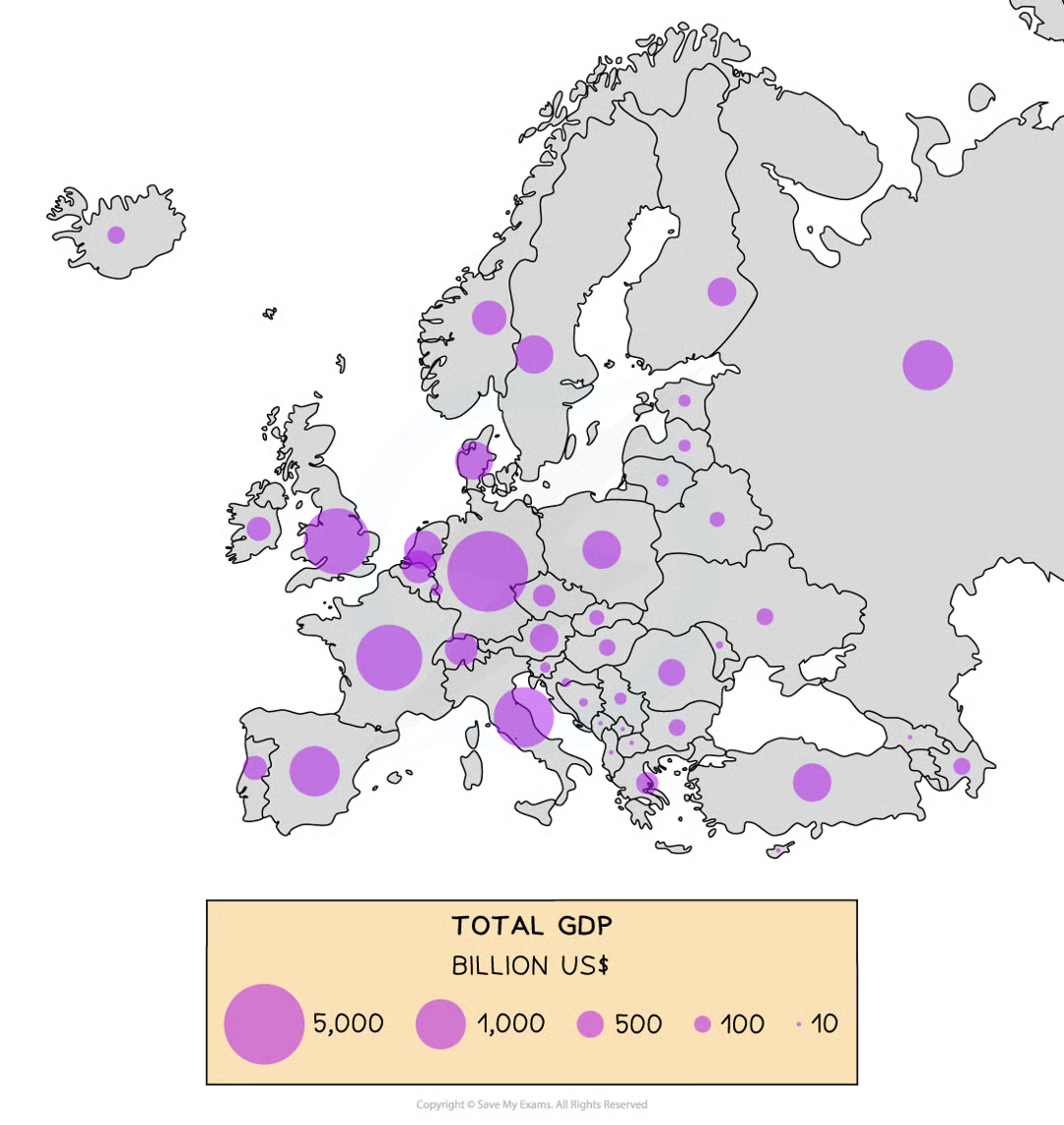
proportional symbols map
symbols on the map drawn in proportion to the variable represented. usually circle / square used but can be an image. can be used to show a range of data eg population, electricity generation, traffic / pedestrian flows
illustrates the differences between many places, easy to read, data is specific to particular locations
not easy to calculate actual value, time consuming to construct, positioning may be hard with larger symbols
data analysis
once data has been collected & presented it needs to be analysed. analysis is the process that makes sense of the data collected. it identifies patterns, trends, significance, connections, and meaning in the data. involves stages:
describing data shown in graphs / photos / maps
identifying highest & lowest results
identifying patterns & trends
identifying relationships between data
statistical methods
can be used to help explore & explain results gathered during data collection. mean, median & mode are measures of central tendency:
mean is calculated by adding all values in the set and dividing by the total number of values
median is the middle value of a set of data. numbers are arranged in rank order to find middle value
mode is the value that occurs most frequently in a set of data
range is a measure of dispersion - the spread of data around the average. it’s the distance between the highest & lowest value. interquartile range is the part of the range that covers the middle 50% of the data
anomalies are results that don’t fit the pattern / trend. they need to be described & explained
evaluation - limitations of data collection
accessibility of sample sites - could all be accessed
size of sample - was it large enough
duration of data collection - was it long enough to collect data needed
methods - were methods appropriate to meet the aim & test the hypothesis
equipment - issues
human error - mistakes in recording data / reading equipment
time of data collection - did weather / time impact results
unforeseen issues - problems on the day eg road works, river flow that affect results
improvements to data collection
increasing sample size
taking more measurements
looking at a wider range of secondary sources
using other (more accurate) equipment eg a flow meter
evaluating conclusions
to evaluation the conclusion you should examine whether
the conclusions reflect the aims & hypothesis set out at the start
the aim & hypothesis were appropriate - could they be easily assessed
the location was appropriate
the accuracy of results could be improved if data collection were to be repeated
fieldwork enquiry process
introduction & planning: coming up with a question & fieldwork location, planning ahead, risk assessments, aims & hypothesis
methods & data collection: deciding how to collect information needed eg where to collect the data from in the location. collecting data, thinking of limitations
data presentation: presenting data so you can analyse it easily & make links - maps, graphs, charts, photos
data analysis: explaining what the data shows eg making links between different pieces of data
conclusions: trying to find an answer to the original question, assessing how sure we can be of it
evaluation: looking back over each stage and evaluating it for WWW & EBI eg problems, things that could have been done differently
evaluation for different fieldwork stages
methods: were sampling methods representative & unbiased, was timing & frequency appropriate, were methods accurate, precise & ethically sound - avoiding harm/offence & gaining consent where needed
data presentation: was data suitable for analysis, were graphs & statistical measures correct, were presentations valid & did they acknowledge all secondary sources used
data analysis: justify choice of statistical tests & minimise subjectivity in qualitative analysis. check for statistical significance, calculation errors & maintain confidentiality throughout
conclusions: were conclusions based on valid methods & reliable data, were all trends & errors considered, were findings supported by evidence & ethically responsible
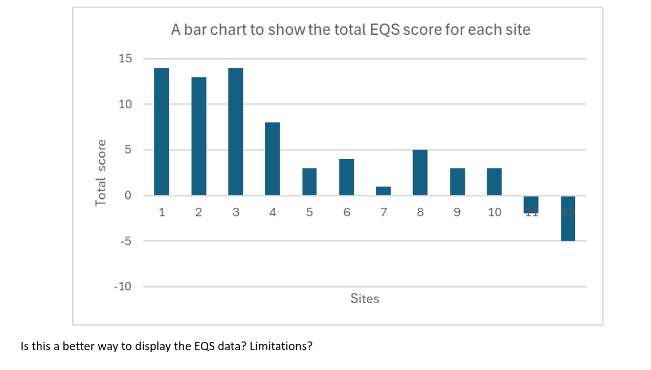
values: difference in total EQS score of sites
goes from 14 in site 1 to -5 in site 12
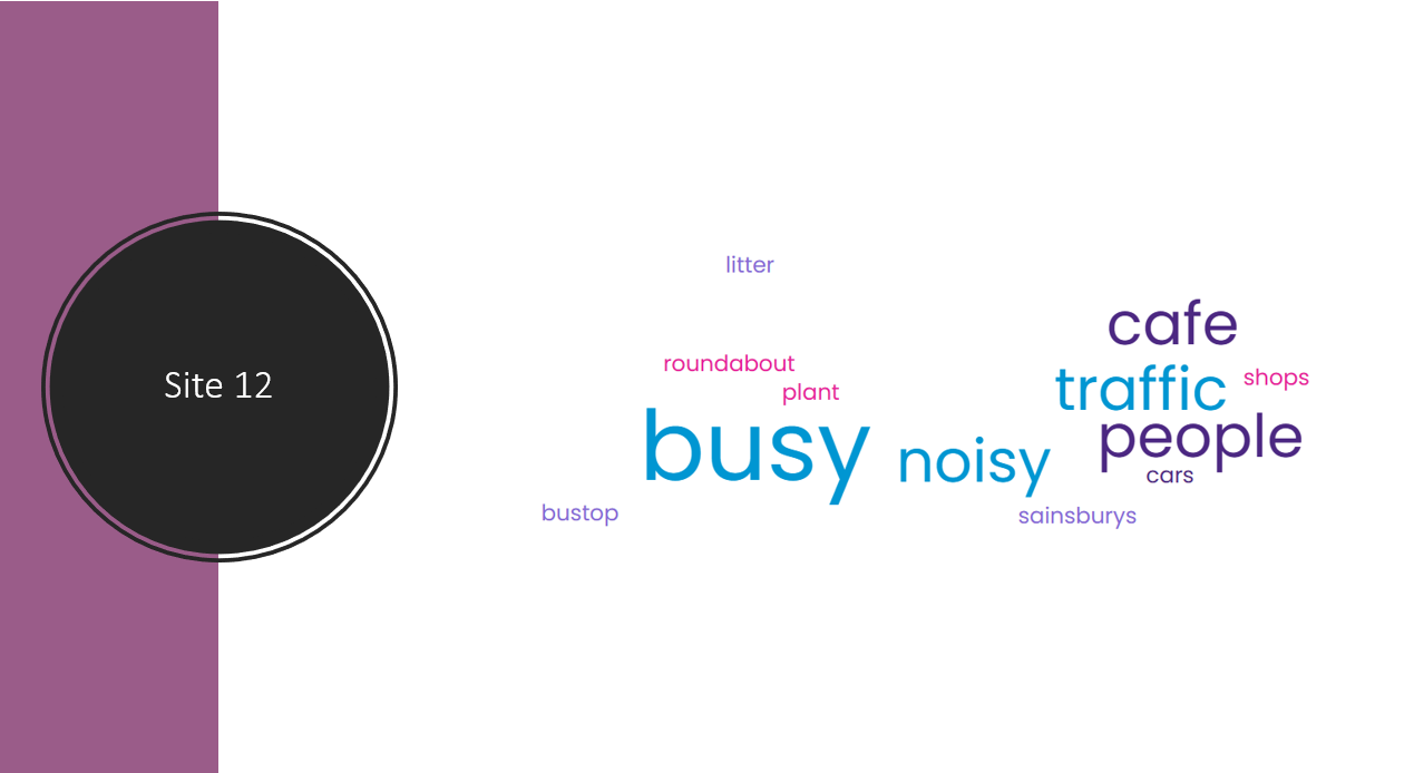
values: word clouds
prevalent words in site 1 = green, common, trees
prevalent words in site 12 = busy, noisy, cars, traffic, people
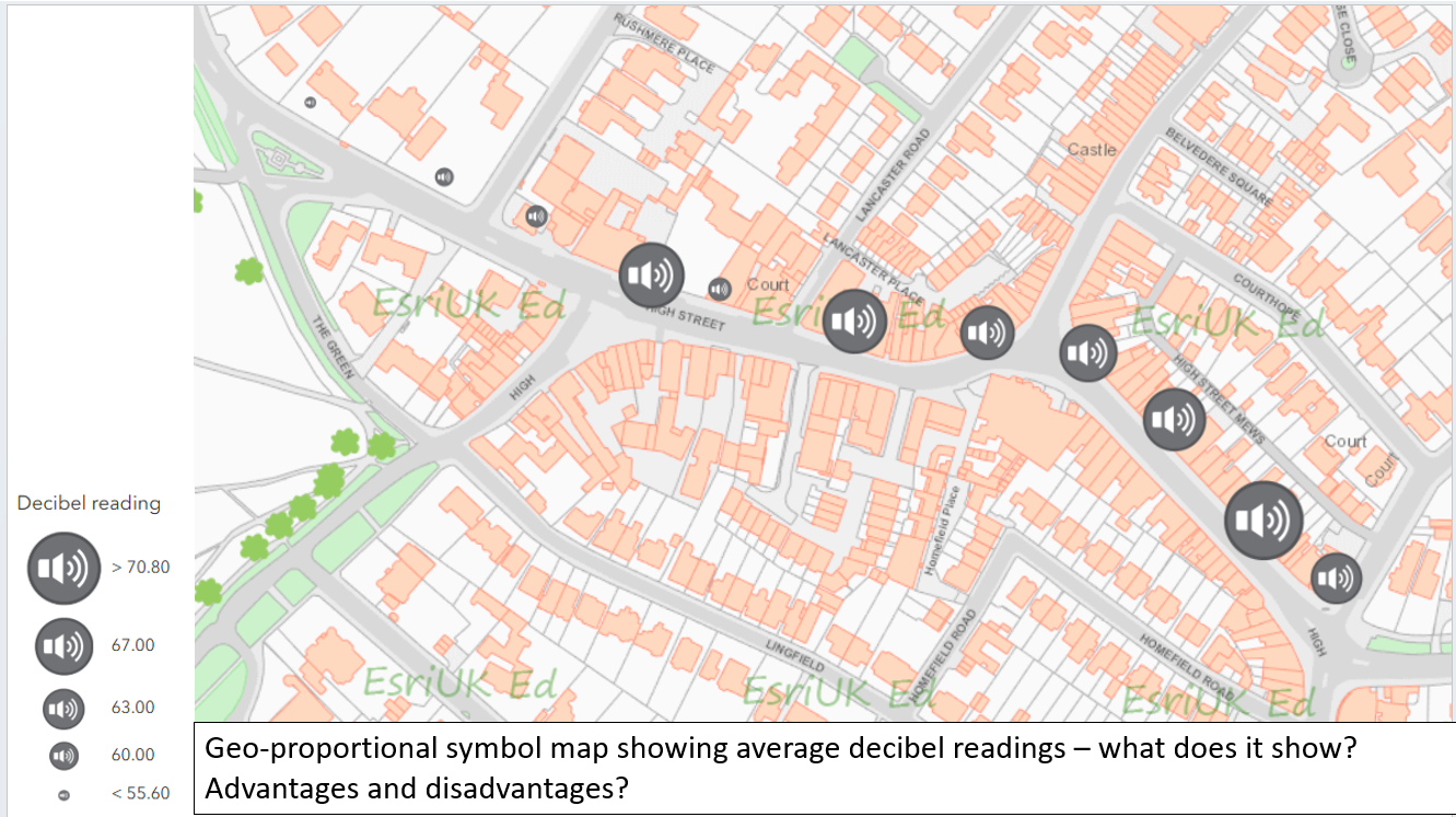
values: decibel readings
40.2 at site 1
89.1 at site 12