GEOG 561: GIS Analysis & Applications
1/24
Earn XP
Description and Tags
Winter 2026 John Lowry - weeks 6-10
Name | Mastery | Learn | Test | Matching | Spaced | Call with Kai |
|---|
No analytics yet
Send a link to your students to track their progress
25 Terms
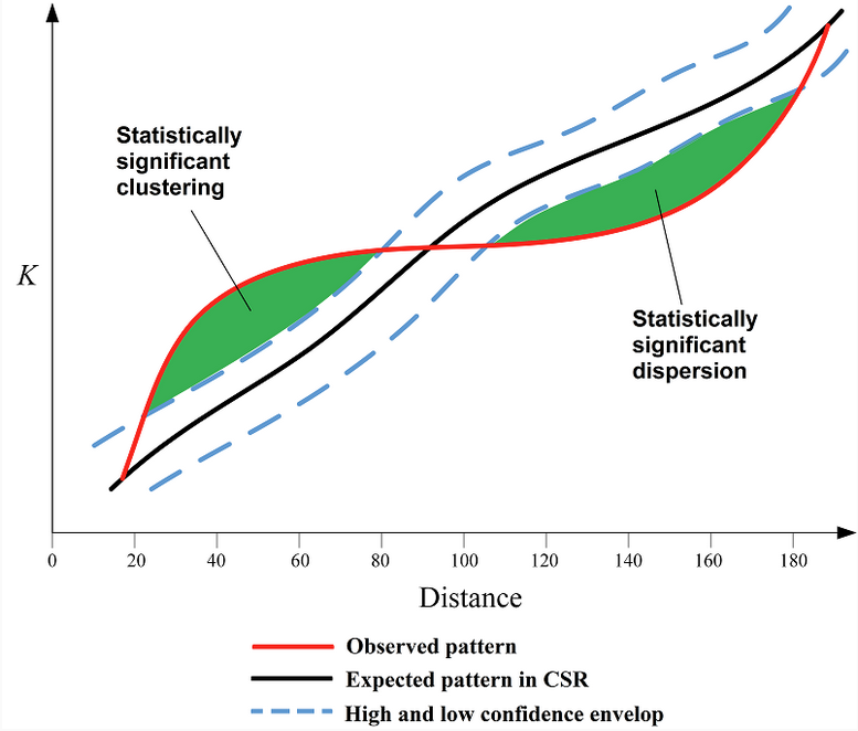
Ripley’s K function
multi-scale spatial analysis tool that tests whether point patterns differ from randomness by measuring how many neighbors occur within increasing distances around each point.
For a given distance r:
Imagine drawing a circle of radius r around each point.
Count how many other points fall within that circle.
Average that count across all points.
Standardize it relative to the overall point density.
So the K value at distance r reflects: The average number of neighboring points located within distance r of each point, compared to what would be expected under Complete Spatial Randomness (CSR).
Ripley’s K is calculated for many increasing distances (r₁, r₂, r₃, …), which allows you to examine spatial structure at multiple scales.
Short distances (small r):
If K(r) > expected CSR → points are clustered at small scales.
If K(r) < expected CSR → points are dispersed at small scales.
Longer distances (large r):
The same comparison applies, but now you’re evaluating broader-scale spatial structure.
For graph shown:
At small search radii, there are more neighboring points within that radius than expected under CSR → clustering.
At larger search radii, there are fewer neighbors within that radius than expected under CSR → dispersion at broader spatial scales.
Ex. Imagine trees in a forest:
Trees may grow in small groups (clustered at 5–10 meters).
But those groups may be evenly spaced due to competition (dispersed at 100 meters).
Ripley’s K detects that change because it evaluates spatial structure as a function of distance (r).
LISA
local indicators of hot spot analysis
ex. Local moran’s I or Getis-Ord Gi*
According to Anselin (1995), a statistic qualifies as a LISA if:
It provides a local measure of spatial association for each feature.
The sum of the local statistics relates to the corresponding global statistic.
It allows identification of significant local clustering.
Hot Spot Analysis (Getis-Ord Gi*)
local spatial statistic used in GIS to identify statistically significant clusters of high values (hot spots) and low values (cold spots) in spatial data.
It is based on the Getis-Ord Gi* statistic.
Unlike Global Moran's I, which summarizes clustering across an entire study area, Getis-Ord Gi* evaluates each feature individually in the context of its neighbors. (So: Moran’s I = “Is there clustering?”; Gi* = “Where are the hot and cold spots?”)
Interpreting Results
The output is typically a z-score map:
High positive z-score → statistically significant hot spot
Low negative z-score → statistically significant cold spot
Near zero → not statistically significant
Example interpretation:
A tract with a z-score of +3.2 → strong clustering of high values nearby.
A tract with a z-score of −2.5 → strong clustering of low values nearby.
Hot Spot Analysis depends on:
Properly defined spatial weights (fixed distance vs. contiguity)
Appropriate scale
Normally distributed z-score interpretation
Multiple testing considerations (since each feature is tested)
Global Moran’s I
an index that measures overall spatial autocorrelation in a dataset based on feature location and an associated numeric (interval-level) attribute value.
It evaluates whether similar values occur near one another across the entire study area.
Positive spatial autocorrelation (I > 0) → clustered pattern
No spatial autocorrelation (I ≈ 0) → random pattern
Negative spatial autocorrelation (I < 0) → dispersed (uniform) pattern
It is a single summary statistic describing the overall spatial pattern in the entire dataset.
This is different from Local Moran’s I, which identifies specific clusters within the data.
The statistic is based on three components:
Spatial Weights Matrix (SO) – Defines which features are neighbors (connectivity).
Sum of Squared Deviations (D) – Measures how values differ from the global mean.
Sum of Cross-Products (C) – Measures how neighboring values co-vary relative to the mean.
Local Moran’s I
A type of LISA statistic which identifies statistically significant local clusters and “outliers” i.e., unique features and what they’re adjacent to. Measures degree to which a feature is similar to its neighbors (comparing each feature’s value to its neighbors)
“Is this feature similar to its neighbors, or different from them?”
This differs from Global Moran's I, which only tells you whether clustering exists overall.
Local Moran’s I vs Getis-Ord Gi*:
Local Moran’s I identifies:
Clusters (High–High, Low–Low)
Spatial outliers (High–Low, Low–High)
Getis-Ord Gi* identifies:
Hot spots (clusters of high values)
Cold spots (clusters of low values)
But not spatial outliers
How is classification different from clustering?
Classification assigns observations into pre-defined categories (classes) that analysts already know about (e.g., land cover types like Water, Forest, Urban). It’s considered a supervised process because you often train the model with labeled examples.
Clustering discovers groups from the data itself without knowing the number or nature of the groups in advance. It’s unsupervised learning — the algorithm finds similarity patterns and forms clusters based on those.
Classification uses known classes → assigns new observations to them.
Clustering finds new group structures directly from the data
How is clustering different from point pattern analysis (PPA)?
Clustering and point pattern analysis (PPA) both involve spatial data, but they focus on different things:
Clustering groups objects (points or features) based on similarity — this similarity may include spatial proximity but often includes attribute similarity as well. Clustering tries to partition data into defined clusters, sometimes using spatial distance as just one factor.
Point Pattern Analysis (PPA) looks at the spatial arrangement of events in space to determine whether a pattern is clustered, random, or dispersed relative to some null model like complete spatial randomness. PPA is primarily about spatial distribution and pattern detection, not forming classification/group labels.
In short:
✔ Clustering groups data into clusters (often attribute-based or combined spatial/attribute).
✔ PPA tests the spatial distribution of points to infer whether they are non-randomly clustered, randomly distributed, or regularly spaced.
What is meant by univariate clustering? What are some examples of univariate clustering?
Univariate clustering refers to clustering based on one variable at a time — the clustering process uses a single attribute to group observations. In the context of the reading, this is discussed under univariate classification and clustering, where methods group data based on one attribute’s values.
Examples of univariate clustering
These are techniques that form clusters from one numeric attribute:
Quantile / Percentile breaks — groups created by dividing a single variable into quantiles.
Jenks’ Natural Breaks — identifies natural clusters or groupings in one variable’s distribution.
K-means clustering applied to one variable (points on a number line) — groups values into k clusters based on similarity on that one variable.
These methods all treat just one attribute (e.g., median age, income) as the basis for determining cluster membership.
MAUP
Modifiable Areal Unit Problem
A challenge in spatial analysis where the results can change depending on how the boundaries of the areas (e.g., census tracts vs. zip codes) are drawn.
-result of aggregating data
When you take the same data and group it into different areas (bigger or smaller, different shapes), your maps and statistics can look very different — and that difference is just caused by how you chose to divide the space, not by any real change in the data.
Imagine you have a big box of candies spread across your kitchen floor. Now suppose you and your grandma want to count how many candies are in different parts of the room.
If you draw big squares on the floor and count the candies in those, you might see one big square has lots of candies and another has few.
But if you draw smaller squares or divide the room differently, the pattern of where the candies are most dense suddenly looks very different.
Even though nothing has changed with the candies themselves, your picture of how they are distributed changes just because you changed how you draw the boxes.
Two types of MAUP:
Scale effect: Different results when scale of aggregation of units is changed
Zone effect: Scale is fixed but shape of aggregation units has changed
Can you think of examples from your discipline or area of interest where the MAUP and/or the Ecological Fallacy come in to play?
Both the MAUP and the ecological fallacy come up anytime you work with aggregated spatial data — data summarized over regions rather than at the level of individuals.
The Ecological Fallacy warns us that characteristics of the individual may express themselves differently in aggregate
The MAUP warns us that placement of boundaries and/or how boundaries are drawn will have an effect with areal data
MAUP examples:
a) Elections and Districts
If you map election results by state vs county vs precinct, the apparent patterns of which party wins or how close the races look can vary widely just because of how the political boundaries are drawn.
b) Health and Disease Mapping
In public health research, the relationship between environmental risks (like pollution) and disease rates can change when data are aggregated at the county level instead of the census tract level — even though the underlying disease cases are the same.
c) Urban planning
When you analyze access to grocery stores, parks, or public transit, the strength of correlation with health outcomes can change dramatically depending on whether you use ZIP codes, census tracts, or 500 m buffers.
The ecological fallacy happens when you assume that what’s true for a group must be true for the individuals in that group.
ex. Income and Neighborhoods
Suppose a neighborhood’s average income is $80 k per year. That doesn’t mean every person living there earns $80 k — some might earn much more or much less. If you assume every resident is wealthy because the average is high, you’ve made the ecological fallacy.
ecological fallacy
aka aggregation bias
Inference about the nature of an individual deduced from data about a group to which the individual belongs
ex. proportional reduction in political elections
Type I error
Reject true H₀ (Rejecting the null hypothesis (H₀) incorrectly.)
Convict an innocent person
Say pattern is clustered when it’s random
The probability of making this error is called alpha (α).
Alpha is the maximum probability of committing a Type I error that we are willing to tolerate.
Common values: α = 0.05 or 0.01 (5% or 1%).
Type II error
Fail to reject false H₀ (Failing to reject (accepting) the null hypothesis when the alternative hypothesis is actually true.)
Acquit a guilty person
Say pattern is random when it’s clustered (This means we miss a real effect or pattern.)
geodemographics
Study of characteristics of populations of people & where they live.
Common in business—marketing strategies, locational analysis
composed of:
demography (population structure), geography (features across space), sociology (social interactions), data analytics
can be used to create classifications (geodemographic classifications built from census data)
k-means clustering algorithm
A common algorithm used to build these classifications (geodemographic). It follows a four-step iterative process:
Step 1: Randomly choose initial "mean" seeds for k clusters.
Step 2: Assign all observations to the nearest cluster mean.
Step 3: Calculate a new mean for each cluster based on the observations assigned to it.
Step 4: Repeat until the variation within clusters is minimized and "convergence" is reached (assignments no longer change significantly)
Standardization (Z-score): Before performing analysis, variables must be standardized to a common range (often using Min-Max or z-scores) so that variables with larger raw numbers do not disproportionately influence the results.
Pseudo-F Statistic: A statistical measure used to determine the optimal number of clusters. A larger Pseudo-F statistic suggests a more effective grouping of the data.
ex. Natural breaks (jenks) classification in symbology
multicollinearity
measurement of how two variables are related to one another
high collinearity - very related to one another (highly correlated)
can tell you whether to include or exclude
refers to a situation where two or more variables in a dataset are highly correlated with each other. In the context of clustering, if variables are redundant (e.g., "% home ownership" and "% renters"), one might be excluded to prevent the model from over-representing a single factor.
multivariate clustering
aka Geodemographic Classification
analytical technique used for grouping or dividing populations based on multiple characteristics.
It partitions a set of observations into "clusters," where each observation in a cluster is more similar to the mean of its own cluster than to any other cluster mean.
Box Plots
Used to interpret cluster results by showing the distribution of variables. Key markers include:
Median: The 50th percentile.
1st Quartile: The 25th percentile.
3rd Quartile: The 75th percentile.
single linear regression
Single linear regression is a statistical model used to estimate the relationship between a dependent variable (response, y) and one independent variable (predictor, x). It works by fitting a straight "prediction line" through a scatterplot of data points to model how the two variables are connected.
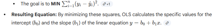
Ordinary Least Squares (OLS)
The "best" line in a linear regression is found using a method called Ordinary Least Squares (OLS), which minimizes the sum of all squared residual errors—the differences between the actual observed values and the values predicted by the line.
Ordinary Least Squares (OLS) is the actual mathematical tool or method used to perform linear regression. While "linear regression" refers to the general goal of modeling a relationship with a straight line, OLS is the specific procedure that determines where exactly that line should be placed.
The "Least Squares" Objective: The OLS method works by calculating the square of every residual and then finding the line that makes the sum of all these squared errors as small as possible.
Assumptions of OLS
For a single linear regression, the model assumes the following regarding its residuals:
Constant Variance (Homoskedasticity): The variance in residual errors must not change with the value of X. A common diagnostic for this is a "Standardized Residuals vs. Predicted Y" plot; a funnel shape in this plot suggests non-constant variance, also known as heteroskedasticity.
Normal Distribution: Residuals should be normally distributed around the regression line. This is a necessary assumption for using t-tests and F-tests to determine the significance of the slope ($\beta$) and R². A Q-Q Plot is typically used to check this; points should fall along the diagonal line if residuals are normal.
Independence: There should be no trend or dependence in residual errors among observations, whether through time or geographic space. In spatial studies, this is checked by looking for spatial autocorrelation using diagnostics like Global Moran’s I.
No Outliers (Leverage Points): There should be no extreme observations that act as a "lever" on the regression line. Cook’s Distance is a common diagnostic here, where a value greater than 0.5 is generally considered a large influence
Multiple Linear Regression follows all the SLR assumptions listed above but adds one critical requirement:
No Multicollinearity: The explanatory (X) variables must not be highly correlated with one another. The model assumes each X variable has an independent effect on Y.
Diagnostics: This is tested using Pearson’s correlation (r) or the Variance Inflation Factor (VIF).
Solution: If collinearity is found, it is best to use X variables that are not likely to be highly correlated
R² vs P-value in linear regression
While both are key metrics for interpreting a regression model, they measure different things: one focuses on the strength of the relationship, while the other focuses on the certainty of that relationship.
R² measures how well the regression line fits the data points.
Definition: It is the proportion of the total variation in the data that is explained by the regression model.
Interpretation: A high R² indicates a "tight fit," meaning the model explains much of the data's behavior. A low R² indicates a "loose fit".
Simplified View: It tells you how much better the regression line is at predicting y compared to just using the average (mean) of y.
The p-value tells you if the results you see (like the slope or the $R^2$) could have occurred by pure chance.
Testing the Slope ($b_1$): A p-value is calculated to test the null hypothesis that there is actually no relationship (b_1 = 0).
Significance: If the p-value is less than a certain threshold (usually 0.05), you "reject" the idea that there is no relationship. This means the slope is statistically significant, and you can have confidence that x actually affects y.
Testing the R²: Similarly, a p-value for $R^2$ tells you if the "fit" of the model is likely to be real or just a fluke in the sample data.
In short: R² tells you how much of the variation is explained, while the p-value tells you if that explanation is statistically reliable.
Multiple Regression Analysis
While simple linear regression models the relationship between two variables (X and Y), MLR allows you to understand how a combination of factors (x values) influences an outcome (y value). Still uses OLS as method for finding line (or plane in this case in multidimensional model) of best fit, just calculates a separate Bi for each independent variable
EXs:
Simple Regression Example: Using only "Age" to predict "Tree Canopy".
Multiple Regression Example: Using "track density," "stream density," "landing density," "slope," and "rainfall" all together to predict "landslide density"
MLR is designed to separate the effects of each individual independent variable on the dependent variable.
The model providing a separate estimate (\beta_i) for each $X$ variable.
Each beta coefficient tells you the specific change in $Y$ for a one-unit change in that particular $X$, assuming all other independent variables remain constant.
uses Adjusted R² instead of R² to account for the number of independent variables added to the model, and thus is smaller than the standard R²
Geographically Weighted Regression (GWR)
spatial regression technique designed to account for geographic variation in the relationships between variables. Unlike standard OLS regression, which assumes a "stationary" or fixed relationship across the entire study area, GWR assumes that these relationships are "non-stationary" and vary by location
an algorithm that calculates the regression equation for each observation based on its weighted neighboring points (wij)
Key Components
The Kernel (Moving Window)
The model uses a "kernel," which can be thought of as a moving window that "visits" every feature in the dataset. For each individual feature, the model calculates its own unique regression equation based on its neighboring points.
Weighting and Distance-Decay
GWR operates on the principle of distance-decay: points closer to the feature being analyzed are given more weight than points further away.
Spatial Weights Matrix ($w_{ij}$): This matrix defines the neighbors for each calculation.
Gaussian Function: A Gaussian (normal) kernel density function is the most common method used to apply these weights.
Bandwidth Types (for Kernel operator)
The "bandwidth" determines the size of the kernel and how far out it looks for neighbors. There are two primary types:
Fixed Bandwidth: The distance used to define the neighborhood is constant across the entire study area.
Adaptive Bandwidth: The distance changes based on the density of the data points. In areas where data points are sparse, the bandwidth expands; in dense areas, it shrinks.
Local Regression Statistics
Because GWR runs a separate regression for every location, it produces "local" statistics rather than just one global set of results:
Local R²: Indicates how well the model explains the variation at each specific location.
Local Beta Coefficients ($\beta$): These show how the strength and direction of the relationship between $X$ and $Y$ change geographically.
Adjusted R²: GWR often results in a higher Adjusted R² because it accounts for local variation that a global model misses
GWR is considered a good approach for explanatory regression and exploring the non-stationary relationship between Xs and Y. Whether it is a good model for prediction is controversial.
AICc (Akaike’s Information Criterion)
mathematical method for evaluating how well a model fits the data it was generated from, while also accounting for the complexity of the model. In the context of OLS and GWR, it is primarily used as a tool for model selection.
COMPARABLE ACCROSS DIFFERENT MODELS
Lower is Better: When comparing two or more models using the same dataset, the model with the lowest AIC value is considered the best fit.
Relative, Not Absolute: An AIC value on its own (e.g., "AIC = 250") doesn't mean much. It is only useful when compared to the AIC of another model
In GWR, the AICc is the primary metric used to determine if the spatial model is actually an improvement over the global OLS model. If the GWR AICc is significantly lower than the OLS AICc, it provides strong evidence that the relationship you are studying is indeed non-stationary (varies across space).
suggested workflow for Regression Analysis
Prepare spatial data (normalize fields if needed)
Use Exploratory Regression to learn more about variables
Use OLS Regression to run diagnostics
Calculate Global Moran’s I on OSL residuals
Use Geographically Weighted Regression
Regression analysis is a process of exploring variables, testing assumptions, running models, and comparing models…