GRC 318
1/203
There's no tags or description
Looks like no tags are added yet.
Name | Mastery | Learn | Test | Matching | Spaced | Call with Kai |
|---|
No analytics yet
Send a link to your students to track their progress
204 Terms
Em
same size as the unit of type being set
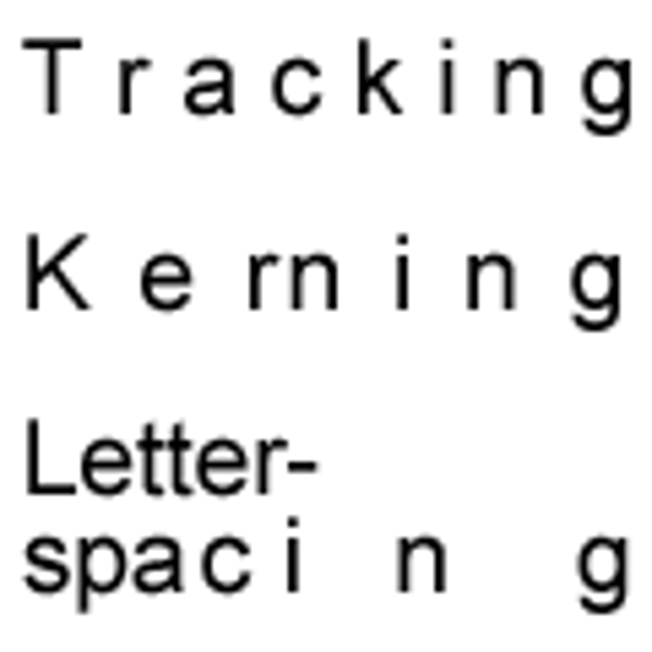
horizontal spacing of type is based in Ems
the earliest dated printed book (AD 368)
Diamond Sutra
Leading
measure from the baseline of one line of type to the baseline of the line that precedes it
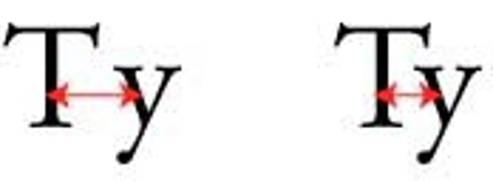
Kerning
horizontal spacing between pairs of letters
Tracking
space between a range of letters
Digital Fonts
divided into 1,000 relative units
Phototypesetting Typography
brought relative measurements and the ability to kern letters into neighboring bounding boxes
Bounding Box
A border that displays around the edges of a letter
Point size
the height of the bounding box
Absolute measurement
measurements we know (feet, inches, points, picas)
Relative measurement
have no fixed value, fundamental unit the em
Em dash
used during a pause in thought or parenthetical sentence
En dash
used to denote duration
Text dominated layouts require _________ grids?
simpler
use grids to
find placement and organization of white space text/images
Paragraph Styles
A style in which the formats are applied instantly to all text in the paragraph where the insertion point is located, whether or not text is selected.
Character Styles
A style that is applied to individual characters or words that users have selected.
the smaller the heading
the more leading is needed
Old style
always have bracketed serifs (connected with a curve)
Diagonal Stress (as if drawn with a pen)
Modern
Horizontal serifs that connect with a 90 degree angle
radical thicks and thins (handwritten quality gone)
vertical stress
ex. times new roman
Slab Serif
thick, fat, horizontal serifs
little to no thicks and thins

Sans Serif
no serifs
minimal thicks and thins
reasonably legible
script
designed to imitate handwriting and calligraphy
Blackletter
referred to as gothic and old letter
classic newspaper logo, juicy couture
never use in all caps
use sparingly/for effect
Decorative
Any typeface that is festive or decorative. For use in headlines and at larger sizes.
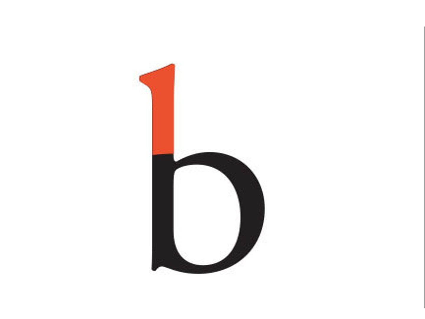
Ascender
the part of the lowercase letters b, d, f, h, k, l and t that extends above the x-height
Bar/Cross bar
the horizontal stroke across the middle of uppercase A and H

Baseline
the implied line upon which the character sit
Bowl
the rounded part of the letterform
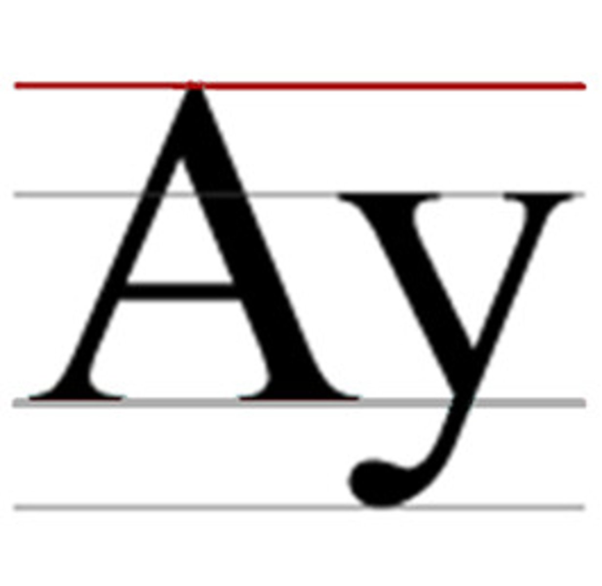
Cap line
The imaginary horizontal line resting upon the tops of the capital letters
Counter
the interior "negative" space of the letter
Descender
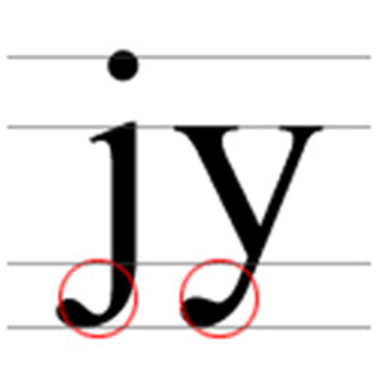
The portion of the lowercase characters g, j, p, q and y that projects below the baseline
Descender line
The invisible line marking the lowest point of the descenders within front
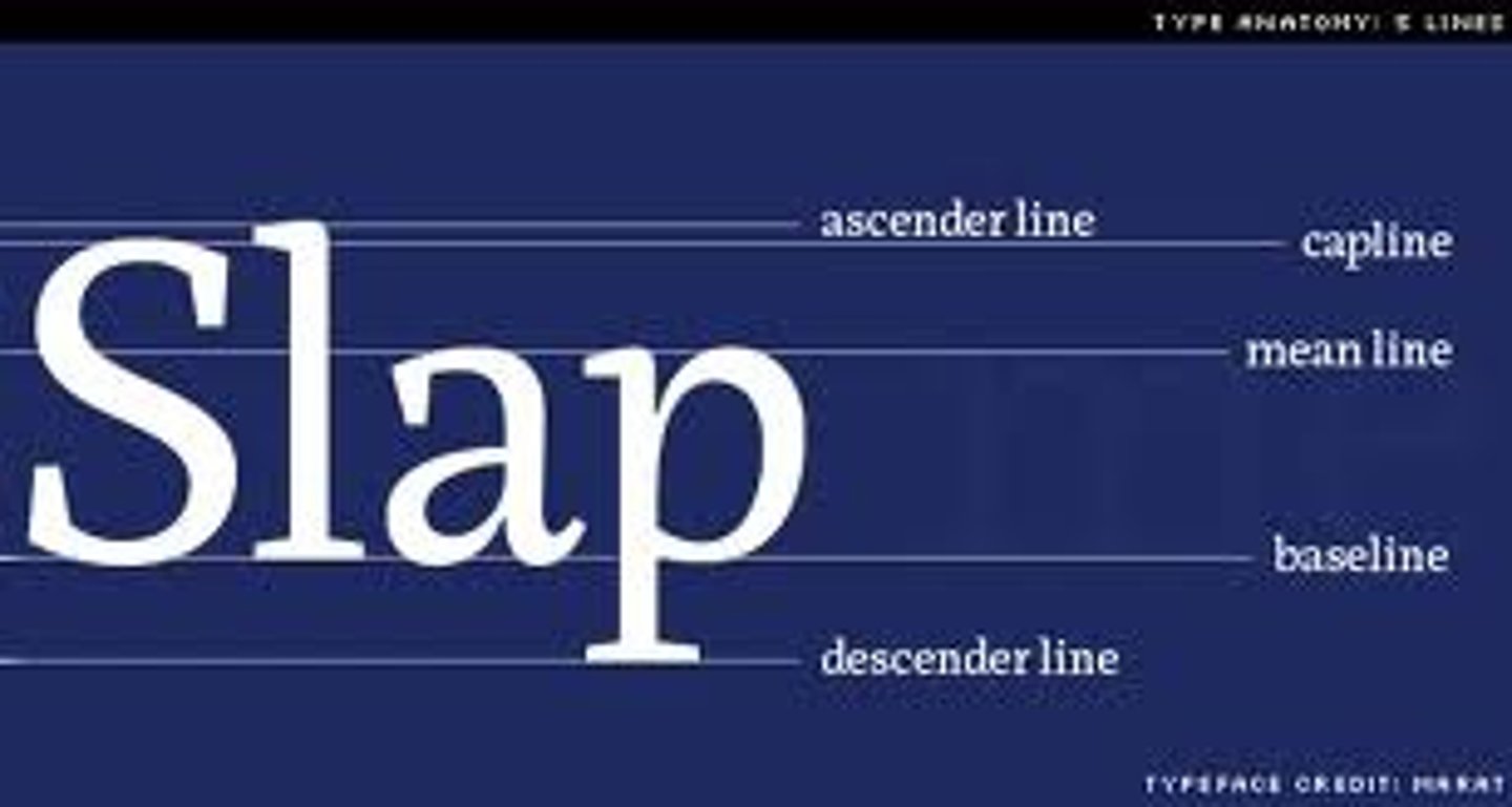
Median line (mean line)
imaginary line defining the x-height
Serif
ends of a character's main strokes, where the stroke appears to flare out
Stem
The main part of the letterform that is straight
Stress
the orientation of the letterform's curved strokes. from thin to thick
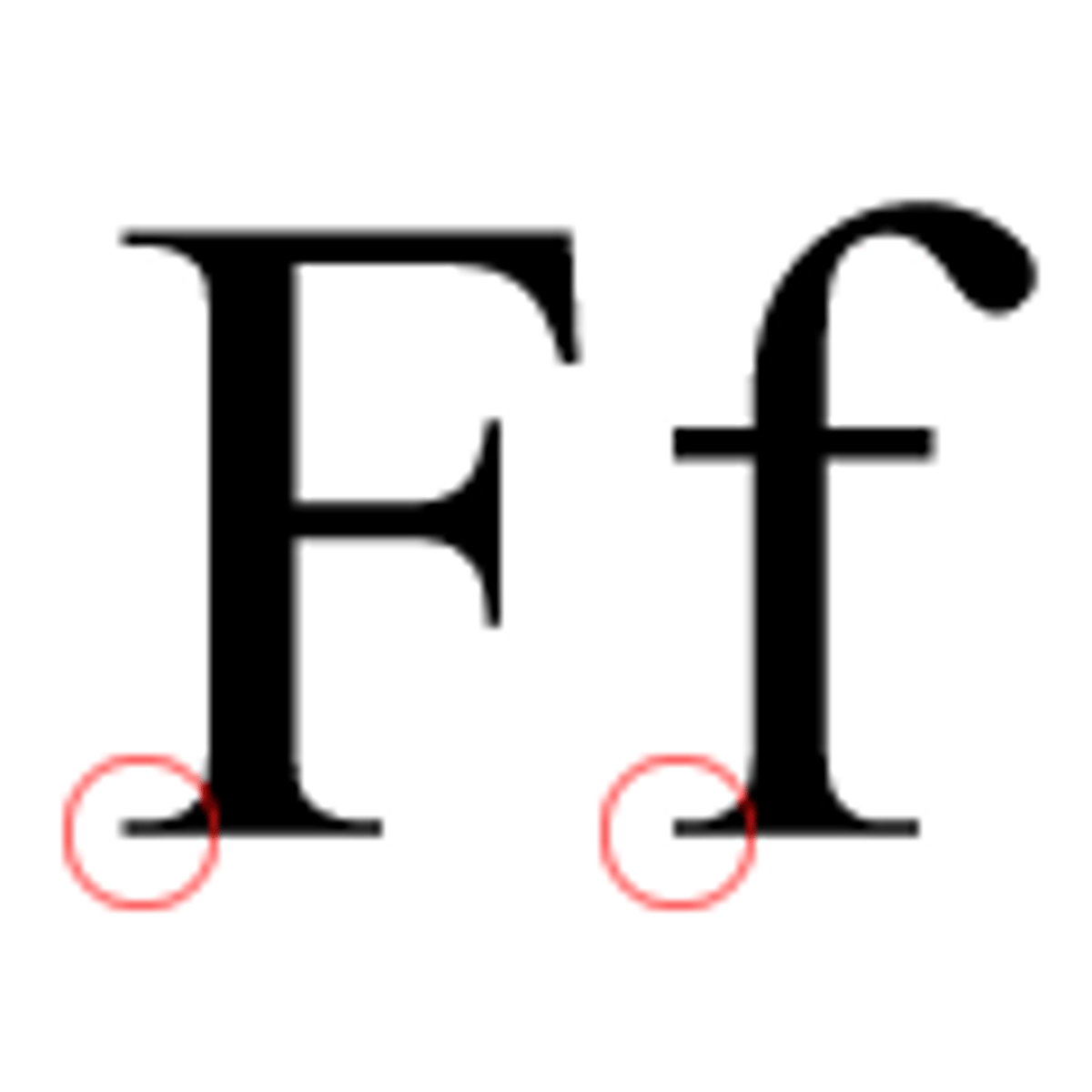
X-height
The height of the main body of the lowercase characters. The letter x is chosen because the letter's strokes end at — rather than overshoot — this line of measurement.
Start with a good font
choose a typeface other than the default
choose a point size and leading that is not default
body copy should be smaller than default and leading should exceed the default
Family planning...choose the right family for the job
if the project calls for different weights etc., choose a font that has the different styles
Typeface Family
same as font family
never use the "skew" feature/false italic
never stretch & squeeze type
Use typographers quotes (smart quotes)
do not use primes
Use small caps or none at all
don't fake it
look at open type > [ ] = not available
Space between paragraphs or indent paragraphs
good starting point for indents = 1-1.5 ems
use "space after" in paragraph style to set a space after each paragraph
Set the right line length
50-70 characters per line
Set the right leading
pt size > leading (negative leading)
pt size = leading (type set solid)
pt size < leading (type set w/default leading)
Use the appropriate dashes
hyphen, en dash, em dash
Hyphen
used for compound modifiers or to tie prefixes to proper adjectives such as pre-victorian
Don't justify narrow columns
if you have narrow columns or short lines of text, set them ragged - right
don't set them justified
widows
Words or single lines of text that become separated from the other lines in a paragraph and are left alone at the top of a page
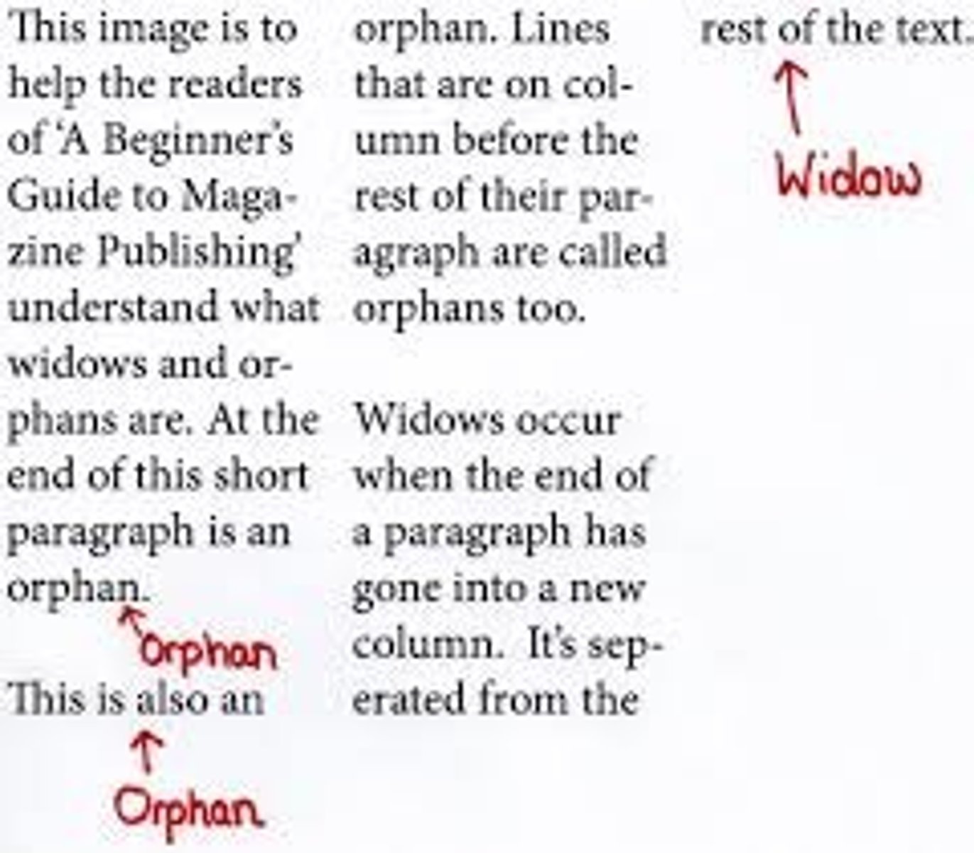
orphan
The first line of a paragraph that appears alone at the bottom of a page.
runt
the last line of a paragraph that ends with a short word or hyphenated syllable
balanced ragged lines
don't use for body text
good for headings, subheadings, captions
paragraph style > indents > BLR
Column Break
Used to end a column of text. Text after the break is moved into the next column
hidden character = v
^
non breaking space
>>
tab
downwards ^
column break
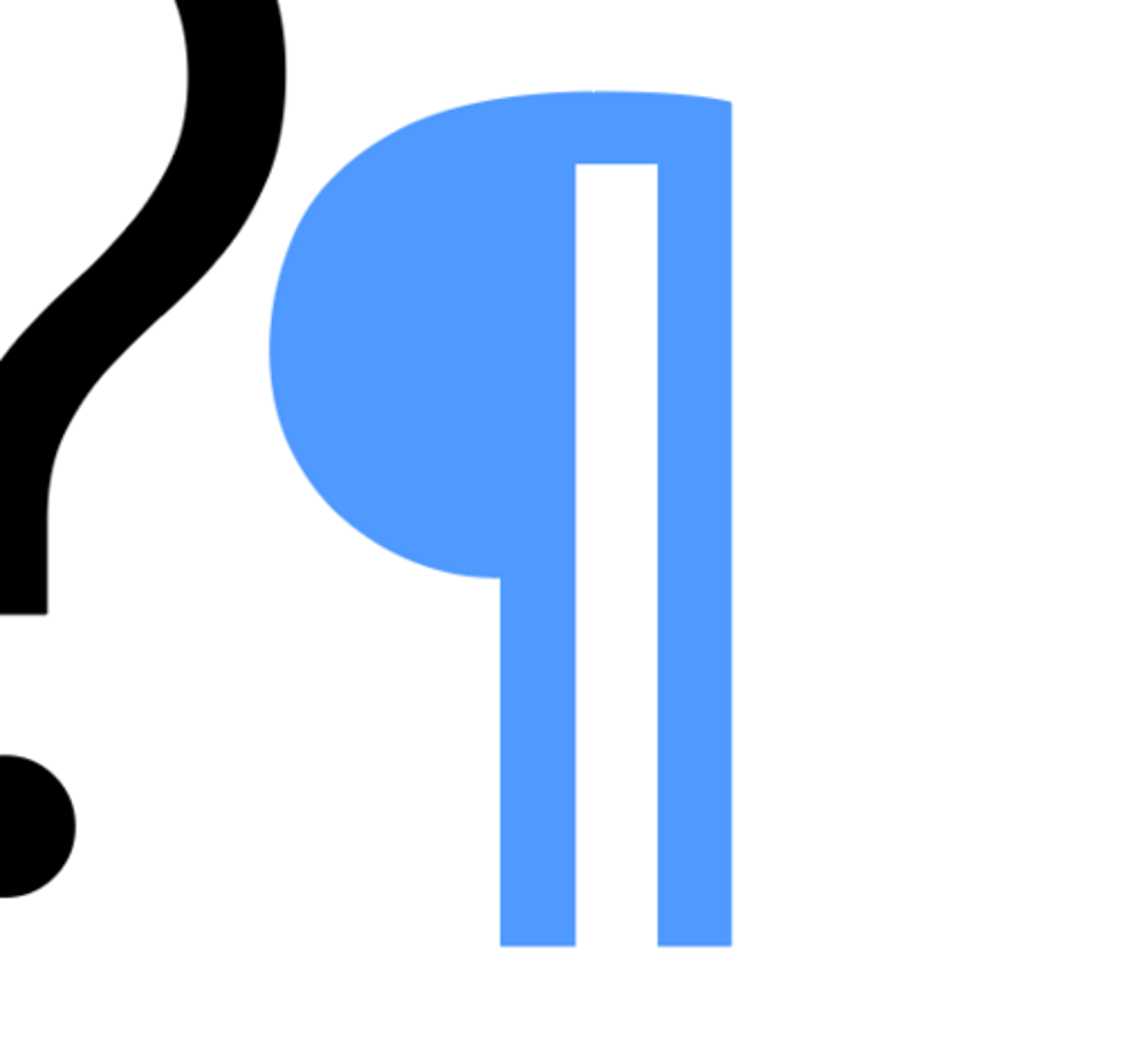
Paragraph return
backwards p
forced line break
hidden character
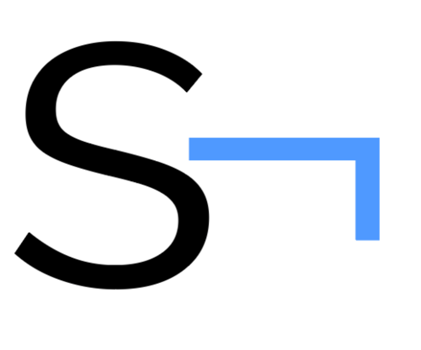
Right Indent tab
hidden character

#
end of story
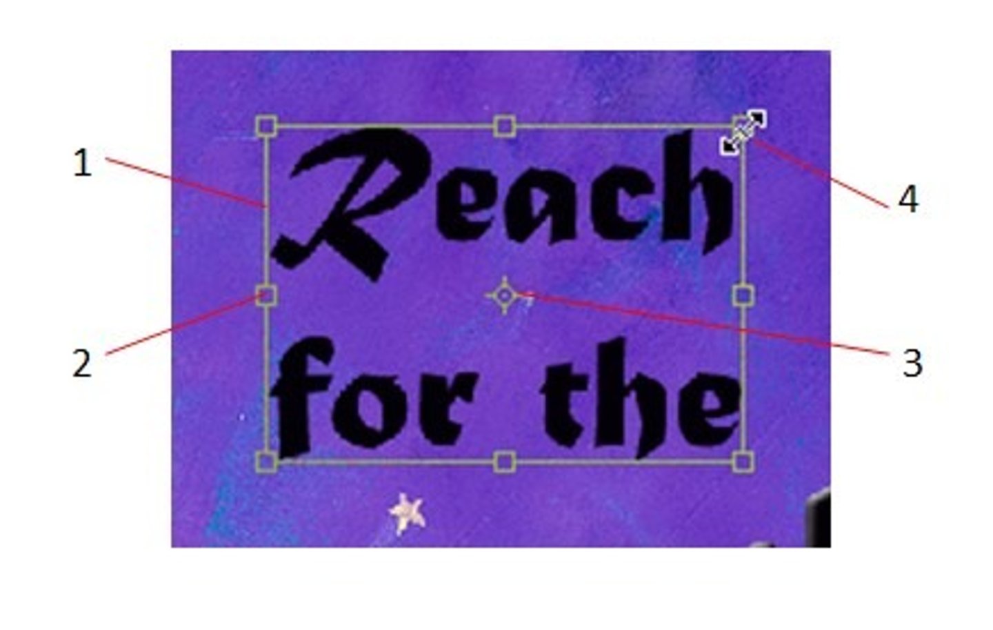
anchored or inline object
hidden character
yellow square around text box
adjusts the corners (rounded, etc.)
blue square around text box
anchor object
anchored objects are
images or text boxes that are attached to a specific text
Inline anchor option
aligns the anchored object with the baseline of the insertion point
can use the y offset to position the object above or below the baseline
Above line
places the anchored object above the line with different choices of alignment
Custom
Places the anchored object in the position that you define
Justification
creates columns that are even on both sides
gives a formal and structures look to the design
Do not justify
headings, subheadings, bylines, captions, pull quotes, footnotes, bibliographies, or indexes
Justification settings are applied as a part of
paragraph style (justification settings)
allow a small variation of how much in letter spacing and glyph scaling g
+/- 2
A good starting point with word spacing is
100%
H&J violations
hyphenation and justification violations, highlights text, identifying your hyphenation and justification problems
the more yellow it is, the more problems/uglier/hard to read
Default leading in InDesign
120% of the point size of the type
Text wrap is a way to control
the flow of text around objects
No text wrapping
text will be displayed on top of or under the object
Wrap around bounding box
creates a box, regardless of the shape of the selected object
Jump Object
Forces the text above and below of the object's text wrap boundary to the area above and below the boundary
Jump to next column
moves text from beside or below the object to the top of the next column or text frame
72 points = ____ inches
1 inch
moveable type
blocks of metal/wood each contain a character (foundry type)
scribe
prior to moveable type, spent years making copies (all their lives)
nick
orients type (eg b/p)
linotype/monotype
hot metal type, spit out lines/pages of type as if set by hand, then melted and reused
typewriter
monospaced, three spaces of indents, hard returns
Phototypesetting
photograph images of type, introduced relative measurements (way lesss)
master page item
outline of frame will be dotted
the larger the type face
the less leading is needed
the smaller the typeface
the more leading is needed
more text
simpler grid
more images
more complex grid
hard return vs soft return
hard after every para, sub/heading, soft for runts/orphans/widows
Proper bleed value
1/8 of an inch (0.125 in)
Wrap around object shape
creates a text wrap boundary as the selected object
If text wrap is not working
check if the image has been flipped or rotated
ignore text wrap is selected
the text wrap layer has been applied to layer preference or incompatible selection option
avoid text wraps in a
single column
To see the areas with missing fonts make sure you are in normal view and look for the
pink highlighting
How to replace font
use the find/replace tool
press find first
press change to replace the font and check the redefine style checkbox to make it easier to change all errors
Be brief and concise
one page
short and to the point works best
first reading of a resume takes 5-10 seconds (succinct is key)