Ch 15 & 16 – Presentations
1/25
There's no tags or description
Looks like no tags are added yet.
Name | Mastery | Learn | Test | Matching | Spaced |
|---|
No study sessions yet.
26 Terms
Purpose of a presentation
The goals of a presentation are to either
Inform
Persuade
The goal of communication is to increase common ground between the presenter and the audience
Get the audience to understand and embrace your idea
Structure of a presentation
Introduction – Guess what?
Body – Prove it!
Conclusion – So now what?
Introduction – Guess what?
Get the audience’s attention
Establish credibility
Preview presentation
Body – Prove it!
Present your main points
Connect ideas
Hold the audience’s attention
Conclusion – So now what?
Restate your main points
Provide a clear wrap up
End on a strong note
The opening and closing are the
most important parts of the presentation
4 building blocks for opening a presentation:
Attention
Benefit
Credibility
Direction
Attention – 3 ways to get attention
Presenting facts
Asking questions
Telling stories
Benefit
Some type of benefit needs to be emphasized for the audience
Credibility
Professionalism in design enhances credibility
Direction
keep your audience on track with structure/specific direction for the presentation
Define your main idea and purpose
Organize with points/subpoints
Identify your major points throughout the presentation
Plan natural transitions between sections
Prepare bibliography or source notes
Choose a compelling title
Process of perception:
Exposure
Attention
Interpretation
Exposure –
stimulus factors
Attention –
individual factors
Interpretation –
situational factors
4 building blocks to closing a presentation
Announce – direction/information
Benefit
CTA – call to action
Deliver a “clincher” to tie everything back to the attention getter
PowerPoint Design – The status quo
PowerPoint is almost 30 years old now
People still use the same presentation tactics, which is not a good thing
Death by PowerPoint
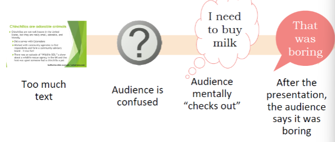
Do not have too much text and do not resort to reading through the slides
Slide limits can vary depending on the requirements of the presentation
It’s better to limit oneself to 1 message/idea per slide
Limit yourself to 6 objects per slide, or you will create visual noise
Design Tips
Bullet points should not be more than 6 words long
Font size should be legible but simultaneously not so big that it doesn’t match other design elements
Background should not be something distracting
Make sure everything is aligned along the same margins
Make use of whitespace to enhance the clarity of content
Frame content properly so it looks polished and professional
Color contrast can make or break the design of your presentation
You can use different methods to emphasize graphics/bullets you want to focus on
Size can also be used for emphasis
Using visuals and animation
Visuals increase attention
Increases chances of retention
Do not use low-res or badly cropped visuals
Use functional artwork
Visual dissonance
Do not overuse animations
Use functional artwork –
visuals that contain information to help explain your message
Example of functional artwork
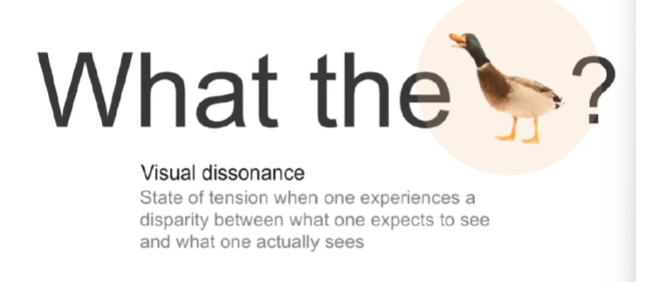
Visual dissonance –
when elements within a visual composition clash or create a sense of discomfort for the viewer
visuals that are overly decorated or colorful can be distracting/confusing
Do not overuse animations
In most work presentations, animations are considered unprofessional
Delivering your presentation
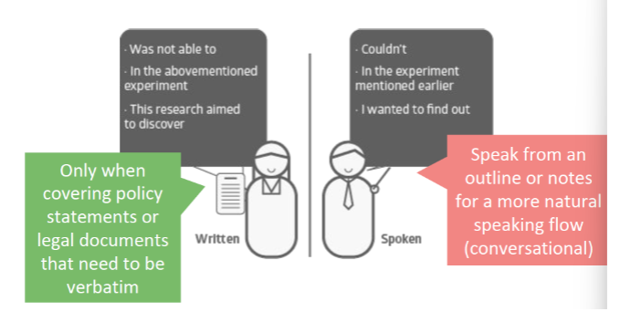
Should you memorize your speech?
Pay attention to your body language
Do not keep yelling stuff like ‘next slide’
Speak to your audience, not the screen
Don’t just read through, but interpret your slides and elaborate on them
Overcoming anxiety
Should you memorize your speech?
Pay attention to your body language – the SOFTEN model
Smile
Open stance
Forward lean
Tone
Eye contact
nod
Do not keep yelling stuff like ‘next slide’
Either do it yourself or
Rely on discreet visual cues
Overcoming anxiety:
Focus on:
Your message
Friendlier audience members
Visualize your success
Do not panic if something doesn’t go according to plan