Week 2 Data, Statistics, and Visualization
1/18
There's no tags or description
Looks like no tags are added yet.
Name | Mastery | Learn | Test | Matching | Spaced | Call with Kai |
|---|
No analytics yet
Send a link to your students to track their progress
19 Terms
Critical Factors for Data
Source reliability
Accuracy
Accessibility
Security/privacy
Richness
Consistency
Currency/timeliness
Granularity
Validity
Relevancy
Structured Data
Easier for computers to process
Categorial vs. numerical.
Categorical variables classify information into categories, e.g., nationality, college major, breed (animals).
A variable is numerical if meaningful arithmetic can be performed on it, e.g., age, income, service duration.
Ratio data takes values only from zero and above, allowing for reference to multiples.
Unstructured data
Easier for humans to process/digest
Semi-structured data
XML, HTML, Log files, etc.
Elements of Structured Data
Variable: characteristic of members of a population (e.g. age, gender)
Observation: conceptually, what is observed for a variable with respect to a member of the dataset.
Value: the specific datum (number, letters, etc.) observed for one variable with respect to a member of the dataset
Mean
…of a set of numerical values is the arithmetical average of all values in the set. For example, the mean � 𝑿 𝑿 of n observations 𝑋𝑋1,…, 𝑋𝑋𝑛𝑛 is � 𝑿 𝑿 = ∑𝑖𝑖=1 𝑛 𝑛 𝑋𝑋𝑖𝑖 �
Mode
…of a set of numerical values is the value that appears most frequently. There can be more than one mode or no mode at all … it depends on the data.
Median
The middle observation when data are sorted from smallest to largest.
If number of observations is odd, median is the middle observation.
If number of observations is even, median is average of the two middle observations.
The median is more robust to outliers than the mean. • Outliers are values that are ‘unusually large or small’ compared to the range of most other values.
Large outliers will have a large effect (positive or negative) on the mean, but median will generally not change much
Quartile
Divides the data into four groups, each with a quarter of all observations
1st quartile (25th percentile): 25% of observations below it
2nd quartile (50th percentile / median): 50% of observations below it
3rd quartile (75th percentile): 75% of observations below it
4th quartile (100th percentile / maximum): all other observations below it
Variance
A measure that quantifies the amount of variability in numerical data. (denoted by 𝜎𝜎2 – ‘sigma squared’)
is in squared units: for example, if observations are measured in dollars or minutes, the ________ is in dollars squared or minutes squared.
Standard Deviation
A measure of variability that is easier to interpret is the_________: the square root of variance
is measured in the same units as the original variable and observations.
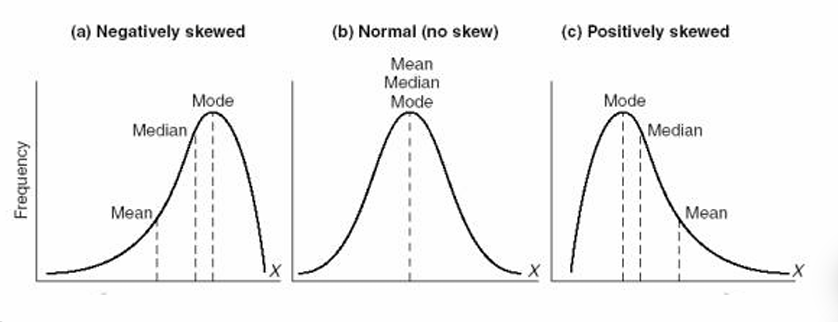
Skewness
A measure of symmetry (or lack of symmetry).
_______ of the values of a numerical variable is compared to normal distribution (symmetrical, skewness is close to 0).
The values of a numerical variable can be ____ to the right (or positively ____) because of some very large values.
The values of a numerical variable can be _____ to the left (or negatively _____) because of some very small values
Data Visualization
The use of visual representations to explore, interpret, and communicate data or information derived from the data.
Goal: present key insights from data in ways that reduce the cognitive burden for the audience – in a business context, typically someone who needs to make a decision.
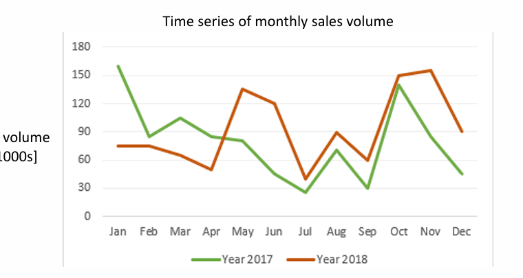
Line Graphs
Good when there is progression of a variable, e.g., with respect to time (called ‘time-series’ data).
Sequentially connects data points of a variable.
Often one axis is time: track changes or trends over time.
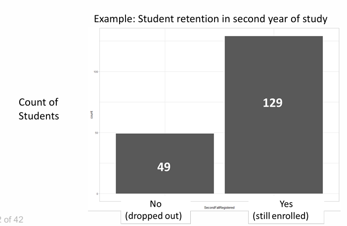
Bar Charts
Useful for depicting nominal or numerical data that is naturally categorized.
Splits categorical or numeric data into different categories
Compare data across the categories
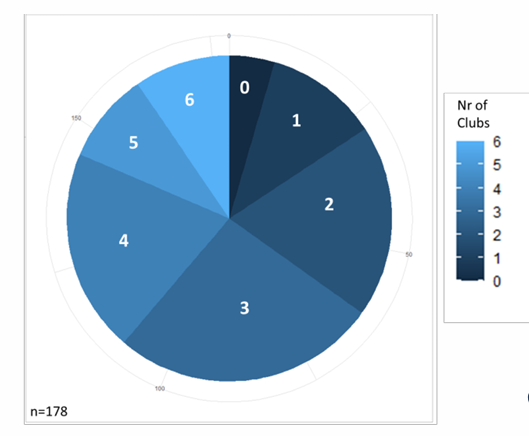
Pie Charts
Used to depict proportions within a variable.
Shows relative proportions in data for a variable
Example: Number of high school clubs that applicants to an undergraduate program served as an officer
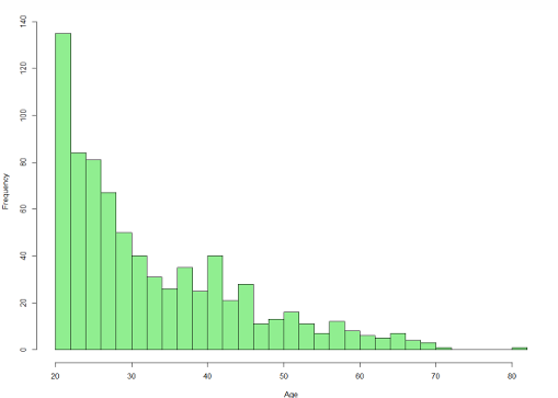
Histograms
Shows frequency distribution for a variable
Shows the distribution of a numerical variable
Divide the horizontal axis into bins (usually of equal length)
Draw a rectangle over each bin with the area of the rectangle proportional to the number of observations in that specific bin.
Number of bins determines granularity.
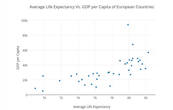
Scatter Plots
Illustrates relationships between two or more numerical variables.
Shows a scatter of points where each point denotes the values of an observation for two numerical variables
Detects relationships between two numerical variables, often labeled as X and Y
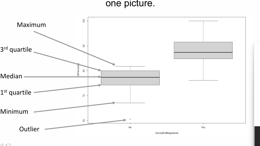
Boxplots
Shows key descriptive statistics for a numerical variable, e.g., minimum, maximum, median, first and third quartiles.