Biology HL statistics
1/56
There's no tags or description
Looks like no tags are added yet.
Name | Mastery | Learn | Test | Matching | Spaced |
|---|
No study sessions yet.
57 Terms
Mean
sum of the data points divided by the number of data points
Normal distribution
Bell curve.
Occurs when you have a large sample size only (as their sample means are more likely to be closer to the population mean which will cause less variation)
has a spike in the middle with the most values, and fewer on either side
Tall and narrow when values are closer together
flatter and wider if data is more spread out
mean value at the peak of the curve
x
represents a single value
n
represents the total number of values in a set
x bar. x
mean of a set of values
Σ
the sum of values
s
standard deviation of a sample
±
plus or minus
to do a t test or analyse a spread using standard deviation
requires a spread of data close to normal distribution, this is why its best to get as
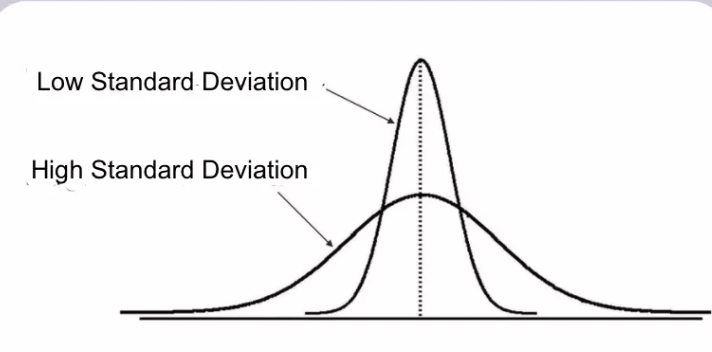
Standard deviation
shows the spread of all the values around the mean. shows variability of the data set. 68% of the data lies around the 1 standard deviation from the mean on the horizontal axis
higher standard deviation, more spread around the mean
lower standard deviation, less spread around the mean, more clumped together
What percent of the values in a sample fall within +-1 standard deviation from the mean
68%
What percent of the values in a sample fall within +-2 standard deviation from the mean
95%
variability
Measure of how spread out the data is from the centre of the data, which can be the mean
how to calculate two standard deviations from one
multiply by two
how to calculate standard deviation
on excel type in STDEV(highlight all boxes)
higher/lower standard deviation
higher- more lower-less variation
Standard deviation can give additional information on
whether the differences between two samples are likely to be significant. The mean can be the same, but the spread around the mean can be different.
error bars
a way of showing either range or standard deviation of data, show variability
Range
spread of data from the lowest to highest value in the distribution
How do error bars work
The mean is plotted either on a bar graph or a scattered plot graph, and the error bar is plotted around the mean
to show the highest and lowest values in the set (this shows the range) (used on smaller sets).
to show standard deviation (used in bigger sets as then you have enough values for normal distribution
To find the range of values in standard deviation
add and subtract the standard deviation from the mean
t -test
Used to find if the difference between two sets of data is significant
the t test compares
mean and standard deviation of two sets of samples to see if they are the same or different (leaves on tree in front and leaves on tree in back of school)
how to calculate p value
a value for t value is calculated using a formula
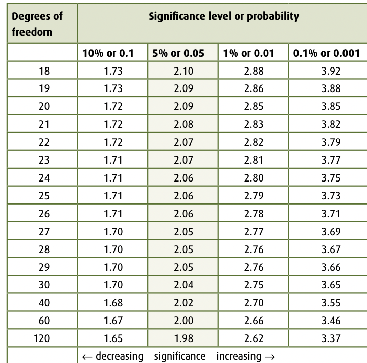
find degrees of freedom (calculated from the sum of the sample sizes of the two groups of data minus two.
degrees of freedom = (n1 + n2) − 1. number of values in sample is n
find the t value on that degrees of freedom, and then find the p value, can be a range between two percentages
You can also look at critical value for 5% and then look if your t value is greater or less than that to estimate if it would be statistically significant or not
p value
the probability that the difference between the two data sets were caused by chance
under 5% is
statistically significant as it shows that 95% or more of the time, the differences between the two data sets were not caused by chance, therefore you must deny the null hypothesis
5 % is a
critical value, scientists take this into account because living things have natural variation that can cause differences in the data sets, but at some line the differences were no longer due to this chance
Null hypothesis
there is no significant difference between the two data sets (above 5%)
Alternative hypothesis
there is a significant difference between the two data sets (below 5%)
What if you get a value like 6-15%
conclusion is less certain. if you suspect null hypothesis still, that there is no significant difference, make a bigger sample size
population vs sample set
All the students in the class vs the top ten students
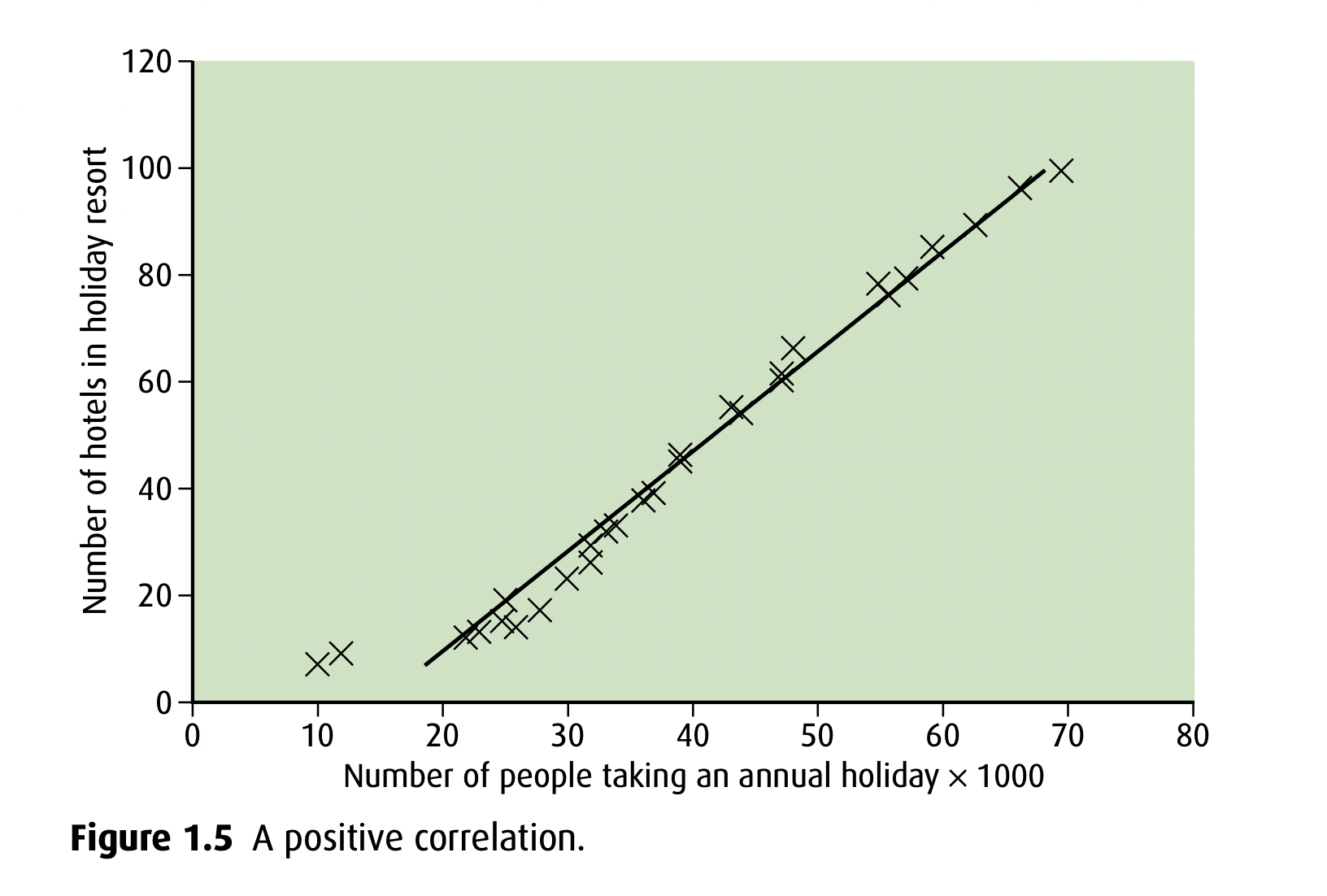
Correlation
describes the degree of a relationship between two variables
what can correlation do
de establish a casual relationship between 2 variables
Positive correlation
as x value increases, so does y value
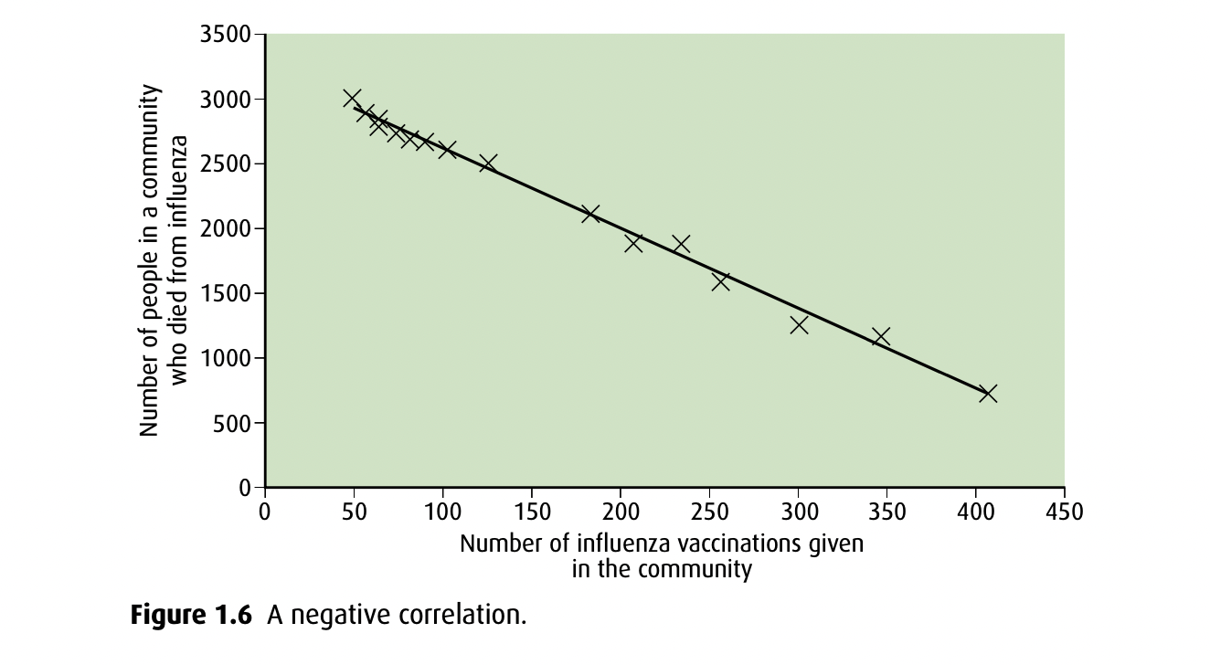
Negative correlation
as x value increases, y value decreases, inversely proportional relationship
Casual relationship
If the occurrence of one variable causes the other (more vaccines, less deaths, negative correlation)
Does a trend always mean a Casal relationship
No, the two variables can be totally unrelated and still show a trend. Experiments must be used to provide evidence showing the cause of the correlation
Median
Middle value of a range of results. Useful if you have outliers
Mode
value that appears the greatest number of times
Continuous variation
Quantitative
Different characteristics within a population
Range
Height, body mass, intelligence
Discontinuous
Either have it or you dont
distinct features
qualititative
Tongue roll, ear lobe, blood group
Positively skewed
tail on the positive end
negatively skewed
tail on the negative end
Error analysis
evaluating the uncertainty associated with a data measurement
Double blinded
Doctor and patients do not know who has placebo or real thing
Interquartile range
calculate main median, and then split up the two groups and calculate their medians, then subtract the 25% median from 75% median to find IQR. shows the range of the middle 50% of your sample. useful with outliers
standard error
Calculates how representative your sample is of your population, how accurate a random sample’s mean would be in comparison with the population’s mean
Calculated using SD and sample size
You can decrease this by having a larger sample size
Standard error vs. standard deviation
Standard deviation is variability within a sample standard error is variability across samples
High Standard error vs low standard error
High- data is widely spread around population
Low- Data is closely distributed around population
Higher mean on graph
Bell curve shifts to the right
Higher frequency of the mean on graph
Bell curve becomes taller and thinner
Pearson correlation coefficient r and R²
Used when data is continuous and normally distributed
Measures the strength and direction of the two variables
(+1- perfect positive correlation, 0- no correlation, -1 perfect negative correlation), the strength of a linear relationship between two variables
r² shows variability in the data, measure of how well the data fits the linear model, how far the points are from the line
•0% represents a model that does not explain any of the variance in the data
•100% represents a model that explains all of the variance in the data
aim for 80% or higher
Spearman test
Can be used with discontinuous data as well as continuous
same as the “r s” explained above, explains the strength and direction of the relationship of the two variables
error bars overlap
share the same values
Variation
A general description of the difference between any two measurements
how to know if the difference in the two sets of data in a t test are caused by the independent variable
Because they will be higher than the t value for the critical p value 5%, showing that they are lower than 5% and the differences are most likely not caused to chance
as p value decreases
t value increases