Propaganda
1/71
There's no tags or description
Looks like no tags are added yet.
Name | Mastery | Learn | Test | Matching | Spaced | Call with Kai |
|---|
No analytics yet
Send a link to your students to track their progress
72 Terms
War, Propaganda, and Graphic Design
What propaganda messages were conveyed?
What visual and descriptive indicators were used?
Which symbols were used and how were they used in propaganda?
Propaganda
consists of the planned use of any form of public or mass-produced communication designed to affect the minds and emotions of a given group for a specific purpose, whether military, economic, or political
Posters
In the 20th Century, ____ became one of the primary tools for these types of propaganda, Many of the mass communications, particularly posters were primarily used as military propaganda. Their aim was to influence either a friendly group or even the enemy for a strategic or tactical purpose. the styles varied depending on which country or group was doing them
“We Want You!”
many designers from the US and Britain were drafted into the military
Eastern Europeans fled to American soil and other artists had no choice but to work as part of the Nazi Propaganda machine
Axis and Allied powers used print media movies TV and radio to spread their messages
Posters go to war!
In Austria, Hungary, and Germany war posters continued the traditions of the Vienna Secession and displayed the simplicity of the Plakatsil pioneered by Bernhard
Words and images were integrated, and the essence of the communication was conveyed by simplofyinging images into powerful shapes and patterns.
Ludwig Hohlwein
a prominent Plakatsil designer began his career at Jugend magazine but experienced a significant artistic shift after encountering the Beggarstaffs
Matched Hitler’s brand of visual propaganda thus it was inevitable that the Nazi party commissioned him to make their posters
Moved toward a bold imperial militaristic form, styles of tight heavy forms and strong tonal contrasts
Herbert Bayer
When he left the Bauhaus, he had to do stuff for the Nazis (He’s not Jewish,,, but his wife is)
accepted assignments from the Third Reich, conspirator for the Nazis - was he forced to or did he need the money?
Exhibit on Eugenics, Berlin Olympics
Left Berlin later on…
Joseph Goebbels, Minister of Propaganda
“If you tell a lie big enough and keep repeating it, people will eventually come to believe it (…)the truth is the mortal enemy of the lie, and thus by extension the truth is the mortal enemy of the state.” — This is said?by?
Symbols of Nazism
“In red we see the social idea of the movement, in white the nationalistic idea, in the swastika the mission of the struggle for the victory of the Aryan man.”
Hitler, Nazi Propaganda
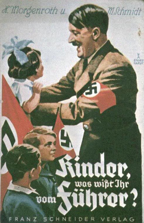
Cult of the leader
Nazi Propaganda
Hitler insisted that “visual presentation was of fundamental importance”
Nazism as an effective corporate identity
Edward Bernays “Propaganda” (1928) Asserts ff:
Create a ministry to publicize the government’s aims and ideals
Dominate the media and suppress opposing views
Celebrities, authorities, and trusted group leaders who control the opinions of their followers
Actively create circumstances that engage the public by dramatizing issues, personalities, and events
Psychological insights, especially Freud’s should be integrated into any propaganda campaigning
Content with basic interests and needs (ie. Food, shelter, entertainment) is highly favored
Hitler’s Mein Kampf
Fraktur
a type of German script was favored initially by Nazi Iconography
Latin, Antiqua
Used in Nazi Iconography after Fraktur, Hitler hated the script because he thought it was unreadable being backwards, his followers also deemed it un-German
Nazi Iconography
Germans were encouraged to own and display artefacts of Hitler in their homes and their beings. This ranged from having photographs of the leader in the most visible part of their homes and flags with swasticas displayed in front of their homes
Ein Volk, ein Reich ein Fuhrer
What the Nazi’s believe all Germans should abide by
Traditional German attire and Nazi uniform
These were also common visual elements to draw out nationalism from the citizens (Nazi Iconography)
Hitler Youth
Boys and Girls between the ages of 10-17 were expected to join (Nazi Iconography)
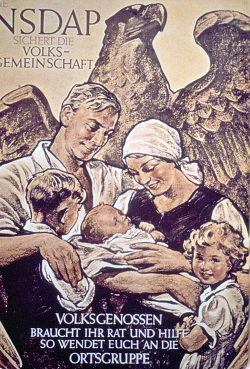
Men, women, and children with Aryan features
Other Nazi propaganda prints that didn’t have the figure of Hitler in them
Men and Women, heteronormative roles
Workers are portrayed as helpful to the cause
Swastika
The word is derived from the Sanskrit svastika, meaning “conducive to well-being.”
Japanese Propaganda
Leaflets and posters were distributed to the people they occupied (Korea, China, and SEA including the PH)
Propaganda contained anti-American and Western themes - denounced particular personalities being “puppets” (ie. Chiang Kai-shek), unity among Asians, and highlighting the atrocities committed by the West, particularly America
“With the help of Japan, China, and Manchuria, the world can be at peace.”
The Nazi Counteroffensive (Allied Forces)
their approach to graphic propaganda was more illustrative, using literal rather than symbolic imagery to address propaganda objectives
they had to appeal to the patriotic emotions of the people to be effective
Public patriotism ran high when the US entered the war to “make the world safe for democracy” in the “war to end all wars”
Goals of propaganda (Nazi Counteroffensive)
Used in recruitment and overall support of the war through activities
Influenced and swayed public opinion against the Axis powers by exaggeration and untruths
Appeals to emotion were commonly used
Used familiar characters and icons that would become the faces of the war
British Efforts
While every other man was tasked to enlist in the war, designers and artists were commissioned by their government to help with the war efforts through their skills
designers and artists were commissioned by their governments to help with the war efforts through their skills
If the Nazis had the military of propaganda and public enlightenment the British had the Ministry of Information (MOI) to work for information and propaganda materials
KEEP CALM AND CARRY ON
series of posters part of the campaign made to defend themselves from the upcoming Nazi forces in the UK (it didn’t happen though)
has is the Tudor Crown, a symbol of the British Monarchy and the Commonwealth of territories.
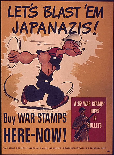
Propaganda in the United States
Several departments in the US published and funded propaganda materials (Treasury Office the Transporation Office, and Health Services) All their campaigns targeted one common enemy
either realistic or caricature - an oversimplification of concepts (ie. Transport safety can help defeat Nazism)
Hitler and Tojo depicted as Cartoons - visual and verbal puns
used to attract the reader’s attention
gathered the support of American animation studios and comic publishers to create propaganda and instructional posters and animations (Disney, Warner Brothers, Metro-Goldwyn-Mayer (MGM))
WWII book that the Disney Studio produced for the US Treasury Department that encouraged children to buy savings stamps, pamphlets were given to the US soldiers for entertainment and morale
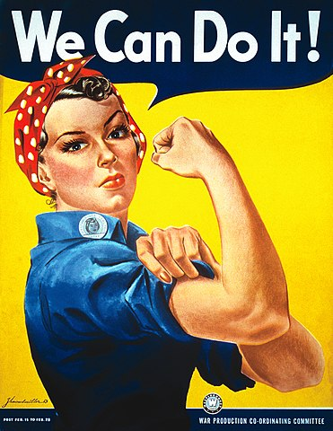
Rosie the Riveter
appeal to the women who were working in factories
Uncle Sam
he represented everything that was American
Rosie the Riveter and Uncle Sam
represented different aspects of the war
The Soviet Union, Lenin and Stalin
used the cult of leadership of _______were built throughout the country to mobilize the Soviets against the Nazis
Iron Curtain
what split Europe into two>
Communist Propaganda in the USSR, Socialism
started initially to introduce and promote ______ as a better alternative to the oppressive monarchy
posters promised freedom from a monarchy and a better life, for the proletariat and farmers who suffered under the 300 rule of the Romanovs. Revolutionary figures were persistently used alongside the common people in many of the designs
prominent use of iconography of communism such as red, the golden hammer, and political figures of Vladimir Lenin and Josef Stalin
References to the Motherland and the Personification of Russia
the peasants and the Red Army
depocted as important assets of the country during USSR propaganda
ROSTA Window (Russian Telegraph Agency) Window (1) Russian Constructivism (2) Socialist Realism (3)
3 major forms of Communist propaganda
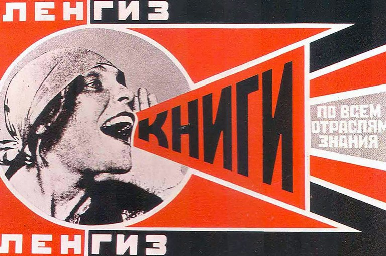
ROSTA Window (Russian Telegraph Agency) Window (1)
Simple images, easier to reproduce, used ink sparingly: red and black
For an illiterate audience in the early days of the Russian Revolution, used to spread revolution, news, and values propagated by the state
iconographic lexicon (ie. blacksmiths with industriousness, sunshine with prosperity, cobwebs with idleness, etc.)
Russian Constructivism (2)
modern art movement that emerged sometime after the Russian revolution, believed that propaganda was a tool that could be used for the greater good. Thus, they created iconic propaganda posters
Constructivists at the time called on the artists to stop producing useless things (for art’s sake) and turn to the poster, as they believed artists must pave the way for a new life
Gustav Klutsis
was convinced that photomontage was the medium of the future, rendering all forms of artistic realism obsolete
Served Bolshevik's government but was later banished to the labor camps (where he died)
Joseph Stalin
However, the USSR government decided to centralize art and design through a contracting system:
Saw himself as the head of culture of propaganda creation, thus by the 1930s, print and art material was saturated with images of himself
Socialist Realism
The officially endorsed style. Ensure that online state-approved images of Stalin were used in propaganda posters.
Communist Propaganda of the CCP
CCP also applied the Cult of Personality to their propaganda
During the Cultural Revolution, the govt produced the production of Art and PRint in China
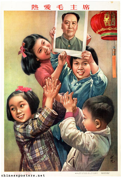
Mao Zedong was also supposed to be depicted in his military garb as a powerful leader or one with the commoners
Every citizen was required to own a red book which had a collection of Mao’s quotes ranging from discipline, patriotism, and unity of the masses under communism.
The red book, Quotations from Chairman Mao Tse-tung became a cultural icon and even propaganda posters showed the proletariat and soldiers holding the book in their hands. Red was chosen as the color of communism
Cult of Personality
what was applied by the CCP?
…his military garb as a powerful leader or one with the commoners (He preferred a Realism Style)
Mao Zedong was also supposed to be depicted in …
Red Book
Every citizen was required to own one, it had a collection of Mao’s quotes ranging from discipline, patriotism, and unity of the masses under communism. Quotations from Chairman Mao Tse-tung became a cultural icon and even propaganda posters showed the proletariat and soldiers holding the book in their hands.
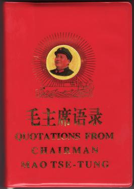
Red
chosen as the color of communism
Effects of CCP Propaganda
Helped encourage and spread recruitment for men and manufacturing work for women
Financial support was asked from private citizen to fund the war through their pride and nationalism
Also spread fear-mongering and prejudice against another race (ie. The Japanese and the Jews) which helped justify the atrocities committed to them.
Post-War Design: Modernist Graphic Design Matures
characteristics by embracing the early modernist movements such Bauhaus and constructivism
most of the graphic design work continued to celebrate the capitalist movement through advertising and product designs that were meant to attract
Die Neue, Emil Ruder
Typography has one plain duty before it and that is to convey information in writing — Typographer and Graphic Designer
Paul Renner (1878-1956)
Futura (Bauer foundry, Germany) - the most widely used sans serif font at the time
Archetype Renner
Typography as Art, The Art of Typography - set of new guidelines for good book design
Jan Tschichold (1902-1974)
Attended Bauhaus exhibition in Weimar and was highly influenced by Bauhaus and Constructivism
Function > Form
The New Typography, “Elementare Typographie” which he distributed to the printers, typesetters, and designers
Arrested for being a “cultural Bolshevik” and creating “Un-German” by the Nazis and fled to Switzerland
Began to turn away from the new typography. used Roman, Egyptian, and Script styles in design
He advocated freedom of thought and artistic expression, becoming more welcoming of other humanist typographic styles
New Typography Guidelines
Headlines in the left margin with uneven line lengths
Sans-serif type, in a range of weights (light, medium, bold, italic) and proportions (condensed, normal, and expanded)
White space was an important component in Design
Photography was preferred over illustration
The essence of new typography was clarity not simply beauty
International Typographic Style
“Swiss Style” “International Infographic Style”
originated in 1940s Swiss, and 50s
Favored simplicity, legibility, and objectivity
Linear division of space into harmonious parts; use of modular grids
Sans-serif fonts; Aksidenz Grotesk
took inspiration from Earlier European movements, New Typography, Bauhaus, and Russian Constructivism, their style was not tied to a single cultural identity or geographic mark
Ernst
“Father of Swiss Style” influential design teacher in the Swiss movement
Know what you’re designing for before you design. Solution to design problem should emerge from its content
Josef Muller-Brockmann
influenced by different design and art movements such as Constructivism, De Stijl, Suprematism, and the Bauhaus
Armin Hoffman
Basil School of Art and Design, wrote the Graphic Design Manual - outlining his philosophies and practices in design
played with Photo typesetting, photo-montage, and experimental composition
Helvetica
Edouard Hoffman of the HASS type foundry in Switzerland decided that the Akzidenz Grotesk fonts should be upgraded, collaborated with Max Miedinger who executed the designs, and their new sans serif was released as Neue Hans Grotesk
More globalized, Latin name for the pre-Roman tribes of Switzerland
Stanley Morrison
typographic adviser to the British Monotype Corp and Cambridge University Press
The Times Newspaper of London commissioned him to create a for the Newspaper and Magazine
designed Times New Roman, characterized by short ascenders and descenders and sharp, small serifs that prioritized readability
Modern design sensibilities and aesthetic defined the look of the 20th Century
development of Corporate Visual Identity, Infographics
“Good Design is Good Business”
Data Visualization in the 20th century
has been around since man learned to diagram things like maps
later half of the 20th century where it would find the support of statisticians as accurate representations of information
The Emergence of the Theory of Information Visualization
spearheaded by a few specialists such as Etienne-Jules-Marey, Williard C. Brinton, and Edward Tufte expanded the initial small of visualization
it was used in the 20th century and presented dense verbal and numerical data
International System of Typographic Picture Education → Infographics
Isotype is a method designed to communicate social-scientific data in a pictorial form
Initially known as the Vienna Method of Pictorial Statistics. Ortho Neurath was the chief theorist, Gerd Arnst was the artist
Isotype
a method designed to communicate social-scientific data in a pictorial form
Scale is best represented in the repetition of same-sized objects
Avoid using perspective in illustrating objects to preserve clarity
Use of Futura “Font of the future”
Key Principles of Infographic Design
Rudolf Modley
introduced and popularized the isotype picture language in the US
Pictorial symbols
Edward Tufte
acclaimed statistician, information design scholar, pioneer of Data Visualization
introduced chartjunks in infographics
encourages chart patterns, data-rich illustrations presenting all available data that reveals details upon close examination, but only trends and patterns from a distance
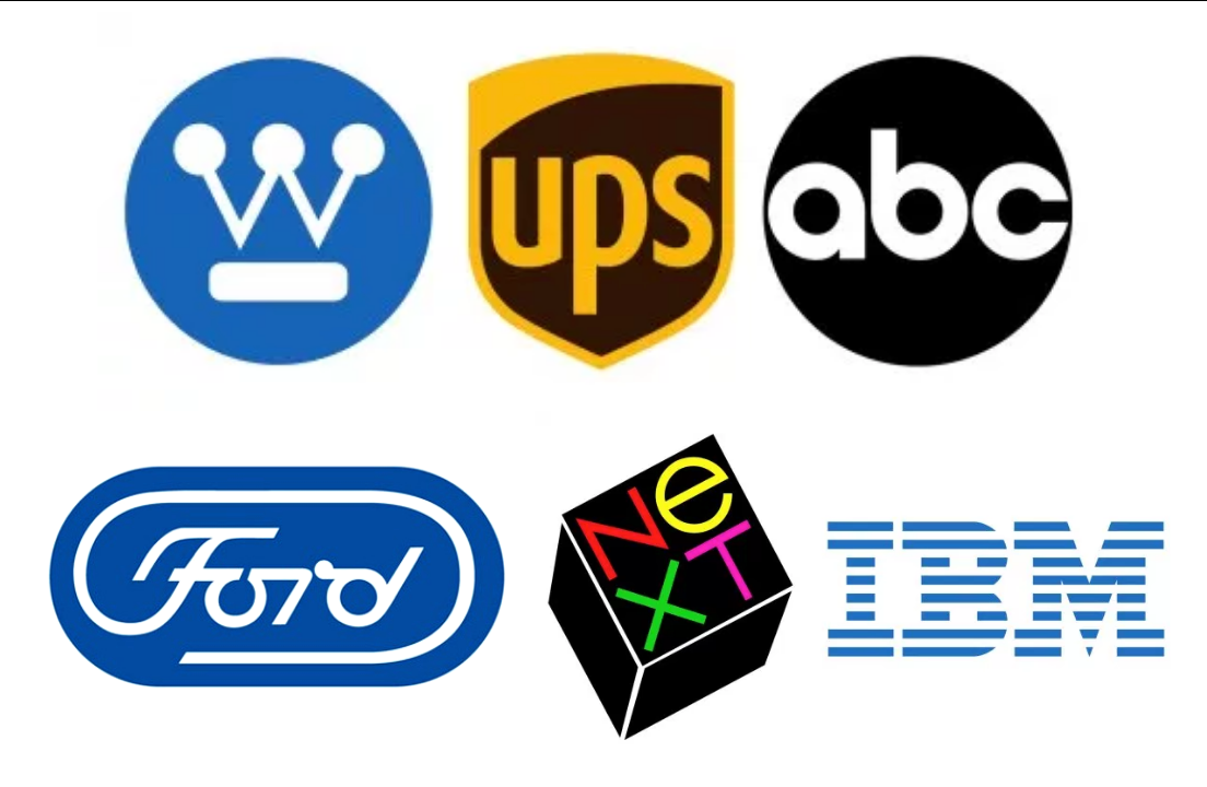
Corporate Visual Identity
After the World Wars, it was inevitable that the US would become one of the world’s superpowers
Allies became markets for their manufacturers
National and multinational corporations began to invest in a strong corporate identity that would ensure the sale of the products locally and abroad
Lufthansa
an airline company adhered strictly to the international style “International Prototype for the Closed Identity system”- (its corporate-identity program)
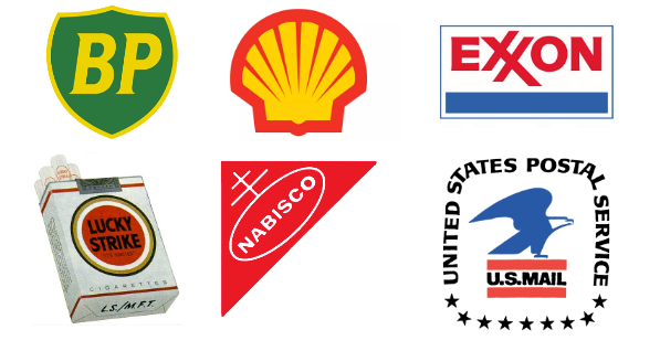
Raymond Loewy
created comprehensive design systems for brands, American History of Visual Styling
automotive and consumer goods (British Petroleum, Shell, Exxon, Nabisco, Lucky Strike)
MAYA “Most advanced yet most accessible” high index of visual retentions
Paul Rand
American multi-national company designer
a logo derives meaning from the thing it symbolizes not the other way around
logos that used simple shapes and forms, what the company stood for, the timelessness of the brand
Print advertising
reaching its full potential through numerous technological developments but it was also challenged by the growing popularity of cinema and TV
TV spots, endorsement of products, and advertising
designs attractive on-screen
Every American home had a TV
Graphics in Film
lettering has been around since the silent film era which provided content to the audience
mostly typography with a little decoration
maturity of versus language of a film title sequence would come in the 50s as cinema struggled against TV viewership and forced filmmakers to rethink how movies are made
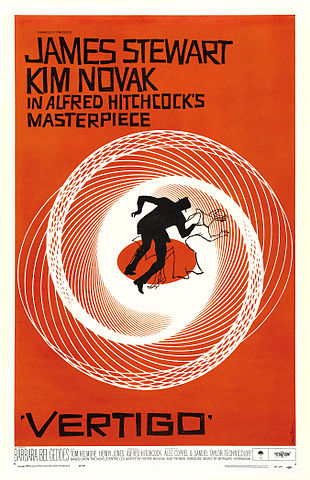
Saul Bass
one of the most celebrated brand identity designers
caught the eye of movie directors for posters (West Side Story, Vertigo, The Shining, Man With The Golden Arm)
He and his wife Elaine elevated title credits in movies by integrating it with graphic design