Descriptive Statistics
1/35
There's no tags or description
Looks like no tags are added yet.
Name | Mastery | Learn | Test | Matching | Spaced |
|---|
No study sessions yet.
36 Terms
descriptive statistics
simple methods to summarise data to plot various graphs and find various summary statistics
statistics
collecting, analysing, interpreting data in the best possible way
qualitative data collection
non-numerical data that can be classified into nominal or ordinal data
population
the universe of objects/people of interest
sample
a subset of the population
→ must be representative of the population from which it is drawn
random sample
each element in the population has an equal chance of being drawn
qualitative data
variables which can be measured in numerical terms
quantitative data
non-numerical data that can only be classified into 1 group of categories
discrete variable
variable that takes only a finite number of values or an infinite number of integer valuesco
continuous variable
can take any value in a particular interval
raw data
unprocessed observations
grouped data
observations that are ordered into groups or classes


summarising data
pick out the most important features of a set of data to be able to understand and interpret them
methods of summarising data
frequency tables
cumulative frequency distribution
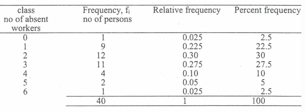
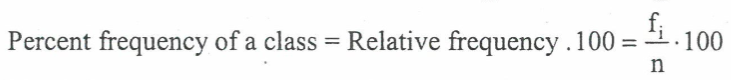
frequency tables - DISCRETE DATA
summary table showing all possible categories with their frequencies
uses grouped data
need to work out:
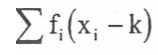
frequency
relative frequency of each class
percent frequency of each class
relative frequency of a class
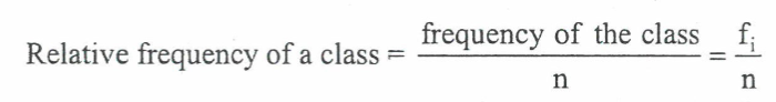
percent frequency of a class
frequency distribution - CONTINUOUS DATA
most economic data is continuous and non-integer
steps:
determine the number of non-overlapping classes
determine the size of each class
determine the class limits
count the number of observations in each interval
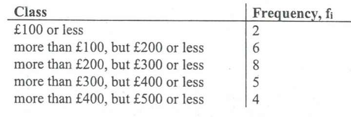
approximate class size
class limit
each data value belongs to 1 class only
halway between the lower and upper class limits = midpoint/classmark
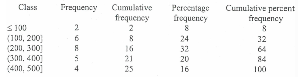
cumulative frequency distribution
shows the number of items less than or equal to the UPPER class limit of each class
steps:
frequency
cumulative frequency
percent frequency
cumulative percent frequency
types of graphical presentation
pie chart
bar chart
histogram
frequency polygon
ogive
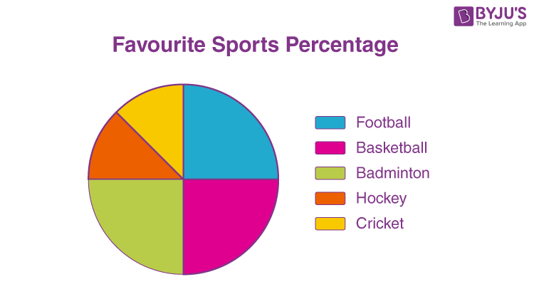
pie chart
represents relative frequency of observations by the section of a circle
area of each section is proportional to the number of observations in the category
useful for when you have 4-8 categories
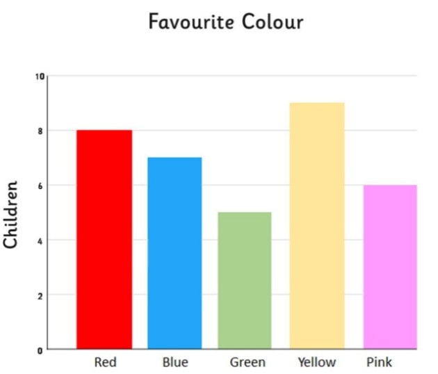
bar chart
presents discrete (qualitative) data
height of each bar is proportional to the number of observations
vertical axis = frequency, relative frequency, % frequency scale
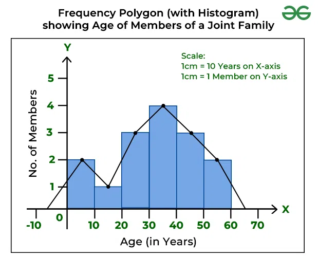
histogram
constructed from a frequency table
presentation of a frequency distribution and relative frequency distribution of CONTINUOUS data
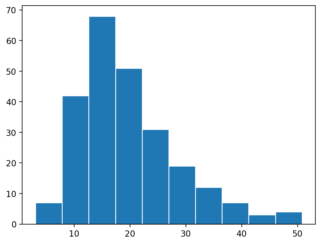
steps histogram
horizontal axis = class intervals
vertical axis = % frequencies
draw rectangles with centres at the class marks, areas proportional to class frequencies
frequency curve (polygon)
use the histogram and connect the midpoints at the top of each box together
ogive (cumulative frequency curve)
graph of cumulative distribution
horizontal axis = upper class limits
vertical axis = cumulative % frequency scale
shows that eg 32% of observations are less than £200
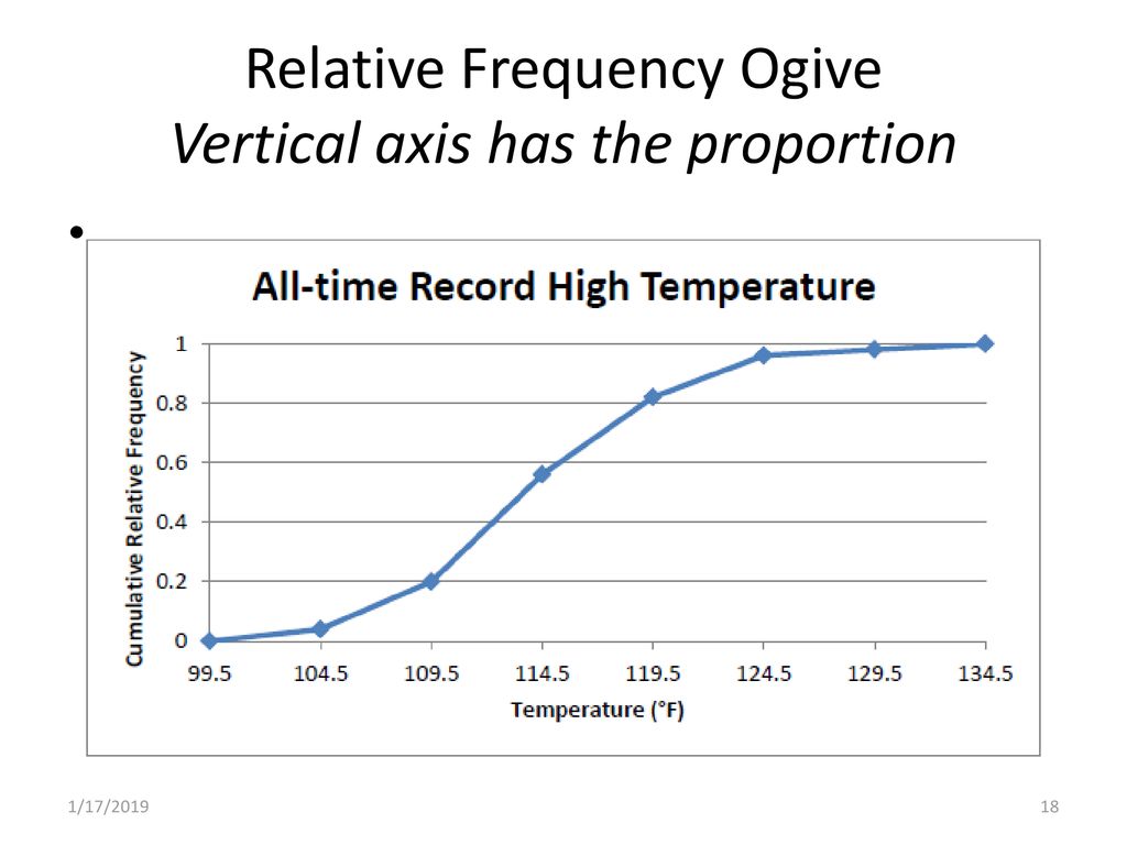
format
plot points corresponding to cumulative frequency of each class at the upper class limit
join the points by a straight line to complete the ogive