Photochemical Smog
1/3
There's no tags or description
Looks like no tags are added yet.
Name | Mastery | Learn | Test | Matching | Spaced | Call with Kai |
|---|
No analytics yet
Send a link to your students to track their progress
4 Terms
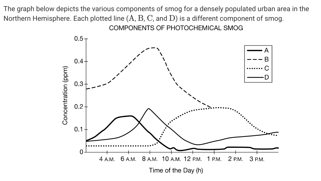
Which of the curves on the graph depicts the concentration of ozone, which requires sunlight to form?
A) A
B) B
C) C
D) D
C
The data that were used to create this graph were collected in the winter. Which of the following best describes how the graph would be different if the data were collected in the middle of the summer?
A) The peaks for every data line would be at a lower concentration.
B) Concentrations for component would be higher throughout the graph.
C) Concentrations for all the data lines would be the horizontal throughout the day.
D) Components A,B , and D would peak in the afternoon instead of in the morning.
B) Concentrations for component would be higher throughout the graph.
Which of the different components of smog depicted in the graph are most likely released from automobile exhaust?
Responses
A) A and B
B) B and C
C) A, B, and C
D) B, C, and D
A) A and B
lol
lol