Frequency Distributions
1/18
Earn XP
Description and Tags
calculation + graph
Name | Mastery | Learn | Test | Matching | Spaced | Call with Kai |
|---|
No analytics yet
Send a link to your students to track their progress
19 Terms
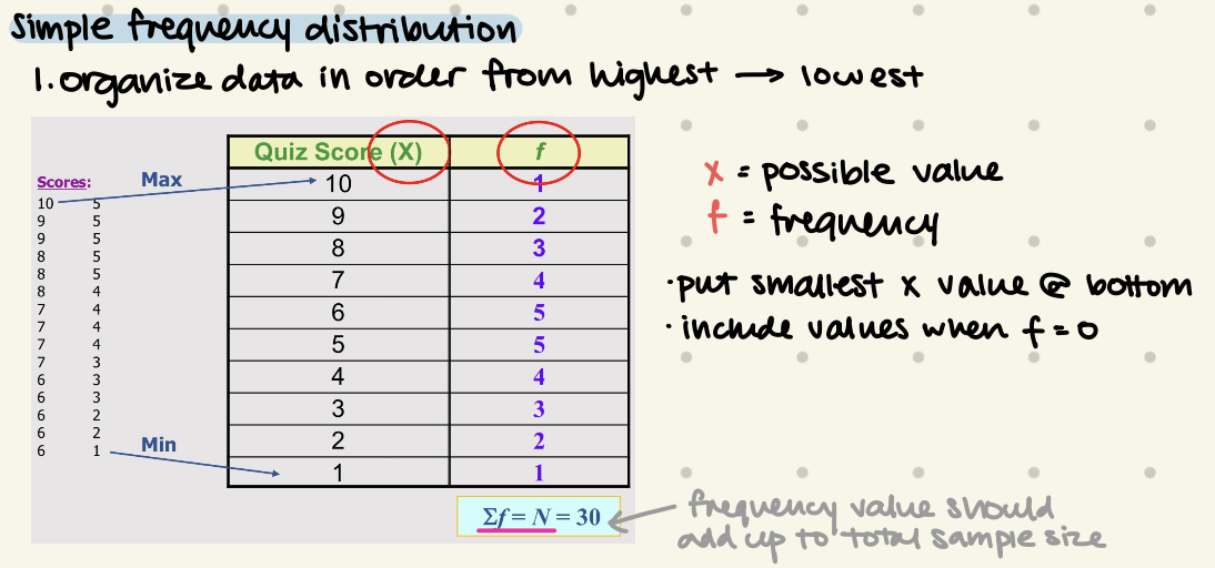
Simple Frequency Distribution
organize data in order from highest → lowest
put smallest x value @ bottom
frequency value should add up to total sample size
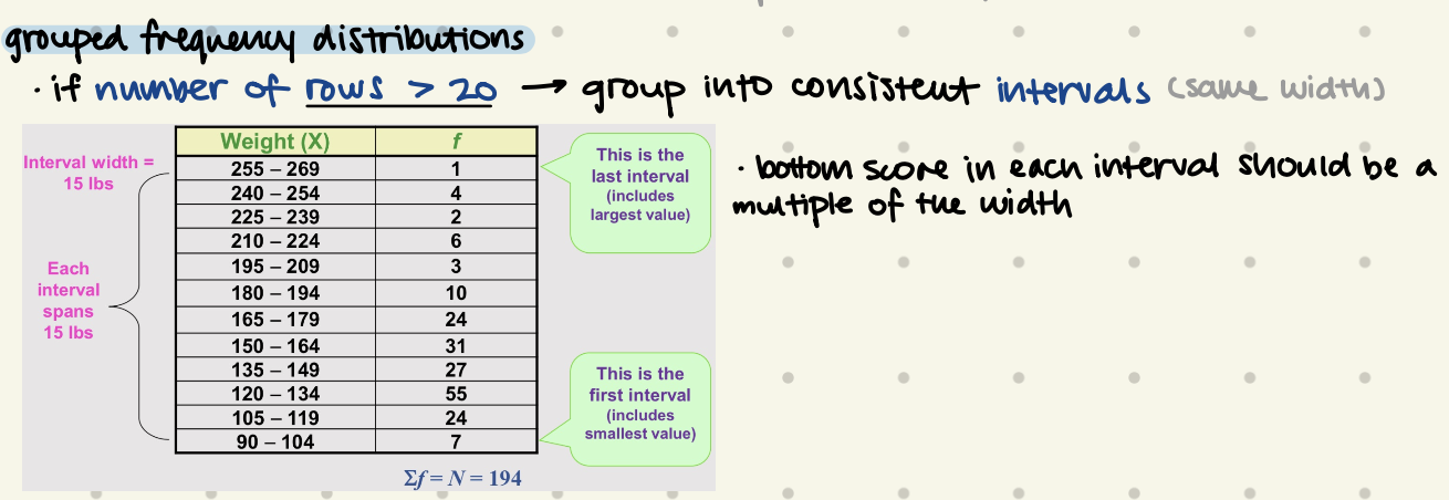
Grouped Frequency Distribution
when to use?
if number of rows > 20 → group into consistent intervals
bottom score in each interval should be a multiple of the width
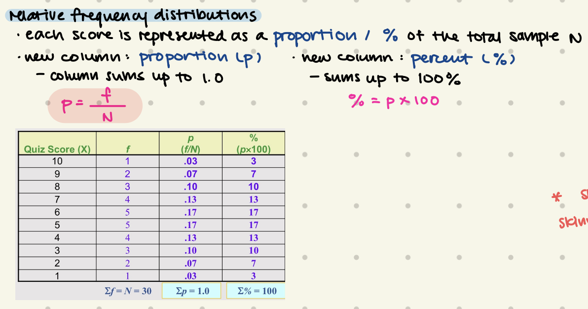
Relative Frequency Distributions
each score is represented as a portion / % of total sample N
new column: proportion, %
p = f/N
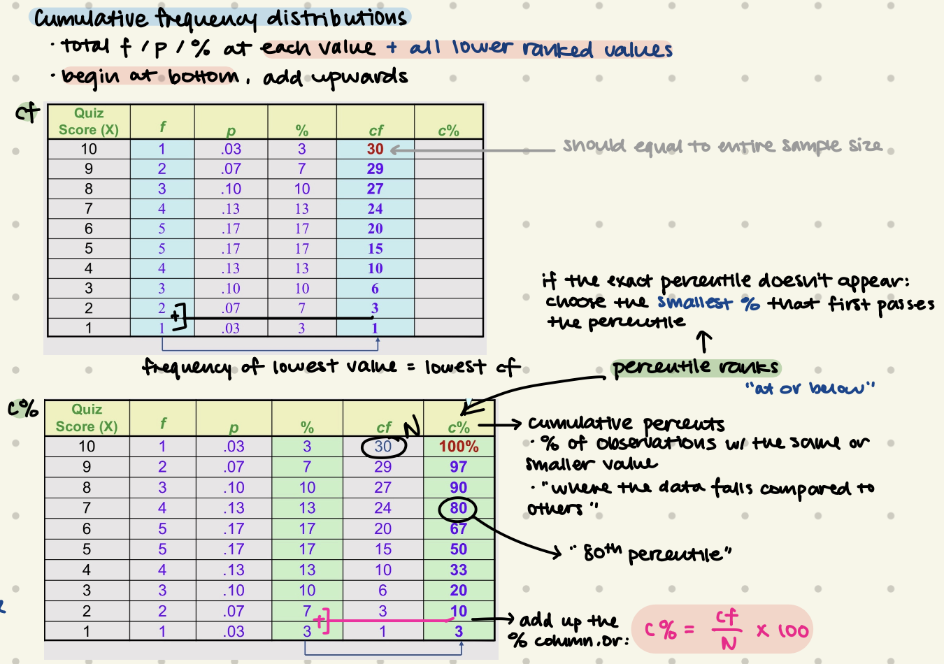
Cumulative Frequency Distributions
new column: cf, c%
= at each value + all lower values
begin at bottom, add upwards
c% = % of observations with the same or smaller value
“80th percentile”
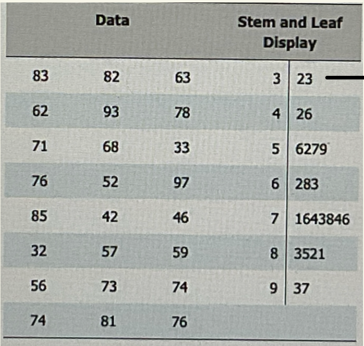
how to interpret Stem & Leaf Displays
first row means 32 & 33
displays exact values of scores
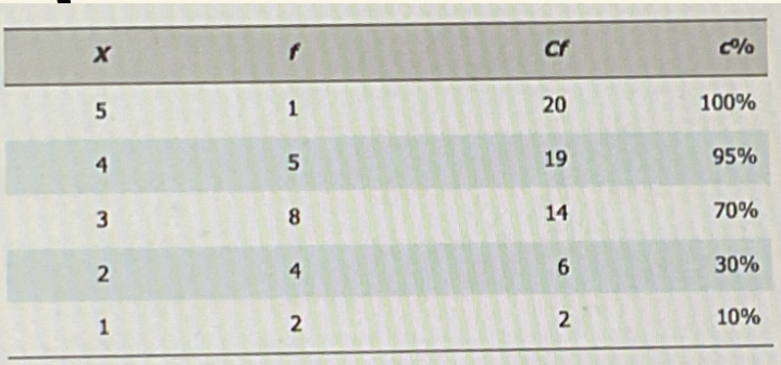
find position of the 95% percentile
find top cf as “N”
N = 20
find position of the 95% percentile
P95%= 0.95 x N = 19
look for the 19th value / class containing the 19th value
up to x=4 → cf = 19
for continuous data, must consider real limit
4 + (0.5 × 1) = 4.5
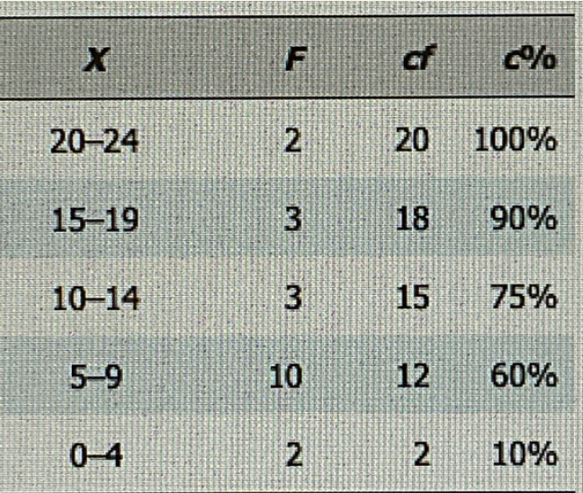
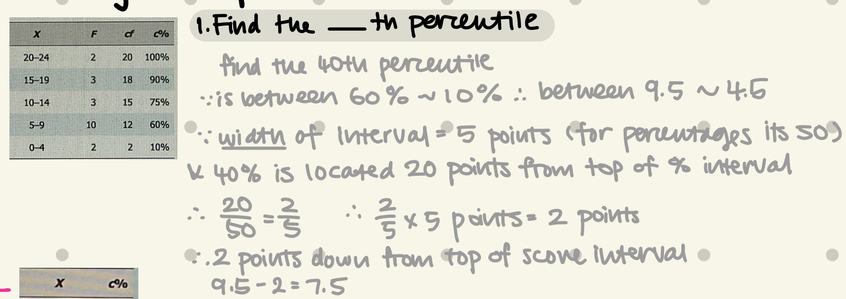
Find the 40th percentile (interpolation)
is between 60%~10% → between 9.5~4.5 (after real limit calculation)
width of interval = 5 points
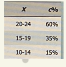
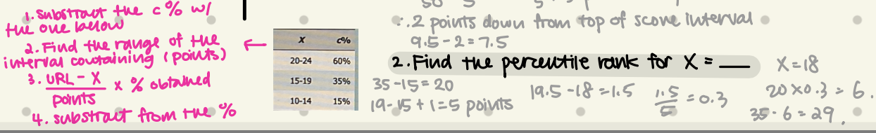
Find the percentile rank for x= 18
Central Limit Theorem
for a sufficiently large sample size, the sampling distribution of the sample mean will be approximately normal, regardless of shape of original population distribution
what may error bars indicate?
measurement precision
variability within groups
may represent: confidence interval, standard error, SD
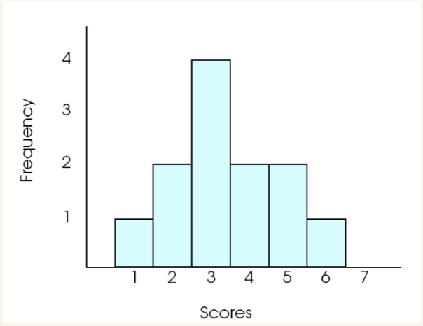
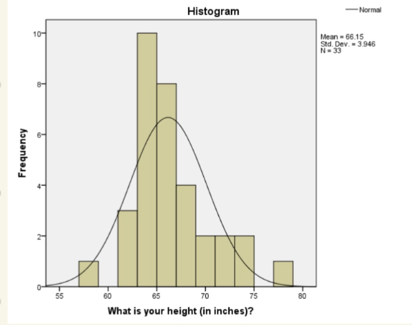
what type of graph is this
Histogram
x = values
y = frequency
equal & touching size bars
each bar extend to the real limits
even if f = 0, still plot ot
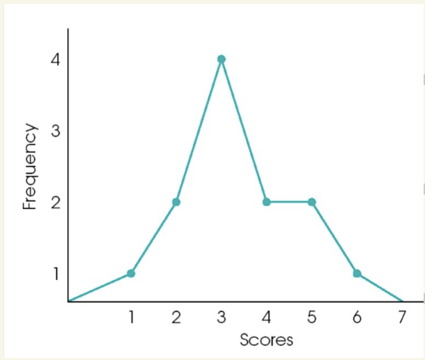
what type of graph is this
when is it used for?
Frequency Polygon
connect-the-dots diagram
a point representing f
anchor the line on x-axis
useful for comparing distribution in 2 samples
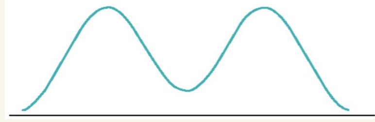
what shape is this? what does it indicate?
Bimodal
symmetrical at each side, 2 peaks
often indicate 2 distinct subgroups in sample
men vs women
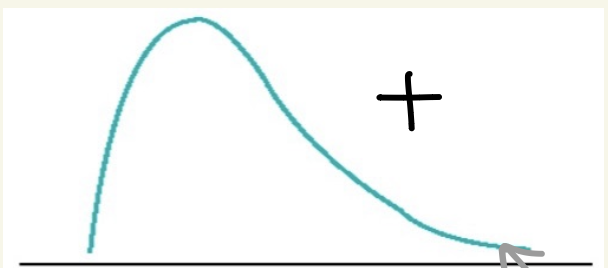
what does positive skew looks like
for negatively valenced variables
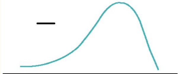
what does negative skew looks like
for positively valenced variables
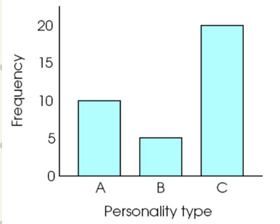
what type of graph is this
when is it used for?
Bar graph
for categorical data
gaps between bars
useful for showing samples side by side
for N & O scales
what type of visualization is this
when is it used for?
Histogram
shows distribution of full sample
easy to compare to ideal distributions
what type of visualization is this
when is it used for?
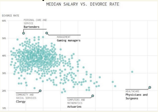
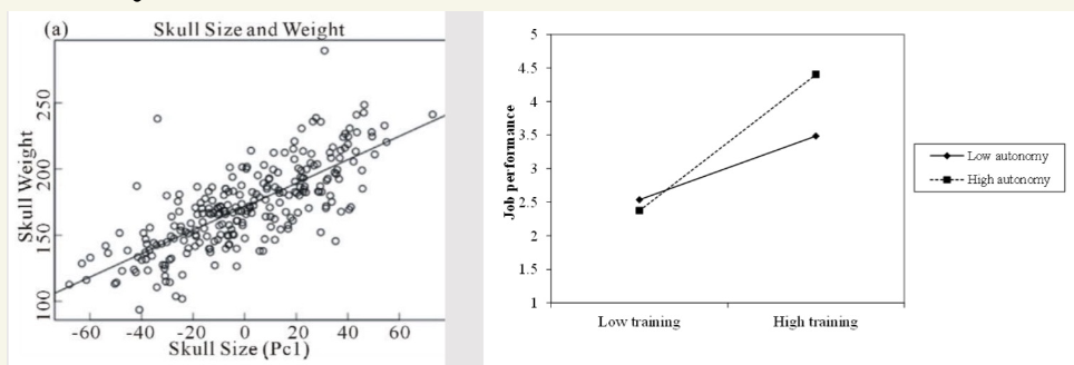
Scatterplots
shows raw data
useful before beginning analysis, to identify measurement issues, outliers
what type of visualization is this
when is it used for?
Line graphs
correlation/regression
best for continuous x-axis
plot changes over time