STATS 100 Exam 1a/
1/137
There's no tags or description
Looks like no tags are added yet.
Name | Mastery | Learn | Test | Matching | Spaced | Call with Kai |
|---|
No analytics yet
Send a link to your students to track their progress
138 Terms
Statistics is
the science of variability
3 short statistical sayings:
What was compared?
Who’s not here?
Incorporate “ish”-ness
Data is
a representation of someone or something
Tidy data is
a way of mapping the real world to a data set
Observations
an entire row, they are the things we care about
Attributes
An entire column, a unique aspect of each observation that we are interested in, they are the pieces of info we are interested in
Measures are
the way in which we collect info about observations
Quantitative data
data in which the values of an attribute for an observation are numbers representing a quantity of something
Key Giveaway: “How many?”, values with decimals, scales
Ex: temp., blood pressure
Categorical data
Data in which the values of an attribute for an observation are selected from a set of different category labels
Key Giveaway: selected from a drop-down list, no order to the values
Ex: hair color, blood type, country of origin
Text Data
Data in which the values of an attribute for an observation is text, typically from an open-ended question. Can be a single word or full sentence
Key Giveaway: Write-in data
Ex: customer reviews, social media posts
Rating scale data
Data in which the values of an attribute for an observation are selected from a predetermined rating scale ~ a list that has an order to it. Can even use numbers (e.g. rate pain 1-10)
Key Giveaway: Clear order to the values
Ex: “to what extent do you agree or disagree?”, how much pain are you in between 1 and 5?)
Time Series Data
Data in which the values of an attribute for an observation indicate a movement in time (such as a year, month, or day)
Key Giveaway: “When?”
Ex: date of birth, year, financial quarterr
Reliability
the extent to which the data you collect from a measure truly represents and reflects the real world characteristics of the observations. (process of measurement)
Data validation
is the act ensuring that the values collected from each observation for each attribute are reliable/valid
Problem
Identify a statistical question
Plan
Choos a sample design, study design, and measures
Data
Collect and process data
Analysis
Look for patterns with summary tables, graphs, and statistical models
Conclusion
Interpret the results and generate new questions about the real world context
Measurement
the process by which we collect information about observations
Data cleaning
Removing invalid values from a dataset
Prospective
Build checks into the survey
Retrospective
Clean the data
Univariate analysis
the analysis of a single attribute or variable at a time
Standard Deviation
Measures how spread out the data points are from the mean of a dataset.
Low = data points clustered closely around the mean
High = data points are spread out over wider range
5 Number Summary
Contains 5 numbers that help statisticians and data scientists understand the different values that the different observations have for an attribute
Minimum
the smallest value that any observation has for the attribute
1st quartile
25th percentile value. 25% of observations have a value below the 1st quartile
The median or the 2nd quartile
the 50th percentile value. ½ of all observations have a value below the median
3rd quartile
the 75th percentile value. 75% of all observations have a value below the 3rd quartile
Maximum
is the largest value that any observation has for the attribute
Frequencies
the number of times a specific value of event occurs in a dataset, how common something is
Percentages or relative frequencies
ratio or percentage of the number of times a value of the data sets occurs out of the total number of outcomes
Dot plot
a graph where each observation is displayed as 1 point on the graph
height of a dot plot = frequency for a particular value
Density plot
similar to a dot plot with a line drawn across the top of all of the stacks of dots
Word cloud
graphically depicts all of the words across all of the responses from all of the observations. The size of the word varies.
Larger the word, the more frequent it is
Bar graph
based on frequency table, and has 1 bar for every response option
The bar’s height is equal to each response option’s frequency
Aggregate characteristics
the characteristics of a group of observations
for text, rating scale, and categorical data, the main aggregate characteristics we focus on are the frequencies and percentages of each of the response options
When examining quantitative data, we focus on the shape of the data, the spread of the data, and the location of the data
Distribution
The pattern that the responses from all the observations make
Normal distributions
A bell-curve shape
most of the observations have a value near the average
Approximately 95% of the observations will have a value within 2 standard deviations of the mean
Skewed distribution
look like they’ve had 1 side stretched out
not symmetric
Right Skew
distributions look like the right side of a normal distribution has been stretched, which indicates that some units have very large values
Left Skew
Distributions look like the left side of a normal distribution has been stretched, which indicates that some units have very small values
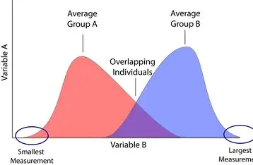
Multimodal distributions
multiple peaks
often seen when there are actually group differences in the attribute
2-way table
is similar to a frequency table, except that 1 attribute’s frequencies are presented as different rows in the table, and a second attribute’s frequencies are presented as columns
Column percents
are relative frequencies based only on the total from a single column
Used to compare the distribution of a categorical or rating scale attribute between 2 groups
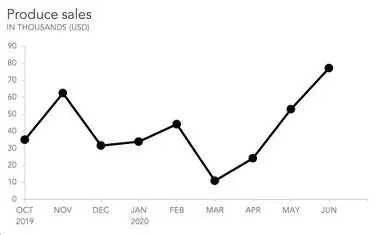
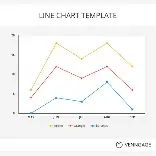
Line graph
Places time on the x axis, and the average value of an attribute or a percentage on the vertical axis
Ratio of Standard Deviations
Equal to the largest standard deviation between the 2 groups divided by the smallest standard deviation
Used to compare the spread of the distribution between 2 groups
If the ratio is approximately 3 or higher, we say that 1 distribution is MORE spread out than the other
Effect Size
Equal to the difference in the means, divided by the larger standard deviation
Used to compare the relative difference in the means between 2 groups
0.75 or MORE indicate a LARGE difference in the averages between the groups
0.25 or LESS indicate a SMALL difference in the averages between the groups
Between 0 and 0.10 indicate that there is a negligible or no meaningful difference in the averages between groups
Grouped Bar Graph
Has 1 bar graph created separately for each of the different response options for the 2nd attribute being considered in the 2-way table
Grouped density plots
have 1 density curve for a quantitative attribute for each group all on the same plot
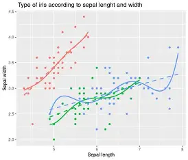
Scatter plot
A plot in which each observation is placed as a point on a graph according to their value for each of the 2 quantitative attributes
Usually the casual factor goes on the horizontal axis
Smoothed Trend Line
A line through the average value of the vertical axis attribute across all values of the horizontal axis attribute
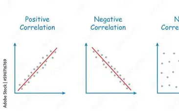
Correlation Coefficient
A statistic that summarizes how related 2 attributes are to each other
X always increases
Values close to 0 indicate that there is NO association between the attributes
Values close to -1 indicate that there is a STRONG NEGATIVE association between the attributes, as x increases, y decreases
Values close to +1 indicate that there is a STRONG POSITIVE association between the attributes, as x increases, y increases
Quantitative Measures
Ex: temp., blood pressure
Summary: count, mean, sd, 5-number summary
Visualizations: density curve
Categorical Measure
Ex: hair color, blood type, country of origin
Summary: frequency table
Visualizations: bar chart
Rating Scale
Ex: “to what extent do you agree or disagree?”, how much pain are you in between 1 and 5?
Summary: frequency table (with the order preserved)
Visualizations: bar chart (with the order preserved)
Text Measure
Ex: customer reviews, social media posts
Summary: frequency table
Visualizations: word cloud
Time Measure
Line graph is ‘when’
Modality
The number of ‘peaks’ a distribution has
Middle 95%
Represents most of the observations
Empirical Rule
The middle 95% of a normal distribution lies within 2 standard deviations of the mean
Middle 99%
3 standard deviations of the mean
Middle 68%
1 standard deviation of the mean
Standard Deviation Equation
(Upper limit of middle 95% - lower limit of middle 95%) / 4
Mean
math average (sum / by count) Add all the data points together and / by total # of points
Median
exact middle value when data is ordered. If even # of data points it is the average of the 2 middle #’'‘s
Mode
The value that appears the most frequently. A set can have no mode, 1 mode, or multiple modes. The peak of a distribution
Absolute Difference
Subtracting 1 column percent from the other, and taking the absolute value (i.e., positive numbers only)
Whenever the absolute difference is GREATER THAN 10%, we interpret that difference to indicate a real-world difference between the 2 groups
As you get closer to 0 the more similar they are
Relative Difference
When column percents are less than 50% we focus on computing the relative difference
By dividing 1 column percent from the other
Whenever the relative difference is LESS THAN 0.80 or GREATER THAN 1.25 we interpret that difference to indicate a real world difference between the 2 groups
As you get closer to 1 the more similar the data is
Ratio of Standard Deviation Equation
Larger sd / Smaller sd
If the ratio is approximately 3 OR HIGHER we say that 1 distribution is more spread out than the other
Effect Size Equation
(Group 1 mean - Group 2 mean) / larger standard deviation
0.10ish or less as an indicator of NO difference in the averages between the groups
0.25ish as an indication of a SMALL difference in the averages between the groups
0.75ish as an indicator of a LARGE difference in the average between the groups
If 2 attributes are not correlated at all…
The correlation will be 0
If 2 attributes are perfectly correlated with a positive trend…
the correlation will be 1
If 2 attributes are perfectly correlated with a negative trend…
the correlation will be -1
The closer a correlation is to 1 or -1…
the stronger the correlation
If the points are all very close to the trend line
Then the relationship is very strong
If the points are all very spread out and far away from the trend line
Then the relationship is very weak
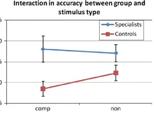
Interaction plot
simplifies comparing distributions between 2 sets of different groups by focusing just on the relative frequencies or mean
Don’t forget error bars
2 types of distinguishing characteristics of quantitative distributions that statisticians and data scientists focus on:
the number of ‘peaks’ the distribution has
whether or not the distribution is symmetric
2 types of modality
unimodal distributions: distributions with only 1 ‘peak’
multimodal distributions: distributions with more than 1 ‘peak’
The empirical rule only applies to:
normal distributions (unimodal symmetric bell-curves)
In symmetric distributions, the location of the ‘peak’ will be equal to:
The values of both the mean and median
In skewed distributions, the value of the median and mean will be:
pulled away from the mode in the same direction of the skew, with the mean being affected more than the median
In left skew distributions, the few observations with very small values ‘pull’ the mean and median to the:
left of the mode. we focus on the value of the median to tell us the location of the center of the distribution, or the most typical value
In right skewed distributions the few observations with very large values ‘pull’ the mean and median to the:
Right of the mode
U-shaped distribution
Bimodal frequency distribution where data points are concentrated at the extreme ends (low and high values) and sparse in the middle, creating a U-shape on the graph.
Most of the observations are concentrated at the 2 extremes (the lowest and highest values) of the range.
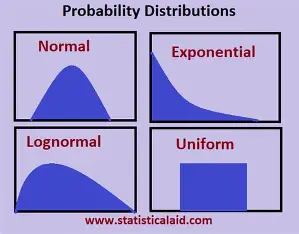
Uniform Distribution
A flat shape. Type of probability distribution where all possible outcomes or values within a specific range are equally likely to occur. Looks like a rectangle.
Distribution of Categorical or Rating Scale
Based on: Groups as defined by a categorical attribute
Summaries: 2-way table, column percents
Distribution of Quantitative
Based on: Groups as defined by a categorical attribute
Summaries: summary table with 1 row per group, effect size, ratio of SDs
Distribution or Quantitative or Categorical or Rating Scale
Based on: Time periods as defined by a time series attribute
Summaries: means or percentages by time period
Distribution of Quantitative (2)
Based on: Another Quantitative attribute
Summaries: Correlation
Distribution or Quantitative or Categorical or Rating Scale (2)
Based on: Time periods as defined by a time series attribute AND Groups as defined by a categorical attribute
Summaries: means or percentages by time period and group
Distribution of Quantitative (3)
Based on: Another Quantitative attribute AND Groups as defined by a categorical attribute
Summaries: Correlation
Distribution or Quantitative or Categorical or Rating Scale (3)
Based on: 2 sets of Groups as defined by 2 categorical attribute
Summaries: means or percentages by group
Causal Inference
an inference about which factor or factors may be responsible for causing an effect on some observed outcome
Observed outcome
What actually happened in the real world
Counterfactual question
What would have happened in the parallel universe
Counterfactual questions are
“What if"?” questions
Treatment observation
observations that were exposed to some causal factor