L5: Principles, Heuristics, Feedback

0.0(0)
studied byStudied by 0 people
0.0(0)
full-widthCall Kai
learnLearn
examPractice Test
spaced repetitionSpaced Repetition
heart puzzleMatch
flashcardsFlashcards
GameKnowt Play
Card Sorting

1/16

encourage image

There's no tags or description

Looks like no tags are added yet.

Study Analytics
Name
Mastery
Learn
Test
Matching
Spaced

No study sessions yet.

17 Terms

1
New cards

What are aspects of a good design?

  • innovative

  • useful

  • environmentally friendly

  • aethestic

  • as little design as possible

  • honest

  • long-lasting

  • consistent

2
New cards

Describe the role feedback plays

Feedback is essential part of interactive systems. The user has to be informed what has happened to decide next actions. 

  • SHOULD be:

    • prompt

    • clear and easy to understand

  • CAN be:

    • visual 

    • auditory

    • tactile

    • combo of the above

3
New cards

What are feedback cycles?

take an action, observe the results, and adjust the behavior

<p>take an action, observe the results, and adjust the behavior</p>
4
New cards

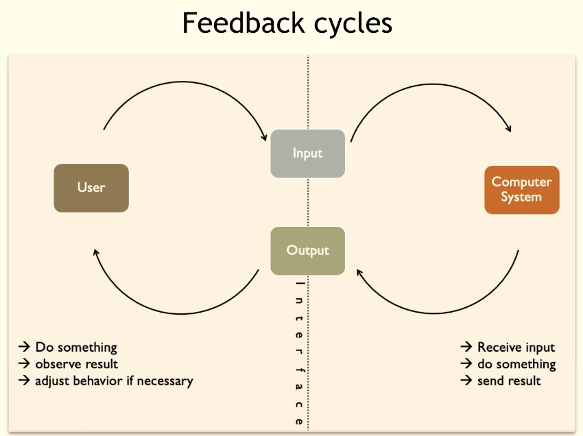
Are feedback cycles limited to human-computer interaction?

NO

  • Autonomous Systems

    • Feedback control

  • (Deep) reinforcement learning

    • Reward

  • Machine learning

    • Backpropagation

5
New cards

What is a gulf and what are the 2 gulfs?

  1. Gulf of execution: How the system operates

  2. Gulf of evaluation: Figure out how to change it


“With every interaction, users must overcome the twin challenges of understanding the current state of a system and figuring out how to change it.”

*DESIGNER’S RESPONSIBILITY TO BRIDGE/minimize THESE 2 GULFS

<ol><li><p style="text-align: justify;"><span style="background-color: transparent; font-family: &quot;Trebuchet MS&quot;, sans-serif;"><strong>Gulf of execution: </strong>How the system operates</span></p></li><li><p style="text-align: justify;"><span style="background-color: transparent; font-family: &quot;Trebuchet MS&quot;, sans-serif;"><strong>Gulf of evaluation: </strong>Figure out how to change it</span></p></li></ol><p><br><span style="background-color: transparent; font-family: &quot;Trebuchet MS&quot;, sans-serif;">“With every interaction, users must overcome the twin challenges of <strong>understanding</strong> the current state of a system and figuring out how to <strong>change</strong> it.”</span></p><p><span style="background-color: transparent; font-family: &quot;Trebuchet MS&quot;, sans-serif;">*DESIGNER’S RESPONSIBILITY TO BRIDGE/minimize THESE 2 GULFS</span></p>
6
New cards
<p>What is the <strong>gulf of execution?</strong></p>

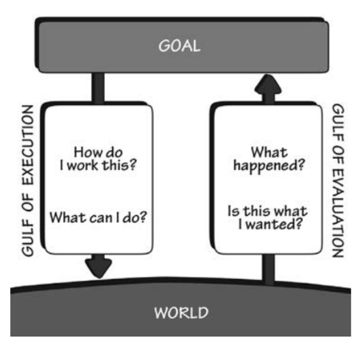
What is the gulf of execution?

The difference between the intentions of the users and what the system allows them to do (or how well the system supports those actions)

7
New cards

Describe an example of not bridging the gulf of execution

Your goal is to watch a movie in these three options. Soon you realize that the action that you performed does not yield the results that you want it.

  • You push a wrong button 

  • You put DVD in a wrong way

  • You double-tap instead of holding once

8
New cards

How do you bridge the gulf of execution?

  • Use affordances (and signifiers only if necessary) 

  • For novice users make actions visible/discoverable

  • For expert users reduce the number of steps (give them short cuts)

  • Provide feedforward (show user what will happen if the action continue)

  • Minimize effort need to execute each action

9
New cards

What is skeuomorphism? - gulf of execution

“a term most often used in graphical user interface design to describe interface objects that mimic their real-world counterparts in how they appear and/or how the user can interact with them.”

<p><span style="background-color: transparent; font-family: &quot;Trebuchet MS&quot;, sans-serif;">“a term most often used in graphical user interface design to describe interface objects that mimic their real-world counterparts in how they appear and/or how the user can interact with them.”</span></p>
10
New cards
<p>What is the <strong>gulf of evaluation?</strong></p>

What is the gulf of evaluation?

The difficulty of assessing the state of the system and how well the artifact supports the discovery and interpretation of that state

11
New cards

Describe an example of not bridging the gulf of evaluation

Problem: after you performed an action there is no understandable feedback by the app. So the designers failed to bridge the gulf of evaluation.

ex. You downloaded a software from an app store, when you click on a button you continuously see the screen on on the right. 

  • What is going on here?

  • What do rotating sticks represent?

  • What will be a purpose of this kind of feedback?

<p><span style="background-color: transparent; font-family: &quot;Trebuchet MS&quot;, sans-serif;"><strong>Problem: </strong>after you performed an action there is no understandable feedback by the app. So the designers failed to bridge the gulf of evaluation.</span></p><p><span style="background-color: transparent; font-family: &quot;Trebuchet MS&quot;, sans-serif;">ex.&nbsp;You downloaded a software from an app store, when you click on a button you continuously see the screen on on the right.&nbsp;</span></p><ul><li><p><span style="background-color: transparent; font-family: &quot;Trebuchet MS&quot;, sans-serif;">What is going on here?</span></p></li><li><p><span style="background-color: transparent; font-family: &quot;Trebuchet MS&quot;, sans-serif;">What do rotating sticks represent?</span></p></li><li><p><span style="background-color: transparent; font-family: &quot;Trebuchet MS&quot;, sans-serif;">What will be a purpose of this kind of feedback?</span></p></li></ul><p></p>
12
New cards

How do you bridge the gulf of evaluation?

  • Give feedback frequently

  • Give feedback immediately

  • Balance feedback with actions

  • Vary the feedback (audio vs. visual)

  • Use direct manipulation

13
New cards

What is direct manipulation? - gulf of evaluation

Direct manipulation (DM) is an interaction style in which users act on displayed objects of interest using physical, incremental, reversible actions whose effects are immediately visible on the screen.

The performed action should be similar to the natural one

<p><span style="background-color: transparent; font-family: &quot;Trebuchet MS&quot;, sans-serif;">Direct manipulation (DM) is an interaction style in which users act on displayed objects of interest using physical, incremental, reversible actions whose effects are immediately visible on the screen.</span></p><p><span style="background-color: transparent; font-family: &quot;Trebuchet MS&quot;, sans-serif;"><strong>The performed action should be similar to the natural one</strong></span></p>
14
New cards

What are the 3 design principles/heuristics (shortcuts)?

  • Shneiderman’s 8 golden rules

  • Norman’s 7 principles

  • Nielsen’s usability Heuristics

At this stage, you can assume you already developed a high-fidelity prototype

15
New cards
<p>What are <span style="background-color: transparent;">Shneiderman’s 8 golden rules?</span></p>

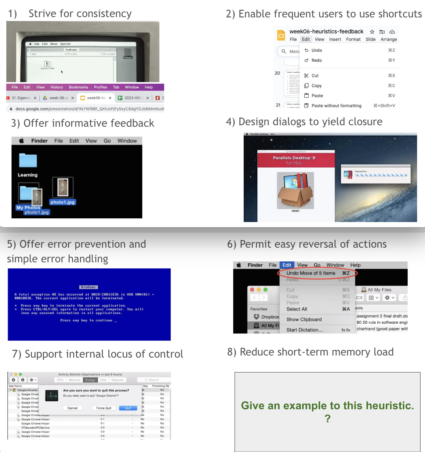
What are Shneiderman’s 8 golden rules?

  1. Strive for consistency

  2. Enable frequent users to use shortcuts

  3. Offer informative feedback

  4. Design dialogs to yield closure

  5. Offer error prevention and simple error handling

  6. Permit easy reversal of actions

  7. Support internal locus of control

  8. Reduce short-term memory load 

<ol><li><p><span style="background-color: transparent;">Strive for consistency</span></p></li><li><p><span style="background-color: transparent;">Enable frequent users to use shortcuts</span></p></li><li><p><span style="background-color: transparent;">Offer informative feedback</span></p></li><li><p><span style="background-color: transparent;">Design dialogs to yield closure</span></p></li><li><p><span style="background-color: transparent;">Offer error prevention and simple error handling</span></p></li><li><p><span style="background-color: transparent;">Permit easy reversal of actions</span></p></li><li><p><span style="background-color: transparent;">Support internal locus of control</span></p></li><li><p><span style="background-color: transparent;">Reduce short-term memory load&nbsp;</span></p></li></ol><p></p>
16
New cards
<p><span style="background-color: transparent; font-family: &quot;Trebuchet MS&quot;, sans-serif;">What are Norman’s 7 Principles?</span></p>

What are Norman’s 7 Principles?

  1. Use both knowledge in the world and knowledge in the head. 

  2. Simplify the structure of tasks. 

  3. Make things visible. 

  4. Get the mappings right. 

  5. Exploit the power of constraints, both natural and artificial. 

  6. Design for error. 

  7. When all else fails, standardize.

17
New cards
<p>What are <span style="background-color: transparent; font-family: &quot;Trebuchet MS&quot;, sans-serif;">Nielsen’s 10 usability heuristics?</span></p>

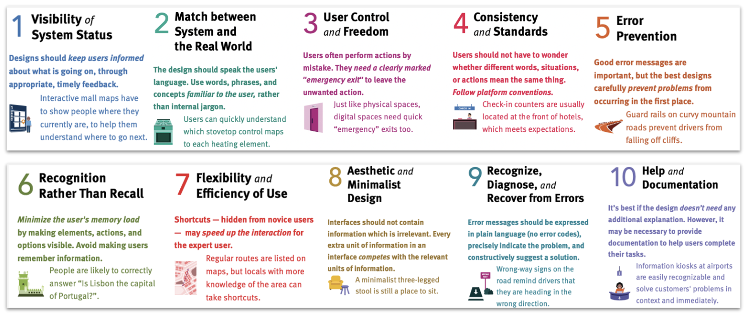
What are Nielsen’s 10 usability heuristics?

They are called "heuristics" because they are broad rules of thumb and not specific usability guidelines

Visibility of system status

  • The design should always keep users informed about what is going on, through appropriate feedback within a reasonable amount of time.

Match between system and the real world

  • The design should speak the users' language. Use words, phrases, and concepts familiar to the user, rather than internal jargon. Follow real-world conventions, making information appear in a natural and logical order.

User control and freedom

  • Users often perform actions by mistake. They need a clearly marked "emergency exit" to leave the unwanted action without having to go through an extended process.

Consistency and standards

  • Users should not have to wonder whether different words, situations, or actions mean the same thing. Follow platform and industry conventions.

Error prevention

  • Good error messages are important, but the best designs carefully prevent problems from occurring in the first place. Either eliminate error-prone conditions, or check for them and present users with a confirmation option before they commit to the action.

Recognition rather than recall

  • Minimize the user's memory load by making elements, actions, and options visible. The user should not have to remember information from one part of the interface to another.

Flexibility and efficiency of use

  • Shortcuts — hidden from novice users — may speed up the interaction for the expert user so that the design can cater to both inexperienced and experienced users. Allow users to tailor frequent actions.

Aesthetic and minimalist design

  • Interfaces should not contain information that is irrelevant or rarely needed. Every extra unit of information in an interface competes with the relevant units of information and diminishes their relative visibility.

Help users recognize, diagnose, and recover from errors

  • Error messages should be expressed in plain language (no error codes), precisely indicate the problem, and constructively suggest a solution.

Help and documentation

  • It’s best if the system doesn’t need any additional explanation. However, it may be necessary to provide documentation to help users understand how to complete their tasks.

<p><span style="background-color: transparent; font-family: &quot;Trebuchet MS&quot;, sans-serif;">They are called "heuristics" because they are broad <strong>rules of thumb</strong> and not specific usability guidelines</span></p><p style="text-align: justify;"><span style="background-color: transparent; font-family: &quot;Trebuchet MS&quot;, sans-serif;"><strong>Visibility of system status</strong></span></p><ul><li><p style="text-align: justify;"><span style="background-color: transparent; font-family: &quot;Trebuchet MS&quot;, sans-serif;">The design should always keep users informed about what is going on, through appropriate feedback within a reasonable amount of time.</span></p></li></ul><p style="text-align: justify;"><span style="background-color: transparent; font-family: &quot;Trebuchet MS&quot;, sans-serif;"><strong>Match between system and the real world</strong></span></p><ul><li><p style="text-align: justify;">The design should speak the users' language. Use words, phrases, and concepts familiar to the user, rather than internal jargon. Follow real-world conventions, making information appear in a natural and logical order.</p></li></ul><p style="text-align: justify;"><span style="background-color: transparent; font-family: &quot;Trebuchet MS&quot;, sans-serif;"><strong>User control and freedom</strong></span></p><ul><li><p style="text-align: justify;"><span>Users often perform actions by mistake. They need a clearly marked "emergency exit" to leave the unwanted action without having to go through an extended process.</span></p></li></ul><p style="text-align: justify;"><span style="background-color: transparent; font-family: &quot;Trebuchet MS&quot;, sans-serif;"><strong>Consistency and standards</strong></span></p><ul><li><p style="text-align: justify;"><span>Users should not have to wonder whether different words, situations, or actions mean the same thing. Follow platform and industry conventions.</span></p></li></ul><p style="text-align: justify;"><span style="background-color: transparent; font-family: &quot;Trebuchet MS&quot;, sans-serif;"><strong>Error prevention</strong></span></p><ul><li><p style="text-align: justify;"><span style="background-color: transparent; font-family: &quot;Trebuchet MS&quot;, sans-serif;">Good error messages are important, but the best designs carefully prevent problems from occurring in the first place. Either eliminate error-prone conditions, or check for them and present users with a confirmation option before they commit to the action.</span></p></li></ul><p style="text-align: justify;"><span style="background-color: transparent; font-family: &quot;Trebuchet MS&quot;, sans-serif;"><strong>Recognition rather than recall</strong></span></p><ul><li><p style="text-align: justify;"><span style="background-color: transparent; font-family: &quot;Trebuchet MS&quot;, sans-serif;">Minimize the user's memory load by making elements, actions, and options visible. The user should not have to remember information from one part of the interface to another.</span></p></li></ul><p style="text-align: justify;"><span style="background-color: transparent; font-family: &quot;Trebuchet MS&quot;, sans-serif;"><strong>Flexibility and efficiency of use</strong></span></p><ul><li><p style="text-align: justify;"><span style="background-color: transparent; font-family: &quot;Trebuchet MS&quot;, sans-serif;">Shortcuts — hidden from novice users — may speed up the interaction for the expert user so that the design can cater to both inexperienced and experienced users. Allow users to tailor frequent actions.</span></p></li></ul><p style="text-align: justify;"><span style="background-color: transparent; font-family: &quot;Trebuchet MS&quot;, sans-serif;"><strong>Aesthetic and minimalist design</strong></span></p><ul><li><p style="text-align: justify;"><span style="background-color: transparent; font-family: &quot;Trebuchet MS&quot;, sans-serif;">Interfaces should not contain information that is irrelevant or rarely needed. Every extra unit of information in an interface competes with the relevant units of information and diminishes their relative visibility.</span></p></li></ul><p style="text-align: justify;"><span style="background-color: transparent; font-family: &quot;Trebuchet MS&quot;, sans-serif;"><strong>Help users recognize, diagnose, and recover from errors</strong></span></p><ul><li><p style="text-align: justify;"><span style="background-color: transparent; font-family: &quot;Trebuchet MS&quot;, sans-serif;">Error messages should be expressed in plain language (no error codes), precisely indicate the problem, and constructively suggest a solution.</span></p></li></ul><p style="text-align: justify;"><span style="background-color: transparent; font-family: &quot;Trebuchet MS&quot;, sans-serif;"><strong>Help and documentation</strong></span></p><ul><li><p><span style="background-color: transparent; font-family: &quot;Trebuchet MS&quot;, sans-serif;">It’s best if the system doesn’t need any additional explanation. However, it may be necessary to provide documentation to help users understand how to complete their tasks.</span></p></li></ul><p></p>