AP GEO MAPS
1/23
There's no tags or description
Looks like no tags are added yet.
Name | Mastery | Learn | Test | Matching | Spaced | Call with Kai |
|---|
No study sessions yet.
24 Terms
What map is this?
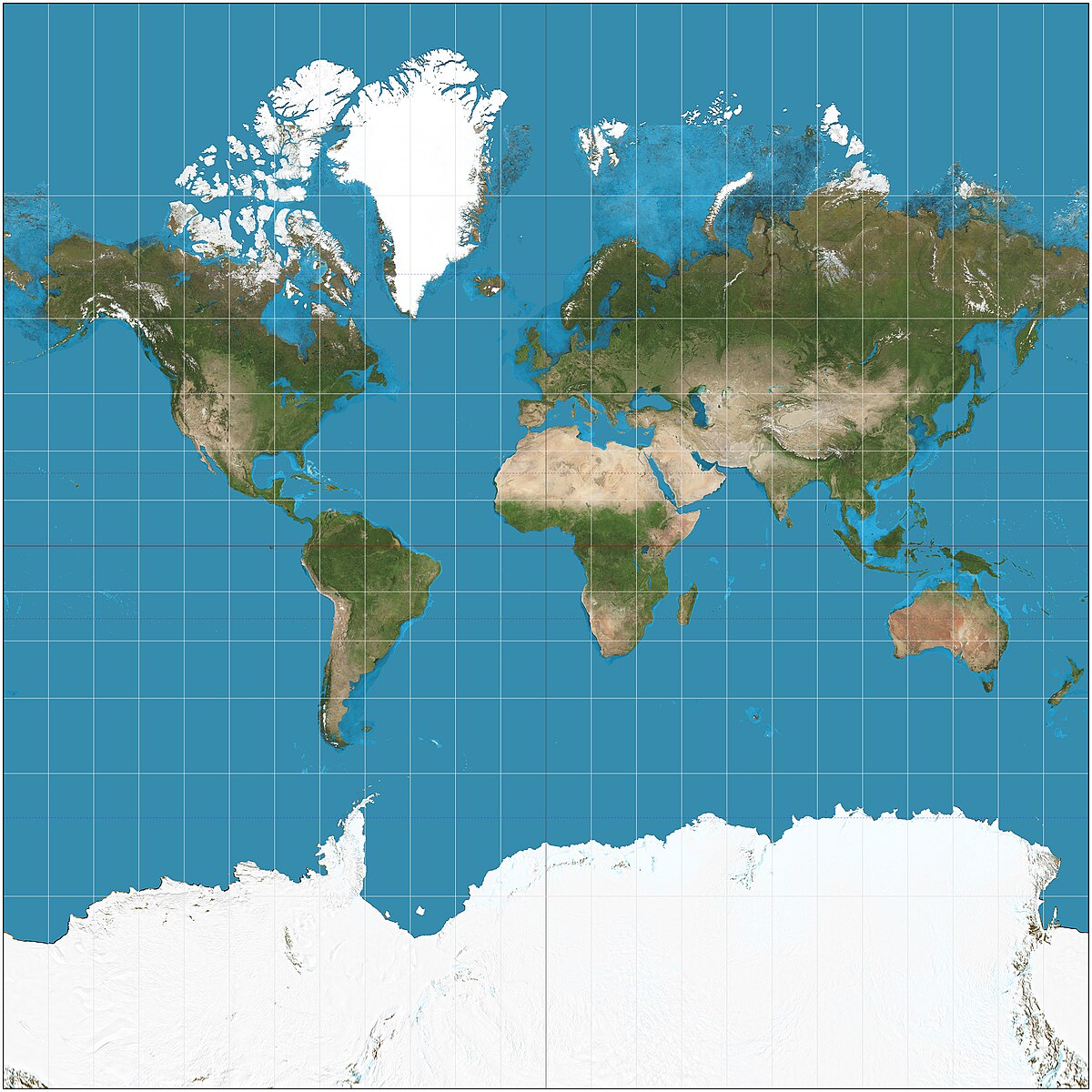
Mercator Projection

What map is this?
Peters Projection
What map is this?
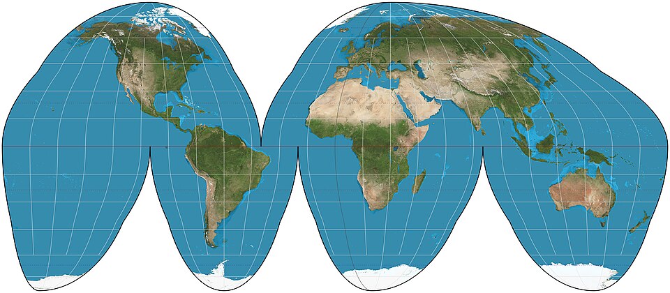
Goode Homolosine Projection

What map is this?
Polar Projection
what map is this?
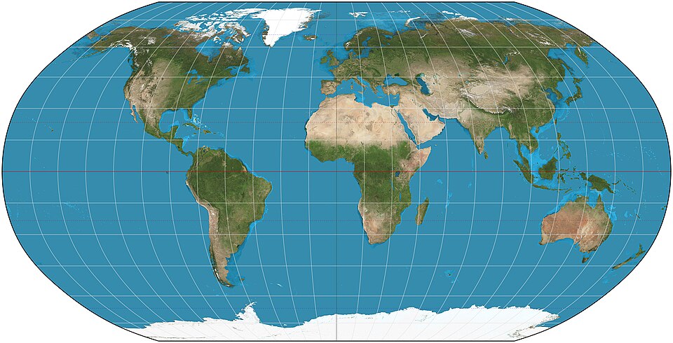
Robinson Projection
Mercator Projection
Useful for navigation but land distorts as farther from equator.
Peters Projection
Shows all landmasses w/ true area but distorts space.
Goode Homolosine Projection
Avoids shape distortion by creating “interruptions” but ends up splitting oceans.
Polar Projection
Looks down at Earth from N/S Pole but distorts as farther from pole.
Robinson Projection
Tries to be most visually appealing w/ low distortion.
What map is this?
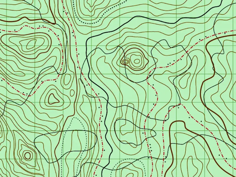
Topographic map
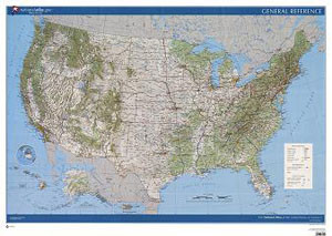
What map is this?
Reference map
what map is this?
Thematic map
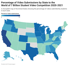
what map is this?
Choropleth map
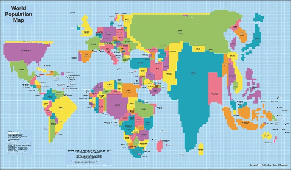
what map is this?
Cartogram
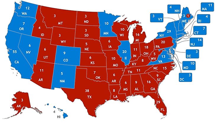
what map is this?
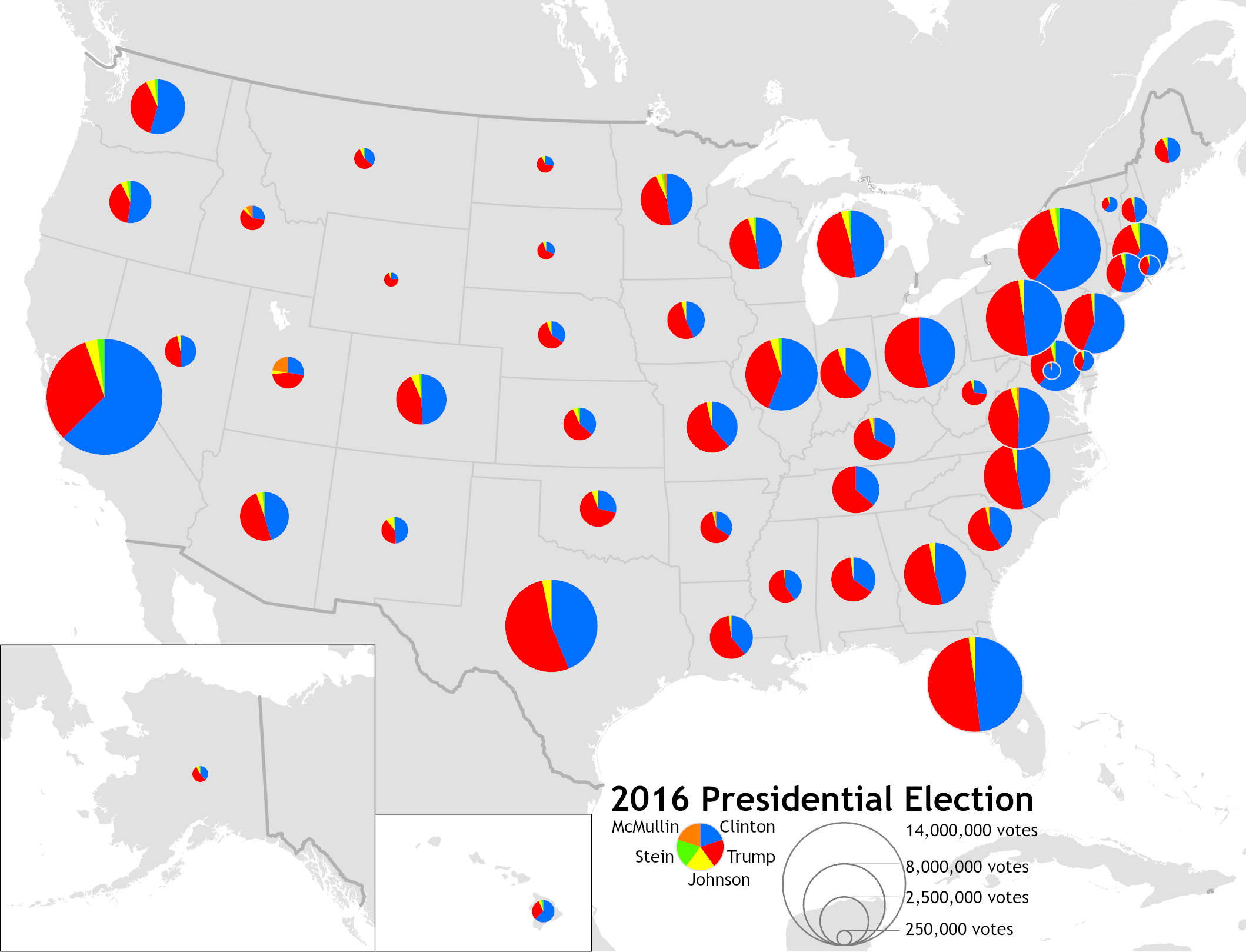
Proportional/Graduated circle map
What map is this?
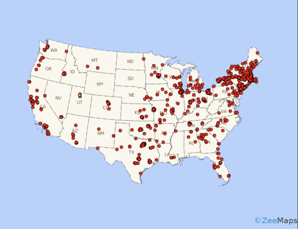
Dot density/dot distribution map
Topographic Map
Shows 3D physical features like mountains, valleys, and elevation using contour lines. Useful for hiking, engineering, and land-use planning.
Reference Map
Focuses on geographic locations rather than data patterns. Displays cities, countries, roads, rivers, oceans, etc. Used for navigation or to locate specific places.
Thematic Map
Highlights spatial patterns of a specific theme or statistic (e.g., population, climate, language). Focuses on one topic rather than general geography.
Choropleth Map
Uses shading or colors to represent data values for defined areas (like countries or states). Darker/lighter colors show higher/lower values.
Cartogram
Distorts the size of geographic areas to represent a variable (e.g., population, GDP). Focuses on the relative importance of data, not actual land size.
Proportional/Graduated Circle Map
Places circles of different sizes over locations to represent numeric values. Easy to read for specific locations, but circle placement can reduce geographic accuracy.
Dot Density / Dot Distribution Map
Uses dots to represent individual occurrences or quantities of a variable. Shows distribution patterns and density differences across an area (one-to-one or one-to-many).