Stat 1000 - Class 1,2 (Unit 1)
1/48
There's no tags or description
Looks like no tags are added yet.
Name | Mastery | Learn | Test | Matching | Spaced |
|---|
No study sessions yet.
49 Terms
Statistics
Set of methods for obtaining, organizing, summarizing, presenting and analyzing data
Data
Comes from characteristics measured on individuals, or units
Individuals/ Units
Nearly anything: people, animals, places, things, etc
Observations
collected data values
Population
Totality of individuals about which we want information
Sample
Subset of the individuals in a population that we actually examine in order to gather information
Good sample
Representative of the populations
Identifying the population that a sample represents
replace the sample size with “all”
Variable
characteristic or property of an individual.
Examples of possible variables
Lifespan of a light bulb, The number of heads in five tosses of a quarter, Hair colour
Classifications of data
categorical and quantitative
Categorical data
values of categorical/qualitative variables.
These are variables that place individuals into one of several groups categories.
Categorical variables (examples)
Eye colour
Favourite singer
Reason for taking STAT 1000
Categorical and ordinal
meaningful, logical ordering to the values of a categorical variable.
Categorical and nominal
not a meaningful, logical ordering to the values of a categorical variable
Quantitative data
Represents quantitative variables
Quantitative variables are
Take numerical values for which arithmetic operations (such as subtracting, averaging, etc.) make sense (i.e. their results are meaningful).
Quantitative variables (examples)
Height
Volume of air in a balloon
Exam score
Time
Data distribution tells us:
What values a variable takes, and How often it takes these values
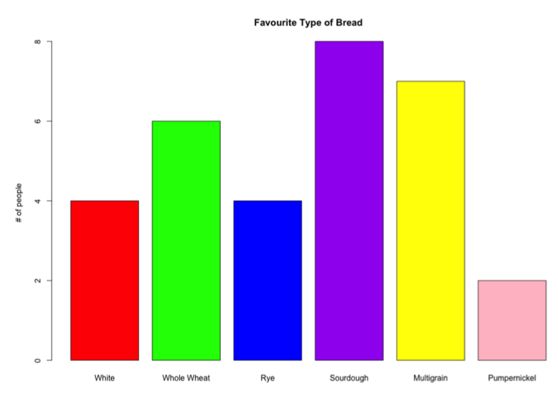
Bar Charts
Display variable values on one axis, and frequencies on the other.
Bars don’t touch (not continuous)
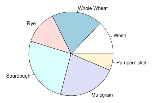
Pie charts
visual representation of the relative frequency/proportion of the observed values for a categorical variable
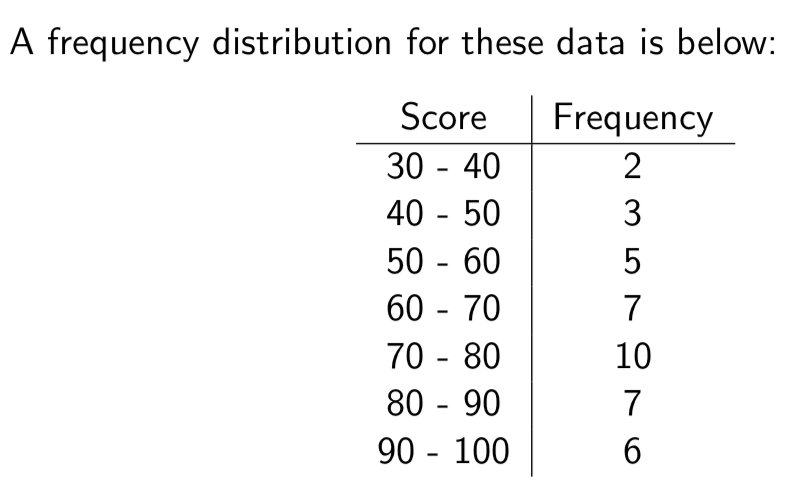
Frequency distribution
count of how many of our data values fall into various predetermined classes or intervals
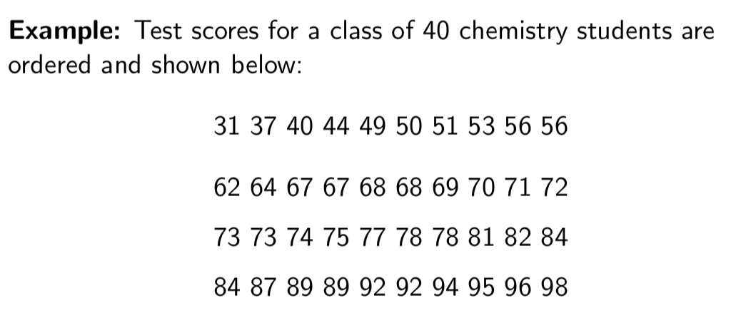
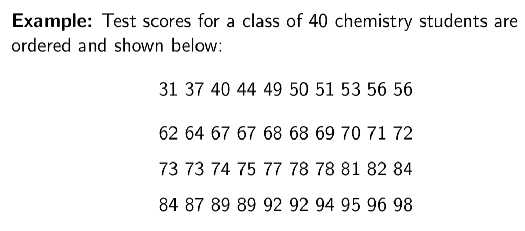
Frequency Distribution Example
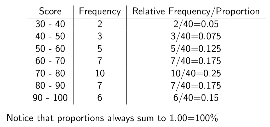
Relative frequency distributions
Dividing the number of data values in each class by the total number of data values, we get the relative frequency, or proportion of individuals in each class
Proportions (relative frequency distributions)
Values between 0 and 1 that are decimal representations of fractions. You can convert proportions to percentages by multiplying by 100.
Relative frequency distribution Example
Frequency distribution (intervals)
choose them ourselves
Frequency distribution (interval rules)
Our first interval must include the lowest data value (called the minimum)
Our last interval must contain the highest data value (called the maximum)
All intervals should be of equal length
Each interval includes the left endpoint, but not the right
Choosing the intervals (frequency distribution)
“nice choices”, that summarize our data well. We’d typically use around 5 - 10 intervals total
Why cant we just use non-overlapping intervals?
because of decimals (continuous variables)
70-79 how about 79.5?
Continuous variables
These are quantitative variables that can take any value within a given range.
Continuous variables (examples)
Test scores, age, height, distance
Discrete variables
These are quantitative variables that can only take a “countable” number of values: i.e. they can only take a specific, distinct values.
discrete variables (examples)
The number of children in a family
The number of days of rain in a month
The number of books a person has read in their life
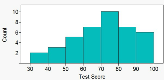
Histograms
More useful and commonly used display of continuous data
Graphical displays of the frequency (or relative frequency) of data values falling into each of several intervals.
Histograms are especially useful when we’re dealing with large data sets.
What type of data is used for a histogram
continuous, quantitative data
Why is there no spaces between the bars in a histogram
because they are continuous data
What does the base of a histogram represent
length of the interval (equal length)
What does the height of a histogram represent
the frequency of the data in each interval
Distribution shape (histogram)
A histogram can be used to characterize the shape of the data distribution
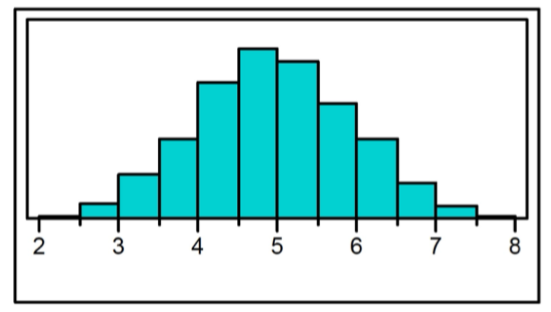
Symmetric
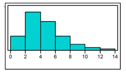
Skewed to the right
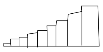
Skewed to the left
Symmetric shape (histogram)
center divides it into two approximate mirror images
Skewed to the right (Histogram)
longer tail on the right side
most of the data values are concentrated on the left
Skewed to the left (Histogram)
longer tail on the left side
most of the data values are concentrated on the right.
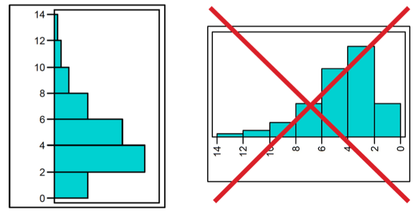
Distribution shape (!!WARNING!!)
Be careful interpreting the shape of a histogram if it’s displayed vertically!!
x-axis has to start at 0 (when flipped horizontal)
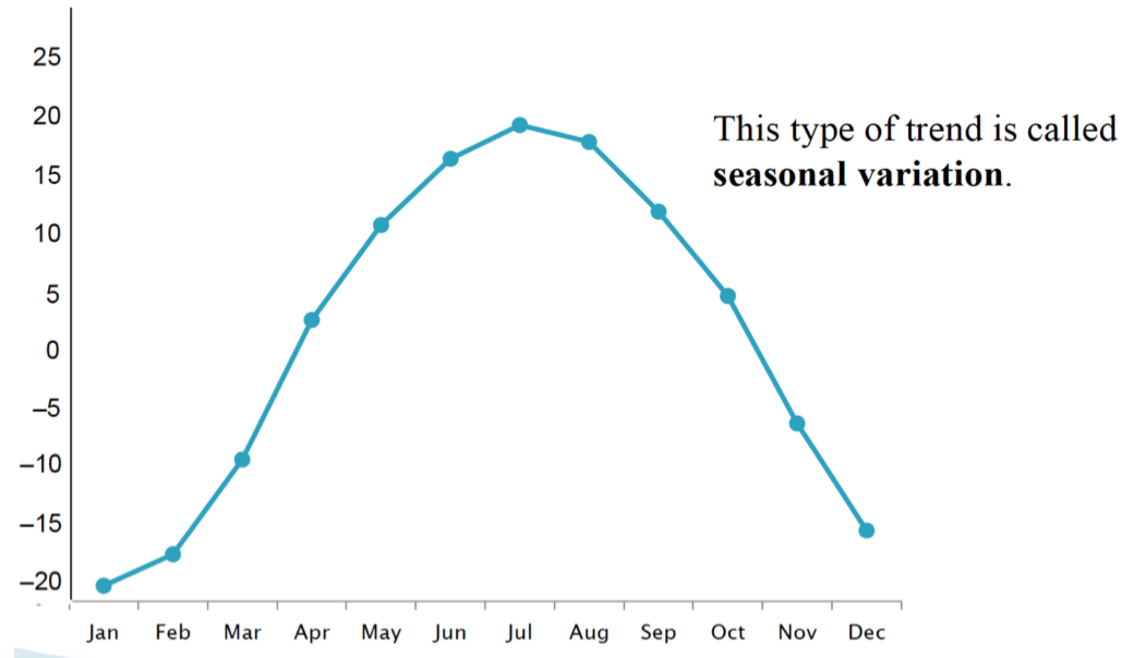
Time series data
which are values for a variable measured over time
How can you visually display time series data
time plots
What constitutes a Time Plot
Time is plotted on the x - axis, and variable values are plotted on the y - axis

How is data represented on a Time Plot
Data values are represented by points. We connect these points to better visualize the pattern/trend.
Seasonal variation (time plot) {example}
fluctuations in data values that occur at regular intervals due to seasonal factors, showing predictable changes at specific times of the year.