3 - Constructing Graphs
1/22
There's no tags or description
Looks like no tags are added yet.
Name | Mastery | Learn | Test | Matching | Spaced | Call with Kai |
|---|
No analytics yet
Send a link to your students to track their progress
23 Terms
Datum
An individual piece of information; singular form of the word data
Data
A collection of pieces of information; plural form of the word datum
A collection of data can be organized in different ways. Two methods are to organize your data in the form of a ______ or ______
Table or Graph
When organizing data, it is important to summarize and simplify it. We should compare it to the body of raw data because it makes it easier to notice ______________________________________
Patterns, trends, differences, changes, or relationships in the data
Tables are best for _____________
Side by side comparison of data
Graphs are best for showing _____________ and ______________
Showing rises & falls and the affects of different variables on each other
The independent variable takes the place of _________ on the graph
x-axis (another word for x-axis is “abscissa”)
The dependent variable takes the place of _________ on the graph
y-axis (another word for y-axis is “ordinate”)
What is the meaning of Abscissa
The x-axis of a graph
What is the meaning of Ordinate
The y-axis of a graph
Dependent Variable
The variable whose value depends on the value of the independent variable
Independent Variable
The variable whose value decides the value of the dependent variable
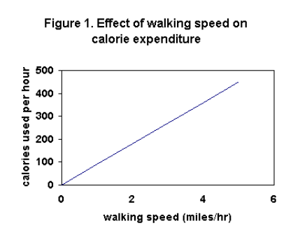
Examine the x-axis of this graph. What is missing?
The axes of a graph should be marked! The x-axis does not have the marks, but the y-axis does.
Note: The marks should also be uniform, meaning that there is an equal amount of space between them. Our graphs should be organized and drawn.
The axes of a graph should be marked. In addition, they must be ______. In other words, the variables need to be identified.
Labeled
The marks/intervals on the axes must be _______. In other words, the space between them should be equal.
Uniform
Note: When marking your axes, make the intervals easy. For example, making the interval between the marks 100 is easier than making it 125. 100 is an easy number to work with.
If your graph involves two or more curves, then there are two methods for differentiating between the curves. What are these two methods?
Use different symbols (one curve use closed circles for its points and the other could use open circles)
Use different lines (one curve could have a dotted line and the other could be a solid line)
When having two or more curves on your graph, it is a must to differentiate them by either using different styles of symbols or lines. It is also a must to have a ______, which explains how you are differentiating the curves.
Legend
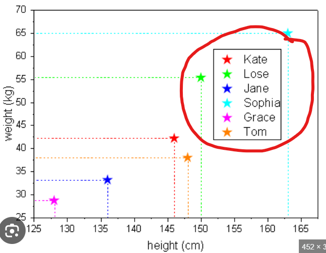
An example was provided in the attached image. Look at what’s circled in red. That is an example of a legend.
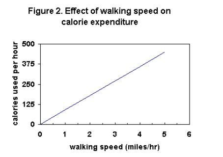
Examine the y-axis of this graph. What could be changed to make this easier for people to understand your data?
Instead of using intervals of 125, use intervals of 100
You should avoid compressing or stretching either axis too much because it would ___________________________
Make it harder to read your data (Only stretch or compress if there is a need)
Although this is not a strict rule in this class, your graph should have a _________. If it would help explain your graph, then you must include it.
Title
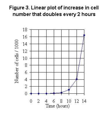
Sometimes we are dealing with large numbers in our data—Possibly numbers in the thousands! Examine the title of the y-axis of this graph. What does it indicate?
It indicates that we are working with thousands of cells.
Note: To make the data easier to read, the data for the y-axis was divided by 1000. If you do this or something similar with your data, then it is a must to indicate to the readers that you have done this.

When dealing with large numbers, one method of making our graph easier to read is by dividing the y-axis by 100, or 1000, etc. This needs to be made known to the reader. Instead of using this technique, it’s better to make the scale of the y-axis _________.
Logarithmic
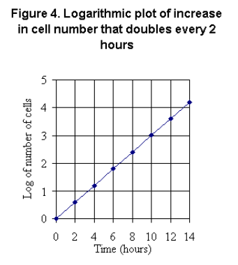
The use of the common log scale for your y-axis (like the graph in the photo) has the advantage of producing a ____________. This makes it easy for people to read your data.
Straight line.
Attached is the same data but without using a logarithmic scale for the y-axis.
