Information Visualization Quiz 2
1/33
There's no tags or description
Looks like no tags are added yet.
Name | Mastery | Learn | Test | Matching | Spaced | Call with Kai |
|---|
No analytics yet
Send a link to your students to track their progress
34 Terms
Definition of Information Visualization
The activity of transforming abstract data into visual representations to improve human cognition.
Why Visualization?
Tells a story about data
Discovers stories from data
Amplifies Cognition
-Expand Working Memory
-Reduce searching time
-Pattern detection
-Inference
Challenges in Visualization
1) Principles for designing effective visualizations
2)Tools to produce them
3) Large data
4) Common language
Visualization
Input: data
output: visual elements
Can be seen as a map between quantifiable features to aesthetics
Aesthetics
Describe aspects of graphical elements
position
shape
size
color
line width
line type
Quantitate data
Data associated with mathematical models and statistical techniques used to analyze spatial location and association.
Qualitive Data
information scientists first collect, describes anything physical (color, odor, shape)
Scales
Map data values onto aesthetics
Important: keep scales to the min required - for human cognition
Typically:
-two positions
-one color
-but many other possibilities
Coordinate Systems and axes
first step in constructing a visual representation
Cartesian
Most used coordinate system
axes can be different units
can be transformed
Log Scale
Large skewness in data
Showing multiplicative factors/ ratios
Square root scale
Need the use of zero, log cannot use 0
Polar coordinates
The location of a point as given by an angle and a distance.
Good for periodic patterns
Color in visualizations
Distinguish groups
represent values
highlight aspects
Color for grouping
Distinguish discrete items or groups without intrinsic ordering
Qualitative Color Scale
-Finite set of colors
-Clearly distinct from eachother
-No one color should stand out
-No impression of ordering
Color to represent values
Using color as an additional dimension in visualization
Sequential Color Scale
-Usually infinite set of colors
-Smoothly-varying
-Perceptually uniform scale
-Clear impression of ordering
Diverging Color Scale
-Same as sequential but there is a clear impression of order but with a clear definition for a mid-point
Color to Highlight
Accent Color Scale
-Finite or infinite set of colors with a subset that clearly stands out
-can be a modification of qualitive, sequential or divergent scales
Visualizations of Amounts
Bars/ dot plots/ Stacked bars/ heatmap
Visualization of Distributions
Histograms/ Density Plot/ Cumulative Density/ Quantile-Quantile Plot/ Boxplots/ Violins/ Strip Charts/ Sina Plots/ Stacked Histograms/ Overlapping Densities/ Ridgeline Plot
Visualization of Proportions
Pie/ Bars/ Stacked Bars/ Muli Pie/ Grouped Bars/ Stacked Bars/ Stacked Densities/Mosaic Plot/ Treemap/ Parallel Sets
Visualizations of Relationships
Scatterplots/ Bubble Charts/ Paired Scatterplot/ Slopegraph/ Density Contours/ 2D bins/ Hex Bins/ Correlogram/ Line graph/ Connected Scatterplot/ Smooth line Graph
Visualization of Geospatial data
Maps/ Choropleth/ Cartogram/ Cartogram Heatmap
Visualization of Uncertainty
Direct interpretation: Error bars
More Detailed: Confidence Strips/ Eyes/ Half-Eyes/ Quantile Dot Plot
Trend Lines: Confidence Band/ Graded Confidence Bands/ Fitted Draws
Visualization of Distributions Strenghts/Weakness
Useful to visualize how a set of numbers is distributed
Data has at lease one set of values
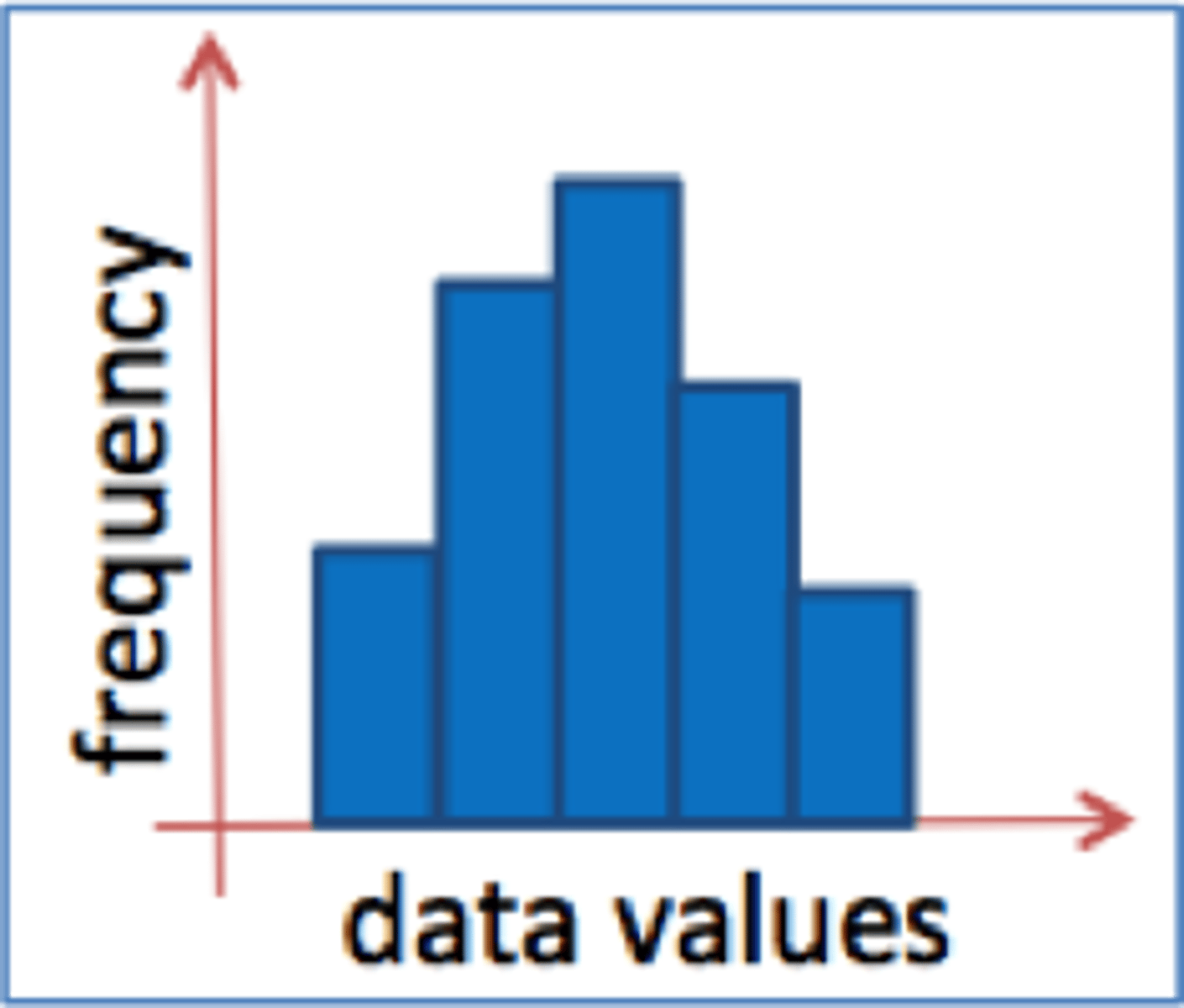
Histogram
a bar graph depicting a frequency distribution
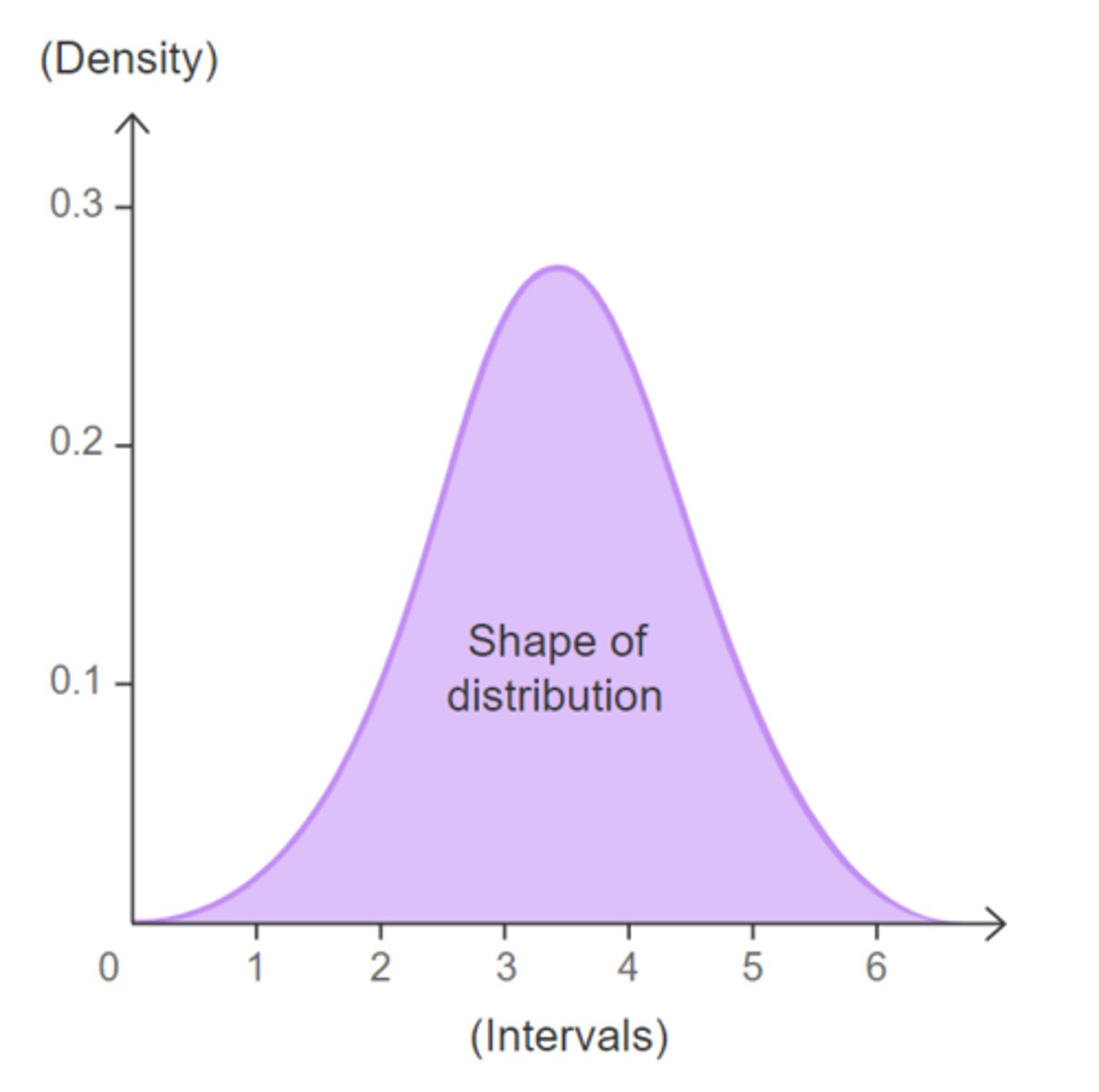
Density Plot
similar to a histogram except that rather than having a summary bar representing the frequency of scores, it shows each individual score as a dot. They can be useful for looking at the shape of a distribution of scores
Cumulative Densities
No Arbitrary Parameters choices
All data displayed
but less intuitive
Skewed Distributions
Existence of heavy tails make visualization challenging
Decay is slower than exponential
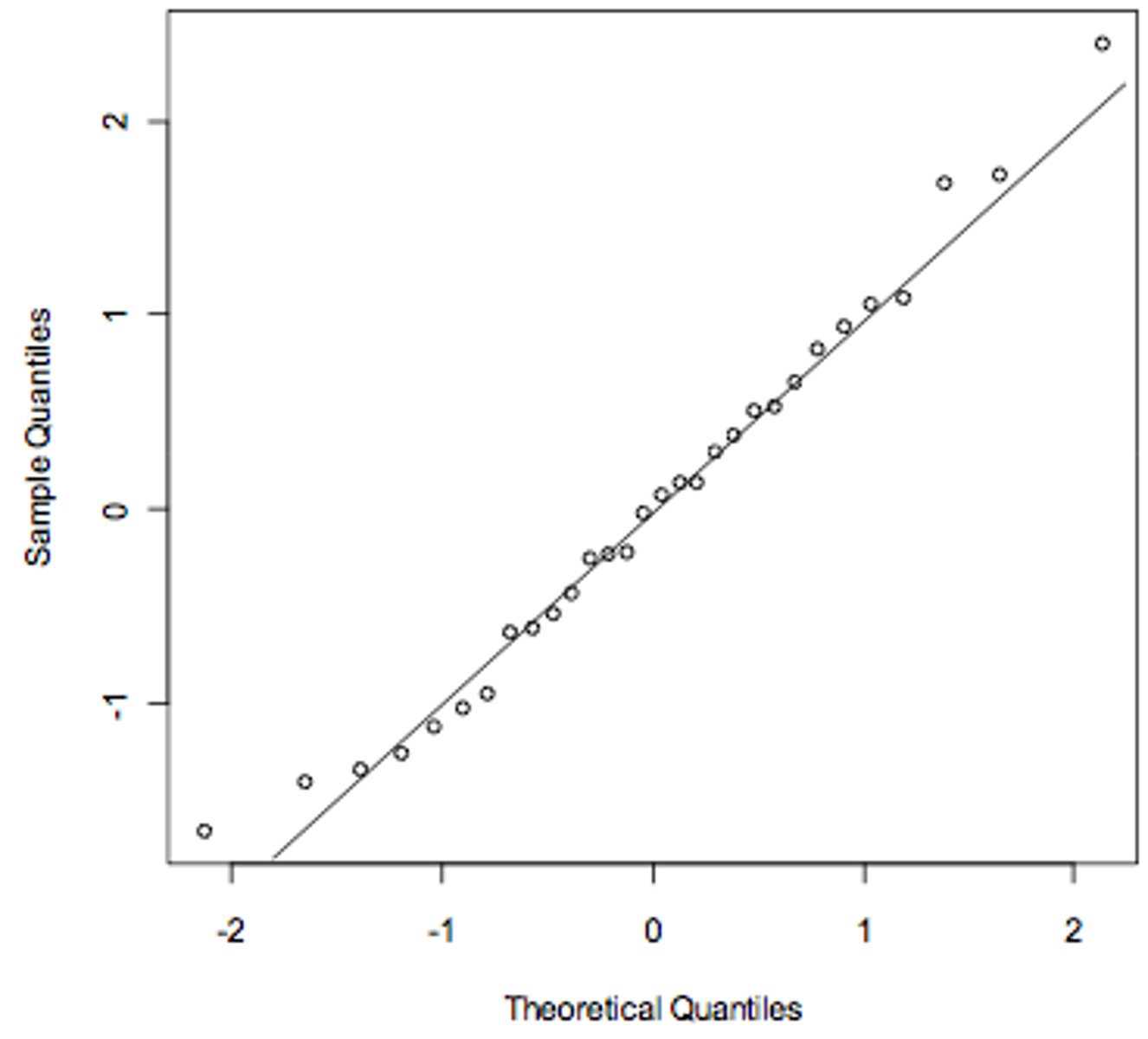
Q-Q plot
Quantile-quantile plot -- a plot comparing the quantiles of two data sets, or one data set and a distribution, to see whether they might have a common distribution.
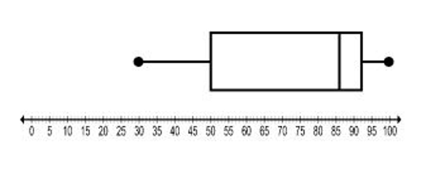
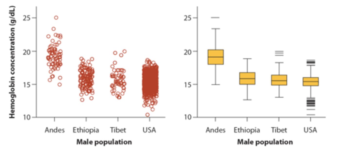
Box Plot
A graph that displays the highest and lowest quarters of data as whiskers, the middle two-quarters of the data as a box, and the median
Invented between 50s-70s by Mary Eleanor Spear and John Tukey
Simple to draw
Hides some information
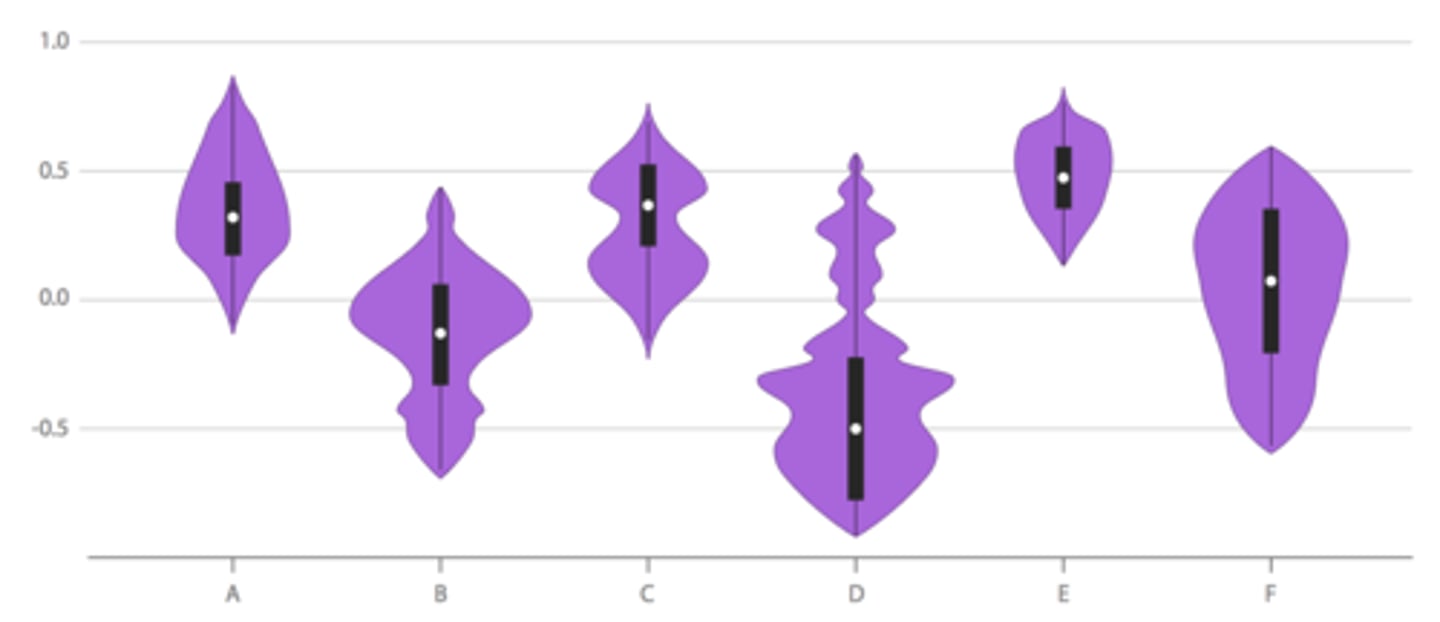
Violin Plot
a graph that shows an approximation of the frequency distribution of a numerical variable in each group and its mirror image
Invented in 1998 by Hintze and Nelson
Very simple to read
Require computers to produce correctly
Can still be misleading
Strip Charts
uses strips of paper to record M mode or spectral doppler information
User jittering to avoid overplotting
Sina Plot
Combination of
Ridgeline
Multiple density plots on a y-axis
Very effective to represent trends along time
Evokes a more intuitive understanding