Maths: Representing Data (GCSE, Edexcel)
1/22
Earn XP
Description and Tags
Name | Mastery | Learn | Test | Matching | Spaced | Call with Kai |
|---|
No analytics yet
Send a link to your students to track their progress
23 Terms
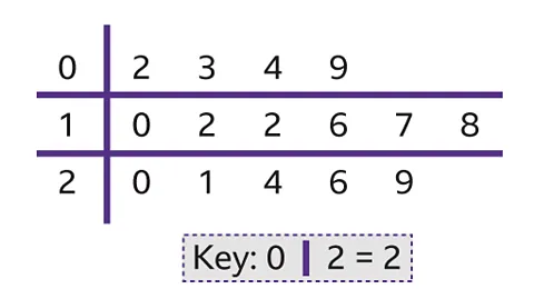
Stem and Leaf Diagram
A glorified table with 2 columns that sorts data by their most significant place value:
The 1st column, “the stem”, is the column that defines the most significant place value. It is one number per row only.
The 2nd column, “the leaves”, is the column that the data is placed into. Data is placed without the stem place value and multiple numbers can occupy a row.
A key is required to show the conversion between stem/leaf and data point.
Averages from a Stem and Leaf Diagram
The process remains the exact same as if it were a set, except now the values must be extrapolated.
Pie Chart and Angle rule
The fraction of the angle over 360 is equivalent to the fraction of people.
Cumulative Frequency Diagram
A curved line graph generated with a cumulative frequency (running total) table.
Cum Freq Coordinate generation strategy
If there is no column for cumulative frequency, make one and keep a running total of the frequencies.
The x-coordinate is the upper bound of the class interval, whereas the y-interval is the corresponding cumulative frequency.
Do this for each row.
Median from a Cum Freq Diagram
Find the place of the median by doing n/2 (this is a diagram).
Treat the place as a y-value and find its corresponding x-value.
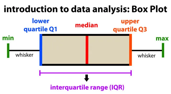
Inter-Quartile Range
A measurement of the data spread aimed at reducing the impact of extreme values, by only considering the middle 50% of values.
IQR formula
upper quartile - lower quartile
IQR from a Cum Freq Diagram
Find the places for the 2 quartiles by doing n/4 (lower quartile) and 3n/4 (upper quartile).
Treat the places like y-values and find their corresponding x-values to find the values of the quartiles.
Find the IQR using the formula.
Box Plot
A diagram used to compare sets of data. It represents the smallest value, lower quartile, median, upper quartile and largest value.
Finding quartiles in a set
Split the list into 2 lists of equal size. Discard the median if the total number of numbers in the set is odd. Find the median of both smaller lists to find the 2 quartiles.
Comparing Box Plots
Compare the median and the IQR. You must explain what it means, so for median it is “x was better/worse on average“ and for IQR it is “x was less/more consistent“.
IQR consistency
A higher IQR means less consistency in results, whereas a lower IQR indicates more consistency in results.
Histograms
A way to display grouped data frequencies similarly to a bar chart. Normally the class interval widths are unequal.
Frequency Density
The y-axis for a histogram, NOT frequency. DO NOT plot against frequency when drawing a histogram.
Frequency Density formula
For each data point:
frequency / class width
Frequency graphics in a histogram
The area of the bar represents the frequency.
“A number of data points are more/less than x, Find x” (HISTOGRAMS)
If the question states more start from the right, if it sates less than start from the left.
Move towards the middle, keeping track of the total frequency by calculating the area. This may include splitting up bars.
The x-axis value for when you reach the desired number is the number.
Median and IQR from a histogram strategy
Find the frequency total if it is not given to you
Start from the left
Move towards the middle, keeping track of the total frequency by calculating the area. This may include splitting up bars.
When you reach your desired value (n/2 for median; n/4 for lower quartile; and 3n/4 for upper quartile) the x-axis is the median/quartile.
“There are a number of data points in a range that spans multiple bars, find the frequency of a different range. There is no scale” (HISTOGRAMS)
Find the area of the given range in squares (it’s graph paper).
Find how much 1 square is worth in terms of real frequency.
Find the area of the wanted range in squares.
Convert to real frequency.
Frequency Polygon
A type of line graph, that shows the values of a frequency table.
Frequency polygon coordinate generation
Find the midpoint for each class interval.
The x-value is the midpoint and the y-value is the frequency.
Repeat for each row to find all the coordinates.
Generating a frequency table from a polygon
Find the values the midpoints are between on the x-axis. This will basically be choreographed to you.
Now you have all the values you need (frequency and class interval) to created the grouped frequency table.
You can then use that to find any average.